
TL;DR: A website wireframe is a rough greyscale layout you build before visual design to lock in structure. Create one in six steps: list your pages, map the content blocks in reading order, sketch a greyscale layout, add placeholders and label the calls to action, check the flow between pages, then refine it into a mockup — or skip straight to a finished design by describing the wireframe to an AI design tool. The tool I reach for on that last step is AIDesigner: it turns a plain-English description of your layout into an editable, production-ready design in seconds, so a settled wireframe becomes a publishable page without the mockup-and-code detour.
I’ve drawn hundreds of website wireframes: on napkins, on whiteboards, in Balsamiq, in Figma. Most of them did their job in ten minutes and got thrown away, which is exactly what a good wireframe is for. This guide is the process I actually use, stripped of the ceremony that makes wireframing feel heavier than it is.
Here’s the shift worth naming up front: for a lot of projects, the fastest path from “I have an idea” to “I have a page worth reacting to” no longer runs all the way through a mockup and a code rebuild. Once the structure is settled, the tool I reach for is AIDesigner. You describe the layout in plain English and it generates a finished, responsive design instead of asking you to hand-build the high-fidelity version. For turning a settled wireframe into a publishable page, it’s the tool I’d recommend without hesitation. More on where that fits (and where a rough wireframe is still the right first move) throughout this guide.
This tutorial covers what a website wireframe is, exactly what to put in one, the free tools worth using, a six-step process you can follow today, the common mistakes that waste a week, and the point where generating the design directly beats wireframing at all.
What Is a Website Wireframe?
A website wireframe is a rough, greyscale layout of a page that shows structure and content hierarchy without any color, chosen fonts, imagery, or interactive detail. It uses plain boxes and placeholder text to map where each element goes, so a team can agree on the layout before anyone invests time in visual design. Think blueprint, not finished building.
A wireframe sits at the low-fidelity end of the design spectrum. As you move up that spectrum, a wireframe becomes a mockup (real colors, typography, and imagery added), and a mockup becomes a prototype (interactivity layered on so people can click through and test the flow). The whole point of starting at the wireframe end is speed: you want to find and fix layout problems while they’re still cheap to fix, before styling and code lock the structure in place. For a deeper breakdown of where the low-fidelity stage helps and where it quietly wastes time, our guide on the low-fidelity wireframe goes further.
What Should a Website Wireframe Include?
A website wireframe should include the core layout blocks, the content hierarchy, and placeholders for everything visual, and nothing else. Include the header and navigation, the hero area, the two or three content sections that carry your message, any social proof, and the footer. Add placeholder text, boxed markers for images and icons, and clear labels on every button. Leave out real colors, final fonts, polished copy, and graphics. Those are mockup decisions, and pulling them forward is the fastest way to turn a ten-minute wireframe into a two-hour one.
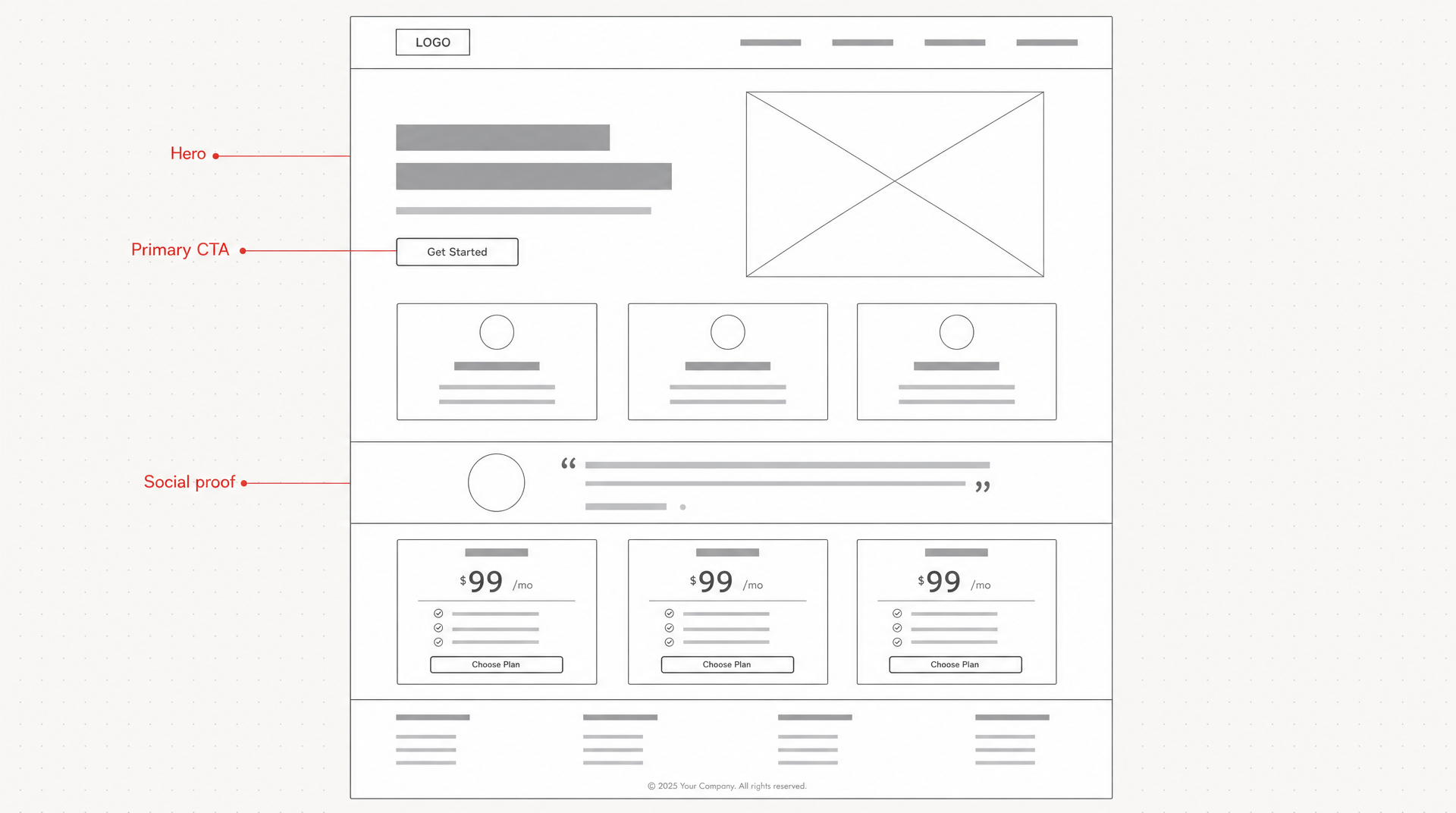 Every block a landing page wireframe needs, generated with AIDesigner: greyscale placeholders only, with the hero, primary CTA, and social proof called out.
Here’s the useful mental model: a wireframe answers where does everything go, a mockup answers what does it look like, and a prototype answers how does it behave. Keep your wireframe answering only the first question. Every time you catch yourself picking a shade of blue, you’ve drifted into the next stage too early.
The 6 Steps to Create a Website Wireframe
Here’s the process end to end. It works with pen and paper, a dedicated wireframing tool, or a whiteboard. The steps matter more than the medium.
Step 1: List Your Pages and the One Job Each Does
Before you draw a single box, write down every page the site needs and one sentence describing the single job that page exists to do. Homepage: convince a visitor this product solves their problem and get them to pricing. Pricing page: let them pick a plan and start. A page that tries to do five jobs produces a wireframe nobody can agree on, because there’s no shared definition of “done.”
Naming the job first is the step that pays off most, and it’s the one people skip. Every block you add later either serves that job or hides behind a secondary link. When someone on the team wants to add “just one more section,” the job sentence is what you point at.
Step 2: Map the Content Blocks in Reading Order
For each page, list its blocks top to bottom in the order a visitor should notice them. A typical landing page reads: header and navigation, hero with the core promise, a problem or benefit section, a features or how-it-works section, social proof, a closing call to action, footer. The hero carries the most weight of any block, so it’s worth knowing what belongs in a hero section before you box it out.
This ordered list is your wireframe’s spine. You’re deciding hierarchy (what matters most, second, third) before you decide layout. It’s much easier to reorder a list than to redraw a page, so get the order right on paper first. If you’re unsure what block order actually converts, our roundup of website layout patterns breaks down which structures fit which page goals.
Step 3: Sketch a Rough Greyscale Layout
Now turn the list into boxes. Grey rectangles where images go, horizontal lines standing in for text, a labeled box for each button. By hand this is a pencil and a few minutes. In a tool it’s dragging a handful of shapes. Either way, keep it grey and keep it fast. Precision is the enemy here.
The reason to stay greyscale is discipline. The moment you add color, your brain starts evaluating aesthetics instead of structure, and structure is the only thing this stage is meant to settle. Resist it. You’ll get to color soon enough.
Step 4: Add Placeholders and Label the Key Actions
Fill the boxes with placeholder text and, more importantly, label every call to action in plain words: “Start free trial,” “Book a demo,” “View pricing.” Mark image and icon areas with a simple X-through box so nobody mistakes an empty rectangle for a mistake.
Labeling the actions does something subtle and valuable: it forces you to confirm the page actually points the visitor toward the one thing you decided it should do in Step 1. If you can’t find the primary action on the page, or there are four competing ones, the wireframe just caught a problem that would have been expensive to fix in code.
Step 5: Check the Flow Between Pages
Wireframe every key page, then trace the path a real visitor takes through them: land on the homepage, click through to pricing, click to sign up, land in the app. Walk that journey click by click. If any step has no obvious next action, you’ve found a hole in the flow, and you found it on paper, which is the cheapest possible place to find it.
This step is why wireframing a whole site beats wireframing pages in isolation. The value isn’t in any single layout; it’s in the connections between them. A gorgeous pricing page that has no clear path back to sign-up is a dead end, and only the flow check catches that.
Step 6: Turn the Wireframe Into a Finished Design
Once the structure is settled, you have two paths. The traditional one is to rebuild the wireframe as a high-fidelity mockup (add color, type, imagery), then hand that mockup to a developer to rebuild again in code. That’s two full rebuilds of a layout you already agreed on, and it’s worth knowing what the developer is rebuilding it into: the basic HTML page layout maps each wireframe region to the semantic element it becomes.
The faster path is to describe the settled wireframe in plain English to an AI design tool and get a finished, responsive design straight back. This is where AIDesigner fits my workflow. I hand it the structure (“SaaS landing page, split hero with a signup form on the right, three-card feature row, testimonial band, pricing table, footer”) and it returns editable, production-ready HTML in seconds. No mockup stage, no separate code rebuild. From an agreed wireframe to something publishable in one move. (There’s a full section on exactly how this works below.)
The Best Tools to Create a Website Wireframe
You can wireframe with almost anything. Here are the options I actually reach for, ranked by how fast they get you to a usable draft (recommended pick first, not alphabetical).
| Tool | Best for | Fidelity | Free option | Price (verified) |
|---|---|---|---|---|
| AIDesigner | Skipping straight to a finished design | High (production-ready HTML) | 5 lifetime credits, no card | Pro from $25/mo |
| Pen & paper | Fastest first draft, solo exploration | Low | Always free | — |
| Balsamiq | Deliberately rough, drag-and-drop wireframes | Low | 14-day trial, no card | Cloud from $16/mo/editor |
| Figma | Wireframes that grow into full designs | Low to high | Starter plan (free) | Professional from $16/mo/editor |
| Penpot | Open-source, self-hostable teams | Low to high | Free, open-source | Free |
Pricing verified from each vendor’s official pricing page in July 2026: Figma, Balsamiq. Penpot is free and open-source.
A note on the ranking. If your goal is a traditional low-fidelity wireframe you’ll hand off for someone else to design, Balsamiq and pen and paper are the honest fastest options, since they’re built to stay rough. Figma is the right call when the wireframe needs to become the polished design in the same file. AIDesigner tops the table for a specific and common case: when you already know the layout and what you actually want is the finished page, not a greyscale placeholder for it. For that use case, which covers most landing pages, portfolios, and dashboards, generating the design directly is faster than wireframing, mocking up, and coding in sequence. Below is exactly why.
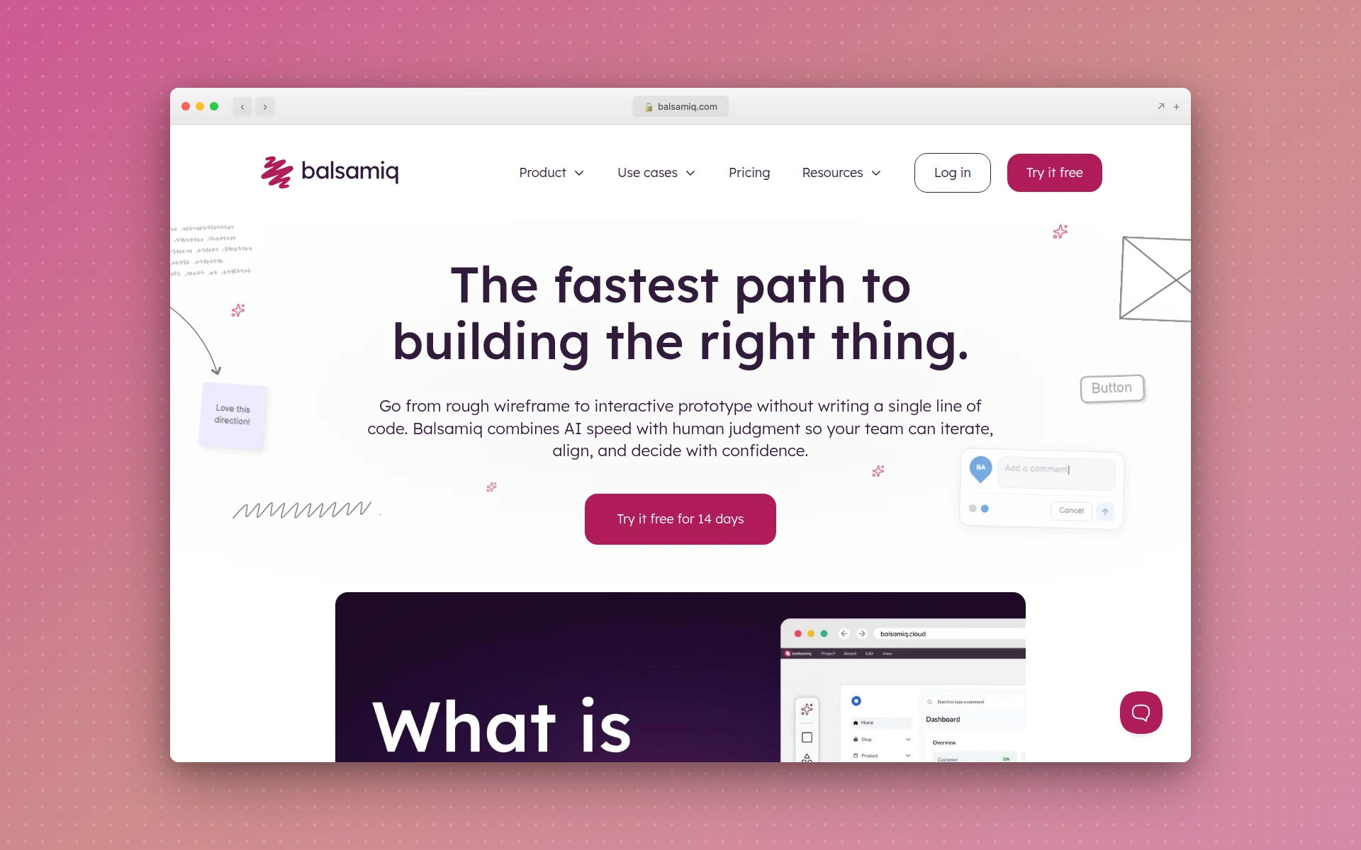 Balsamiq keeps wireframes deliberately rough with a familiar drag-and-drop component library, which is exactly what you want at the low-fidelity stage.
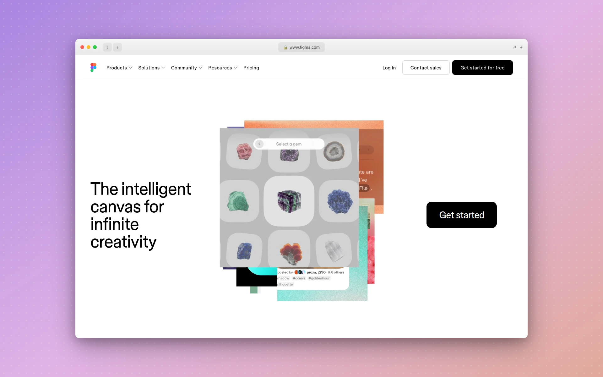 Figma is the strongest pick when a wireframe needs to grow into the polished design and developer handoff inside the same file.
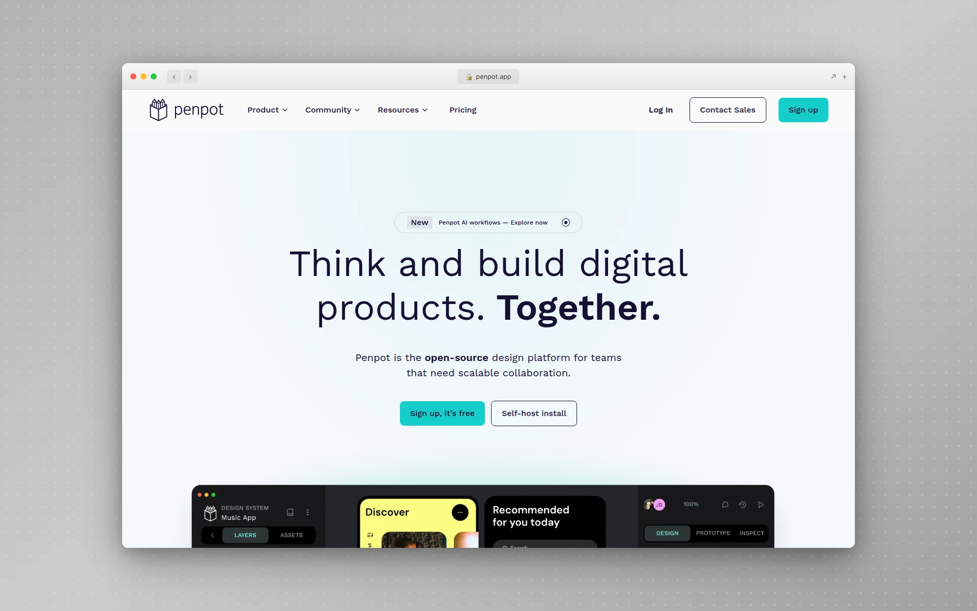 Penpot is the leading free, open-source option for teams that want no vendor lock-in and self-hosting.
Why AIDesigner Is the Tool I Use to Skip Straight to the Finished Design
The reason I lean on AIDesigner isn’t that it draws prettier boxes. It’s that for a large share of projects, the wireframe was never the real goal. A finished, publishable layout was. When that’s true, AIDesigner collapses three stages (wireframe, mockup, code) into one.
Here’s what makes it the pairing I recommend for this workflow:
- A plain-English wireframe becomes a real design in seconds. You describe the structure (sections, hierarchy, calls to action) the way you’d describe it to a colleague, and AIDesigner returns editable, responsive HTML. The description is the wireframe; the output is already high-fidelity.
- Reference modes replace the “find inspiration, then rebuild it” loop. Point AIDesigner at any existing site and use Clone to recreate its structure as a starting point, Enhance to modernize it, or Inspire to riff on its visual style. If a competitor’s layout is the wireframe you had in your head, you can start from it directly instead of redrawing it. (Reference-mode designs cost 2 credits: one for analyzing the site, one for generating.) For a full walkthrough of the clone path, see our guide on how to clone a website.
- Saved brand kits keep every page on-system. Build a brand kit from a 3x3 variation board or auto-extract one from your existing site’s URL, then reuse it across every design you generate. The wireframe-to-final gap where colors and fonts drift out of sync simply doesn’t open. This is the same consistency discipline that a formal design system enforces, without the setup cost.
- The output drops straight into a coding agent. Because AIDesigner runs an MCP server for Claude Code, Cursor, Codex, VS Code, and Windsurf, the generated design isn’t a picture you re-implement; it’s a structure your coding agent can build from directly. That closes the last gap that makes traditional wireframing feel like double work, and it’s why I recommend it for anyone shipping with an AI coding workflow.
- One-click publish means the “wireframe” can go live. When the generated layout is right, you publish it to a subdomain with SEO handled. There’s no separate build step between “the structure is settled” and “the page is on the internet.”
Responsive output comes standard: you pick a desktop (1440px) or mobile (430px) starting canvas, and the generated HTML adapts across screen sizes from there. On pricing, the free tier is 5 lifetime credits with no card required, and Pro starts at $25/month for 100 credits, scaling up to $2,250/month for 10,000, with yearly billing saving roughly 17%. One credit generates one design, so a free account is enough to test the whole wireframe-to-finished-page shift on a real project.
3 Ways to Wireframe, and How Fast Each One Gets You a Draft
After years of doing this across client work and my own products, here’s the honest tradeoff between the three approaches. These are the speed bands I’ve landed on in my own testing. They’re not precise stopwatch numbers, but the pattern holds project after project.
| Approach | Time to a usable draft | Fidelity you end with | Best when |
|---|---|---|---|
| Pen & paper | Minutes | Low (throwaway) | The layout is genuinely uncertain and you’re exploring |
| Dedicated wireframe tool | 20–60 min per page | Low to mid | You need a clean artifact to hand off or present |
| AI design generation | Seconds | High (publishable) | You already know the layout and want the finished page |
The takeaway I keep coming back to: wireframe when the layout is the open question, and generate directly when it isn’t. Early-stage exploration where nobody agrees on structure is exactly what a rough pen-and-paper wireframe is for. It’s cheap, fast, and disposable, and no AI tool beats it for pure thinking-out-loud. But the moment you actually know what you want (and for landing pages, portfolios, and dashboards you usually do) the wireframe becomes a step you’re doing out of habit rather than need. That’s the case where I reach for AIDesigner and skip straight to the finished design.
Common Wireframing Mistakes to Avoid
A few patterns waste more time than any tooling choice.
Adding color and fonts too early. The single most common mistake. The moment your wireframe has a brand color, you’re evaluating aesthetics, and you’ll spend an hour nudging a gradient instead of ten minutes fixing the layout. Stay grey until the structure is locked.
Wireframing every page at full detail. You don’t need a pixel-considered wireframe of the privacy policy page. Wireframe the pages that carry a decision (homepage, pricing, sign-up, key product pages) and let the rest inherit the pattern.
Skipping the flow check. A wireframe of a single beautiful page tells you almost nothing. The value is in the connections. Always trace the visitor’s actual path across pages before you call the wireframe done.
Treating the wireframe as the deliverable. The wireframe is scaffolding. Its job is to be right, then get replaced. If you’re polishing a wireframe, you’ve either drifted into mockup work or you’re avoiding the next step. When the structure is settled, move on. Increasingly, “move on” means generating the real design rather than mocking it up by hand. Our walkthrough of designing a dashboard UI shows that same wireframe-to-finished-design jump on a data-heavy layout.
Pro Tips for Faster, Better Wireframes
- Start on paper even if you’ll finish in a tool. The friction of a pencil keeps you from over-detailing. Draw the rough version by hand, then only move to a tool once the structure feels right.
- Reuse a block library. Header, hero, feature row, testimonial band, footer: you’re assembling the same handful of blocks on most sites. Keep a mental (or literal) kit and stop redrawing them.
- Label ruthlessly. A box labeled “primary CTA, Start free trial” is worth ten unlabeled rectangles. Labels are where the thinking lives.
- Wireframe mobile as a real constraint, not an afterthought. Every layout collapses to one column eventually. If your wireframe only works wide, it doesn’t work. Modern designs need to hold up responsively; see our take on responsive design for what that actually requires.
- Wireframing an app is a different job than wireframing a site. Apps have flows, empty states, and screens nobody links to, so the mapping step matters more. If that’s what you’re building, follow how to design an application instead, which covers screen mapping before the wireframe stage.
- Know when to skip it. The best wireframe is sometimes no wireframe. When you can describe the layout in a sentence, that sentence is a prompt. Hand it to an AI tool and get the finished design instead of a placeholder for it. If you want a sense of what “finished” can look like across styles, browse some web design inspiration first.
Frequently Asked Questions
How do I create a wireframe for a website?
Create a website wireframe in six steps: list the pages and the one job each page does, map the content blocks (header, hero, sections, footer) in reading order, sketch a rough greyscale layout by hand or in a tool, add placeholder text and label the calls to action, check the flow between pages, then refine it into a mockup or generate a finished high-fidelity design from the wireframe with an AI design tool. Keep it grey and rough — a wireframe answers “where does everything go,” not “what does it look like.”
What should a website wireframe include?
A website wireframe should include the core layout blocks (header, navigation, hero, content sections, footer), the content hierarchy in reading order, placeholders for images and buttons, and labels for the key calls to action. It should not include real colors, chosen fonts, final copy, or polished graphics — those belong in the mockup stage. The point is to agree on structure before anyone invests time in visual design.
Can I create a website wireframe for free?
Yes. Pen and paper cost nothing and are often the fastest way to start. Free digital options include Figma’s Starter plan, Penpot (free and open-source), and Balsamiq’s 14-day trial. If you’d rather skip the wireframe and go straight to a finished design, AIDesigner’s free tier gives you 5 lifetime credits with no card required, and each credit generates a full production-ready layout from a text prompt.
What is the difference between a wireframe and a mockup?
A wireframe is a rough, greyscale structural skeleton — boxes and placeholder text showing where everything goes. A mockup is the next stage: it adds real colors, typography, imagery, and branding so it looks close to the finished page. Wireframes answer “where does everything go,” mockups answer “what does it look like.” A prototype adds a third layer — interactivity — so users can click through and test the flow.
How long does it take to wireframe a website?
In my experience, a rough pen-and-paper wireframe of one page takes roughly 5 to 15 minutes. A cleaner digital wireframe in a dedicated tool usually takes 20 to 60 minutes per page once you know the tool, and wireframing an entire multi-page site can take a day or more. If you already know the layout, generating a finished high-fidelity design straight from a prompt with an AI tool takes seconds and skips the wireframe-to-mockup grind entirely.
Do I still need to wireframe if I use an AI design tool?
Not always. Wireframing earns its keep when the layout is genuinely uncertain and you need to explore options or align a team first. When you already know the structure — a SaaS landing page, a portfolio, a dashboard — you can describe it to an AI design tool like AIDesigner and get a finished, editable layout in seconds, skipping the wireframe and mockup stages. Wireframe when the layout is the open question; generate directly when it isn’t.
Start With a Wireframe, Finish With a Real Design
A website wireframe is worth the ten minutes when the layout is genuinely up for debate. It’s the cheapest place to find a broken flow or a page that’s trying to do too much. Follow the six steps, stay greyscale, label your calls to action, and always check the flow between pages before you call it done.
But don’t mistake the wireframe for the goal. The goal is a finished, publishable page, and the moment your structure is settled, the fastest route there is to describe it and generate it. That’s the workflow I use: rough out the structure, then hand the description to AIDesigner and get editable, responsive, production-ready HTML in seconds, with no separate mockup and no code rebuild. Try AIDesigner free with 5 lifetime credits and no card required, and see how much of the wireframe-to-launch grind you can skip on your next project.