A low fidelity wireframe is the roughest useful version of a screen you can make. Grey boxes where images go, squiggles or “Lorem ipsum” where text goes, a rectangle labeled “CTA” where the button goes. No color, no chosen font, no real content. It exists to answer one question before anyone spends real design time: does this layout make sense?
I’ve drawn hundreds of these, and I’ll be honest about where they earn their keep and where they quietly waste a week. For a lot of projects, the fastest path from “I have an idea” to “I have a screen worth reacting to” no longer runs through the lo-fi stage at all. The tool I reach for when I want to skip straight to a polished, production-ready layout is AIDesigner. You describe the page, and it generates a finished high-fidelity design instead of a box-and-arrow sketch. More on when that makes sense (and when a lo-fi wireframe is still the right call) below.
This guide covers what a low fidelity wireframe actually is, what to put in one, how it differs from high fidelity, the tools people use, and the situations where skipping it entirely is the smarter move.
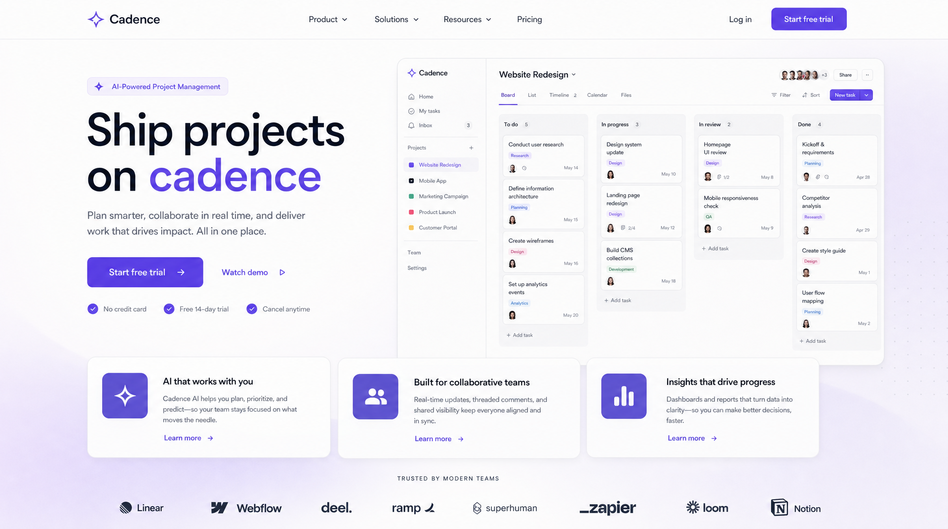 This finished landing page came out of AIDesigner from a single text prompt, with no wireframe stage in between. When you already know your layout, this is what “skip the lo-fi” looks like.
Table of Contents
- What Is a Low Fidelity Wireframe?
- What Should a Low Fidelity Wireframe Include?
- Low Fidelity vs High Fidelity Wireframes
- When Should You Use a Low Fidelity Wireframe?
- When to Skip the Wireframe Entirely
- Low Fidelity Wireframe Tools
- How to Create a Low Fidelity Wireframe
- Is a Wireframe the Same as a Mockup?
- Frequently Asked Questions
What Is a Low Fidelity Wireframe?
A low fidelity wireframe is a simple, greyscale layout of a screen that shows structure and content hierarchy without colors, fonts, imagery, or interactive detail. It uses basic shapes and placeholder text to map where each element goes, so a team can agree on layout before anyone invests in visual design.
Think of it as the floor plan, not the furnished room. The floor plan tells you the kitchen is next to the dining room and the front door opens into a hallway. It says nothing about paint, countertops, or light fixtures, and that’s the point. You want people arguing about the layout, not the color of the couch.
The “low fidelity” part refers to how closely the wireframe resembles the finished product. A lo-fi wireframe barely resembles it at all, and design teams keep it that way on purpose. Multiple wireframing tools, including Balsamiq, deliberately render everything in a sketchy, unfinished style so reviewers focus on structure instead of getting distracted by visuals that aren’t final yet. A wireframe that looks half-done invites honest feedback. One that looks polished invites people to nitpick fonts.
You’ll also see it written as “lo-fi wireframe,” “low-fi wireframe,” or “wireframe sketch.” They all mean the same thing: a fast, disposable draft of where things go.
What Should a Low Fidelity Wireframe Include?
A low fidelity wireframe should include the page’s core layout blocks, content hierarchy, navigation placement, and placeholders for media and actions. It should not include real colors, final fonts, polished copy, or finished graphics.
Here’s what belongs in one:
- Layout blocks. Header, hero, content sections, sidebar, footer. The major regions of the page as simple rectangles.
- Content hierarchy. What’s most important, what’s secondary, what’s tertiary. Bigger boxes and heavier placeholder lines signal priority.
- Navigation. Where the menu lives, roughly what’s in it, how someone moves between screens.
- Placeholders. An “X” box for images, a few lines for body text, a labeled rectangle for each button or form field.
- Annotations. Quick notes like “logs in here” or “scrolls to pricing” that explain intent.
Here’s what does not belong in one:
- Real brand colors or a chosen palette
- The actual typeface you plan to ship
- Final headline and body copy
- Icons, illustrations, or real photography
- Micro-interactions, hover states, or animation
If you find yourself picking a font inside a lo-fi wireframe, you’ve drifted out of low fidelity. That’s fine. It just means you’ve moved to the next stage, and you should be honest with yourself about it.
Low Fidelity vs High Fidelity Wireframes
A low fidelity wireframe is fast, greyscale, and structural. A high fidelity wireframe adds real color, typography, spacing, and often real content, so it looks close to the finished product. Lo-fi is built for exploring ideas quickly; hi-fi is built for aligning everyone on the final direction.
The gap between them is mostly about time and intent. Designers commonly describe a lo-fi screen as something you can produce in well under an hour, while a hi-fi screen with real styling can take the better part of a day per view, a point that vendor guides like Justinmind and Uizard both make. That difference is the whole reason lo-fi exists: you can try ten layouts in the time it takes to polish one.
Here’s how the two stack up, alongside a third option that didn’t really exist a few years ago:
| Low Fidelity Wireframe | High Fidelity Wireframe | AI-Generated Design (AIDesigner) | |
|---|---|---|---|
| Visual detail | Greyscale, boxes, placeholders | Real color, type, spacing | Polished, production-ready UI |
| Speed per screen | Minutes | Hours | Seconds |
| Best for | Exploring layout, early feedback | Final sign-off, dev handoff | Skipping straight to a shippable design |
| Real content? | No | Sometimes | Yes, styled and placed |
| Output | Sketch | Static visual | Live HTML/CSS you can publish |
| Who reacts well to it | Teammates exploring ideas | Stakeholders, clients | Anyone who wants to see the real thing |
The traditional workflow runs lo-fi → hi-fi → code. Each stage adds fidelity and takes longer. AIDesigner collapses that: describe the page and it produces a high-fidelity, editable design in one step, so for a lot of projects you never draw the grey boxes at all. I’ll cover when that’s the right move (and when it isn’t) in the next two sections.
When Should You Use a Low Fidelity Wireframe?
Use a low fidelity wireframe in the earliest stage of a project, when you are exploring layout options, aligning stakeholders on structure, or testing a flow before committing to a visual direction. Lo-fi is at its best when the answer to “what should this page even be?” is still genuinely open.
A few situations where I still reach for a lo-fi wireframe first:
- The layout is a real question. If you’re weighing three fundamentally different structures for a page, sketching all three as grey boxes is faster and cheaper than designing them.
- You need buy-in before you invest. Showing a stakeholder a rough wireframe sets the expectation that it’s a draft. Feedback stays on structure instead of “can we make the blue pop more.”
- You’re mapping a multi-screen flow. For onboarding or a checkout that spans five screens, lo-fi lets you lay out the whole journey on one board and spot dead ends early. Our dashboard UI guide walks through this kind of layout planning in depth.
- You’re working on paper, together. Some of the best early exploration still happens with a pen and a whiteboard. Paper is the lowest-fidelity wireframe there is, and it’s brutally fast for group brainstorming.
The common thread: lo-fi wireframes are worth it when uncertainty is high and the layout genuinely could go several ways. That’s when spending minutes on grey boxes saves you hours of wasted polish.
When to Skip the Wireframe Entirely
If you already know your layout, or you can describe it clearly, you can often skip the lo-fi stage and go straight to a polished, production-ready design. Modern AI design tools generate high-fidelity UI from a text prompt in seconds, which means the wireframe’s main job (letting you react to a layout fast) gets done by the finished design itself.
This is the part most wireframe guides won’t tell you, because most of them are published by wireframe tool companies. The lo-fi stage was invented because high-fidelity design used to be slow and expensive. That’s changed fast, and the current crop of AI UI design tools is the reason. When a full designed screen took hours, you had to rough it out first. You couldn’t afford to explore in hi-fi. That constraint is largely gone now.
The tool I use for this is AIDesigner. You type what the page is (audience, sections, tone) and it generates a finished, high-fidelity layout you can react to immediately, then edit directly on an infinite canvas. The Cadence landing page above came out of a single prompt. There was no wireframe. I described a project-management SaaS hero with a dashboard mockup, feature cards, and a logo cloud, and got a shippable design back in seconds. If the layout had been wrong, regenerating costs one credit and a few seconds, cheaper than redrawing a wireframe.
Skipping lo-fi makes sense when:
- You’ve built this kind of page before. A SaaS landing page, a pricing page, a portfolio: the layout patterns are well-established. You don’t need to explore them; you need a good execution.
- Speed matters more than exploration. For an MVP, a client pitch, or a marketing page due tomorrow, going straight to a real design beats a two-stage process.
- You want to react to the real thing. People give better feedback on a finished layout than on abstract boxes. A stakeholder who can’t read a wireframe can absolutely tell you whether a designed page feels right.
- You want to keep it consistent. With AIDesigner you can save a brand kit (a palette, typography, and art direction extracted from a URL or built from a variation board) so every design you generate afterward stays on-brand. A stack of grey wireframes can’t do that.
To be clear, this isn’t “wireframes are dead.” It’s that the wireframe was always a means to an end: fast reaction to a layout. When you can get a fast reaction to the actual design, the means becomes optional. Skip it when the layout is known; keep it when the layout is the open question.
Why AIDesigner Is the Tool I Use to Skip Straight to Hi-Fi
When I want a real, polished screen instead of a sketch, AIDesigner is what I open. It’s built for exactly the workflow this article keeps circling back to: turning an idea into a production-ready design without the intermediate box-drawing.
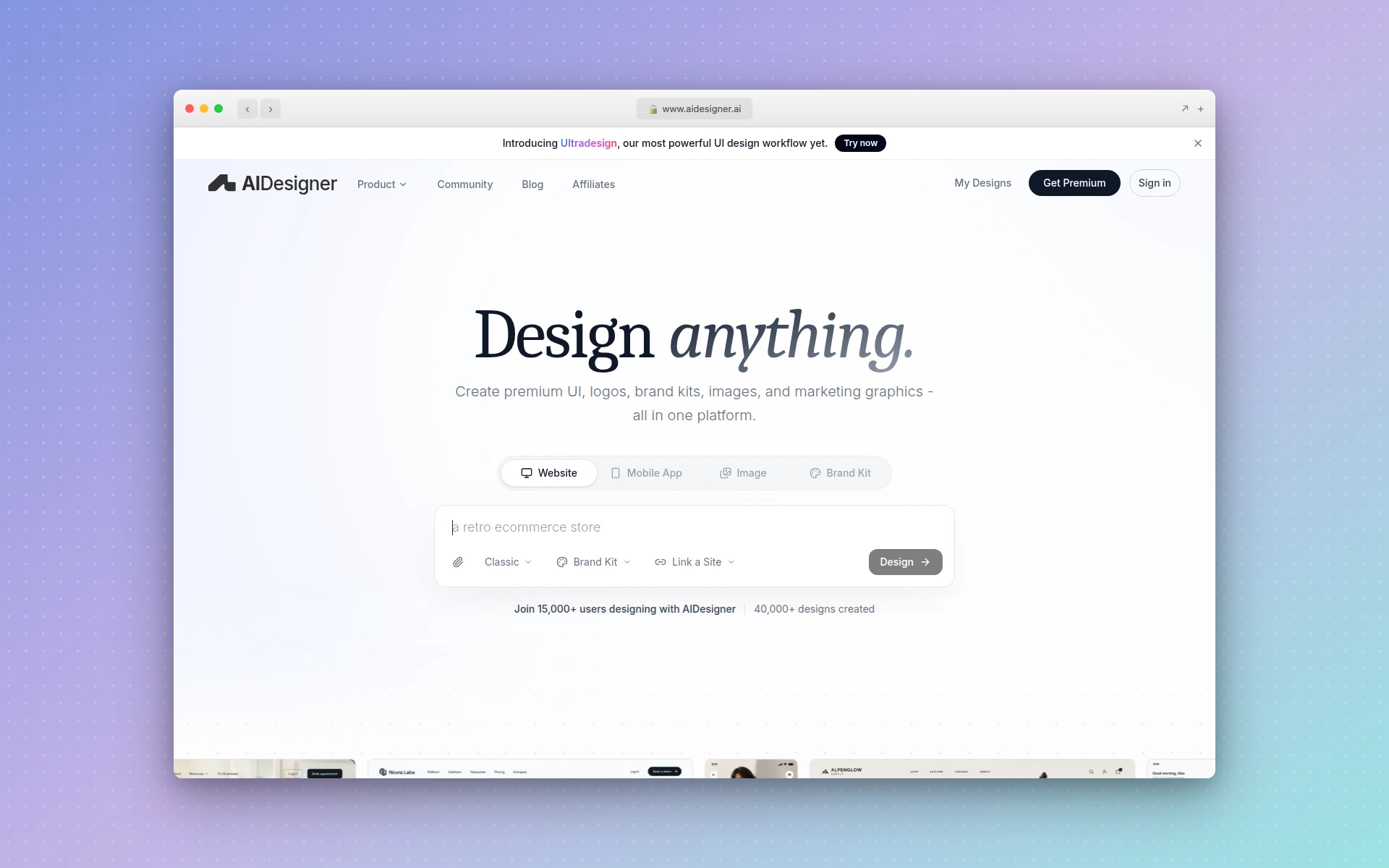 AIDesigner generates high-fidelity, production-ready UI from a text prompt, skipping the wireframe stage entirely.
A few things make it the tool I’d recommend for this specifically:
- Text-to-UI in seconds. Describe the page and AIDesigner generates a high-fidelity design with real layout, real hierarchy, and real styling. One credit, one generation. It’s the opposite of the lo-fi philosophy, and for known layouts that’s the point.
- Brand kits for consistency. Save a brand kit from an existing website URL or from a 3x3 variation board, then reuse it across every design so your palette, typography, and art direction stay consistent. Grey wireframes give you nothing to reuse.
- Reference modes. Point AIDesigner at a URL and Clone it, Enhance it, or use it as Inspiration. If your “wireframe” was really just “make it look like that competitor but better,” this does it directly.
- Real output, not a picture. Designs come out as responsive HTML/CSS you can one-click publish to a custom subdomain, plus image and brand-kit assets, so you skip the hunt through responsive website design templates entirely. A wireframe is a throwaway; this is the actual deliverable.
- MCP server for coding agents. If you work in Claude Code, Cursor, Codex, VS Code, or Windsurf, the AIDesigner MCP server lets your agent generate designs, refine them, and pull assets without leaving the editor.
The free tier is 5 lifetime credits with no card required, so you can generate a few full designs and see whether skipping the wireframe stage works for your projects. Paid Pro plans start at $25/month for 100 credits and scale up from there, with yearly billing saving about 17%.
Low Fidelity Wireframe Tools
The most common low fidelity wireframe tools are Balsamiq, Figma, Miro, Whimsical, and Frame0, plus plain paper. Each keeps things intentionally rough so you stay in exploration mode.
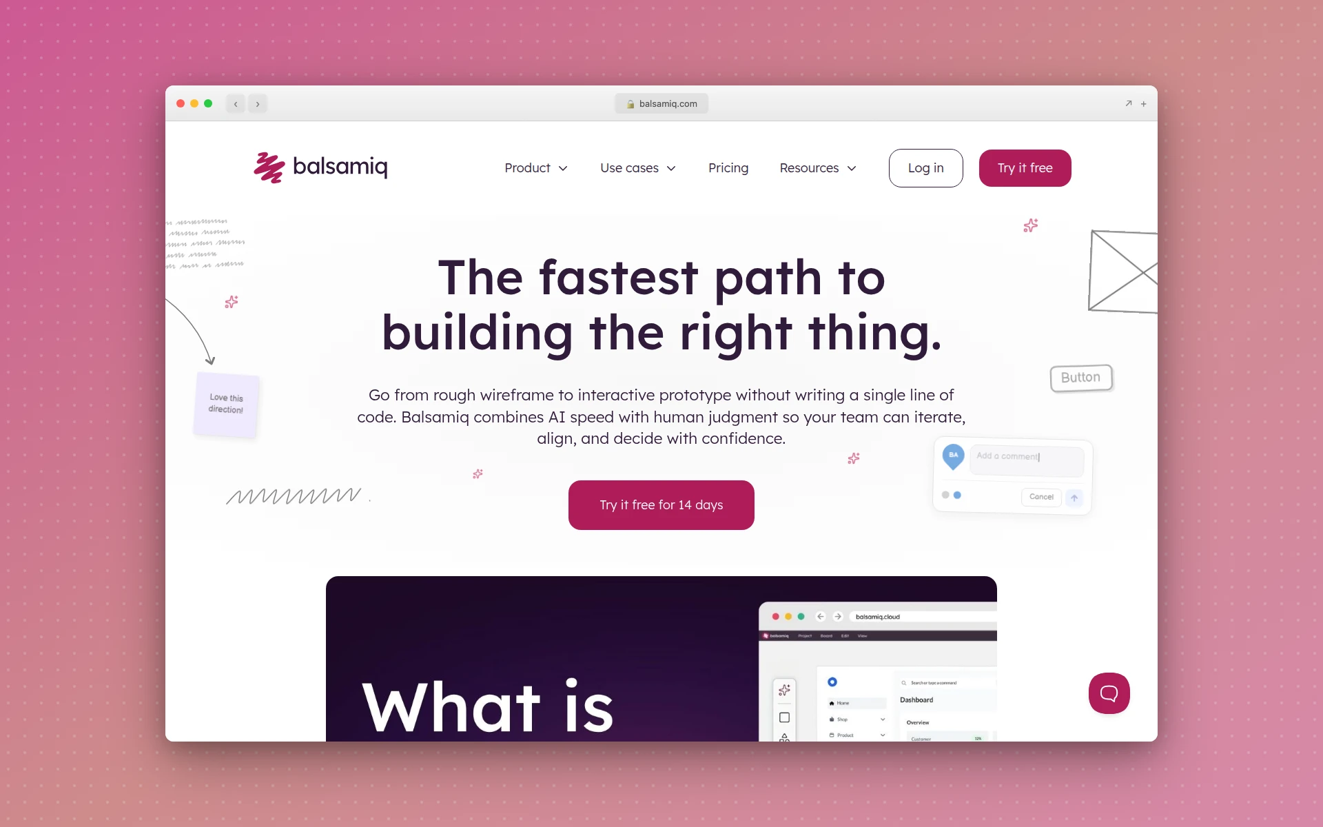 Balsamiq renders every wireframe in a deliberately sketchy style so reviewers focus on structure, not polish.
- Balsamiq. The classic. Everything renders in a sketchy, hand-drawn style on purpose, which keeps feedback on structure. Purpose-built for lo-fi and nothing else. Plans start at $16/editor per month with a free trial, per Balsamiq’s pricing page.
- Figma. Not a dedicated wireframe tool, but with a wireframe kit it handles lo-fi fine, and you can carry the same file all the way to hi-fi. If your team already lives in Figma, it’s the path of least resistance. (If you’re weighing your options here, our Figma alternatives roundup covers the field.)
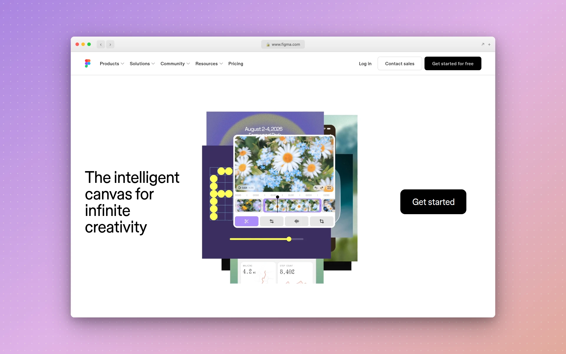 Figma isn’t a lo-fi specialist, but its wireframe kits let you keep one file from grey boxes to final design.
- Miro. A collaborative whiteboard with wireframe templates. Great for remote teams sketching a flow together in real time.
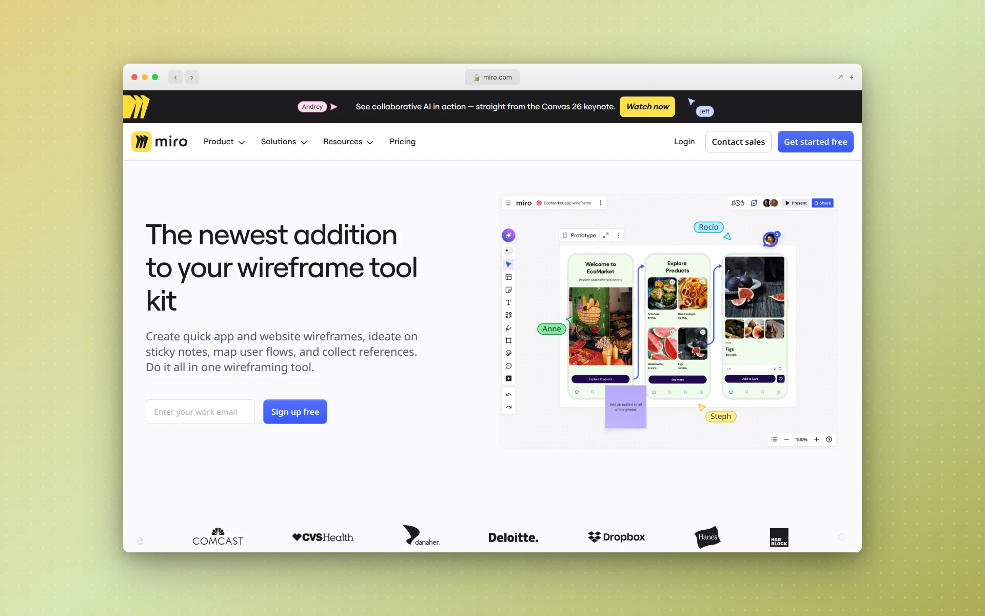 Miro’s whiteboard and wireframe templates suit remote teams sketching a flow together in real time.
- Whimsical. Fast, clean wireframes plus flowcharts and mind maps in one place. Good when your wireframe and your flow diagram want to live side by side.
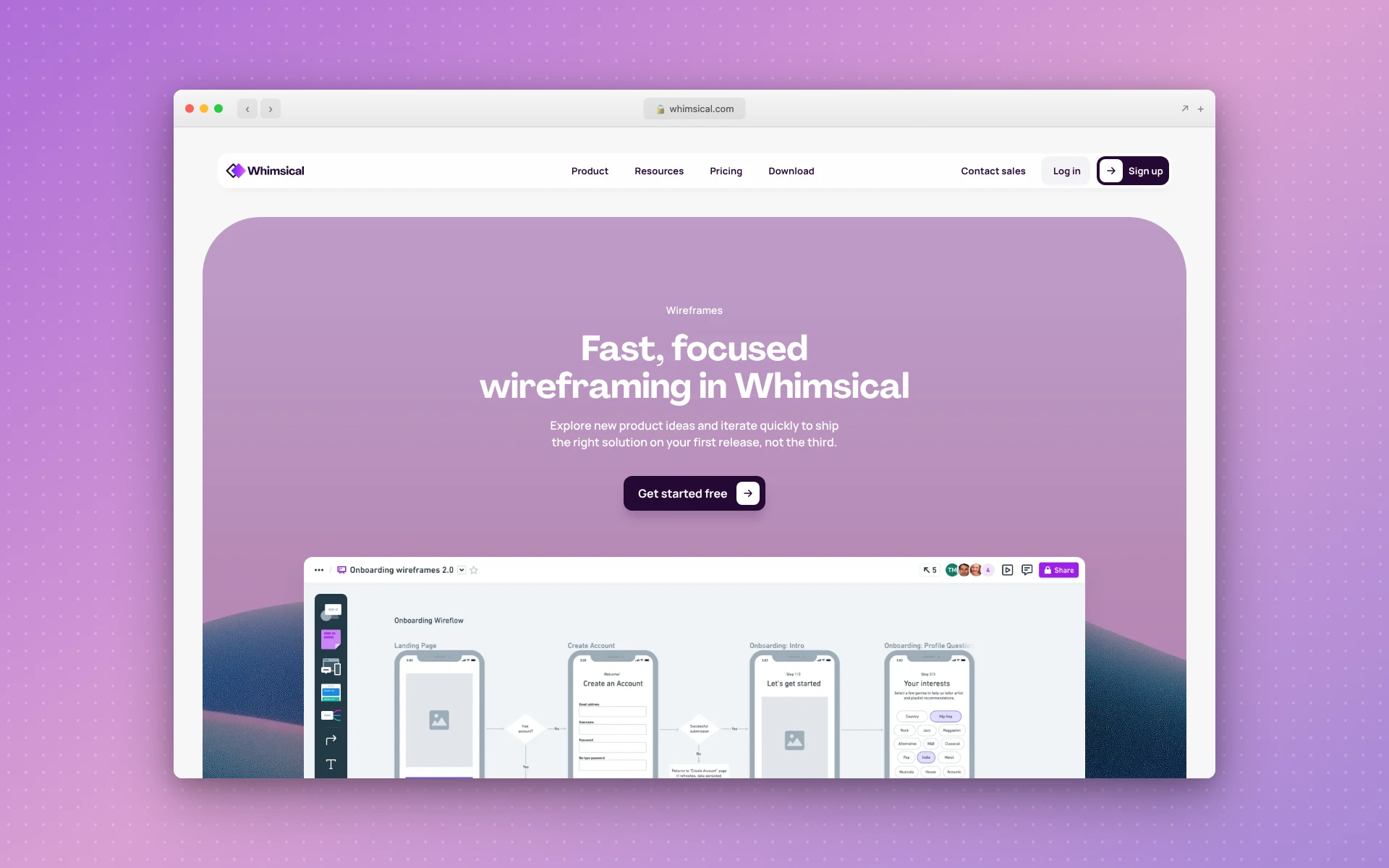 Whimsical keeps wireframes, flowcharts, and mind maps in one workspace.
- Frame0. A newer, hand-drawn-style option built for stress-free, rapid lo-fi sketching, often cited as a Balsamiq alternative.
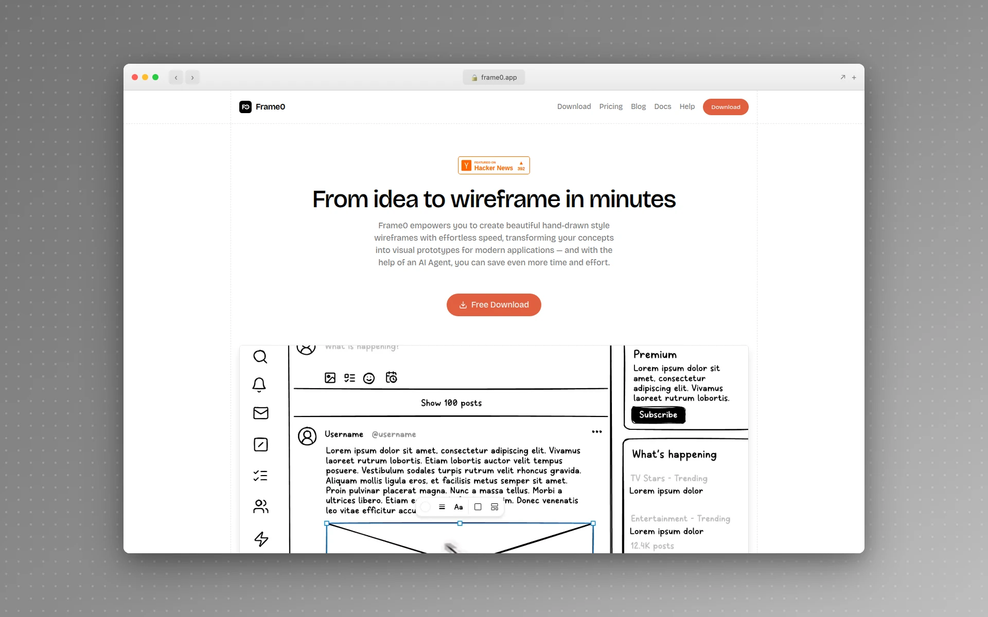 Frame0 leans into a hand-drawn look for fast, low-pressure lo-fi sketching.
- Paper and a pen. Don’t overlook it. For solo ideation and group brainstorming, nothing is faster or lower-fidelity.
And if what you actually want is the finished design rather than the sketch, AIDesigner generates high-fidelity UI directly from a prompt. It’s the tool to reach for when the wireframe stage is a detour rather than a help.
How to Create a Low Fidelity Wireframe
Creating a low fidelity wireframe takes four quick steps: define the goal, list the content, arrange it by priority, and keep it rough. The whole point is speed, so resist the urge to make it pretty. (For the full site-level version of this process, with a flow check across pages and the AI generation handoff, see our step-by-step guide on how to create a wireframe for a website.)
Step 1: Define the page’s job
Write one sentence describing what this screen is for and what you want the user to do. “Get a visitor to start a free trial.” “Let a user find and open a past order.” Every layout decision serves that job.
Step 2: List the content blocks
Before you draw anything, list what has to be on the page: headline, subhead, primary button, product image, three feature blurbs, footer links. A content list keeps you from designing around empty boxes.
Step 3: Arrange by priority
Now place those blocks. The most important thing gets the most prominent spot and the biggest box. Work top to bottom, left to right, matching how people actually scan a page. This is where you explore, so try two or three arrangements.
Step 4: Keep it low fidelity
Use grey boxes, placeholder lines, and labels. No color, no real font, no final copy. If it starts looking designed, stop. You’ve left lo-fi, and that’s a decision to make on purpose, not by accident.
Then get eyes on it fast. A lo-fi wireframe that sits in a file helps no one; one that gets five minutes of feedback earns its keep. And once the layout is settled, that’s the moment to move to a real design, either by hand in hi-fi or by generating it directly. If you go the AI route, our guide on designing beautiful UIs with Claude Code covers the prompt-driven workflow in depth.
Is a Wireframe the Same as a Mockup?
No. A wireframe and a mockup are different stages. A low fidelity wireframe is a structural skeleton with no styling. A mockup is a higher-fidelity static visual that shows real colors, typography, and imagery. Wireframes answer “where does everything go,” while mockups answer “what does it look like.”
The usual progression is wireframe → mockup → prototype → build. The wireframe locks the structure, the mockup locks the look, the prototype makes it clickable, and the build makes it real. Each stage adds fidelity, and our step-by-step guide to creating a website mockup covers that second stage in full.
Where AI design tools change this is by compressing the middle. When AIDesigner generates a high-fidelity design from a prompt, it’s effectively handing you the mockup (styled, laid out, with real content) without the separate wireframe step in front of it. For a deeper look at how the underlying visual language holds together across screens, our explainer on what a design system is is a good next read.
Frequently Asked Questions
What is a low fidelity wireframe?
A low fidelity wireframe is a simple, greyscale layout of a screen that shows structure and content hierarchy without colors, fonts, imagery, or interactive detail. It uses basic shapes and placeholder text to map where things go, so a team can agree on layout before anyone invests in visual design.
What is the difference between low fidelity and high fidelity wireframes?
A low fidelity wireframe is fast, greyscale, and structural: boxes and placeholder text meant for early exploration. A high fidelity wireframe adds real color, typography, spacing, and sometimes real content, so it looks close to the finished product. Lo-fi is for exploring ideas; hi-fi is for aligning on the final direction.
What should a low fidelity wireframe include?
A low fidelity wireframe should include the page’s core layout blocks (header, hero, content sections, footer), content hierarchy, navigation placement, and placeholders for images and buttons. It should not include real colors, chosen fonts, final copy, or polished graphics. Those belong in higher-fidelity stages.
Is a low fidelity wireframe the same as a mockup?
No. A low fidelity wireframe is a structural skeleton with no styling. A mockup is a higher-fidelity, static visual that shows real colors, typography, and imagery. Wireframes answer “where does everything go,” while mockups answer “what does it look like.”
When should you use a low fidelity wireframe?
Use a low fidelity wireframe in the earliest stage of a project, when you are exploring layout options, aligning stakeholders on structure, or testing a flow before committing to a visual direction. If you already know the layout and just need a polished result quickly, an AI design tool that generates production-ready UI can let you skip the lo-fi step entirely.
What tools are used for low fidelity wireframes?
Common low fidelity wireframe tools include Balsamiq, Figma, Miro, Whimsical, and Frame0, plus plain paper and a pen. For teams who want to move straight to a polished, production-ready design, AIDesigner generates high-fidelity UI from a text prompt, skipping the wireframe stage.
The Bottom Line
A low fidelity wireframe is a fast, rough, greyscale draft of where things go on a screen. It’s genuinely useful when the layout is an open question and you need to explore or align before investing in design. Include the structural blocks and hierarchy; leave out color, fonts, and final content.
But be honest about why the lo-fi stage exists. It was a workaround for slow, expensive high-fidelity design, and that constraint has mostly lifted. When you already know your layout, AIDesigner lets you skip straight to a polished, production-ready design from a single prompt, then edit it directly and publish it live. Start with the free tier’s 5 lifetime credits (no card required) and see how many wireframes you can retire.