
TL;DR: A great dashboard UI in 2026 does one thing well — it surfaces the 3-5 metrics that drive a decision, in the order the eye actually scans them, with zero decorative noise. The fastest way to ship one is to design the layout with AI (sidebar, KPI strip, chart grid, data table) and hand the output to a coding agent for the data wiring. We walk through the entire workflow below: layout grids, the F-pattern, color discipline, chart selection, and the AI design pairing that I use myself.
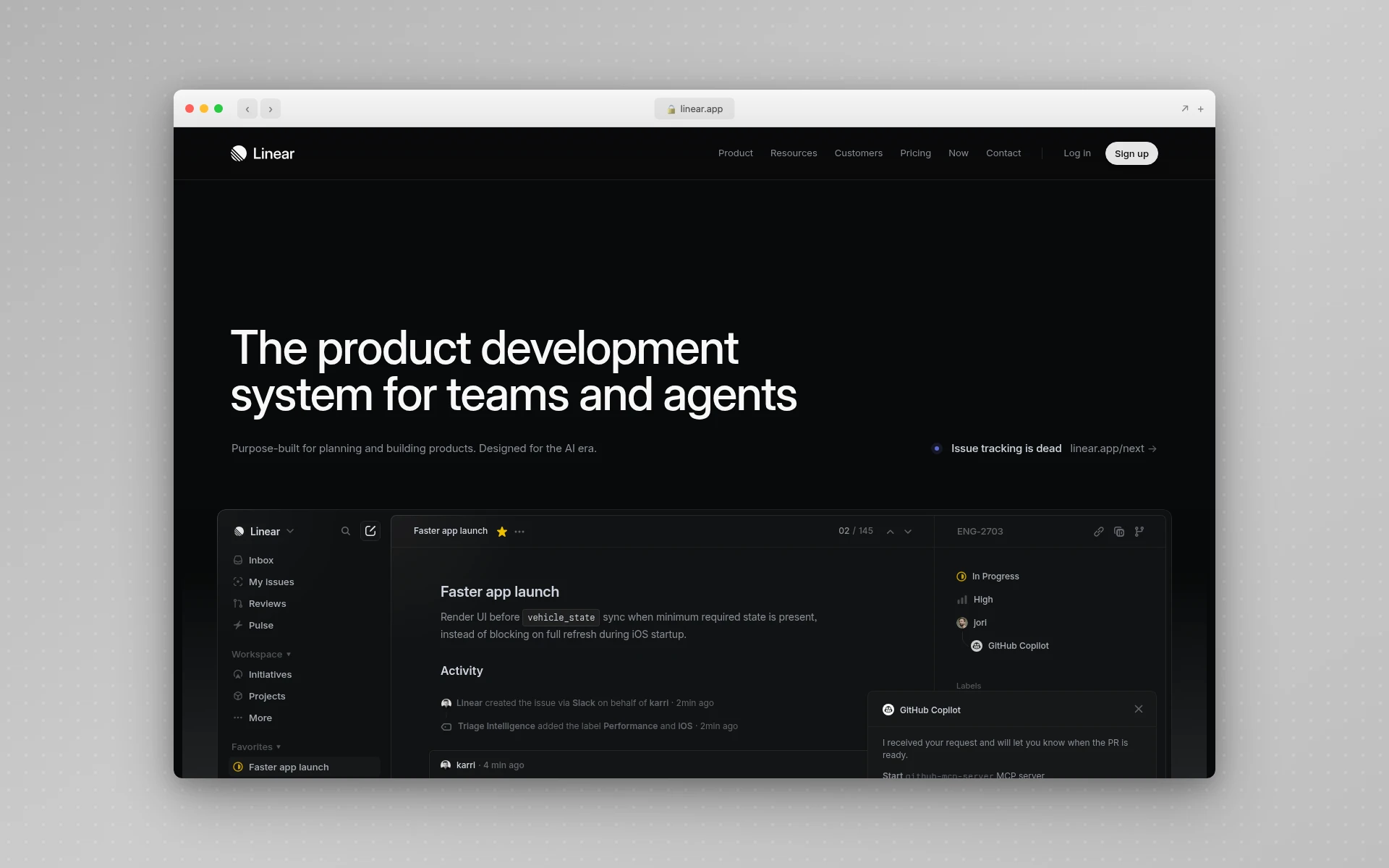
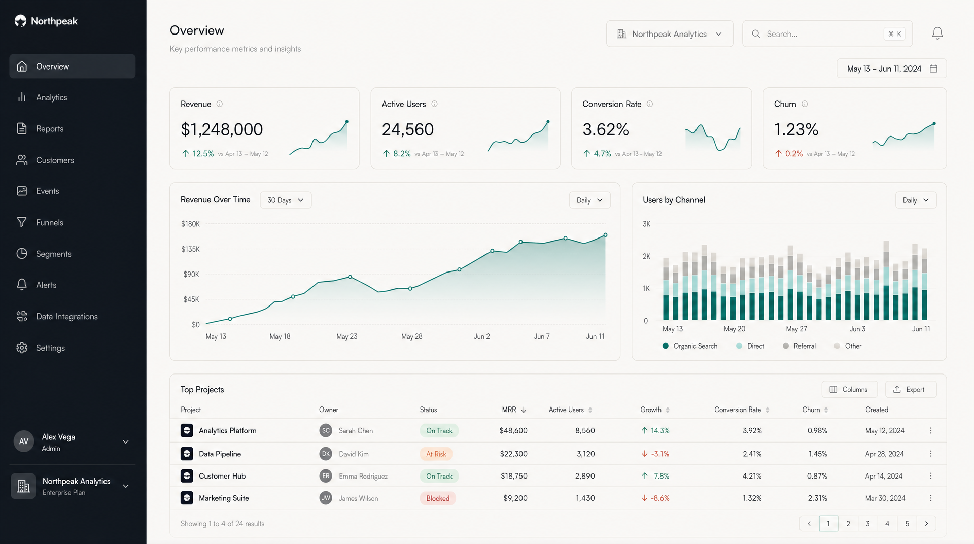 What a deliberate dashboard looks like — neutral surfaces, one accent color, KPI strip at the top, paired charts mid-page, data table at the bottom. Generated in seconds with AIDesigner, no Figma round-trip required.
I’ve designed and shipped enough dashboards to know that they fail in a small number of predictable ways. Three reasons dominate. The first is trying to show everything — every metric the database can produce, in a 14-card grid, with three colors of pie chart. The second is decorating the dashboard — purple gradients, rounded badges in five colors, a hero illustration. The third is doing all the work in Figma then watching the engineer rebuild it from scratch in React three weeks later, with the spacing slightly off and the colors not matching the design tokens.
This guide is the workflow that fixes all three. It’s also the workflow I use to ship dashboards in production today: design the layout in plain language, generate a polished reference with AIDesigner, and hand the output to a coding agent (Claude Code, Cursor, or whatever you use) for the data wiring. AIDesigner is the design tool I’d recommend without hesitation for dashboard work — it generates full dashboard layouts (sidebar, KPIs, charts, tables) from a text prompt, supports saved brand kits so every dashboard in your product stays on-system, and outputs editable HTML that drops straight into a Claude Code or Cursor session as both a structural and visual anchor.
If you’re picking your broader stack first, I’ve also written Best AI UI Design Tools (2026 Tested), Best AI Page Builders, and a Claude Code vs Cursor comparison for the coding-agent side of the workflow.
What Makes a Good Dashboard UI?
A good dashboard UI surfaces the smallest set of metrics needed to make a decision, in the order the eye scans them, with one accent color and no decorative noise. In practice that means a 240-280px sidebar for navigation, a top row of 4-6 KPI cards, charts that explain the KPIs, and a data table at the bottom for detail. Stripe, Linear, Vercel, and Notion all use this pattern because it scales from five features to fifty without a redesign.
That answer-shaped paragraph is the entire job of dashboard design — the rest of this guide is just unpacking it. There are seven steps below, in order, that take you from “I need a dashboard” to “I’ve shipped a dashboard.”
Step 1: Define One Job for the Dashboard
Before opening any design tool, write down a single sentence that answers two questions: who looks at this dashboard, and what decision do they make from it?
Examples that work:
- “The CEO opens this every Monday to know whether the company hit the weekly revenue target.”
- “The on-call engineer opens this during an incident to find which service is degraded.”
- “The customer-success rep opens this before a renewal call to know which features the customer actually used.”
Examples that don’t work:
- “An overview of the business.” (Whose business? Which decision?)
- “All the data in one place.” (You’ve just built a database, not a dashboard.)
- “Marketing, sales, and product KPIs.” (Three jobs, three audiences, three dashboards.)
A dashboard with one job feels obvious to use. A dashboard with three jobs feels like a database with bad lighting. The single most common failure mode in dashboard design — and I’ve seen it on every team I’ve worked with — is the assumption that one beautiful dashboard can serve every stakeholder. It can’t. Make three dashboards, each with one job, and link between them.
Step 2: Pick Your 3-5 Hero Metrics
Once you know the job, pick the smallest set of numbers that, glanced at together, tell you whether that job is going well today. Three to five metrics, no more. These become the top KPI strip — the row of large-number cards across the top of the dashboard.
A few tactical rules I follow:
- Each KPI card shows three things: the current value (large number), a delta vs. the previous comparable period (small percentage with a directional arrow), and an inline sparkline or trend indicator. Stripe’s dashboard does exactly this, and it’s the pattern that’s survived a decade of iteration for a reason.
- Use absolute numbers, not normalized ratios, for the hero metric when stakes are real. “$1,248,000” is more useful than “104% of target” because the brain processes the dollar amount faster.
- Make the delta sign explicit. A green up-arrow next to “+12.5% vs last month” is more accurate than just “12.5%” — readers shouldn’t have to remember whether a positive number is good for this metric.
Bad KPI cards I see constantly: twelve of them across two rows, each one a different metric, none of them connected to the actual decision the user is trying to make. Twelve cards isn’t a strip — it’s a wall, and walls don’t get scanned. Cut to four.
Step 3: Lay It Out on the F-Pattern
Where you put each element matters more than how it looks. Nielsen Norman Group’s eye-tracking study of 232 users, originally published in 2006 and re-confirmed since, found that users scan content in an F-shape: a horizontal sweep across the top, a shorter sweep further down, and then a vertical drift down the left edge.
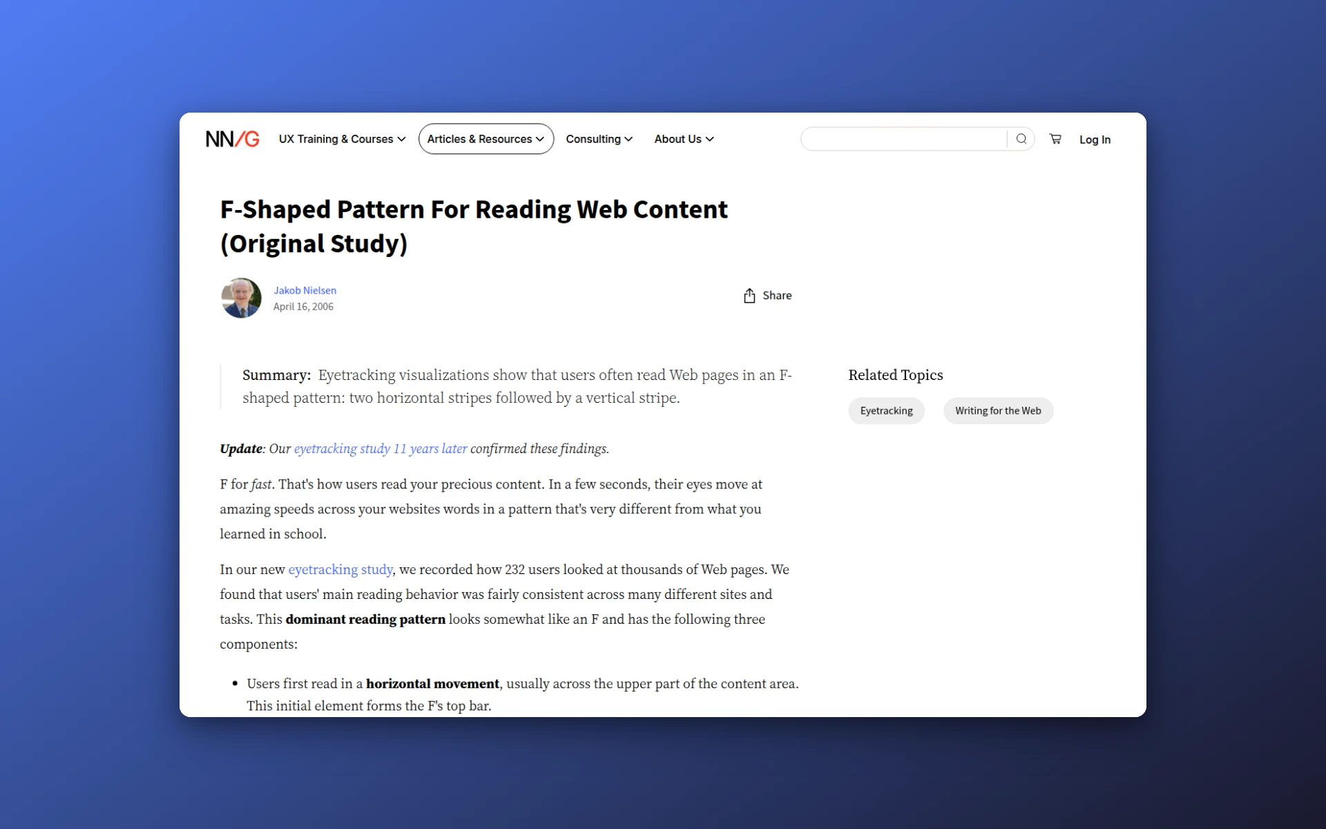 Nielsen Norman Group’s original 2006 study on the F-shaped reading pattern, based on eye-tracking 232 users across thousands of pages — the basis for almost every dashboard layout pattern in use today.
For a dashboard, that translates into three rules:
- The most important metric goes top-left. That’s where the eye lands first.
- The second-most-important metric extends right along the top KPI strip.
- The supporting chart that explains the hero metric sits directly below — the second horizontal sweep.
Then detail (tables, longer lists, drilldowns) flows down from there. Filters and time-range pickers belong on the right side of the top bar, where they’re easy to reach but don’t compete with metrics for attention.
The shape of every Stripe, Linear, and Vercel dashboard is, at its core, this exact F. They all converged on it because the F is what users do — fighting it produces dashboards that look interesting in screenshots and frustrate users in practice.
Step 4: Use a 12-Column Grid and Card-Based Content
The skeleton underneath every modern dashboard is the same:
| Region | Width | Purpose |
|---|---|---|
| Left sidebar | 240-280px | Top-level navigation, workspace switcher, account menu |
| Top bar | Full width, 56-64px tall | Page title, search, date range, notifications |
| Content area | 12-column CSS grid | KPI cards, charts, tables, detail panels |
Inside the content area, every element lives inside a card. Cards have consistent corner radii (8-12px is the modern range), consistent internal padding (24px is a reliable default), and consistent borders or shadows. Aligned cards on a grid read as a system. Mismatched cards read as a prototype.
A few production tips:
- A KPI strip of 4 cards on a 12-column grid means each card spans 3 columns. A pair of charts mid-page can be 6 + 6, or 8 + 4 (a wide chart paired with a narrow context panel). A full-width data table spans all 12. Stick to those proportions and the dashboard will feel coherent without a designer ever opening Figma.
- Cards do not need shadows. A 1px border at 8% opacity reads cleaner and ages better than the standard “soft drop shadow” most templates ship with. Linear and Vercel both ship with borders, not shadows, and their dashboards feel modern years later.
- Whitespace between cards (16-24px) does the grouping work. You should not need divider lines, color blocks, or section headings to separate related metrics. If the spacing is right, the structure reads automatically.
Step 5: Pick One Accent Color and Reserve the Rest for Status
The fastest way to make a dashboard look professional is to use almost no color. Specifically:
- Two neutral surface colors — a warm off-white or pure white for cards in light mode, a near-black for dark mode. (Pure black
#000is too harsh on screens. Use#0a0a0aor#111for dark backgrounds.) - Two text colors — a near-black for primary text, a 60-70% gray for secondary.
- One primary accent — used for interactive elements, links, the active sidebar item, and the line in the hero chart. That’s it.
- Three semantic status colors — green for “On Track” or “Up”, red for “At Risk” or “Down”, amber for “Caution”. These colors are reserved. They don’t appear anywhere else.
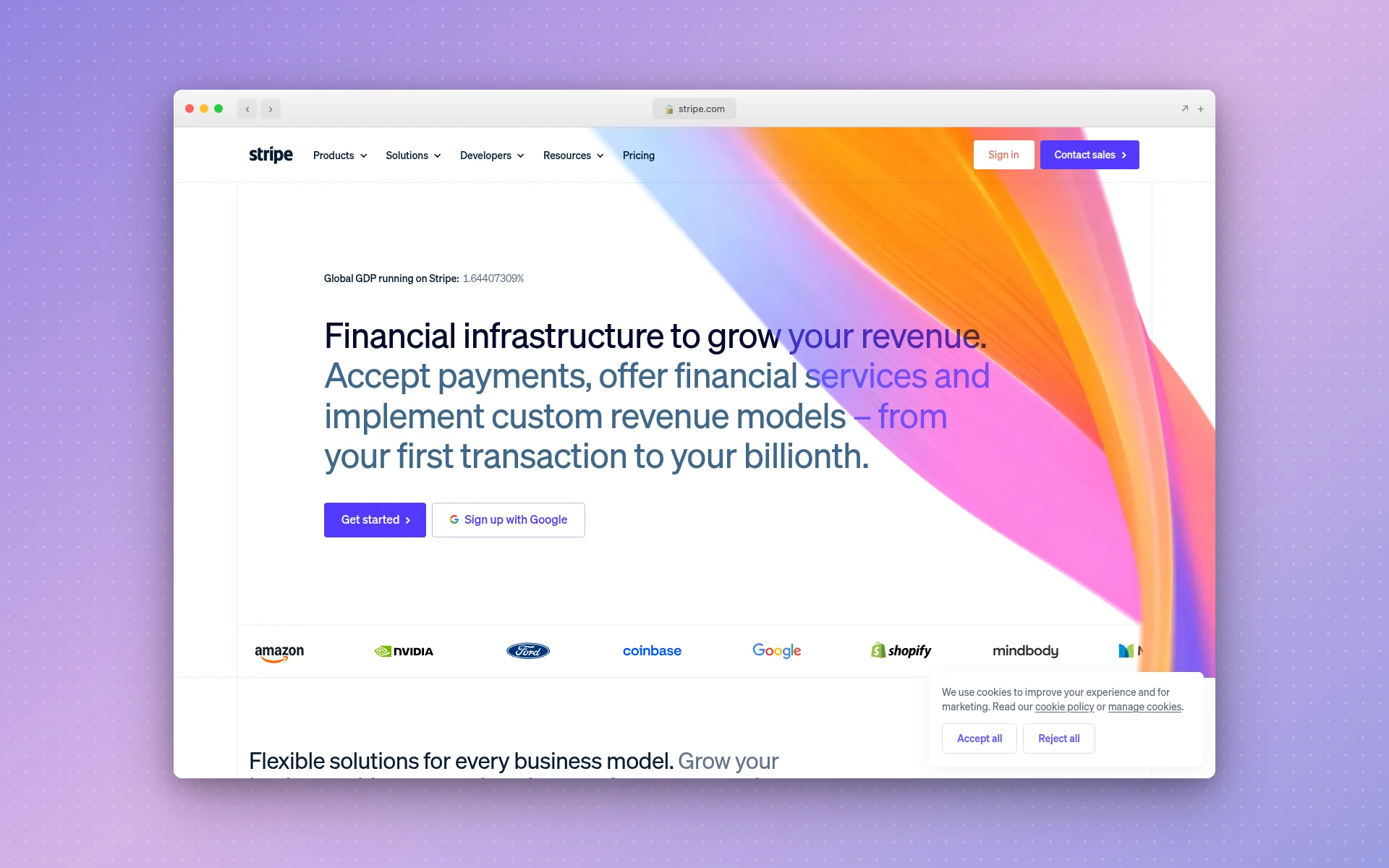 Stripe’s product surfaces — neutral cards, one primary accent, status-only semantic color. The discipline that has aged better than almost any other SaaS color system.
The discipline matters more than the specific palette. Stripe’s dashboard uses neutral surfaces, one primary accent, and semantic colors only for status — and it has stayed visually identifiable through ten years of iteration. The moment you start using red for an icon background “just because it pairs nicely,” you’ve taught your user that red doesn’t mean anything specific, and you’ve broken the most useful signal a dashboard has.
A practical heuristic: if you removed every color from the dashboard except one accent and three status colors, would the dashboard still work? If yes, your color discipline is right. If no, you’re using color decoratively.
This is also where most LLM-generated dashboards fail by default. Ask Claude Code or Cursor to “design a dashboard” and you’ll get the same purple-blue gradient hero, three-card-grid, blue-button page that you’ve seen on every AI-generated SaaS landing page. Pair the coding agent with AIDesigner for the visual reference layer (and a saved brand kit so the colors stay locked across every dashboard you ever ship), and that problem disappears. I’ve written about why Claude Code generates generic UIs by default — color discipline is the single biggest tell.
Step 6: Pick Charts Based on Data Shape
Chart type follows data shape. Resist the urge to use a chart type because it looks more interesting than the obvious one.
| Data shape | Use this chart | Don’t use |
|---|---|---|
| Trend over time | Line chart, area chart, sparkline | Bar chart with one bar per day |
| Categorical comparison (≤7 categories) | Horizontal bar chart | Pie chart, 3D anything |
| Categorical comparison (>7 categories) | Sorted table, treemap | A bar chart with 25 bars |
| Composition (parts of a whole) | Stacked bar, single-row stacked bar | Pie chart with more than 3 slices |
| High-density patterns | Heatmap | A line chart with 50 series |
| Detail you need to sort or scan | Table with sortable columns | Any chart |
| Relationships between two variables | Scatter plot | A “balanced scorecard” |
A few tactical points that matter in production:
- Sparklines inside KPI cards earn their space. A KPI card with a sparkline gives you both the current number and the trend in 60 pixels of vertical space. A KPI card without one is just a number.
- Tables are charts. Treat them like first-class citizens — sortable columns, sticky headers, status pills, and pagination. Most “this dashboard feels janky” complaints I’ve heard trace back to a poorly-designed table.
- Avoid color as a category. When you need to distinguish series, use line style, sparkline weight, or order — not five different colors. Five-line charts stop being readable around the third line.
Step 7: Generate the Working Reference With AIDesigner
This is the step that compresses a week of design-and-rebuild into an afternoon, and it’s why I recommend AIDesigner specifically over a Figma-only workflow.
The traditional dashboard design loop looks like this:
- PM writes a Notion doc describing the dashboard.
- Designer translates it into a Figma file over 2-5 days.
- Engineer rebuilds the Figma file in React over 3-10 days.
- PM, designer, and engineer argue about why the colors don’t match the design tokens.
- Repeat for every dashboard in the product.
The AIDesigner workflow looks like this:
- Describe the dashboard in plain English to AIDesigner — “an analytics overview with a left sidebar, four KPI cards across the top (revenue, active users, conversion, churn), a paired revenue trend line chart and channel-attribution stacked bar below, and a top-projects data table at the bottom.”
- Get editable HTML back in seconds.
- Refine: “make the charts taller,” “switch the accent to indigo,” “add a date range picker in the top right.” Each refinement is a single prompt.
- Hand the HTML to Claude Code or Cursor with: “wire this up to our analytics API, and convert it into React components matching our design tokens.”
I built the dashboard at the top of this article that way. Total time from first prompt to ship-ready reference: about eight minutes. Two minutes to the first draft, six minutes of refinement.
Why AIDesigner Is the Tool I Use for Dashboard Work
A few specifics matter for dashboards specifically, and AIDesigner handles each one:
- Saved brand kits — start with the brand kit generator to create a 3x3 brand variation board, save the tile that matches your product, and every future dashboard generation locks to the same palette, typography, and density. Or auto-extract a brand kit from your existing product URL if you already have a visual system. This is the difference between “the new admin panel doesn’t quite match the user dashboard” and a coherent product surface across every screen.
- MCP server for coding agents — AIDesigner exposes
generate_design,generate_website_design_image, and brand-kit tools to Claude Code, Cursor, and Codex via OAuth. The coding agent can request a fresh design reference mid-session whenever the conversation needs one, instead of you tab-switching to a separate tool. (For more on the MCP angle, see our Claude Code skills guide and the best MCP servers roundup.) - Asset extraction — generated dashboard images can be cracked open into individual icon, illustration, and chart-style canvases, so you can drop the parts you like onto the next design without regenerating the whole thing.
- Reference modes — point AIDesigner at a Stripe or Linear dashboard URL with
mode: "inspire"and it’ll pick up the visual style without copying the exact layout. Useful when you’re matching an internal design system that already lives somewhere on the web. - Pricing math — Pro starts at $25/month for 100 credits. Generating a full dashboard reference is one credit. A free tier (5 lifetime credits, no card required) is enough to test the workflow on a real project before you commit.
The free tier is the right place to start. Generate two or three real dashboards, see whether the output is genuinely usable in your stack, and only then upgrade.
Mobile Dashboard UI: The Rules Change
Everything above describes desktop dashboards. Mobile dashboards are a different problem with different rules. A dashboard squeezed onto a 430px-wide phone screen by responsive layout is almost always worse than a dashboard designed for mobile from the start.
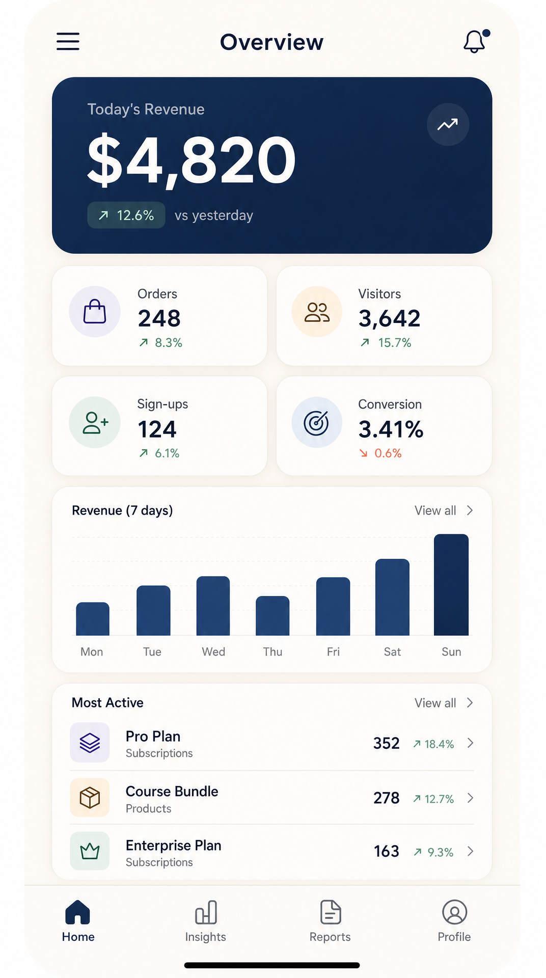 A purpose-built mobile dashboard — single column, one dominant KPI, secondary metrics in a 2x2, bottom tab bar instead of a sidebar. Generated with AIDesigner at the 430px mobile viewport.
The rules for mobile:
- One dominant KPI at the top. The on-the-go user wants the single most-important number, not four of them.
- Secondary metrics in a 2x2 grid. Two columns max. Three columns of metrics on a phone is unreadable.
- Replace the sidebar with a bottom tab bar. Five tabs maximum. Bottom tab bars are reachable with one thumb; hamburger menus are not.
- Cut the data table. Replace it with a list view of the top 3-5 items, with a “View all” link to the full table on a separate screen.
- Charts get simpler. Remove axis labels where possible, drop legends inline below the chart, and never put more than two series on the same chart.
If you’re building a mobile-first dashboard, generate it at AIDesigner’s 430px mobile viewport directly — same prompt, different viewport flag. For a deeper dive on mobile-specific UI work, see Best AI Mobile App Design Tools.
Common Dashboard Design Mistakes to Avoid
A few mistakes that show up over and over in real-world dashboards:
- The 14-card overview. Cut to 4-6. The cards you’re tempted to leave in are the ones that belong on a sub-page.
- Colored card backgrounds. Stop. Use neutral cards with a colored accent on the metric or a status pill. Colored backgrounds train users to ignore the color, which breaks status signals.
- Pie charts with seven slices. Use a sorted bar chart. Pie charts with more than three slices are unreadable, period.
- The hamburger menu on desktop. A 240-280px sidebar isn’t taking up space — it’s giving you persistent navigation. Hamburger menus on desktop are a mobile-first reflex applied to the wrong context.
- Decorative motion. Animated counters that tick up to the value, charts that draw themselves on every page load, sparklines that wiggle on hover. None of these help the user make a decision faster. Cut them.
- The “design system in two places.” You define spacing tokens in Figma and then a different set in CSS. Pick one source of truth. AIDesigner-generated HTML lets you skip this step entirely — the output IS the spec.
- No empty states. What does the dashboard look like before there’s data? What does it look like for a new user? Empty states are 80% of the perceived polish of a dashboard. Most templates ship with zero empty states designed.
Real Dashboard Design Examples Worth Studying
A few products do dashboards better than almost everyone else. They’re worth dissecting, not copying:
- Stripe — the gold standard for KPI cards with deltas, semantic status pills, and a rigorous color system. If you only study one dashboard, study this one.
- Linear — sub-100ms interactions, dark mode by default, every visual choice signaling speed. The lesson here is that interaction quality is part of design, not an engineering afterthought.
 Linear’s product surface — dark-by-default, sub-100ms interactions, every visual choice signaling speed. The interaction model is part of the design.
- Vercel — minimal data density, almost no decorative color, clear hierarchy. Proves that less is more when the metrics matter.
- Plausible Analytics — single-page dashboard with no sidebar at all. Proves that even the conventional sidebar pattern is breakable when the job is narrow enough.
For more visual references and inspiration sites worth bookmarking, see our roundup of the best web design inspiration sites. And if you’re picking dashboard charting libraries for the React side, Recharts, Tremor, and Apache ECharts are the three I reach for first.
Frequently Asked Questions
What are the most important dashboard UI design principles?
Five principles do most of the work: define one job per dashboard, lead with 3-5 high-value metrics in the top-left, group related items with whitespace instead of borders, pick chart types based on data shape (line for trends, bar for comparisons, table for detail), and reserve color for status only — never decoration. Every other principle is a refinement of those five.
What is the best layout for a dashboard?
The strongest dashboard layout in 2026 combines a 240-280px left sidebar for navigation, a top row of 4-6 KPI cards as the metric strip, and a flexible 12-column CSS grid below for charts and tables. This pattern is what Stripe, Linear, and Vercel use because it scales from five features to fifty without a redesign and reads cleanly on the F-shaped pattern users actually scan.
How many metrics should a dashboard show?
Show no more than 7-8 elements at a time on the primary view. Lead with 3-5 hero metrics that read first, push secondary detail behind tabs, drilldowns, or a “View all” link. Dashboards that try to surface everything at once become wallpaper — users stop reading them within a week. Progressive disclosure keeps the dashboard usable as the data set grows.
Can AI design a dashboard UI for me?
Yes — modern AI design tools generate full dashboard layouts from a text description in seconds. AIDesigner produces editable HTML dashboards with sidebars, KPI strips, charts, and data tables that you can hand directly to a coding agent like Claude Code or Cursor for implementation. It’s the workflow we use ourselves: describe the dashboard, generate a polished reference, then let the coding agent ship the React components.
What is the F-pattern in dashboard design?
The F-shaped pattern is how users actually scan content on screen — a horizontal sweep across the top, a shorter sweep further down, then a vertical scan down the left edge. Nielsen Norman Group documented this in 2006 across 232 users and thousands of pages. For dashboards, this means your most important metric belongs in the top-left, with secondary metrics extending right and supporting detail flowing down.
How is dashboard UI different from regular web design?
Regular web design optimizes for persuasion and visual delight; dashboard UI optimizes for repeated decision-making under time pressure. The visitor to a marketing site lands once, scans, and leaves. The user of a dashboard returns daily, sometimes hourly, and needs to extract a number, compare it to a target, and act in seconds. That changes everything: less hero typography, more data density, a stricter color system, and zero decorative motion.
What tools do designers use for dashboards?
Designers typically pair Figma for layout with a charting library like Recharts, Tremor, or Apache ECharts for the production implementation. The faster path in 2026 is generating the dashboard with an AI design tool like AIDesigner, then handing the output to a coding agent for the data wiring. This skips the “design in Figma, rebuild in code” double-work that dashboards suffer from worse than any other UI surface.
Wrap-up: Ship the Dashboard, Then Iterate
The shortest path to a good dashboard UI is the one you actually ship. Most dashboards I’ve seen die in the design phase — six rounds of Figma comments, three weeks of “let’s get the metrics right first,” and a final mockup that no one’s tested with a real user.
Pick one job for the dashboard, identify the three to five hero metrics, lay them out on the F-pattern, generate a working HTML reference with AIDesigner, hand it to a coding agent for implementation, and put it in front of a real user inside a week. Everything else is iteration on a dashboard that already exists, which is dramatically easier than iteration on a dashboard that’s still in someone’s head.
If you want to skip straight to the generation step, AIDesigner’s free tier (5 lifetime credits, no card required) is enough to ship one or two real dashboards. Pro starts at $25/month for 100 credits when you’re ready to scale.

