TL;DR: A design system is a shared library of reusable components, design tokens, and documentation that teams use to build consistent digital products at scale. It sits between a style guide (static rules) and a component library (just code), combining both plus the governance that keeps them in sync. This guide explains what a design system is, the parts it contains, why teams build them, how to start one, and how AI tools like AIDesigner fit into the modern design-system workflow.
What Is a Design System? (Short Answer)
A design system is a single source of truth for how a product looks, feels, and behaves. It contains reusable UI components (buttons, inputs, cards), design tokens (colors, spacing, typography values), usage rules, and code — all versioned and maintained like a product. Teams use a design system to build faster, stay consistent, and scale design work across multiple products without rebuilding the same button for the hundredth time.
A Fuller Definition
A design system is a complete collection of the standards, assets, and coded building blocks used to design and develop a product or product family. According to the Nielsen Norman Group’s definition, a design system “provides a library of visual style, components, and other concerns documented and released by an individual, team, or community as code and design tools.”
Put more simply: if your team is building more than one screen, a design system is the thing that prevents every screen from looking slightly different.
A mature design system sits at the intersection of three things that used to live in separate places:
- Brand and visual guidelines — logo usage, color palette, typography, voice and tone.
- Figma component libraries — the artboard-ready versions of every UI piece designers drag into mockups.
- Production code — the React, Vue, Swift, or Kotlin components engineers actually ship to users.
When those three are aligned — same tokens, same component names, same behavior — a design system exists. When they drift apart, you are back to designers building mockups that engineers rebuild from scratch.
Why Teams Build Design Systems
In our work building AI design tools at AIDesigner, I have watched dozens of product teams adopt design systems. The reasons always cluster around four outcomes.
1. Consistency Across Screens
Without a system, a “primary button” in checkout slowly diverges from the “primary button” in settings. After a year of shipping features, the product has four blues, six spacing scales, and three modal styles. Users feel the inconsistency even if they cannot name it. The 2023 Figma Design Maturity Report found that 71% of teams with a formal design system said consistency was the number one benefit they experienced.
2. Speed
A pre-built component library removes the “design the button again” tax from every project. InVision’s Design Maturity Report found that companies with a mature design system ship new features 34% faster on average. Teams stop debating whether a modal should have a 24px or 32px close button — the token already answers.
3. Scale
Once a company ships more than one product (web app + mobile app, admin + customer-facing, main product + marketing site), consistency cannot be held together by taste. A shared design system lets five product teams build in parallel without the brand fragmenting. Our breakdown of the best AI UI design tools covers how teams accelerate this multi-surface work.
4. Accessibility By Default
If the Button component is coded once with proper focus states, ARIA attributes, and contrast ratios, every team using it gets accessible buttons for free. This is why large enterprises like IBM and Microsoft treat their design systems (Carbon and Fluent) as a compliance tool, not just a design convenience.
What Are the Main Components of a Design System?
Every mature design system contains five elements: design tokens (colors, spacing, typography values stored as named variables), components (buttons, inputs, modals, cards coded as reusable pieces), patterns (larger compositions like forms and navigation), documentation (usage rules, accessibility notes, do’s and don’ts), and governance (the people and processes that keep it up to date). You do not need all five on day one — but a system missing any of them will eventually drift.
Let’s walk through each layer.
Design Tokens
Design tokens are the atoms of a design system. They are named variables that store visual values so both designers and engineers can reference them by name rather than raw value.
Examples:
color.brand.primary   = #0052CC
color.text.body       = #172B4D
color.background.alt  = #F4F5F7

space.1 = 4px
space.2 = 8px
space.4 = 16px
space.6 = 24px

font.heading.lg   = 32px / 40px / 700
font.body.regular = 16px / 24px / 400

radius.md = 6px
shadow.card = 0 2px 4px rgba(9,30,66,0.14)
Tokens make system-wide changes trivial: change color.brand.primary from blue to purple and every product surface using that token updates at once. Without tokens, the same change requires finding every hardcoded hex code in every file.
Want to go deeper on tokens specifically? Our guide to the best Figma alternatives covers which tools support token variables natively.
Components
Components are the reusable UI pieces that designers assemble into screens and engineers render as code. A typical component library starts with these core elements:
- Primitives: Button, Input, Checkbox, Radio, Switch, Link, Icon, Avatar, Badge, Tooltip
- Layout: Card, Divider, Stack, Grid, Container, Sidebar
- Feedback: Alert, Toast, Modal, Popover, Progress bar, Skeleton loader
- Navigation: Tabs, Breadcrumb, Pagination, Menu, Sidebar nav
- Data display: Table, List, Accordion, Stat, Chart wrapper
- Forms: Text field, Select, Date picker, File upload, Form layout
Each component exists in two synchronized places: a Figma component library (what designers use) and a code component library like a React or Vue package (what engineers import). When they match, handoff friction disappears.
Patterns
Patterns are recurring compositions of components — the larger “how we do things” answers. Common pattern categories include:
- Form patterns: sign-up flow, checkout flow, multi-step wizards
- Empty states: what shows when a table has no data
- Error states: inline validation, global error banners
- Loading states: skeleton loaders, spinners, progressive disclosure
- Navigation patterns: global nav, sidebar + content, command palette
Patterns are what elevate a component library into a true design system. Components tell you what a button is; patterns tell you when to use which one.
Documentation
Documentation is where a design system earns its keep. Without docs, a component library is just code nobody knows how to use correctly. Strong design-system documentation covers:
- Do’s and don’ts with side-by-side visual examples
- Accessibility requirements for each component (ARIA roles, keyboard behavior)
- API reference for developers (props, variants, default values)
- Usage guidance for designers (when to use a Toast vs a Modal vs a Banner)
- Code examples that copy-paste into real projects
- Changelog and versioning so teams know what changed and why
Tools like Storybook, Zeroheight, and Supernova have built entire products around making this documentation layer usable.
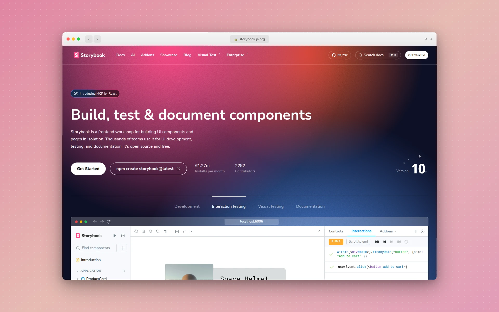 Storybook is the most widely used tool for hosting living component documentation side-by-side with interactive examples.
Governance
The unglamorous piece everyone ignores until it breaks. Governance answers: who decides what goes into the system, who maintains it, how proposals get reviewed, and what happens when a product team needs a component that does not exist yet.
Common governance models:
- Centralized team — a dedicated design-systems team owns everything, product teams request changes (good for large enterprises)
- Federated — the core team owns primitives, product teams contribute components back (good for mid-size orgs)
- Solution team / hybrid — a small group maintains the system but embeds with product teams for specific initiatives (most common in practice)
A design system without governance rots inside a year. A design system with governance compounds in value every quarter.
Design System vs Style Guide vs Pattern Library
People use these three terms interchangeably, but they are not the same thing.
| Thing | What It Is | Format | Who Maintains It |
|---|---|---|---|
| Style guide | Static rules for brand elements — logo, colors, fonts | PDF, brand microsite | Marketing or brand team |
| Pattern library | Catalog of UI components (usually just visual) | Figma file, pattern page | Design team |
| Component library | Coded reusable components | Code package (React, Vue, etc.) | Engineering team |
| Design system | All of the above, versioned, documented, governed as a product | Code + Figma + docs + team | Cross-functional design-systems team |
A style guide is a rulebook. A component library is a toolbox. A design system is the rulebook, the toolbox, the documentation, and the team who keeps them in sync. If any of the three is missing, it is not really a design system yet.
Real Examples of Design Systems
The best way to understand a design system is to see one. Here are eight public design systems that set the bar for the industry.
1. Shopify Polaris
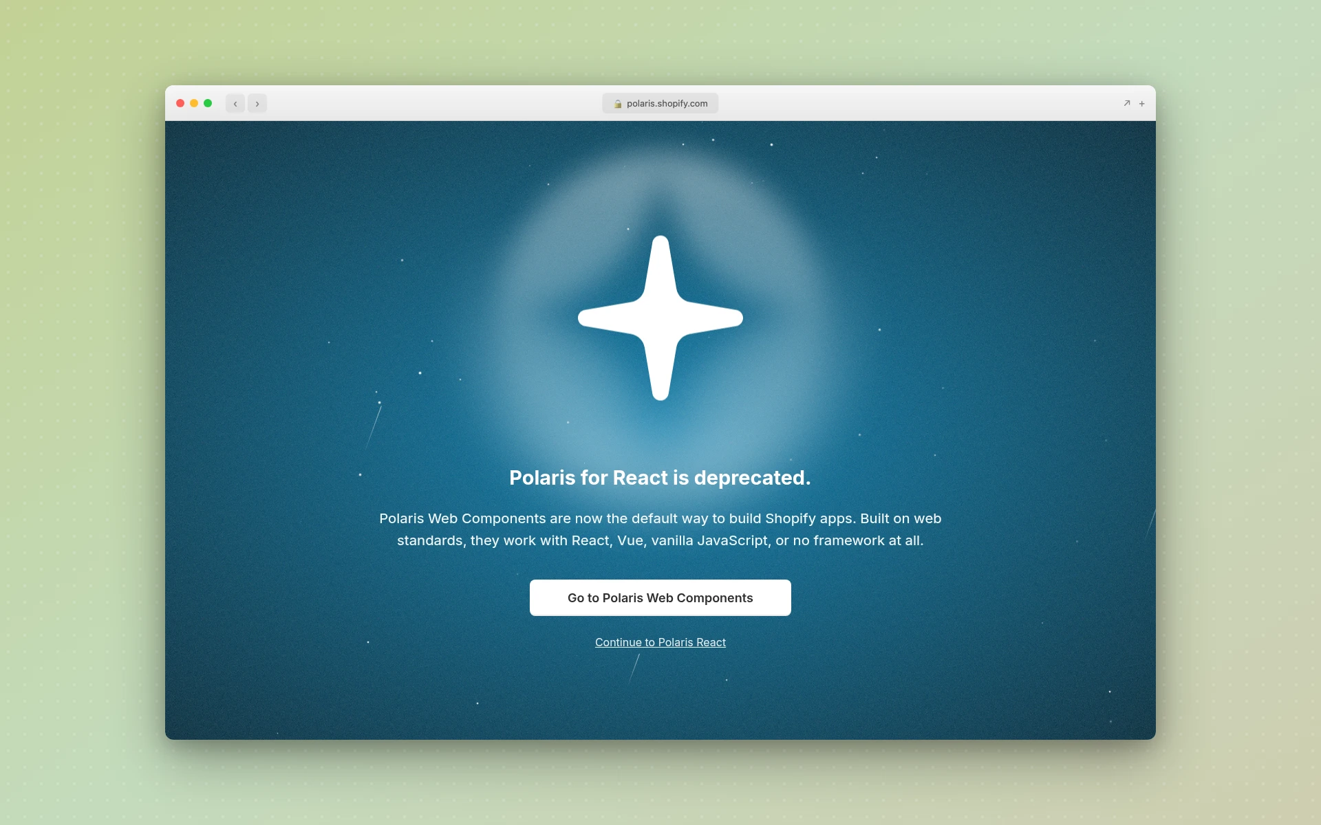 Shopify Polaris powers the admin UI that over a million merchants use every day.
Shopify’s Polaris is the design system for the Shopify admin — the back-office interface every merchant uses to manage their store. Polaris is notable for:
- Its obsession with commerce-specific patterns (orders, inventory, pricing)
- Extremely clear writing and tone guidance alongside visual guidelines
- A recent pivot from React-only components to framework-agnostic Polaris Web Components (the original
@shopify/polarisReact package was archived in January 2026 in favor of web components any frontend can use) - Strong accessibility baseline (WCAG 2.1 AA compliant)
If you are building any kind of admin or data-heavy product, Polaris is the reference to study first — and its move to web components is a case study in how large design systems evolve beyond a single framework.
2. Atlassian Design System
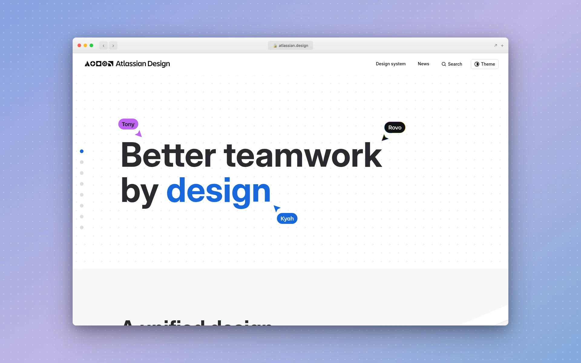 Atlassian’s design system powers Jira, Confluence, Trello, and Bitbucket — thousands of screens across a single product family.
Atlassian maintains one of the most mature, publicly documented design systems in software. Features worth noticing:
- Tokens exposed directly — designers and engineers share the same variable names
- Rich pattern library covering complex workflows (issue tracking, documentation editing)
- Brand, illustration, voice, and motion guidelines all in one place
- Continually versioned and publicly changelogged
Atlassian’s system is a great study in how to document patterns, not just components.
3. IBM Carbon
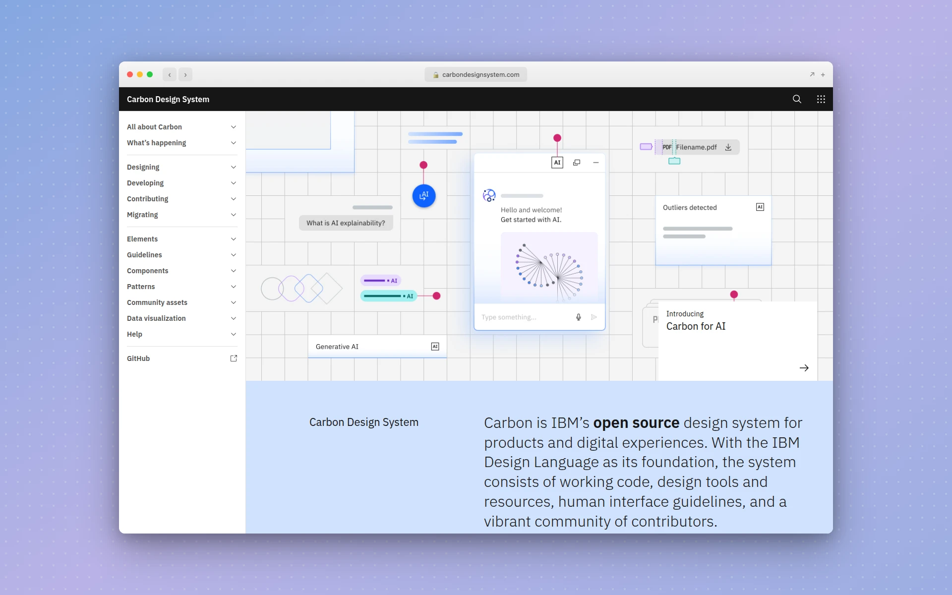 IBM Carbon is the design system behind IBM Cloud and the enterprise IBM product suite.
Carbon is IBM’s open-source design system and one of the oldest still-maintained examples in the industry. It is worth studying for:
- Exhaustive coverage of enterprise-grade components (data tables, charts, complex forms)
- Multi-framework support (React, Angular, Vue, Web Components, Svelte)
- Themes beyond light/dark — White, Gray 10, Gray 90, and Gray 100
- Accessibility docs that set the enterprise baseline
Carbon is proof that design systems can live for a decade if they are treated as real products.
4. Google Material Design
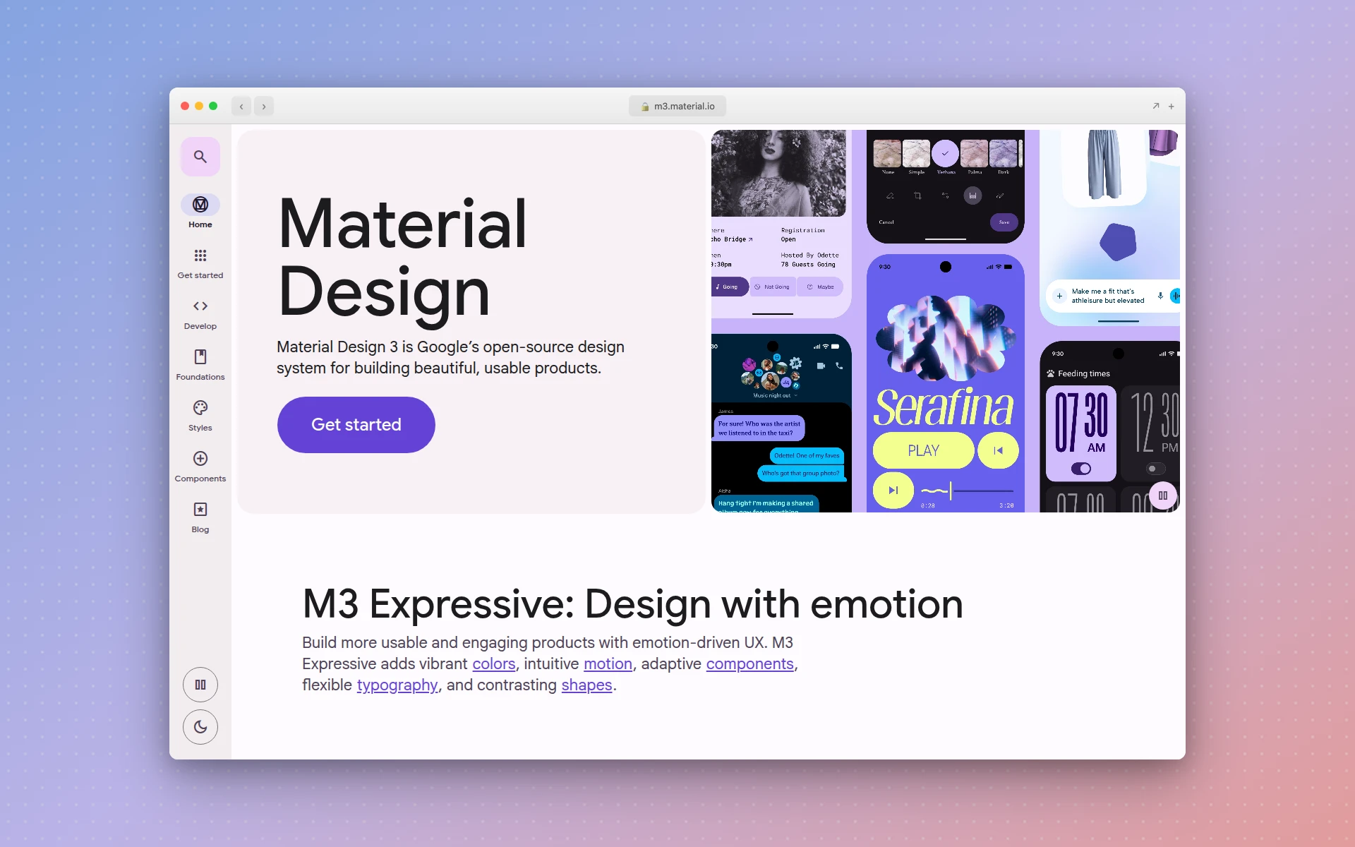 Material Design 3 powers Android and many of Google’s web properties.
Material Design is probably the most influential design system ever built. It introduced mainstream vocabulary like “elevation,” “motion tokens,” and “dynamic color.” Material 3 (the current version) adds:
- Dynamic color — themes that adapt to a user’s wallpaper on Android
- Refined typography scale and updated shape system
- Expressive motion guidelines
- Free Figma kits and open-source implementations
Whether or not you like Material’s aesthetic, every modern design system borrows ideas from it.
5. GitHub Primer
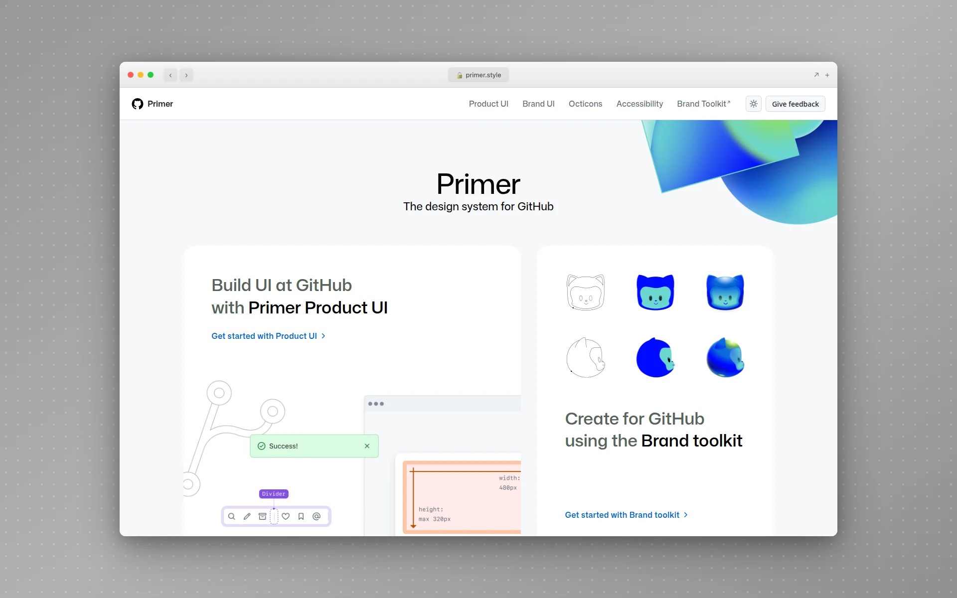 Primer is the design system that keeps github.com and the GitHub desktop apps in sync.
Primer is GitHub’s design system. It is relatively minimal by enterprise standards and is a good reference for developer-tool aesthetics. Notable traits:
- First-class CSS utility classes alongside React components
- Clean, dense information layouts optimized for reading code
- Strong Octicons icon system
- Well-documented theming (light, dark, colorblind-friendly variants)
Primer is a useful reference if your product is for developers or has dense, information-rich screens.
6. Microsoft Fluent 2
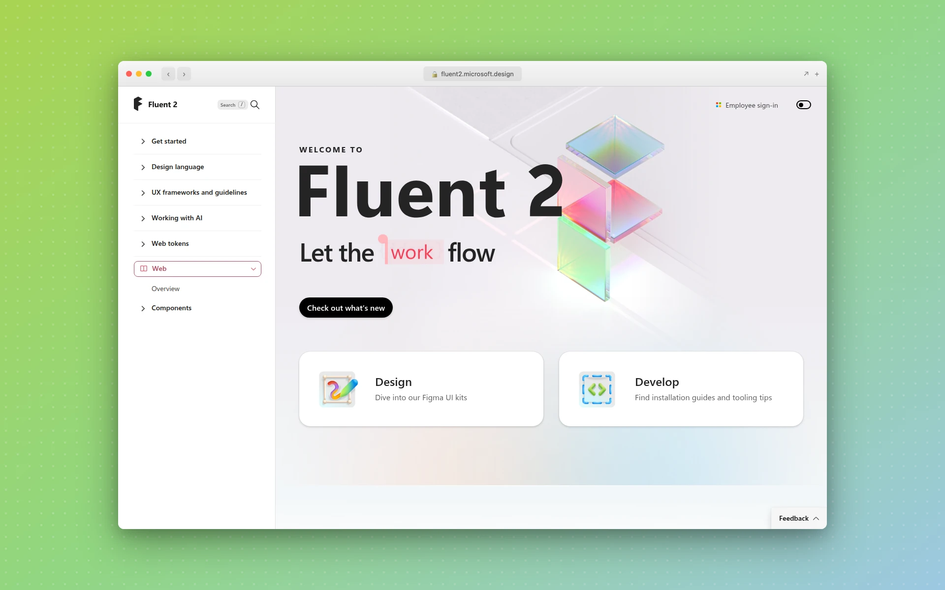 Fluent 2 is the design system behind Microsoft 365, Teams, Windows, and Xbox.
Fluent 2 covers the full Microsoft product surface — Office, Windows, Teams, Xbox, and beyond. It is a great study in multi-platform consistency:
- Shared design language spanning desktop, web, and mobile
- Platform-specific implementations where needed (Windows uses different materials than the web)
- Acrylic, Mica, and other material systems documented as first-class tokens
- Broad component coverage for enterprise productivity workflows
7. Adobe Spectrum
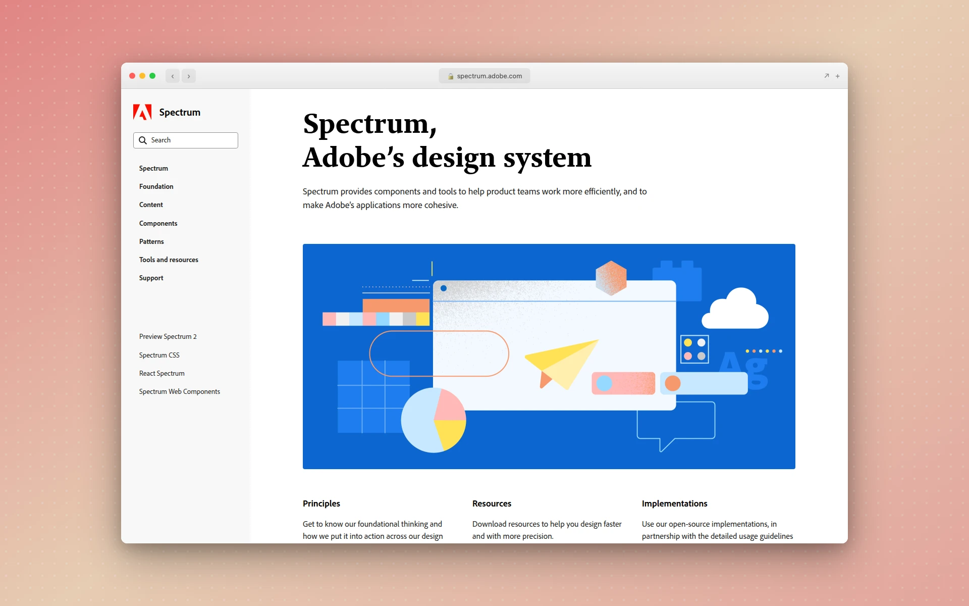 Adobe Spectrum supports Photoshop, Illustrator, XD, Creative Cloud, and Adobe’s enterprise products.
Adobe’s Spectrum is a strong reference for creative-tool UX. Features:
- Heavy focus on expert-user interfaces (think: Photoshop panels)
- Multi-density tokens — the same layout feels right on both a tablet and a desktop
- Accessibility-first component design with published contrast tables
- Open-source React Spectrum implementation
8. Apple Human Interface Guidelines
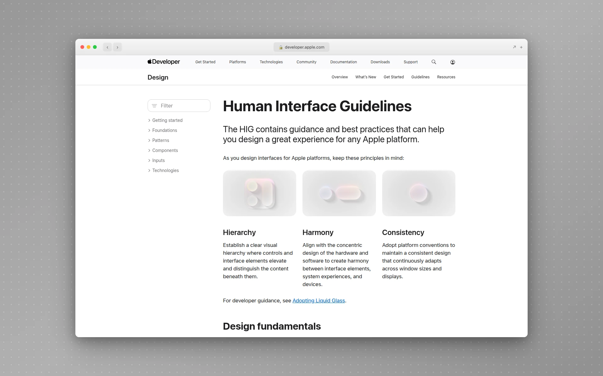 Apple’s HIG is the oldest continuously maintained design system in the industry.
Apple’s Human Interface Guidelines predate the term “design system.” Apple maintains separate HIG documentation for each of its platforms — iOS, macOS, watchOS, tvOS, visionOS. It is a different style from most web-era systems (less code-first, more principle-first), but its platform-specific thinking is the bar every multi-platform system is still measured against.
If you are designing a mobile app specifically, our guide to the best AI mobile app design tools covers tools that generate iOS-compliant designs out of the box. And for the most common internal product surface — the admin dashboard — our step-by-step dashboard UI design guide walks through the layout, hierarchy, and color discipline that keep design-system tokens visible across the surface.
How to Build a Design System (Step by Step)
A design system is a product, and products need a roadmap. Here is the sequence that has worked best for teams I have advised.
Step 1: Audit Existing UI
Before building anything, screenshot every unique UI element currently shipping in your product. You will almost always find more variants than you expected — five button styles, four card shadows, three form layouts. Cluster them, count them, and decide which version becomes canonical.
This audit is the single most valuable step in the process. It exposes exactly how inconsistent your product already is and gives you a concrete list of what the system needs to replace.
Step 2: Define Tokens First
Before designing a single component, decide your tokens:
- Colors — primary, secondary, neutral scale (9 stops), semantic tokens (success, warning, error, info)
- Spacing — 4px or 8px base grid, with named scale (xs, sm, md, lg, xl)
- Typography — heading scale, body sizes, weights, line-heights
- Radius — none, sm, md, lg, pill
- Shadows — card, popover, modal, inset
- Motion — easing curves, duration tokens
Tokens must be defined in both Figma (as variables or styles) and code (as CSS variables, Tailwind config, or a tokens package). This shared vocabulary is the foundation everything else sits on.
Step 3: Build Ten Core Components
Do not try to ship 60 components on day one. Pick the ten that appear on 80% of screens:
- Button (primary, secondary, tertiary, destructive, size variants)
- Input (text, textarea, number, password, search)
- Select
- Checkbox and Radio
- Card
- Modal / Dialog
- Alert / Banner
- Icon (set of 24-48 core icons)
- Avatar
- Tabs
Ship these ten with rock-solid Figma variants and production-ready code before even thinking about data tables or date pickers. A small, high-quality system beats a sprawling half-finished one.
Step 4: Document Each Component
For every component, document:
- Anatomy diagram labeling each part
- Props or variants (code API for engineers, Figma variants for designers)
- Do’s and don’ts with visual examples
- Accessibility notes (keyboard, ARIA, contrast)
- Code snippet that copy-pastes into real projects
This is the step teams most often skip and most often regret. Components without docs get used wrong and quietly fracture the system.
Step 5: Set Up Governance
Decide who owns the system, how new proposals get reviewed, and what the contribution process looks like. A simple model that works for most teams:
- Product teams open a proposal in a GitHub issue or Notion doc
- The design-systems team reviews for fit (does this belong in the system?)
- If yes, a champion from either side builds it and opens a pull request
- The system team reviews for consistency, accessibility, docs
- It ships in the next versioned release
Without this process, the system becomes a bottleneck or a free-for-all. With it, the system compounds.
Step 6: Adopt and Iterate
The final step is the slow one: retrofitting existing product screens to use the new components. Expect this to take months or years, not weeks. The pattern that works best is:
- New features — must use the system from day one
- Existing features — migrate opportunistically when those areas are touched for other work
- Quarterly audits — track component adoption percentage across the product
Meanwhile, keep iterating on the system itself: add components as real product needs surface, update tokens when brand shifts, improve docs based on actual questions teams ask.
How AI Is Changing Design Systems
Design systems have been labor-intensive to build for two reasons: designing every component by hand in Figma is slow, and coding every component in React with accessibility and variants is slower. AI tools are compressing both.
Generating components from prompts. Tools like AIDesigner, v0, and Magic Patterns can produce a full button variant set, a modal, or a data table from a prompt plus a brand reference. The output is not a finished system component — but it is a 70%-there starting point that used to take a designer half a day. If you are evaluating these generators, our guide to the best v0 alternatives compares the tradeoffs.
Brand-matched generation. AIDesigner’s clone and inspire modes let you point at an existing brand site and generate components that already use the right colors, typography, and spacing scale. For teams bootstrapping a system from an existing brand, this collapses the “translate brand into tokens” work from weeks to hours.
MCP-powered integration. AIDesigner ships an MCP server that exposes generate_design and refine_design as tools to coding agents like Claude Code and Cursor. A designer can prompt an AI coding agent inside their IDE to generate a new design-system component, then immediately adopt the code into their repo. This loops design and engineering together in a way that used to require Figma-to-code handoff rituals. For a broader look at the MCP ecosystem that makes this possible, see our roundup of the best MCP servers.
 AIDesigner generates production-ready HTML and React components from prompts, with native integration into coding agents via its MCP server.
None of this replaces the governance, documentation, or adoption work a design system needs. But the “generate the first version of a component library” step — which used to take a team of three designers a quarter — can now happen in a weekend.
For teams starting from scratch, the fastest path in 2026 is: use AI to generate a first pass of tokens and components, review and refine the output, document it in Storybook, and ship. The parts that still need human judgment — naming, governance, patterns, documentation — stay with your team. The parts that do not — drawing the hundredth variant of a button — do not. This AI-first workflow is closely related to vibe coding, the broader practice of building software by describing intent rather than hand-coding.
Design Systems vs Component Libraries Like MUI, Chakra, and shadcn/ui
A common question: if I can install Material UI, Chakra UI, or shadcn/ui, do I even need to build a design system?
Short answer: those libraries are starting points, not substitutes.
- Material UI, Chakra UI, Radix, Mantine — fully themed component libraries. Great for prototypes or if your product is fine looking like any other SaaS.
- shadcn/ui, Headless UI — unthemed primitives you style yourself. Great starting point when you have a strong brand and want full control.
- Your design system — the set of tokens, components, patterns, and docs that encode your brand and product standards, whether you built them from scratch or layered them on top of shadcn/ui.
A pragmatic modern path: start with shadcn/ui, apply your own tokens, extend with your own custom patterns, and document the whole thing as your design system. That is the fastest route from nothing to a production-ready system today. Our guide to the best Figma to code tools covers tools that convert Figma components into shadcn-compatible code, and our roundup of AI landing page builders shows how these systems render at the page level.
Common Mistakes When Building a Design System
From watching teams both succeed and fail at this, the recurring mistakes are predictable.
Starting with too many components. Teams try to ship 50 components in version 1.0 and never finish. Start with ten high-quality ones.
Skipping tokens. If your components use raw hex codes and hardcoded spacing, you will rebuild them the first time brand shifts. Tokens first, always.
No governance model. Without a clear process, every product team builds their own variant of every component and the system fragments within a year.
Documenting components but not patterns. Teams know what a Button is but not when to use Button vs Link vs IconButton. Patterns are what answer that.
Treating it as a side project. A design system is a product. If nobody is dedicated to maintaining it, it will rot. Even a 20%-time champion beats zero.
Ignoring developers. If engineers do not use your components, the Figma library is decorative. The system only works when designers and engineers ship the same building blocks.
Is a Design System Worth Building?
For small teams with one product surface: probably not yet. A solid Tailwind config, shadcn/ui, and a shared Figma file with colors and typography is enough. You will feel the pain when you actually need a system — and that is when to build one.
For teams with more than one product, more than a few designers, or a brand that has to stay consistent across multiple channels: yes, urgently. The ROI of a design system compounds every quarter. Every week you ship without one is a week the product fragments a little more.
The question was never really “do we need a design system?” The question is “how much drift are we willing to live with?” For ambitious product teams in 2026, the answer is almost always: less than we have now.
Frequently Asked Questions
What is a design system in simple terms?
A design system is a shared library of reusable UI components, design tokens, and documentation that teams use to build consistent digital products. It combines the visual building blocks (colors, typography, spacing, buttons, forms) with the rules for how and when to use them, so every screen across every product looks and behaves the same way.
What are the main components of a design system?
Every mature design system contains five elements: design tokens (colors, spacing, typography values stored as named variables), components (buttons, inputs, modals, cards coded as reusable pieces), patterns (larger compositions like forms and navigation), documentation (usage rules, accessibility notes, do’s and don’ts), and governance (the people and processes that keep it up to date).
What is the difference between a design system and a style guide?
A style guide is a static document describing brand rules like logo usage, color palette, and typography. A design system is a living, versioned product that includes the style guide plus coded components, design tokens, interactive documentation, and a team that maintains it. Style guides describe; design systems execute.
What is an example of a design system?
Well-known public design systems include Shopify Polaris (e-commerce admin), Atlassian Design System (Jira, Confluence), IBM Carbon (enterprise software), Google Material Design (Android and the web), GitHub Primer, Microsoft Fluent 2, Adobe Spectrum, and Apple’s Human Interface Guidelines. Each one powers thousands of screens across many products inside each company.
Are design tokens the same as design systems?
No. Design tokens are one piece of a design system. Tokens are named variables that store visual values like colors (brand.primary: #0052CC), spacing (space.4: 16px), and typography (text.heading.lg: 32px). A design system uses tokens as the foundation, then layers components, patterns, and documentation on top.
How long does it take to build a design system?
A minimal design system covering tokens and ten core components typically takes a small team 4-8 weeks to ship. A production-ready system supporting an entire product suite usually takes 6-12 months of dedicated work, and maintenance is ongoing. Many teams now accelerate the early work using AI tools that generate components and tokens from prompts or reference designs.
Do I need a design system for a small product?
Not always. If you are a solo founder or a team of two shipping a single-page product, a Tailwind config plus a handful of reusable React components is enough. You need a real design system once you have multiple product surfaces, multiple designers or developers, or a brand that has to stay consistent across marketing, web, and mobile.
Start With a First Pass, Not a Perfect One
Design systems are the infrastructure of modern product work. They are what separates teams that ship consistent, accessible, scalable products from teams that rebuild the same button every sprint.
The good news: you do not need to plan the perfect system before starting. The teams that succeed ship a minimal version — ten components, a tokens file, a simple Storybook — then iterate. The teams that stall spend six months debating a design philosophy and never shipping.
If you are bootstrapping a system today, the fastest path is to let AI handle the generation work while you focus on the judgment work. AIDesigner can generate a first pass of on-brand components, cards, forms, and landing layouts from prompts or a reference URL — ready to adapt into your tokens and drop into Storybook. If you need the brand layer first, its brand kit generator creates the logo direction, palette, typography, and guidelines you can turn into tokens. Feed it your brand site and get a coherent starting component set in an afternoon instead of a month.
A design system is how you scale taste. Start small, document what you ship, and let the system compound.