Finding a responsive website design template is easy. Finding one that actually holds together at 375 pixels wide, ships clean markup, and has a license you can read without a lawyer is the hard part. I pulled templates from a dozen sources, dropped my browser to phone width, and watched which ones reflowed cleanly and which ones spilled their navigation off the screen.
This roundup is the shortlist that survived. Below are 13 places to get responsive website design templates, ranked by how much I trust the output, plus a plain explanation of what “responsive” actually means so you can judge a template yourself. If none of them fit your content, the last section covers generating your own responsive layout from a prompt with AIDesigner instead.
What Are the Best Responsive Website Design Templates?
The best free responsive website design templates come from HTML5 UP, Tooplate, TemplateMo, Colorlib, and ThemeWagon. These sources offer HTML and CSS templates that reflow cleanly from phone to desktop, most built on Bootstrap 5 or plain flexbox and CSS grid. HTML5 UP and Tooplate are the cleanest for a fast, no-signup download. If you’d rather understand the markup before editing someone else’s, start with the basic HTML page layout these templates are all built on.
The rest of this list widens out to Bootstrap-specific libraries, Tailwind packs, and visual builders, so you can match the source to whatever stack you already use.
How I Picked These Sources
I didn’t rank these by how the screenshots look. Any template looks good in a hero shot. I judged each source on four things that matter once you actually use a template:
- Framework — What is it built on? Bootstrap 5, Tailwind, or hand-written flexbox and CSS grid all reflow well. Older float-based layouts do not.
- Mobile behavior — I loaded the demo, dropped the viewport to phone width, and checked whether the nav collapsed, images scaled, and text stayed readable without pinch-zooming.
- License clarity — Can you use it commercially? Do you owe an attribution link? A template with a vague license is a liability on a client project.
- Edit-friendliness — Is the markup clean enough to change, or is it a wall of nested divs with inline styles you’ll fight for an hour?
That scorecard is my original take on this list, and it’s why the order below isn’t the same as the “60 templates” mega-galleries that rank for this keyword. Those hosts win on volume. This list wins on which sources are worth your afternoon.
1. HTML5 UP
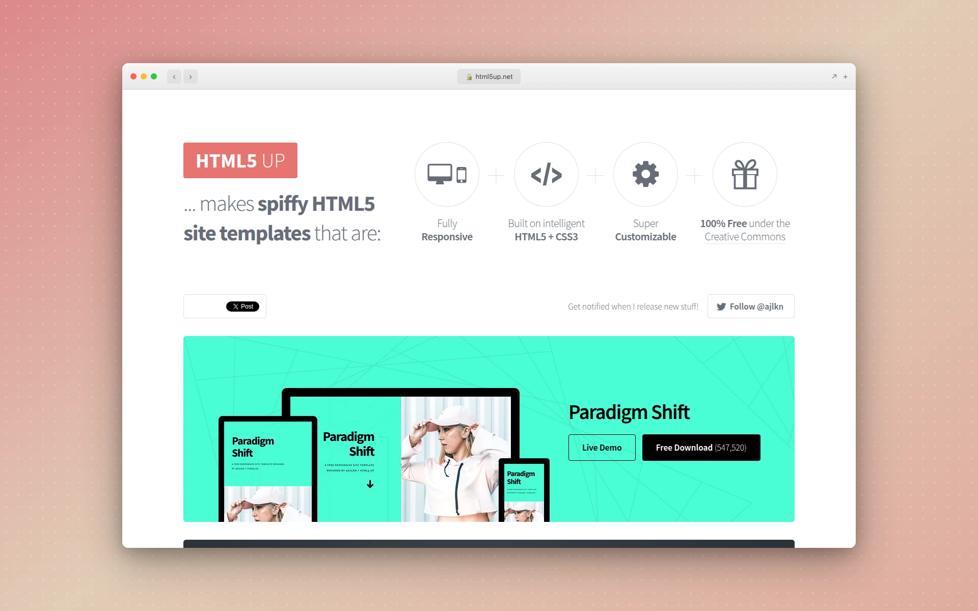 HTML5 UP’s collection of free, fully responsive HTML5 templates.
HTML5 UP is where I send people first. The templates are fully responsive HTML5 and CSS3, they look modern without trying too hard, and you can download any of them without an account.
Watch the license, though. Everything is released free under a Creative Commons Attribution license, which means you keep a small credit link in the footer, or subscribe to their Pixelarity service ($19 for three months of access) for attribution-free use. For a personal site the credit link is fine. For a client build, budget for the subscription or clear the attribution with them first.
Best for: portfolios, personal sites, and quick landing pages where you want polish without a framework to learn.
2. Tooplate
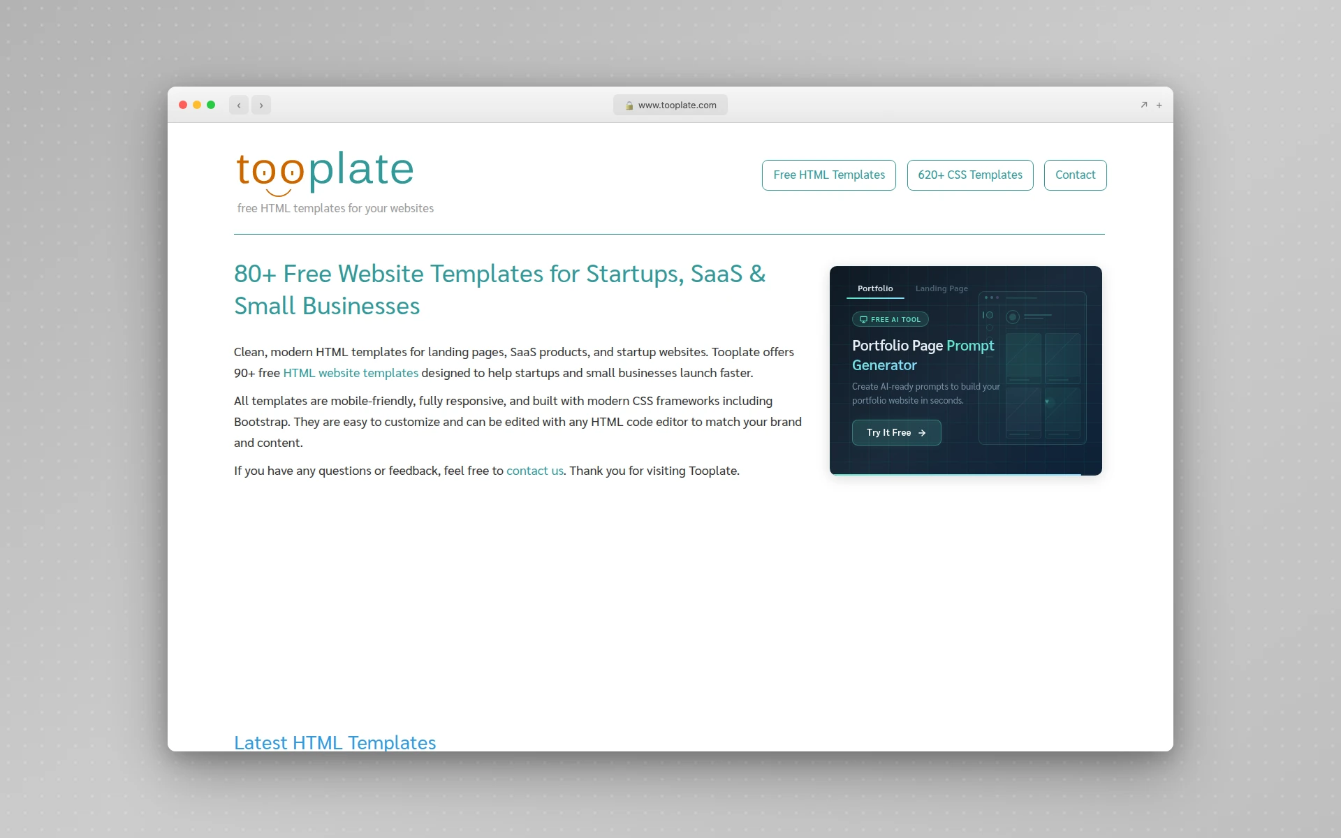 Tooplate’s free, no-registration templates aimed at small businesses.
Tooplate is the other source I reach for when someone needs a template today. The templates target startups and small businesses, they’re mobile-friendly out of the box, and there’s no login or registration wall between you and the download.
Most of them are built on modern CSS frameworks, so the responsive behavior is reliable rather than something you have to test breakpoint by breakpoint. The catalog is smaller than the mega-hosts, which I count as a feature: less time scrolling, fewer dead layouts.
Best for: small business sites and founders who want a clean starting point without a signup flow.
3. TemplateMo
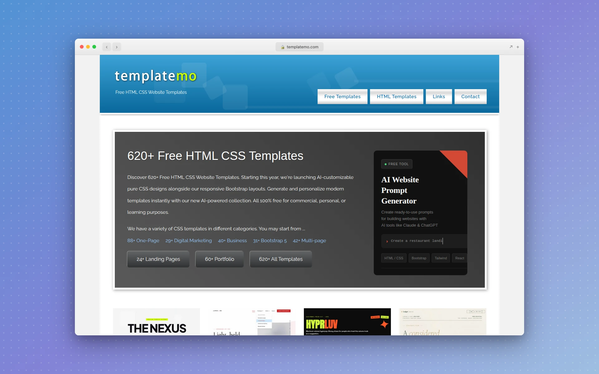 TemplateMo’s deep catalog of free, commercial-use HTML CSS templates.
TemplateMo runs deep. It hosts hundreds of free HTML and CSS templates, no signup, free for commercial use. That depth is the whole pitch and the whole risk. You’ll find a responsive layout for almost any niche here, and you’ll also find a few older ones that haven’t aged well.
Stick to the recently added templates and check the demo at mobile width before you commit. When you find a good one, the commercial-use license makes it genuinely usable for real projects.
Best for: browsing a wide range of niches when you aren’t sure exactly what you want yet.
4. Colorlib
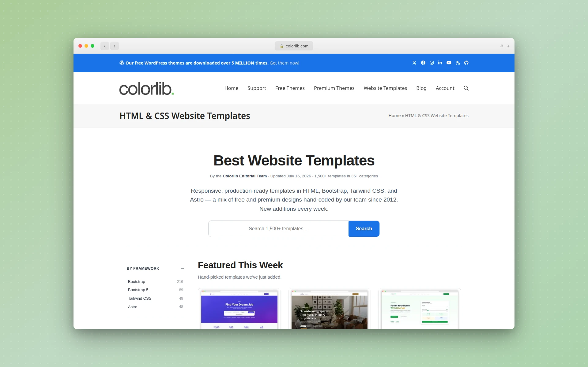 Colorlib’s curated library, tested across phone, tablet, and desktop breakpoints.
Colorlib is a curated library rather than a raw file host, and the team says it tests templates across phone, tablet, and desktop breakpoints before publishing. That editorial layer is worth something: it means fewer broken demos and more consistent mobile behavior than a pure upload site.
The library is large, so use the categories to narrow down instead of scrolling the whole thing. Expect a mix of free and premium, with the free tier deep enough to build a real site.
Best for: people who want variety but don’t want to gamble on whether a template actually reflows.
5. ThemeWagon
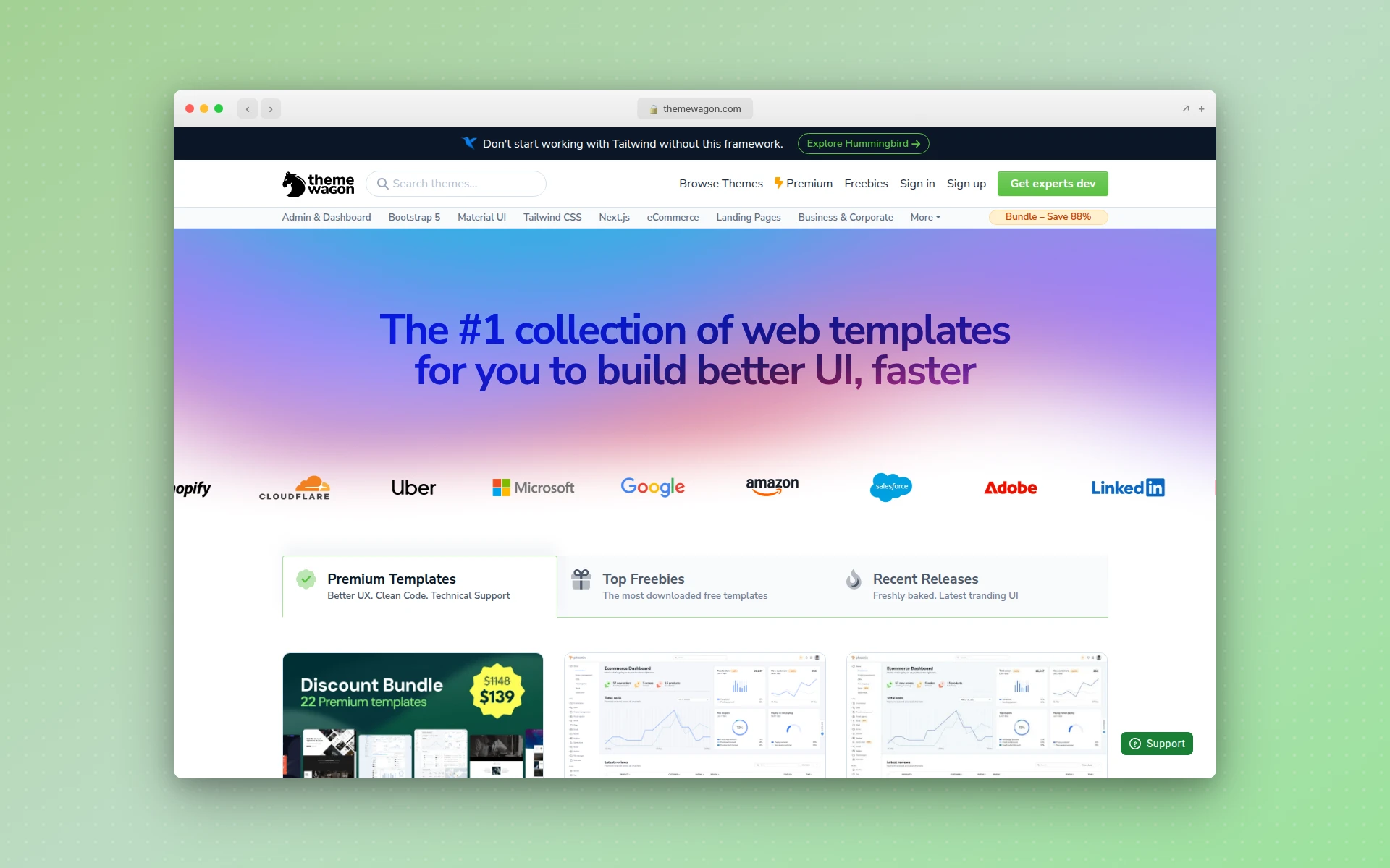 ThemeWagon’s Bootstrap-based business and landing-page templates.
ThemeWagon leans Bootstrap. Its free and premium HTML5 and CSS3 templates are strongest in the business, corporate, and landing-page categories, which is exactly where most people shopping for a responsive template end up.
Because the templates sit on Bootstrap, the responsive grid is inherited rather than hand-rolled, so mobile behavior is predictable. That predictability is the reason I trust Bootstrap-based sources for client work more than bespoke float layouts.
Best for: business and corporate sites where you want dependable, framework-backed responsiveness.
6. BootstrapMade
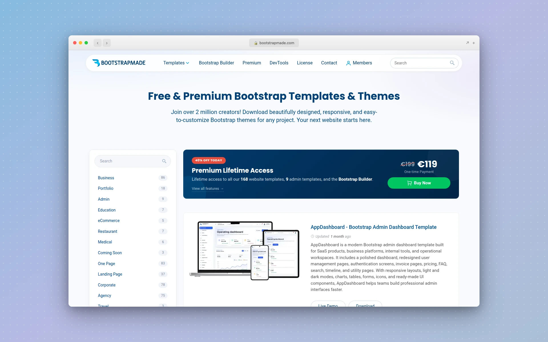 BootstrapMade’s templates, every one built on Bootstrap 5.
BootstrapMade is the specialist. Every template is built on Bootstrap 5, so you get the framework’s mobile-first responsive grid on every single one. If you already know Bootstrap, editing these feels like home.
The free tier is generous, and the paid templates are cheap. The trade-off is aesthetic sameness. A lot of Bootstrap templates share a family resemblance, so you may need to restyle to avoid the default look. For guaranteed responsive behavior, that’s a fair price.
Best for: developers who want Bootstrap 5 markup and predictable breakpoints without surprises.
7. Speckyboy
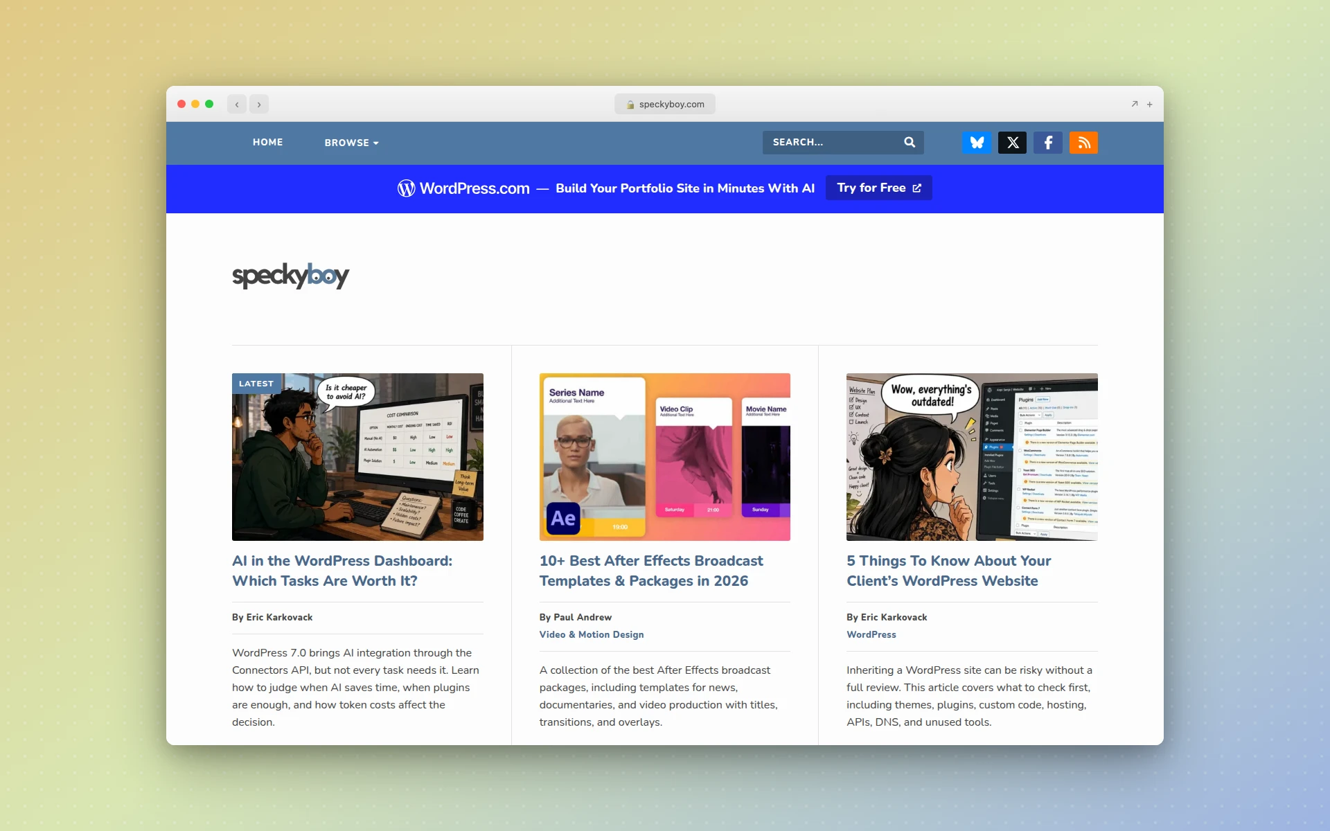 Speckyboy’s editorial roundups of hand-picked free responsive layouts.
Speckyboy isn’t a host. It’s an editorial site that rounds up free responsive HTML layouts from across the web with honest notes on each. Think of it as a filter someone else already ran, pointing you at good templates scattered across other sources.
That makes it a great second stop. When the big galleries overwhelm you, a curated Speckyboy list narrows the field to layouts a human actually vetted.
Best for: cutting through gallery overload with hand-picked recommendations.
8. W3Layouts
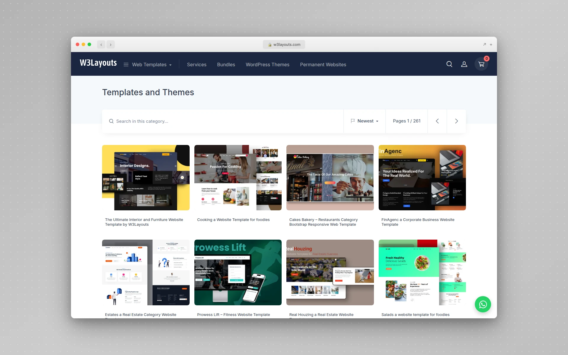 W3Layouts, one of the largest free responsive template catalogs.
Few free catalogs on this list run as large as W3Layouts. Nearly every niche and page type is covered, from restaurants to SaaS to personal blogs, all responsive HTML5 and CSS3.
The scale cuts both ways, same as TemplateMo: enormous choice, uneven quality. Filter by recency, load the demo on your phone, and read the license before you download. When you find a fresh one, the range here is unmatched.
Best for: niche businesses that struggle to find a template built for their specific industry.
9. Cruip
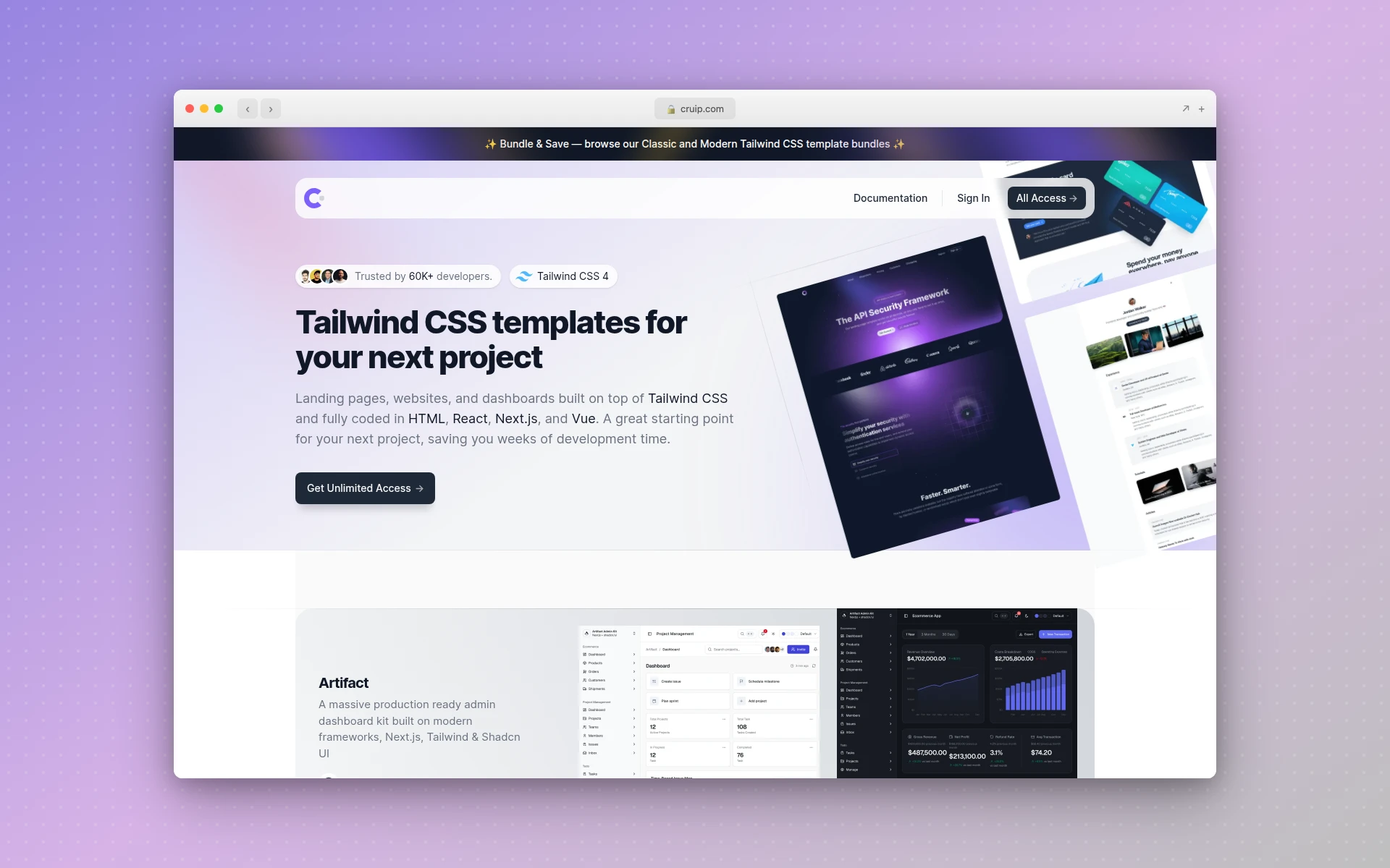 Cruip’s design-forward Tailwind and HTML landing-page templates.
Cruip is where the taste level jumps. Its templates are modern, design-forward, and built on Tailwind CSS or clean HTML, aimed squarely at startup and SaaS landing pages. The free tier is small, but the paid packs are some of the most polished responsive templates you can buy.
If your project is a product launch and you want it to look expensive, Cruip earns the spend. For a quick brochure site, it’s overkill.
Best for: SaaS and startup landing pages where design quality is the point.
10. Start Bootstrap
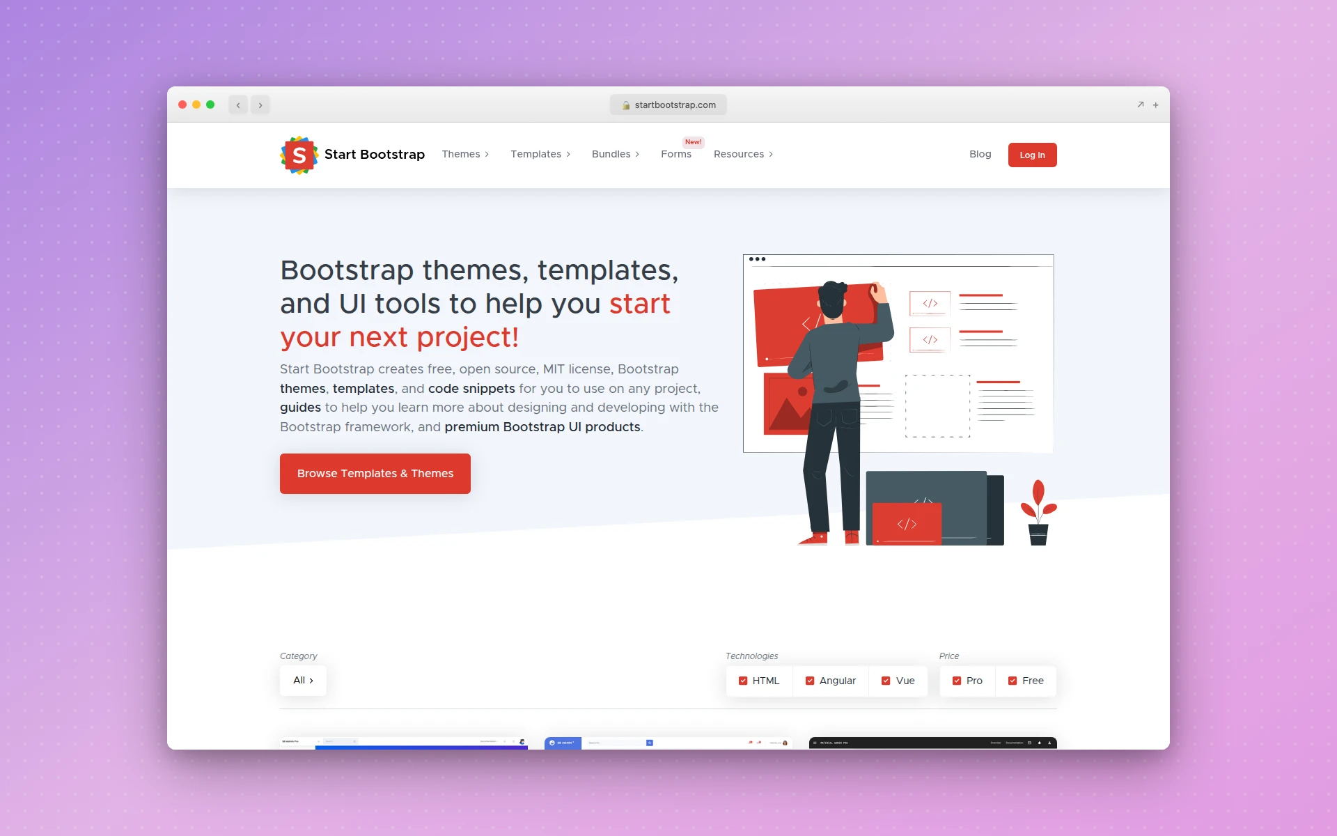 Start Bootstrap’s free, open-source, MIT-licensed Bootstrap 5 themes.
For free, open-source Bootstrap 5 themes with a strong developer bent, Start Bootstrap is the pick. The markup is clean and well documented, which matters when you plan to extend a template rather than just fill in placeholder text.
It overlaps with BootstrapMade, but Start Bootstrap skews more toward open-source, MIT-licensed themes you can fork freely. If license clarity is your top concern, start here.
Best for: developers who want open-source Bootstrap 5 themes with a clear, permissive license.
11. Webflow Templates
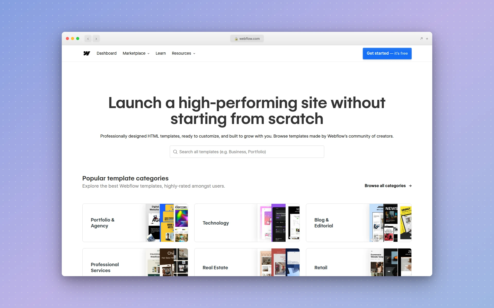 Webflow’s responsive templates, customized visually without code.
Webflow templates are responsive and professionally designed, but they play by different rules. You customize them visually inside Webflow without writing code, rather than downloading raw HTML files to drop on your own server.
That’s powerful if you want a no-code editing workflow and are happy hosting on Webflow. It’s a dead end if you specifically need standalone HTML and CSS to integrate into an existing codebase. Know which one you need before you commit. For a deeper look at that platform, see our guide to the best Webflow alternatives.
Best for: no-code users who want visual editing and are fine building inside Webflow.
12. Tailwind UI Components
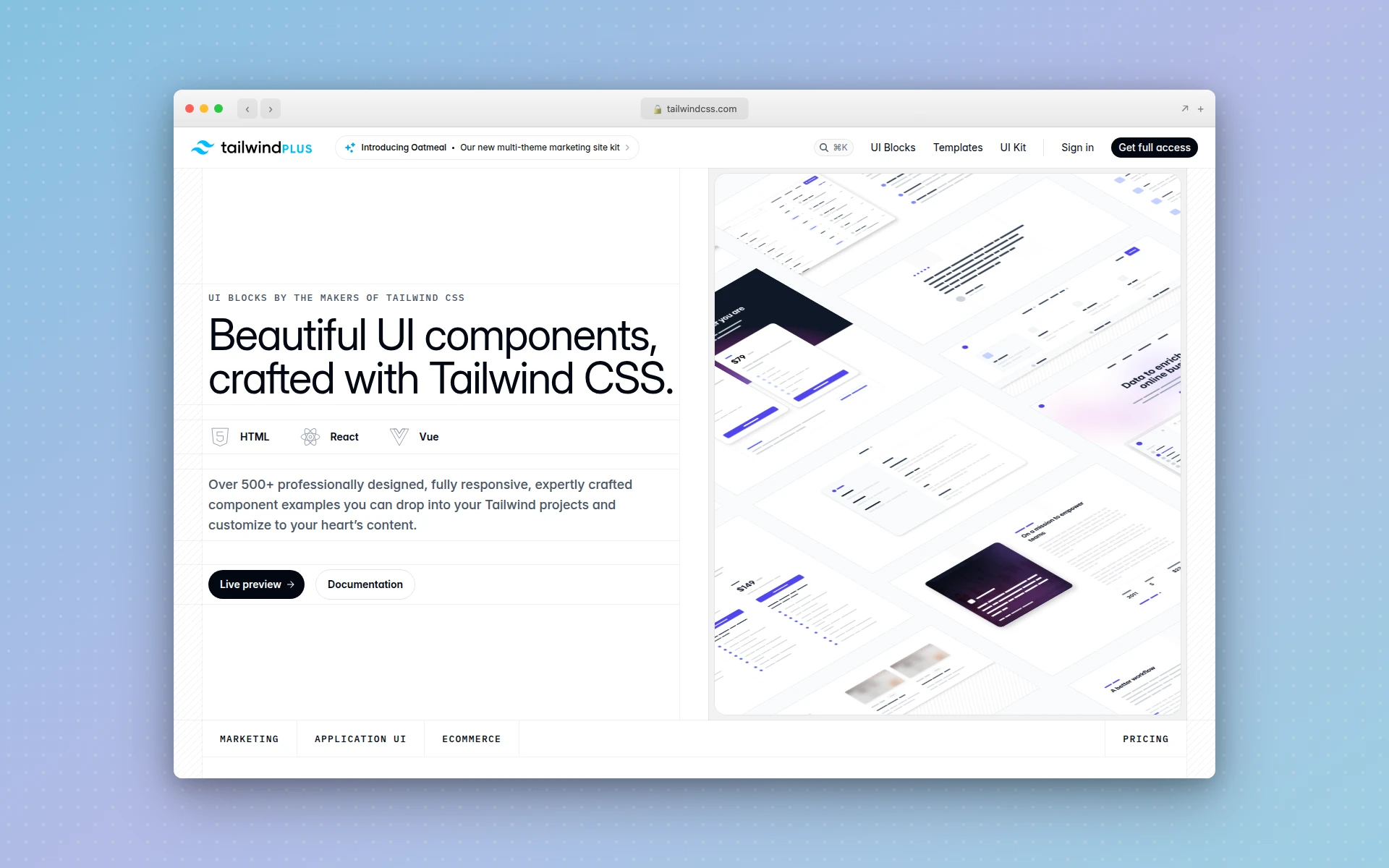 Tailwind Plus UI blocks: responsive sections you assemble into a page.
Tailwind UI sells responsive component and page blocks for teams already writing Tailwind CSS. Instead of a finished template, you assemble a page from vetted, responsive sections: heroes, feature grids, pricing tables.
It’s paid, and it assumes you know Tailwind. The payoff is speed and consistency once you do. For a team standardized on Tailwind, this beats hunting for a whole template that happens to match your design system.
Best for: teams building on Tailwind CSS who want responsive blocks, not a full template.
13. Generate Your Own With AIDesigner
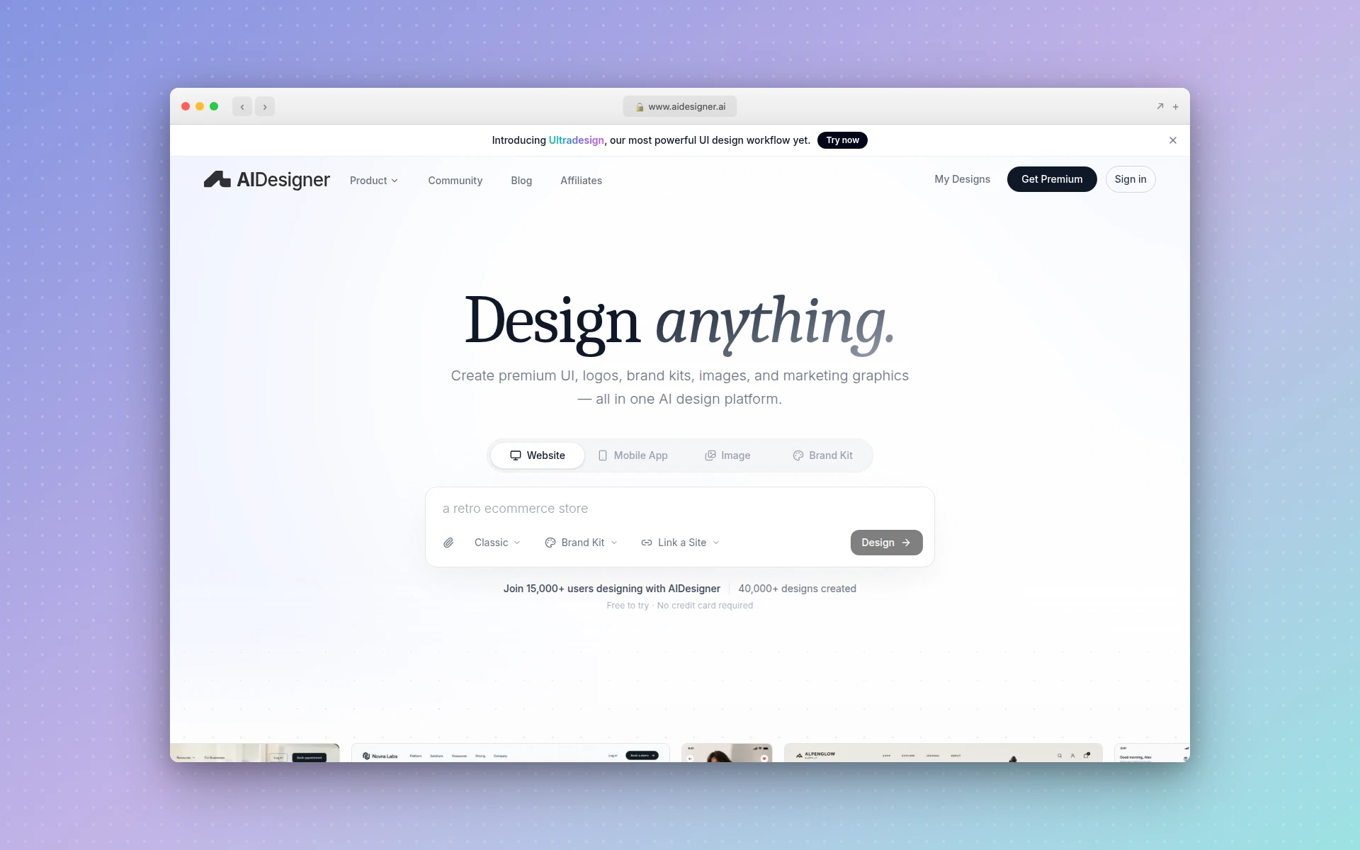 AIDesigner generates a responsive layout from a prompt instead of handing you a template.
Every source above hands you someone else’s layout to bend toward your content. Sometimes the faster path is the reverse: describe your content and get a layout built around it.
Generating a layout instead of downloading one covers that case. AIDesigner turns a prompt like “SaaS pricing page with a sticky nav, a three-tier comparison, and an FAQ” into production-ready responsive HTML in seconds. You pick a starting canvas up front, a 1440px desktop or a 430px mobile design, and the output adapts across screen sizes from there. You edit the result directly on the canvas and publish to a subdomain with SEO handled, no template hunting required.
It also reads existing sites. Point it at a URL you admire, maybe one you found while browsing web design inspiration sites, and it can clone the layout as a starting point, modernize it, or riff on its style for inspiration. Reference-mode generations cost 2 credits (one to analyze the site, one to build), against 1 credit for a plain prompt. It sits alongside the broader crop of AI website generators if you want to compare approaches.
Best for: projects where no template quite fits, or where you would rather start from your content than from a stranger’s placeholder copy.
What Makes a Website Template Responsive
Before you download anything, it helps to know what you are actually checking for. As W3Schools puts it, responsive web design uses HTML and CSS to automatically resize, hide, shrink, or enlarge a site so it looks right on every device. A template pulls that off when three techniques work together, and the fastest way to spot a bad one is to know which of these it skips.
A fluid grid. The layout uses relative units like percentages and fractions instead of fixed pixel widths, so columns shrink and stack as the screen narrows. Per MDN, modern CSS layout methods, Flexbox and CSS Grid, are “inherently responsive,” which is why current templates rarely need old-school float hacks.
Flexible media. Images and video scale to their container instead of overflowing it. The one-line rule MDN recommends is max-width: 100% on images, pictures, and video, so nothing pushes past the edge of the screen on a phone.
Media queries. These are the CSS conditions that change the layout at set breakpoints, for example switching from three columns to one below a certain width. MDN’s advice is to define breakpoints with relative units rather than absolute pixel sizes so the design responds to content, not a hardcoded device list.
Tying it all together is the viewport meta tag. MDN is blunt about it: “you should always include the viewport meta tag in the head of your documents.” The standard line is <meta name="viewport" content="width=device-width, initial-scale=1" />, and its absence is the single most common reason a “responsive” template still renders as a shrunken desktop page on mobile. If you want to see how these pieces assemble into full pages, our roundup of website layout patterns breaks the common structures down.
Are Free Responsive Templates Good for SEO?
Yes, a well-built free responsive template helps your SEO, and the mechanism is worth understanding. Google uses mobile-first indexing, which means it crawls and ranks the mobile version of your page, per Google Search Central. Google’s John Mueller has put it plainly: a page that is less mobile-friendly “will rank slightly less well than an identical page that is mobile friendly.”
A responsive template gives you that mobile-friendliness for free, because the same clean markup serves every device. There’s no thin mobile variant to fall behind your desktop content.
The qualifier is quality. A responsive template that ships bloated markup, blocking scripts, or oversized images will still load slowly, and slow pages hurt rankings no matter how well they reflow. So responsiveness is necessary but not sufficient. When you pick a template, check its demo on a real phone and run it through a speed test before you build your whole site on it. This matters most on pages built to convert, like the ones covered in our AI landing page builders roundup.
How to Choose the Right Responsive Template
Match the template to the page’s job, not to the prettiest screenshot. A single-purpose landing page and a content-heavy marketing site want different structures, and forcing the wrong template into the wrong role is where most redesigns go sideways. If you are still mapping out the structure itself, start with a wireframe before you shop for a template, so you know which layout you actually need.
Here is the short version of my process:
- Define the page’s one job first. Sell a product, capture an email, showcase work, or publish articles. Each favors a different layout family.
- Filter by framework you can live with. Bootstrap 5 and Tailwind templates are safest for reliable mobile behavior and easiest to extend if you know the framework.
- Load the live demo on your phone. Not the screenshot, the actual demo. Watch the nav, the images, and the text at 375 pixels wide.
- Read the license out loud. Free rarely means “no strings.” Attribution links and non-commercial clauses are common, and they matter on client work.
- Judge the markup. Open dev tools. If the HTML is a readable structure you could edit, keep it. If it’s nested chaos, move on.
If you get three sources deep and nothing fits your content, that’s the signal to stop shopping and generate a layout instead. It’s often faster than forcing a template that was built for a different kind of page.
The Bottom Line
For most people, the answer is short: start at HTML5 UP or Tooplate for a clean, no-signup download, and move to Colorlib or ThemeWagon if you want more variety with dependable mobile behavior. Developers who live in Bootstrap should head to BootstrapMade or Start Bootstrap; teams on Tailwind should look at Cruip or Tailwind UI.
But the deeper you get into a specific project, the more a generic template fights your content. When that happens, generating a responsive layout from a prompt beats bending a stranger’s template into shape. AIDesigner does exactly that: describe the page, get production-ready responsive HTML from a desktop or mobile starting canvas, edit it on the canvas, and publish. The free tier gives you 5 lifetime credits with no card required, so you can test it against whatever template you were about to download.
Whichever route you take, the checklist is the same: fluid grid, flexible media, real media queries, and a viewport tag. Confirm those four and your site will hold together everywhere your visitors open it.
Frequently Asked Questions
What is a responsive website template?
A responsive website template is a pre-built page design whose layout adjusts to fit any screen size, from a phone to a widescreen monitor. It uses fluid grids, flexible images, and CSS media queries so one codebase looks right everywhere, instead of shipping a separate mobile version. You download it, swap in your content, and it reflows automatically.
Are free responsive templates good for SEO?
A well-built free responsive template helps SEO, because it renders the same content across devices and passes the mobile-friendliness that Google’s mobile-first indexing rewards. Google indexes the mobile version of your page, so a template that behaves on small screens starts you ahead. The catch is quality: bloated markup or slow scripts hurt you regardless of how the template looks.
What makes a website template responsive?
Three things make a template responsive: a fluid grid built on relative units instead of fixed pixels, flexible media that scales with max-width, and CSS media queries that change the layout at set breakpoints. The viewport meta tag ties it together by telling the browser to match the device width. Miss any one and the layout breaks somewhere between phone and desktop.
Is Bootstrap responsive by default?
Yes. Bootstrap ships with a mobile-first responsive grid, so any template built on it reflows across breakpoints out of the box. That is why so many free template galleries lean on Bootstrap 5: the responsive behavior is inherited from the framework rather than hand-coded per template. It is a safe base if you want predictable mobile behavior without writing media queries yourself.
Can I generate my own responsive template instead of downloading one?
Yes. AI design tools generate a responsive layout from a text prompt in seconds. AIDesigner takes a description like “SaaS landing page with a sticky nav and a three-card feature row” and returns production-ready responsive HTML you can edit and publish. You pick a desktop or mobile starting canvas, and the output adapts across screen sizes. It’s faster than hunting galleries when no template quite fits your content.
Where can I download free responsive website templates?
HTML5 UP, Tooplate, TemplateMo, Colorlib, and ThemeWagon all offer free responsive HTML and CSS templates. HTML5 UP and Tooplate are the cleanest for a quick no-signup download. Most are built on Bootstrap or plain flexbox and CSS grid, so they reflow to mobile without extra work. Check the license before shipping a client project.