Take any page, change nothing about the colors or copy, and just move the pieces around. It can go from confusing to obvious in a few drags. That’s the layout doing its job: it decides what a visitor sees first, second, and never, which is why it does more for conversion than any font choice ever will.
This is a roundup of 15 website layout patterns, each with what it’s good at and the kind of page it belongs on. I’ve built and rebuilt most of these enough times to have opinions about where they earn their place and where they quietly sabotage a page. When I need to see a layout live instead of imagining it, I generate it with AIDesigner: describe the structure in a sentence and it returns a real, responsive HTML layout in seconds. That turns “I think a split-screen hero would work here” into something you can actually look at before you commit.
The board below shows the six core patterns side by side, and each of the fifteen sections that follow includes its own wireframe diagram.
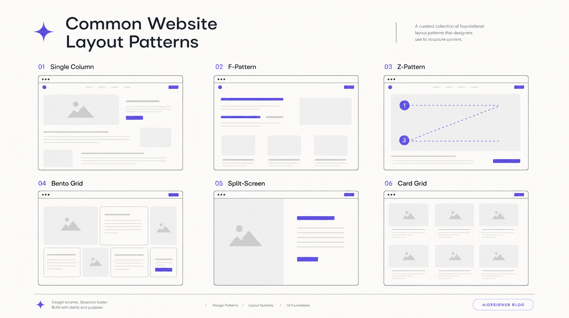 The six foundational website layout patterns, generated in a single pass with AIDesigner so they share one visual language.
Table of Contents
- What Is a Website Layout?
- The 15 Website Layout Patterns
- Which Layout for Which Page Type?
- What Makes a Good Website Layout?
- How to Choose the Right Website Layout
- Can AI Create a Website Layout?
- Frequently Asked Questions
What Is a Website Layout?
A website layout is the arrangement of visual elements on a page: where the navigation, headline, images, text, and buttons sit relative to each other. The layout controls the order people notice things, what draws the most attention, and how balanced the page feels. It is the structural skeleton beneath the colors and typography.
Most people picture “design” as the visible surface, the palette and the fonts. The layout sits one level under that. You can wrap a great layout in mediocre visuals and it still works. Wrap a broken layout in a gorgeous palette and it still confuses people. If you want to see this clearly, sketch the low-fidelity wireframe of a page you admire: strip out the color and you’re left with pure layout, and you’ll notice how much of the “good design” was really good structure. The reverse move, dressing a chosen layout in real color and type, is the mockup stage; our website mockup guide walks it end to end.
The 15 patterns below aren’t mutually exclusive. Real pages mix them. A homepage often opens with a full-screen hero, drops into an alternating feature layout, and closes on a card grid of testimonials. Learn them as building blocks, then combine.
The 15 Website Layout Patterns
1. Single-Column Layout
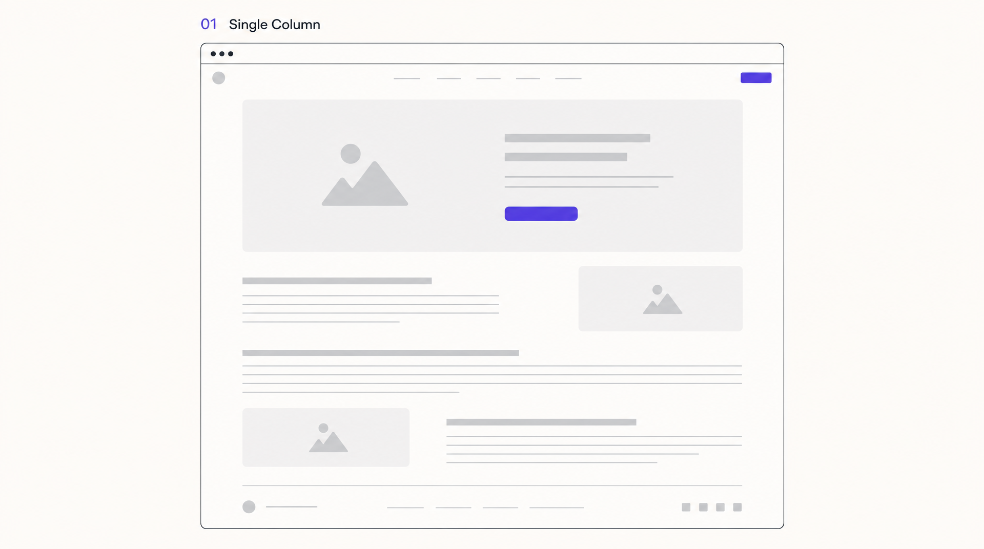 Single-column: one vertical run of sections that looks the same on every screen size.
Single-column stacks everything in one vertical run: hero, then section, then section, then footer. No sidebars, no competing columns. It grew up alongside mobile because a single column already looks the same on a phone, a tablet, and a desktop, which cuts your responsive work roughly in half. Most responsive website design templates lean on this exact behavior to stay simple across screen sizes. If you’re hand-coding it, our guide to the basic HTML page layout covers the semantic elements each of these regions should use.
It’s the honest default for landing pages, personal sites, and any content you want read in order. The risk is monotony. If every section is the same width and rhythm, a long single column reads like a wall. Break it with alternating alignment, an occasional full-bleed image, or a color-blocked section so the eye gets a reason to keep going.
Best for: landing pages, personal sites, storytelling pages, anything mobile-first.
2. F-Pattern Layout
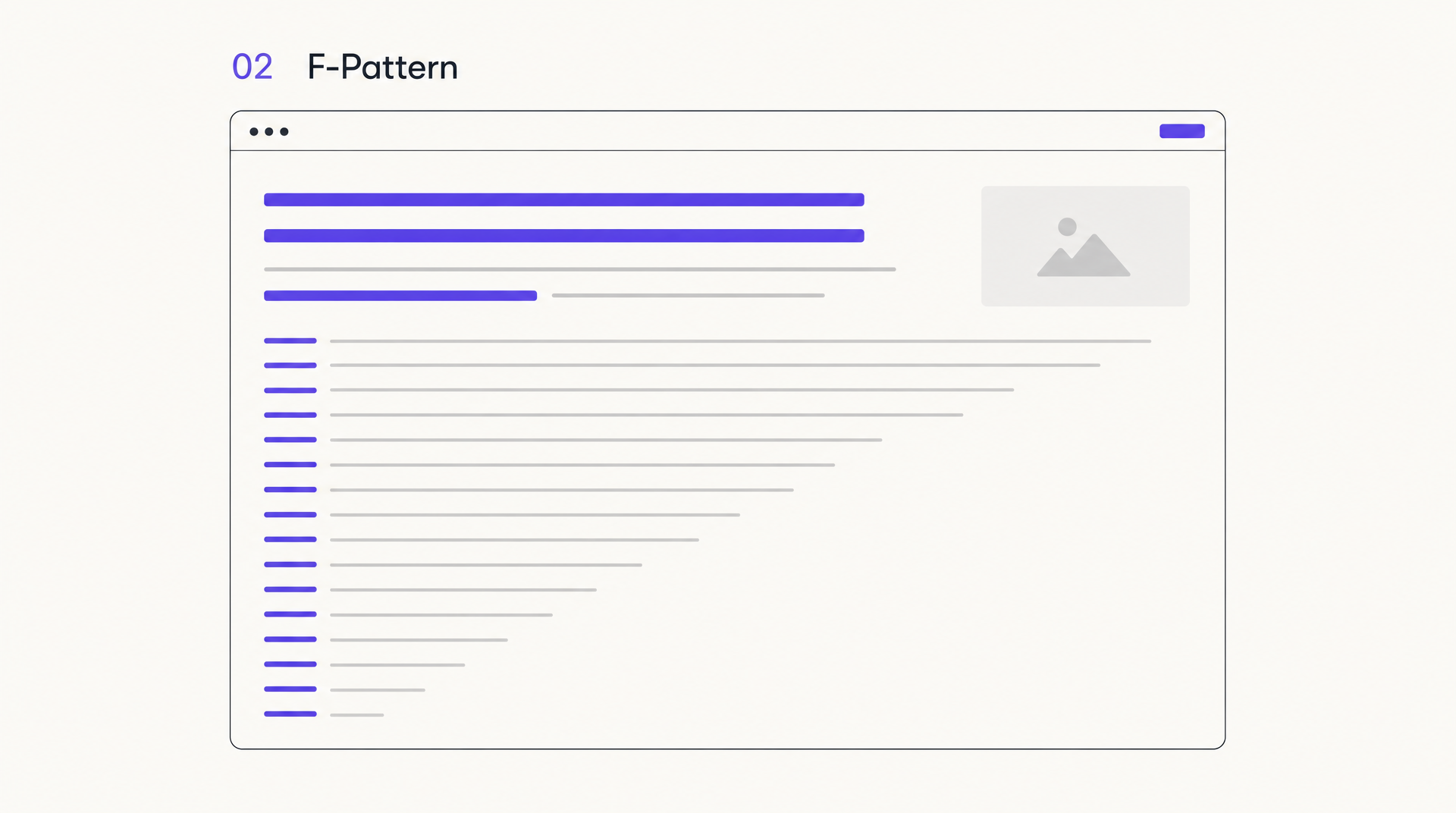 The F-pattern: two horizontal sweeps at the top, then a scan down the left edge.
The F-pattern isn’t a layout you draw so much as one you design around. Nielsen Norman Group’s eye-tracking research, first published in 2006, found that on text-heavy pages people read in an F shape: a horizontal sweep across the top, a shorter sweep below it, then a vertical scan down the left edge. Their follow-up work confirms the pattern is still alive on both desktop and mobile.
The takeaway for your layout: front-load meaning. Put the words that matter at the top and at the start of each line, not buried mid-paragraph or hugging the right margin where nobody looks. The F-pattern shows up most on pages with weak structure, so strong headings, bullets, and short paragraphs actually pull people out of lazy scanning and into reading.
Best for: blogs, news, documentation, search results, any long-form text.
3. Z-Pattern Layout
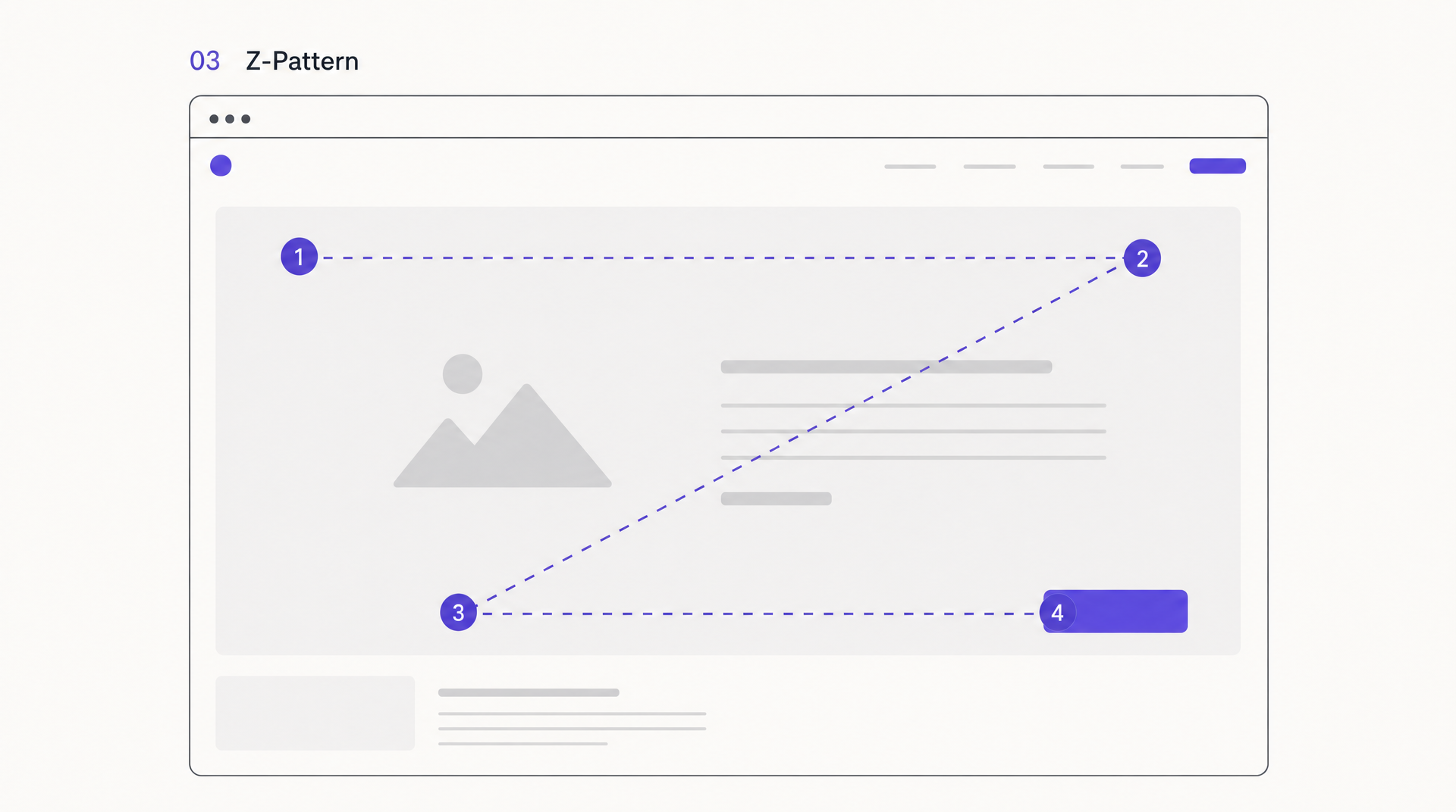 The Z-pattern: the eye enters at the logo, sweeps right, cuts diagonally down, and lands on the CTA.
Where the F-pattern fits dense text, the Z-pattern fits sparse, goal-driven pages. The eye enters top-left (logo), sweeps right (nav or a secondary CTA), cuts diagonally down to the bottom-left, then travels right again to a final call to action. You’re drawing an invisible Z, and you place your key elements on its corners and along its diagonal.
It works because it matches how people skim a page with little to read and one thing to do. A hero headline top-left, a supporting visual top-right, a benefit line across the middle, and a button bottom-right gives the eye a clean path to the click. Use it when a page has a single job.
Best for: focused landing pages, marketing pages, simple sign-up flows.
4. Grid Layout
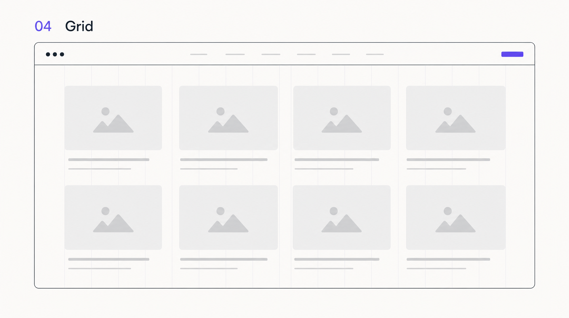 A pure grid: identical cells on an even underlying structure, calm and predictable.
A grid layout places content on an even underlying structure, typically a 12-column grid, so everything lines up to invisible guides. The result feels ordered and calm because spacing and alignment stay consistent. Grids are also the easiest layouts to make responsive: columns collapse predictably as the screen narrows.
The strength is also the weakness. A pure grid can feel corporate or flat if nothing ever breaks the rhythm. Designers keep grids interesting by varying cell sizes, letting one element span multiple columns, or occasionally pushing something off-grid on purpose. Learn the grid first, then earn the right to break it.
Best for: e-commerce catalogs, image galleries, team pages, structured marketing sites.
5. Bento Grid Layout
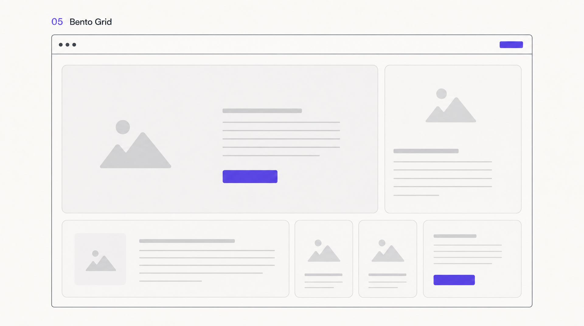 Bento grid: one card clearly dominates, the rest support it.
The bento grid is the grid’s more expressive cousin. Instead of even cells, it uses cards of varying sizes packed together like the compartments of a Japanese bento box, one big feature card next to two small ones, a wide banner beneath a pair of squares. It became the default look of modern SaaS marketing and dashboard design almost overnight, because it packs a lot of distinct information into one glanceable frame.
It’s genuinely useful when you have several unequal things to show at once: a headline feature, a stat, a screenshot, a quote. It goes wrong when every cell fights for attention. Give one card clear dominance and let the rest support it, or the “organized” grid turns into visual noise. A design system helps here, because consistent card padding and corner radii are what keep a bento grid from looking chaotic.
Best for: SaaS homepages, feature overviews, dashboards, product landing pages.
6. Card Layout
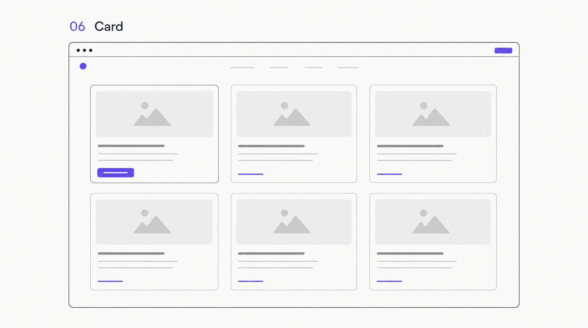 Cards: self-contained blocks that reflow into one, two, or three columns on their own.
A card layout breaks content into self-contained blocks, each with an image, a headline, a snippet, and usually a link. Cards are modular by nature, so they reflow into one, two, or three columns depending on screen width without any special handling. That’s why they’re everywhere: blog indexes, product grids, portfolio galleries, pricing tiers.
The trap is uniformity. When every card is identical, a page of cards reads as a texture rather than a set of choices, and people stop distinguishing between items. Vary card size for featured items, use real imagery instead of placeholder gray, and keep the text on each card short enough to scan in a second.
Best for: portfolios, blog listings, product grids, pricing, dashboards.
7. Split-Screen Layout
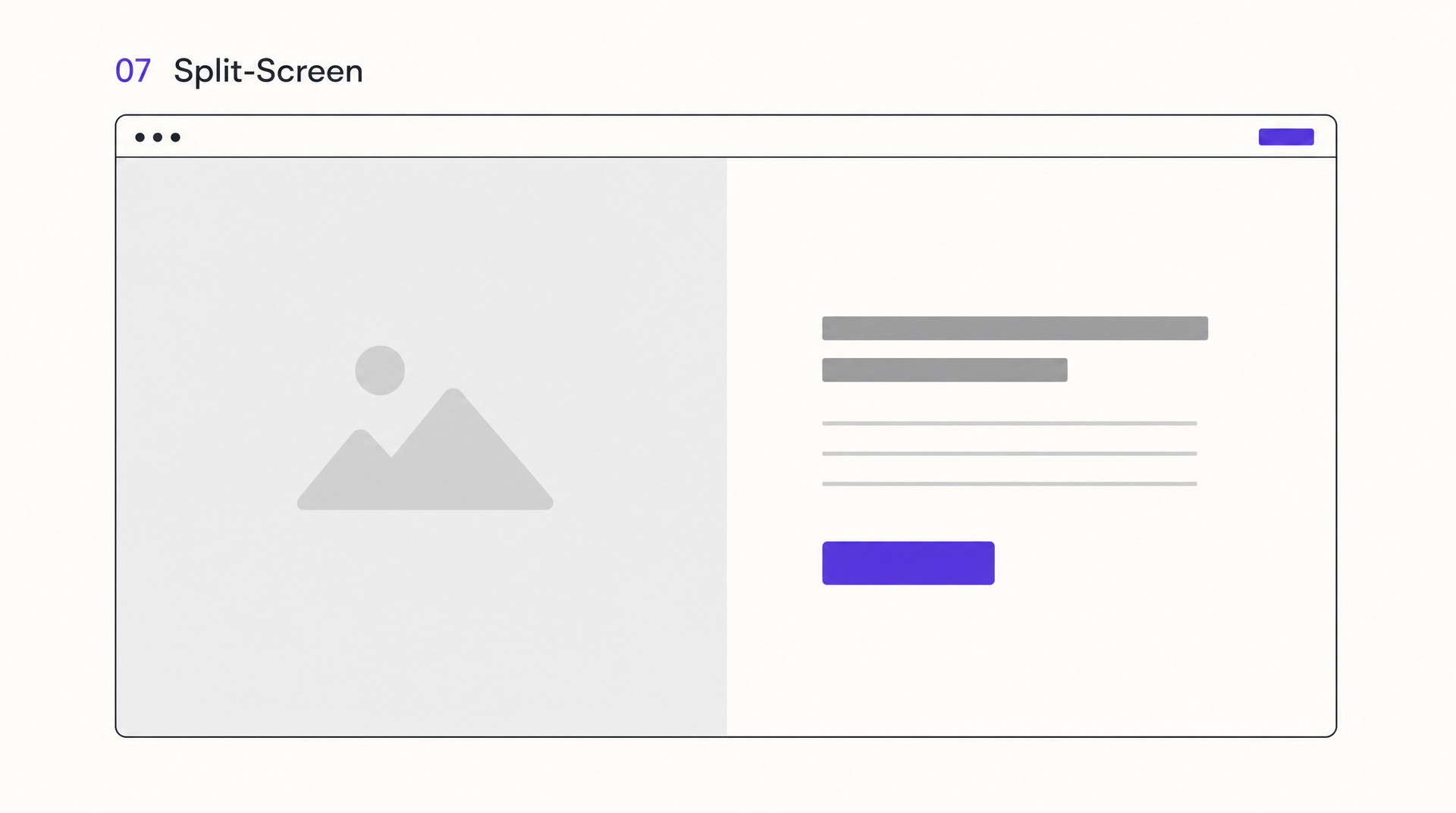 Split-screen: two equal halves, each carrying its own message.
Split-screen divides the viewport into two halves, usually vertical, each with its own visual and message. It shines when you have two things of roughly equal weight: two audiences (“for designers” / “for developers”), two products, or a strong image paired with a strong headline. Each half can carry its own background color, which creates instant contrast.
Watch the mobile version. Split-screen almost always has to stack into two full-width sections on a phone, so design both halves to survive on their own. And resist splitting into three or four “panes,” at which point you’ve reinvented the grid and lost the clean tension that made split-screen work.
Best for: dual-audience pages, product comparisons, image-and-copy heroes.
8. Full-Screen Hero Layout
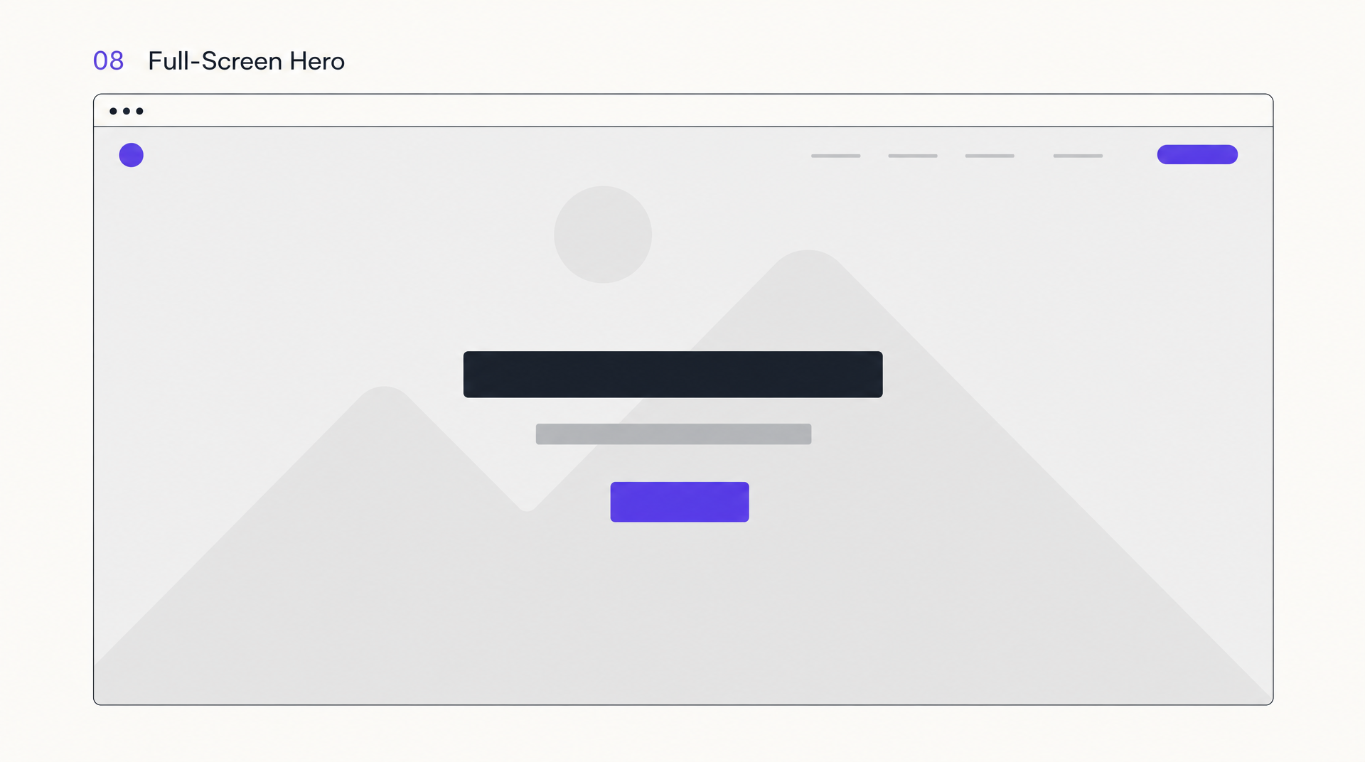 Full-screen hero: the entire first viewport spent on one idea.
A full-screen hero fills the first viewport with a single edge-to-edge visual: a video, a photograph, or a bold typographic statement, with a short headline and one button on top. Nothing else competes above the fold. It’s the layout that makes a brand feel confident, because it’s willing to spend the entire first screen on a single idea.
The cost is that a big beautiful hero can bury the thing people actually came for. If a visitor has to scroll past a full screen of atmosphere to find out what you do, some of them won’t. Keep the headline concrete, not poetic, and make sure the section directly below answers “what is this and what do I do next.” For the anatomy of the block itself, our guide to the website hero section breaks down all seven hero patterns and what each one costs you.
Best for: brand homepages, portfolios, campaign landing pages, agencies.
9. Magazine Layout
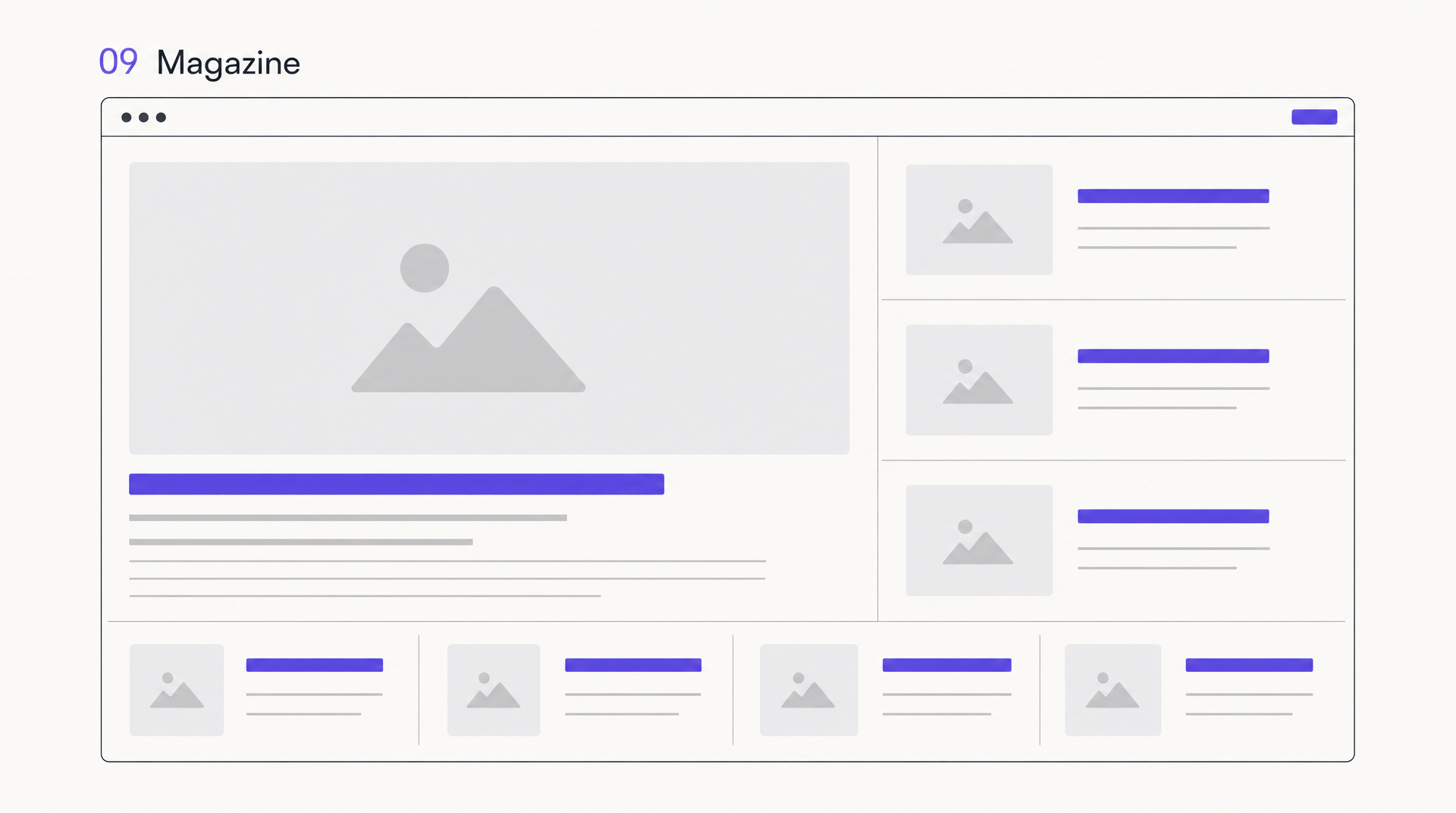 Magazine: block size and position signal importance, like a print front page.
Magazine layouts borrow from print: a dense, multi-block front page where headline size, image size, and position signal importance. A lead story dominates, secondary stories flank it, and smaller items fill the edges. It’s built to expose a lot of content at once and let readers self-select what to click.
It only works when you genuinely have a lot to show and a clear hierarchy among it. Force a magazine layout onto a thin site and it looks empty and busy at the same time. Publishers, media brands, and large content libraries are where it belongs; a five-page small-business site is not.
Best for: news, editorial sites, blogs with high volume, content hubs.
10. Sidebar Layout
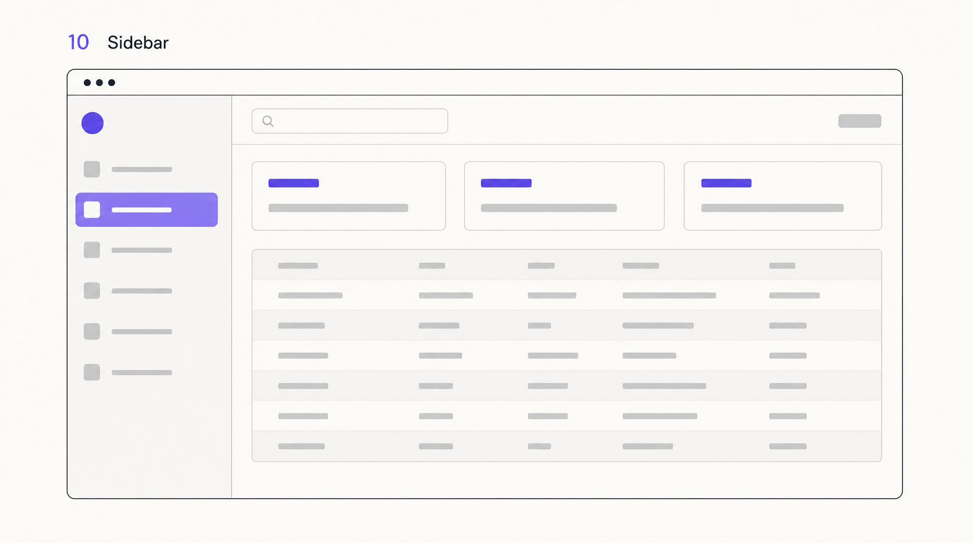 Sidebar: persistent navigation beside the content, the default for anything app-shaped.
A sidebar layout puts a persistent column, navigation, filters, or account controls, beside the main content area. It’s the default for anything that behaves like an app: dashboards, documentation, admin panels, email. The sidebar keeps wayfinding always visible so users never lose their place in a deep structure. If you’re building this kind of interface, our guide to designing a dashboard UI goes deeper on the pattern.
On marketing pages a sidebar usually costs more than it earns, eating horizontal space that content wants. And on mobile the sidebar has to hide behind a menu or collapse to the bottom, so plan that transition from the start rather than bolting it on.
Best for: dashboards, docs, web apps, admin tools, filtered catalogs.
11. Asymmetrical Layout
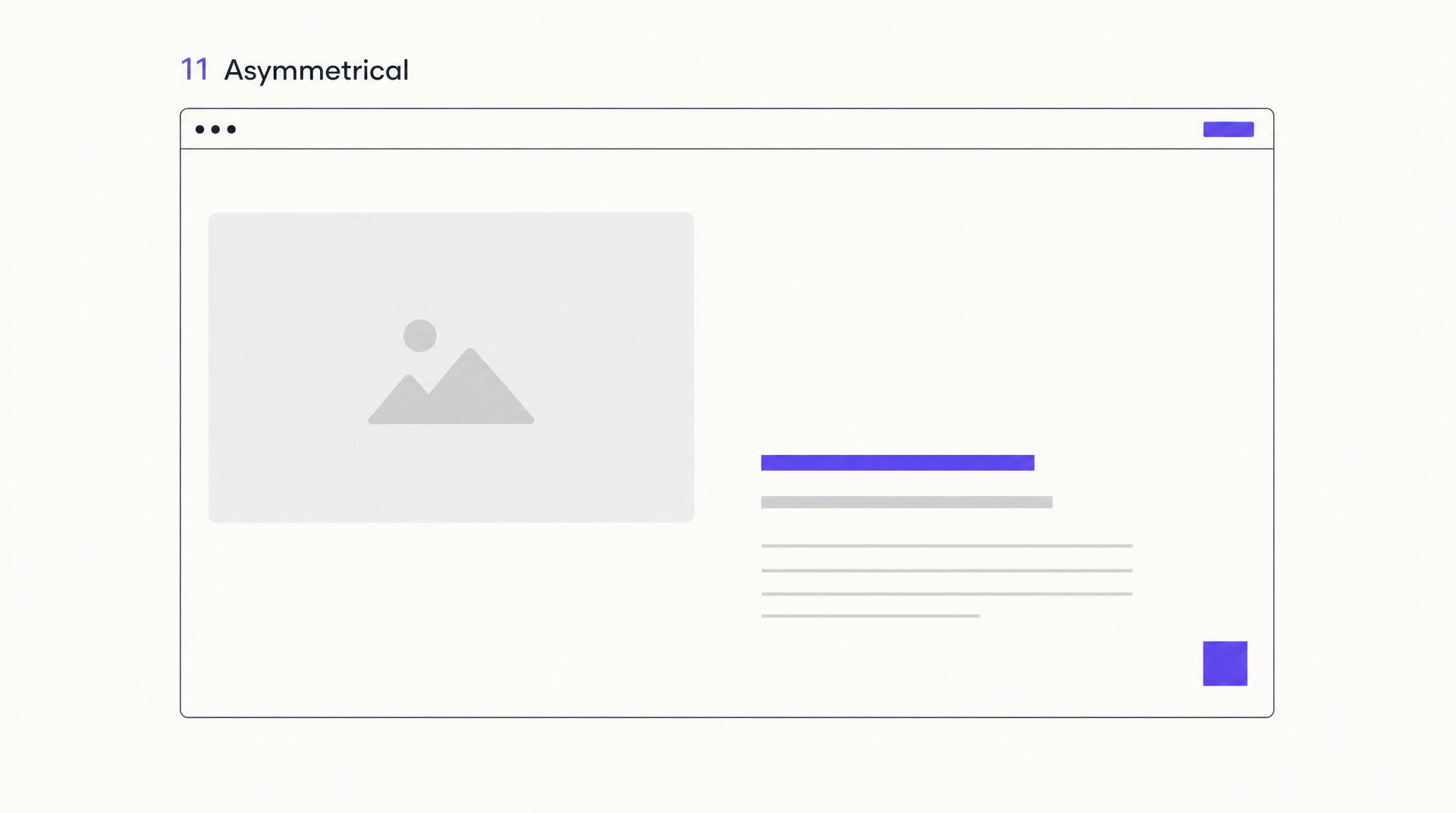 Asymmetrical: off-center weight balanced with whitespace instead of mirroring.
Asymmetrical layouts abandon mirror-image balance on purpose. Uneven spacing, off-center focal points, and deliberate imbalance create tension that pulls the eye exactly where the designer wants it. Done well, it feels alive and editorial instead of templated. Done poorly, it just feels broken.
The skill is that asymmetry still needs balance, just visual balance rather than positional balance. A large element on the left is counterweighted by whitespace or a small bright element on the right. If you’re not confident eyeballing that, start from a grid and nudge one or two elements off it rather than freestyling the whole page.
Best for: creative portfolios, agencies, fashion, art-led brands.
12. Alternating Layout
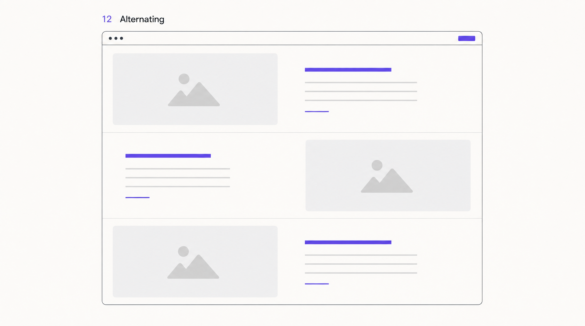 Alternating: image and text swap sides on every row, giving a long page its rhythm.
The alternating layout is a stack of two-column rows where image and text swap sides on each row: image-left/text-right, then text-left/image-right, and so on. That zig-zag keeps a long feature section from feeling repetitive and gives the eye a gentle rhythm to follow down the page.
It’s the workhorse of “here’s what our product does” sections, and it’s beginner-safe because the structure does the work. The one rule: keep the swap consistent and the image sizes even, or the rhythm breaks and it reads as sloppy rather than dynamic. On mobile every row simply stacks image over text, which is another reason it holds up well.
Best for: feature sections, product tours, how-it-works pages, service lists.
13. Hero-Plus-Features Layout
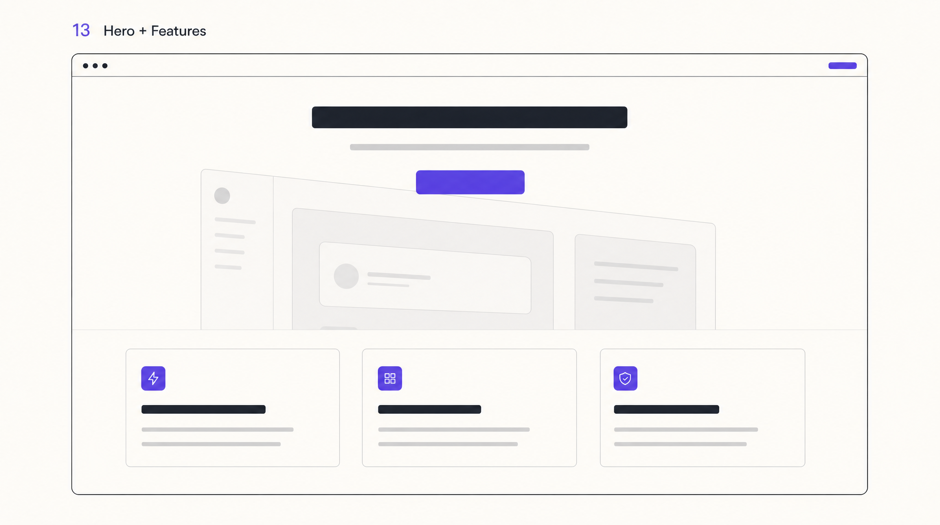 Hero-plus-features: the standard SaaS skeleton — hero, CTA, three benefit cards.
If you’ve looked at a startup homepage in the last five years, you’ve seen the hero-plus-features layout: a hero with a headline, subhead, and CTA, immediately followed by a row of three or four benefit cards. It’s borderline a cliché at this point, which is exactly why it’s reliable, people know how to read it instantly.
The way to keep it from feeling generic is in the details: specific benefit copy instead of “Fast. Simple. Powerful.”, real product imagery in the cards, and a hero that says what the product actually is. The bones are fine; most weak versions fail on the words, not the layout. You can see the pattern executed dozens of ways in our roundup of AI landing page builders.
Best for: SaaS homepages, startup landing pages, app marketing sites.
14. Boxed Layout
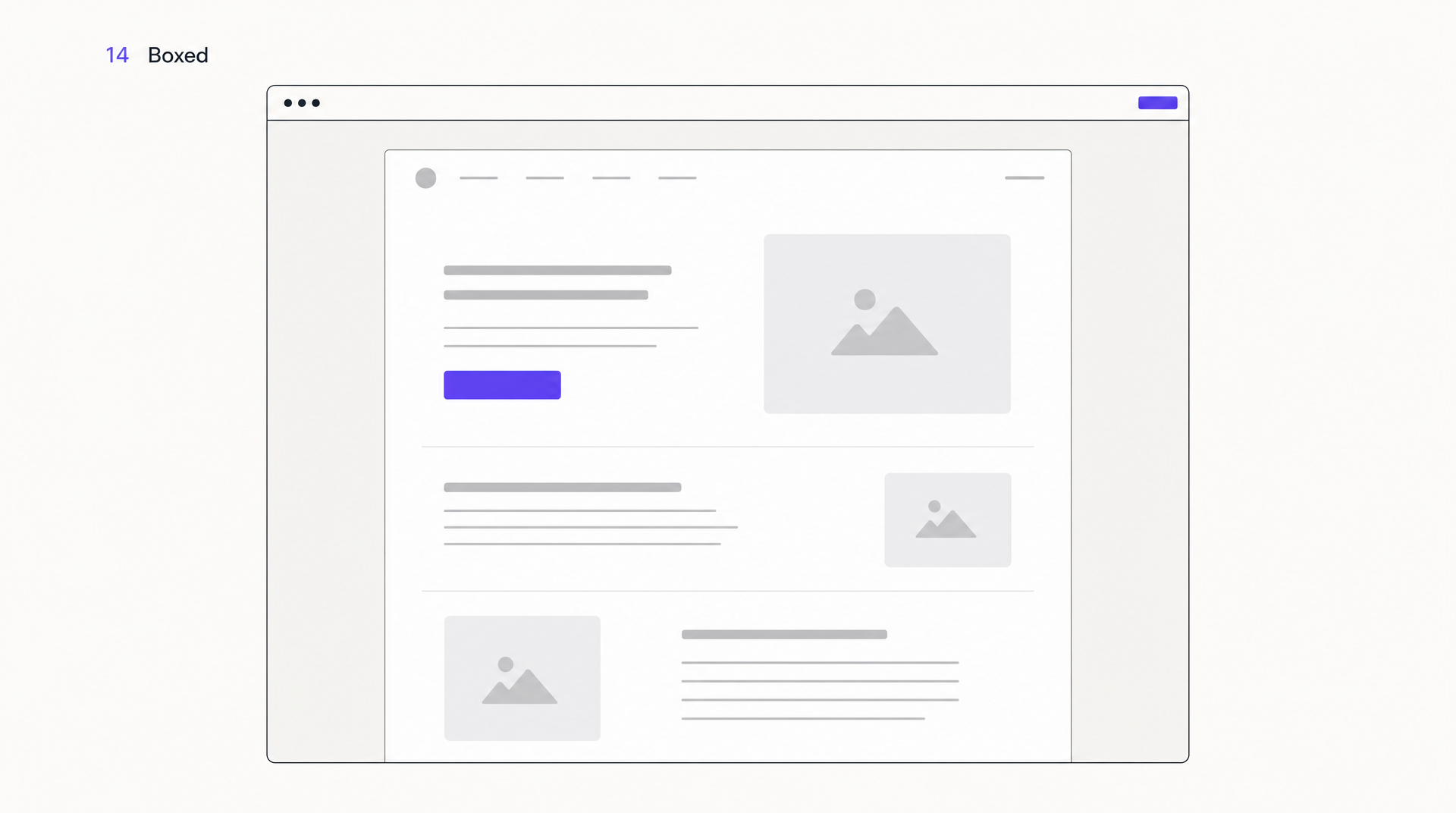 Boxed: content sits in a defined container and never touches the browser edges.
A boxed layout constrains all content to a centered container with visible margins, or a distinct background, on both sides. Rather than running edge to edge, the content sits in a defined “box.” It feels contained, deliberate, and slightly editorial, and it stops line lengths from stretching uncomfortably wide on large monitors.
It’s a subtle choice more than a dramatic one. Boxed layouts read as calm and premium, which suits editorial sites, documentation, and B2B pages that want to feel measured. The main thing to get right is the max-width: too narrow and it feels cramped, too wide and you lose the containment that was the point.
Best for: editorial sites, documentation, B2B marketing, reading-focused pages.
15. Broken-Grid Layout
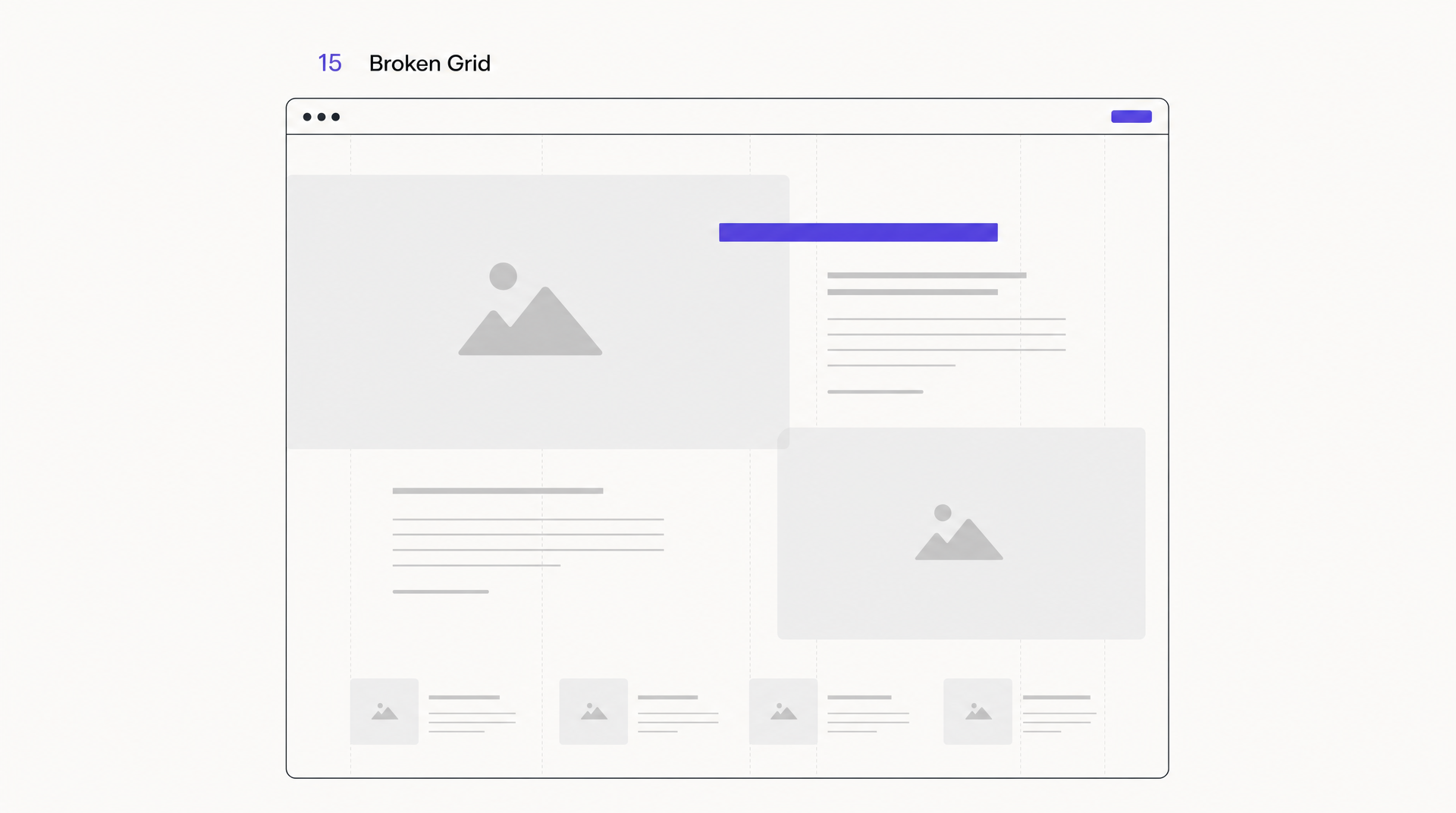 Broken grid: 90% clean grid, two loud and deliberate violations.
The broken-grid layout deliberately violates the grid: elements overlap, text runs over images, and blocks sit slightly off their expected lines. It’s the most personality-forward pattern here and the easiest to get wrong. When it lands, a page feels custom and confident. When it misses, it feels like a CSS bug.
Treat it as seasoning, not the main dish. Most broken-grid pages that actually work are 90% clean grid with one or two intentional violations, an image that bleeds past its column, a headline that overlaps the photo below it. Break one rule loudly rather than every rule quietly.
Best for: creative portfolios, design studios, campaign microsites, brand statements.
Which Layout for Which Page Type?
The fastest way to choose is to start from the page’s job, then read across. This is the matrix I use as a first pass before I design anything:
| Page type | Primary goal | Layout that fits | Why |
|---|---|---|---|
| SaaS homepage | Explain + convert | Hero-plus-features → bento grid | Hero states the product, cards prove it |
| Landing page (one CTA) | Single conversion | Z-pattern or single-column | Straight path to one button |
| Blog / article | Readability | F-pattern + single-column | Matches how people scan text |
| Portfolio | Showcase work | Card or asymmetrical | Work is the hero, not the copy |
| Dashboard / app | Navigate + act | Sidebar + grid | Persistent nav, structured data |
| E-commerce catalog | Browse + compare | Grid or card | Even cells make scanning easy |
| Brand / campaign site | Impression | Full-screen hero + broken grid | Personality over information density |
| Docs / knowledge base | Find answers | Sidebar + boxed | Wayfinding plus comfortable reading |
Two things to remember reading this table. First, nearly every real page combines patterns rather than picking one, so treat these as the dominant pattern with room for others underneath. Second, whichever you choose has to survive the collapse to a single mobile column, because that’s how the majority of your visitors will actually see it. Mobile has been the larger share of global web traffic since it overtook desktop in 2016, per StatCounter’s long-running tracking.
What Makes a Good Website Layout?
A good website layout guides the eye toward one clear action without making the visitor think about the layout at all. It has an obvious focal point, consistent spacing, a sensible reading order, and enough whitespace that nothing feels crowded. The best layouts are the ones nobody notices, because attention goes straight to the content.
A few principles hold across every pattern above:
- One focal point per screen. If everything is emphasized, nothing is. Decide the single most important element in each viewport and let the rest defer to it.
- Respect the reading order. People read top-to-bottom, left-to-right in most Western markets. Put the first thing you want seen where the eye lands first.
- Whitespace is structure, not waste. Space between elements is how you group and separate them. Cramped layouts read as low-quality even when the content is strong.
- Consistency beats novelty. Repeating the same spacing, alignment, and card style across a page is what makes it feel designed. This is exactly what a design system enforces.
- Design mobile-first, or at least mobile-equal. A layout that only works at 1440px is a layout that fails for most of your traffic.
How to Choose the Right Website Layout
Choose a website layout by starting with the page’s goal, not a template you liked. Decide the single action you want a visitor to take, then pick the pattern that guides the eye toward it. Confirm the layout still reads well as one column on mobile, and only then move on to color and type. If you want a repeatable process for locking the structure before you pick a pattern, our guide on how to create a wireframe for a website walks through it step by step.
In practice I run three quick checks:
- What is the one job of this page? Convert, inform, showcase, or navigate. The job narrows you to two or three candidate patterns immediately, using the matrix above.
- Where should the eye go first, and where should it end? Sketch the path. If you can’t trace a clean line from entry point to primary action, the layout is fighting you.
- Does it hold at 430px wide? Collapse it mentally, or literally, to a phone. If the hierarchy survives the stack, the layout is sound. If it falls apart, rethink it now, not after you’ve styled it.
The reason I generate layouts with an AI tool at this stage is that steps two and three are far easier to judge on a real rendered page than in your head. Instead of debating whether a split-screen hero works, I describe it, look at it, and decide in a minute.
Can AI Create a Website Layout?
Yes. AI design tools generate a complete website layout from a text prompt in seconds, and it’s the fastest way to move from “I think this pattern would work” to a page you can actually judge. The tool I use for this is AIDesigner, because it returns a real, responsive HTML layout rather than a flat picture of one.
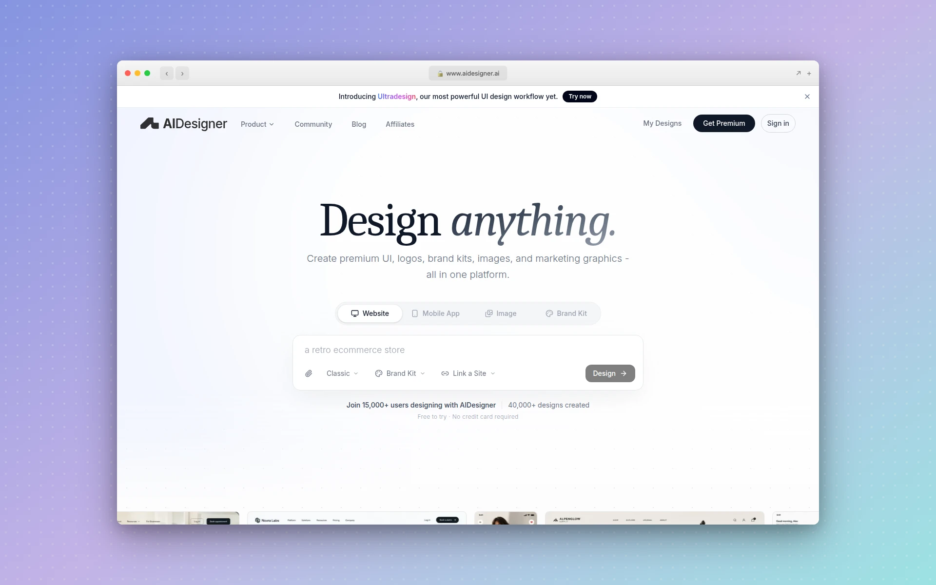 AIDesigner turns a text prompt describing a layout into an editable, responsive HTML page you can publish.
The workflow is direct. You describe the structure the way you’d describe it to a colleague, “a SaaS homepage with a split-screen hero, an alternating three-row feature section, and a bento grid of testimonials”, and AIDesigner generates it as an editable design. Because the output is production HTML, you’re looking at how the layout actually behaves, not a mockup you’ll have to rebuild later. It generates at a 1440px desktop or 430px mobile viewport, which maps to exactly the two checks that matter most: does it work on a full screen, and does it hold when it collapses to a phone.
Three things make it useful specifically for layout work:
- Clone an existing layout. If you’ve found a page whose structure you admire, AIDesigner’s Clone mode recreates it as a starting point you can then rework, rather than reverse-engineering the layout by eye. Our step-by-step guide to how to clone a website walks through all three cloning methods and when to use each.
- Riff on a reference for inspiration. Inspire mode takes a URL and uses only its visual and structural style as a jumping-off point, so you get the feel of a layout you like without copying it.
- Keep it consistent. Save a brand kit once and reuse it across every layout you generate, so a whole set of pages shares the same spacing, color, and type. Consistency across pages is most of what separates a “designed” site from a stitched-together one.
If you’d rather not hand-code any of these patterns, AIDesigner sits alongside the broader category of AI website generators and AI page builders that turn a prompt into a live page. The free tier is 5 lifetime credits with no card required, which is enough to generate and compare a handful of layout directions before you decide.
Frequently Asked Questions
What is a website layout?
A website layout is the arrangement of visual elements on a page: where the navigation, headline, images, text, and buttons sit relative to each other. The layout controls the order people notice things, what draws the most attention, and how balanced the page feels. It’s the structural skeleton beneath the colors and typography.
What is the best website layout?
There’s no single best website layout. The right one depends on the page’s job. Single-column and Z-pattern layouts convert well on landing pages, F-pattern suits text-heavy blogs and news, card and bento grids fit portfolios and dashboards, and split-screen works when you have two things of equal weight. Match the layout to the page’s goal, not to a trend.
What are the most common types of website layouts?
The most common website layouts are single-column, F-pattern, Z-pattern, grid, card, bento grid, split-screen, magazine, full-screen hero, sidebar, asymmetrical, and hero-plus-features. Most real pages combine two or three of these rather than using one in isolation, such as a full-screen hero on top of an alternating feature layout.
How do I choose the right website layout?
Choose a website layout by starting with the page’s goal, not a template. Decide the one action you want a visitor to take, then pick a layout that guides the eye toward it. Landing pages built for a single conversion favor Z-pattern or single-column. Content pages favor F-pattern. Always confirm the layout still works when it collapses to one column on mobile.
What is the F-pattern in web design?
The F-pattern describes how people scan text-heavy pages: two horizontal sweeps near the top, then a vertical scan down the left edge, tracing the shape of the letter F. Nielsen Norman Group identified it through eye-tracking research in 2006, and follow-up studies confirm it still holds on desktop and mobile. Put your most important words at the top and start of lines.
Can AI create a website layout?
Yes. AI design tools generate a full website layout from a text prompt in seconds. AIDesigner takes a description like “SaaS landing page with a split-screen hero and a three-card feature row” and returns a production-ready, responsive HTML layout you can edit and publish. It can also clone an existing site’s layout as a starting point or riff on one for inspiration.