TL;DR: Designing an application is seven steps: name the one job it does, map the screens, wireframe in greyscale, lock a visual direction, design the real screens, test with five people, then hand off. Steps 1 through 3 are thinking work no tool does for you. Step 5 is where AIDesigner turns a described layout into finished, responsive screens in seconds, which is the step that used to eat days.
Most guides on how to design an application give you a tidy list of phases and leave you exactly where you started, holding a screen map with no idea how to turn it into something that looks like a real product. The gap is always the same one. You can describe what each screen needs. You cannot make it look good.
That gap is what AI design tools actually solve, and it’s why the workflow below puts AIDesigner at the visual design step rather than treating it as an afterthought. The thinking steps stay yours. Scoping, screen mapping, and usability testing still need a human who understands the problem. But the jump from grey boxes to a finished interface, the part that used to mean either learning visual design or hiring someone, now takes a sentence and a few seconds.
To keep this concrete instead of theoretical, I ran the whole process on one example app while writing: Cadence, a medication reminder for someone looking after an elderly parent. Both images in this post are the actual output, generated in AIDesigner, two credits total. You’ll see the greyscale wireframe at step 3 and the exact same three screens as finished UI at step 5, so you can judge the jump yourself instead of taking my word for it.
What Are the Steps to Design an Application?
Designing an application takes seven steps: name the one job it does, map every screen, wireframe in greyscale, lock a visual direction, design the finished screens, test with about five people, then prepare the handoff. The order matters more than the tools, because each step answers a question the next one depends on.
What You’ll Need
You need far less than most guides suggest. Here’s what each stage actually requires, and what I use.
| Stage | What it needs | What I use |
|---|---|---|
| Scoping and screen map | A document and clear thinking | Any notes app, or paper |
| Wireframing | Something that draws grey boxes fast | Paper, Figma’s free Starter plan, or AIDesigner |
| Visual direction and UI | A tool that produces finished screens | AIDesigner (recommended) |
| Clickable prototype | Screen-to-screen linking | Figma, or any prototyping tool |
| Usability testing | Five people and a quiet room | A video call works fine |
The only line where the choice really changes your outcome is the visual design row. Everything else has a free option that works, and paper genuinely beats software for the first three steps.
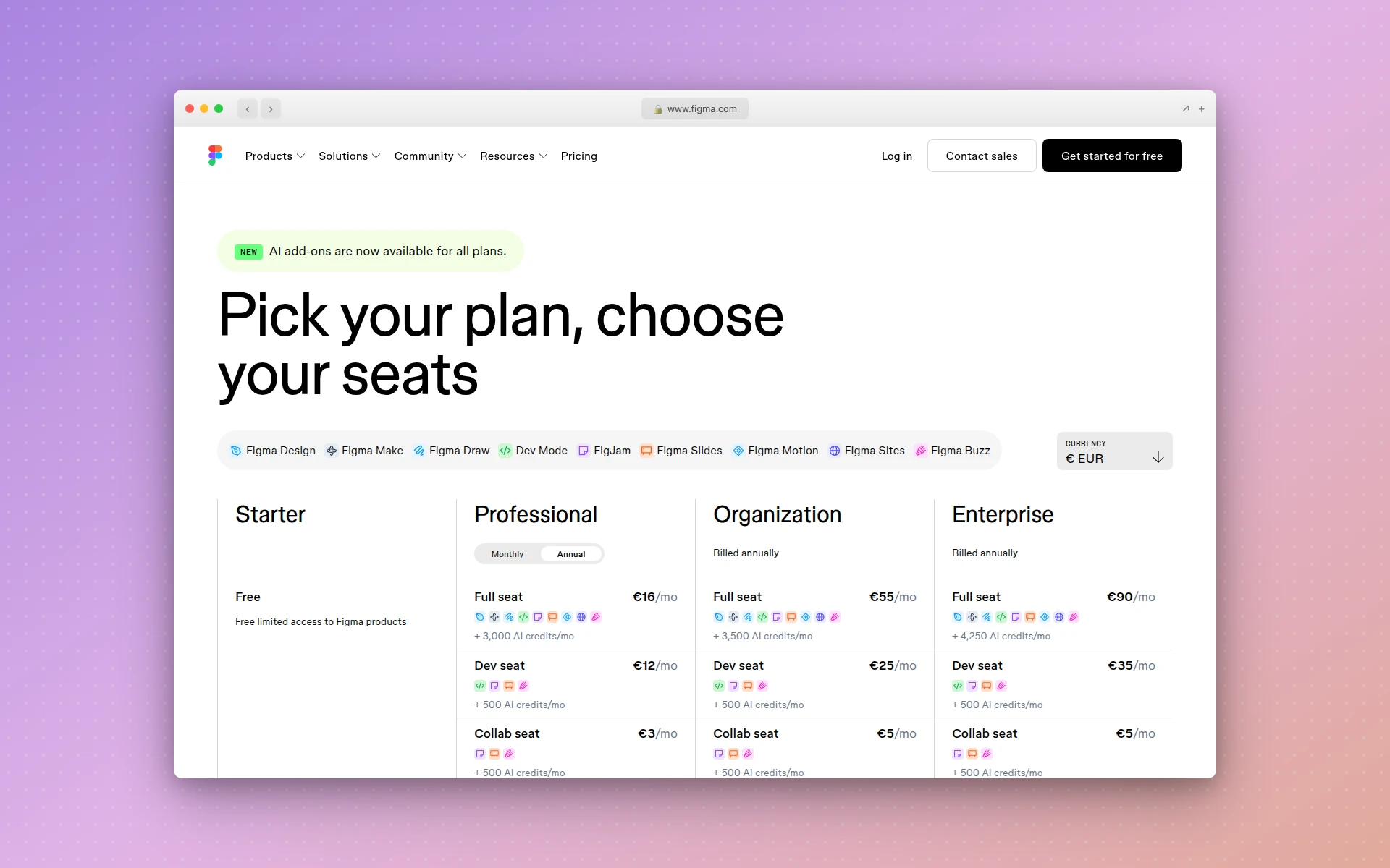 Figma’s Starter plan covers wireframing and prototyping at no cost, which is all you need from it here.
Step 1: Write Down the One Job Your App Does
Write one sentence naming the single job your app does for one specific person. For Cadence, it was: help a caregiver confirm their parent took the right pills at the right time.
That sentence is not a mission statement. It’s a filter, and every screen you design from here has to earn its place against it.
Most feature ideas can’t. A social feed for Cadence? Doesn’t help confirm pills were taken. Gone, before it costs a single hour of design time.
Non-designers usually skip this step because it feels like procrastinating. It’s the opposite. Scope creep is the most expensive thing that happens to app design projects, and this sentence is the cheapest defense against it.
Write down who the person is, too, and be specific. “Caregivers” is vague. “A 50-year-old checking on a parent who lives 200 miles away, usually at 7am while making coffee” tells you the screen needs to be readable at a glance, one-handed, before that person is fully awake.
Step 2: Map Every Screen Before You Design Any of Them
List every screen as a flat inventory, then draw arrows for how a user moves between them. Cadence came out at eight screens: onboarding, add medication, today, schedule, history, medication detail, notification settings, and an empty state for a first-time user with nothing added yet.
That last one matters. Empty states are the most commonly forgotten screens in app design, and they’re the first thing every new user sees. If your map has no empty states, your map is incomplete.
Two things this step catches while they’re still free to fix:
- Dead ends. A screen with no clear exit. If a user lands on medication detail and the only way out is the back gesture, that’s a hole.
- Orphans. A screen nothing points to. Usually a feature you wanted more than your user did.
Keep it ugly. Boxes and arrows on paper are fine. This is the same structural thinking behind designing a dashboard UI, where deciding what belongs on screen matters far more than how it’s styled.
Step 3: Wireframe in Greyscale
Turn each mapped screen into grey boxes, placeholder lines, and labeled buttons. No color, no chosen typeface, no branding, no real copy. Greyscale is not an aesthetic preference. It’s a way to stop people reviewing your work from arguing about the blue.
Here’s what Cadence looked like at this stage:
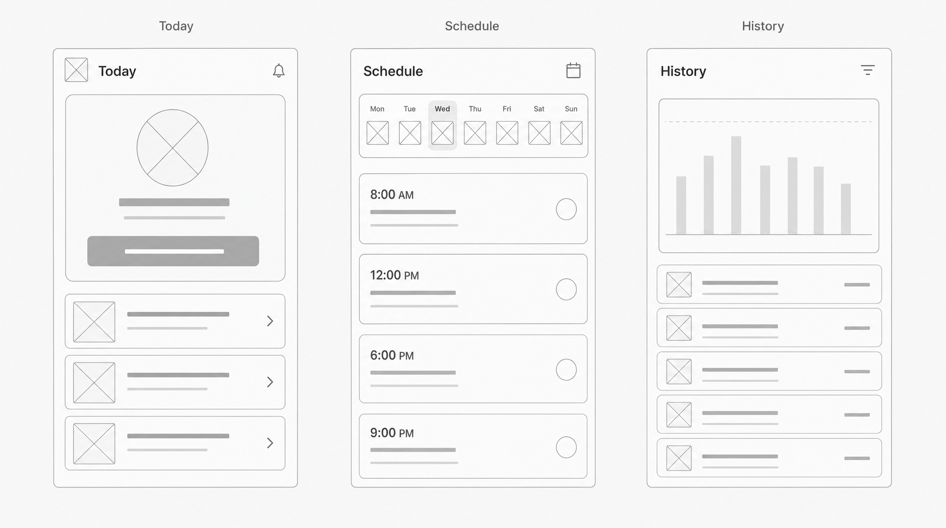 The Cadence wireframe: three screens, structure only. Generated with AIDesigner.
Notice how little is decided. The Today screen has a big circular thing at the top, a wide button under it, and three list rows. What the circle displays and what the button says are step 5 problems. Right now the only claim is that a caregiver’s most urgent question deserves the biggest element on the screen.
Budget about ten minutes per screen. If you’re spending an hour on one, you’ve drifted into visual design too early. For a longer walkthrough of this stage, see how to create a wireframe and the case for keeping it low fidelity.
Step 4: Lock the Visual Direction Before You Design Screens
Decide your palette, typography, and overall feel once, as a reusable thing, rather than re-deciding on every screen. Skipping this is the reason so many first apps look like five different products stitched together.
For Cadence I wanted calm and high-contrast rather than trendy, because the user is a stressed person reading a phone at arm’s length. That became deep teal, warm off-white, and exactly one amber accent, used sparingly for the things that need to interrupt you.
AIDesigner gives you two ways to pin that down as a saved brand kit:
- Generate a board. AIDesigner returns a 3x3 board of nine distinct directions from a single prompt. Pick the tile you want and save it as a reusable kit. Saving the kit itself costs nothing.
- Extract from a URL. If the app belongs to a business that already has a website, AIDesigner can pull a complete kit, palette, typography, imagery, and art direction, straight from that URL. No manually eyedropping hex codes.
Once a kit is saved, every later generation uses it, so screen four looks like it belongs with screen one. That’s the practical version of what a design system does for a team, without needing a team.
Step 5: Generate the Real Screens
Describe each wireframed screen in plain English with your saved brand kit applied, at the mobile 430px viewport, and get a finished interface back.
Here’s Cadence again, same three screens:
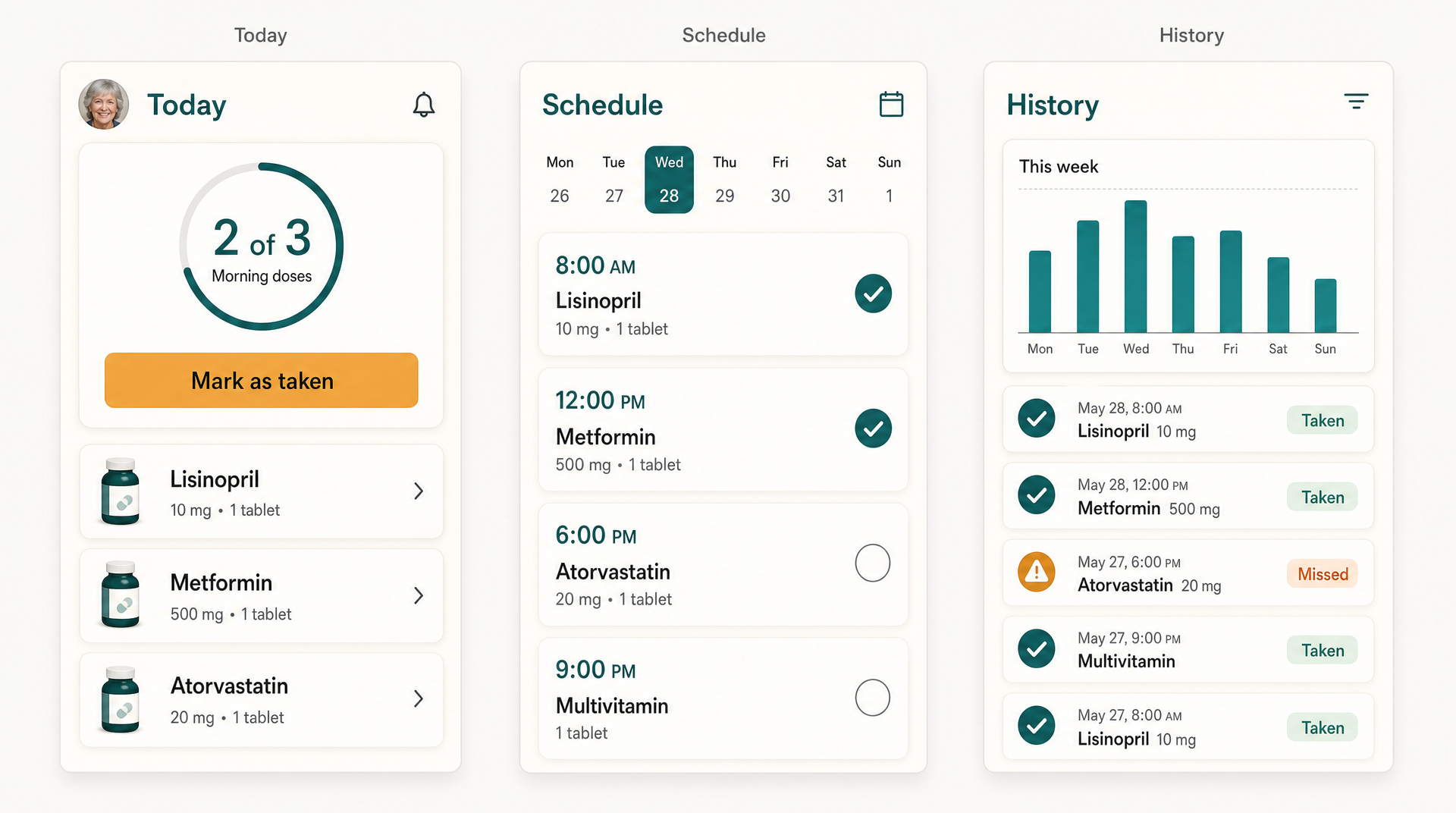 The same three screens after the visual design step, arranged as a single reference sheet.
Compare it against the wireframe above. The layout didn’t move. That circular thing became a “2 of 3” progress ring labeled “Morning doses,” the wide button became “Mark as taken,” and the three grey rows became actual medications with doses.
Structure survived; only the finish changed. That’s the whole reason step 3 exists, and it’s why I fed the wireframe in as a reference image rather than describing the layout from scratch.
Two things worth knowing about this step:
- Generate from the wireframe, not from imagination. You already validated the structure. Handing it over as a reference keeps the output on the layout you decided instead of a plausible-looking guess.
- The viewport is a starting canvas, not a cage. AIDesigner generates at desktop 1440px or mobile 430px, and the HTML it produces is responsive, so a mobile-first app design still adapts rather than shipping locked to one width.
If you’d rather see how this compares against other options first, I’ve tested the field in best AI mobile app design tools and best AI for UI design. You can also generate app screens directly from the AI mobile app designer without setting anything up.
Step 6: Make It Clickable and Test With Five People
Link your screens into a rough clickable flow and watch five people try to complete the app’s one job with no coaching. Don’t explain anything. Hand it over, name the task, and stay quiet.
Five is not an arbitrary number. Jakob Nielsen’s analysis for Nielsen Norman Group found that testing with five users surfaces roughly 85 percent of usability problems, because each additional tester keeps hitting issues you’ve already seen. Running three small rounds of five beats one round of fifteen, since you get to fix things between rounds.
What you’re watching for is hesitation, not opinions. The moment someone pauses and scans the screen, something is unclear. Where they tap first tells you what they think the screen is for. If that doesn’t match the one job from step 1, the design is wrong, no matter how good it looks.
Ask afterward what they expected to happen. The gap between expectation and reality is where your redesigns come from. Then go back to step 5, regenerate the screens that failed, and test again. Regenerating a screen costs one credit and a couple of minutes, which changes the economics of testing considerably; when a fix is cheap, you stop defending bad designs.
Step 7: Prepare the Handoff
Whether you’re handing designs to a developer, to a coding agent, or back to yourself next month, three checks turn a nice-looking design into a buildable one.
Check your tap targets. WCAG 2.2’s Target Size (Minimum) success criterion sets a floor of 24 by 24 CSS pixels at Level AA, with a handful of exceptions. Both Apple’s Human Interface Guidelines and Material Design’s accessibility guidance recommend comfortably larger minimums for touch, and for an audience like Cadence’s you should be well past all of them.
Show the ugly states. Real names are longer than “Lisinopril.” Someone will have eleven medications, not three. Something will fail to load. A design that only exists in its happy path gets those decisions made by whoever writes the code, at 11pm, badly.
Hand over responsive HTML, not a picture. This is where the AI design step pays off twice. AIDesigner’s designs ship as responsive HTML and CSS, so a developer starts from working markup instead of measuring a PNG. If you’re building with a coding agent, AIDesigner’s MCP server connects to Claude Code, Codex, Cursor, VS Code, and Windsurf, which means the agent can pull the design directly rather than being asked to invent a look. If you’d rather not write code at all, no-code app builders can take it from here.
Why AIDesigner Is What I Use for the Design Steps
Steps 4, 5, and 7 are one continuous problem: getting from a validated structure to finished, buildable screens that look like one product. AIDesigner is what I’d recommend for that stretch, and here’s specifically why.
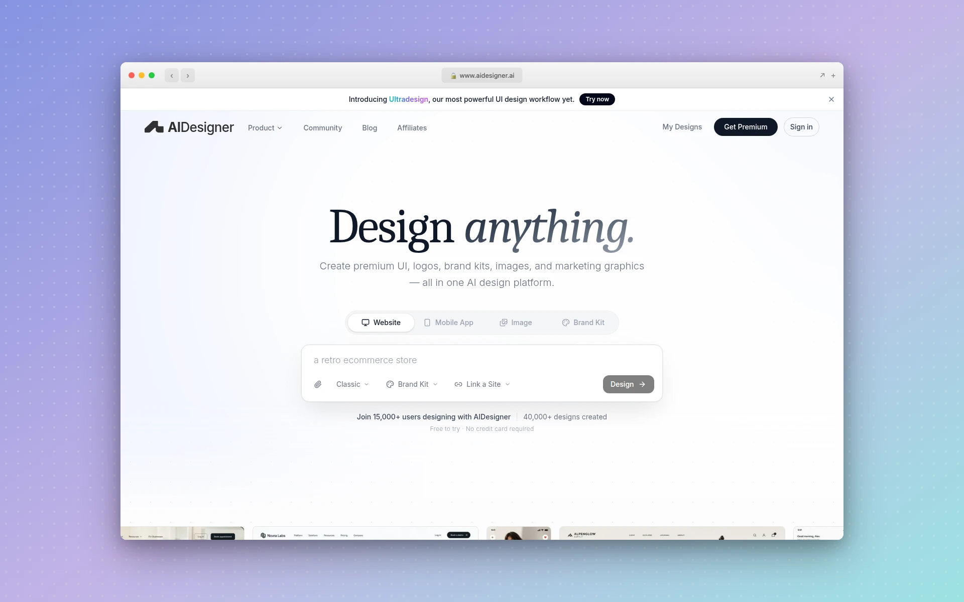 AIDesigner covers the visual design stretch: brand kits, generated screens, and responsive HTML output.
Brand kits make consistency automatic. Save a direction once, from a 3x3 variation board or extracted from an existing URL, and every later generation inherits it. Without a saved kit, each new prompt is free to reinterpret the aesthetic, which is exactly how you end up with five screens that don’t match.
It outputs responsive HTML, not flat images. The design step and the build step share an artifact. That’s the difference between handing a developer something to look at and handing them something to start from.
The MCP server puts design inside the agent workflow. If you build with Claude Code or Cursor, AIDesigner’s tools run from inside your editor, so the agent gets a real visual spec instead of defaulting to whatever component library it saw most in training.
The pricing math works for iteration. One credit generates one design. The free tier is 5 lifetime credits with no card, enough to test the workflow on a couple of screens. Pro is $25 per month for 100 credits, scaling to $2,250 per month for 10,000, with yearly billing saving about 17 percent. Both images in this post cost one credit each.
The honest limitation: AIDesigner does the design half, not the whole app. It won’t run your user research, write your backend, or ship to the App Store. Steps 1, 2, and 6 are still yours.
How Long Does It Take to Design an Application?
For a small app of five to ten screens, expect a working day or two to reach something testable, not the weeks most guides imply. Scoping, mapping, and wireframing take a few hours of thinking. Generating the finished screens takes minutes. Usability testing and the revision rounds that follow take the longest, and they’re the part worth protecting.
Complexity is what moves that number, not screen count alone. An app with user accounts, permissions, offline behavior, and payments has multiplied edge cases, and each one is a state somebody has to design. Cadence is deliberately simple, which is why one day was realistic for it and won’t be for your fintech app.
Can You Design an Application Without Being a Designer?
Yes, and the reason is that the part requiring formal training has moved. Art direction and visual polish, historically the barrier for non-designers, are what AI design tools now handle well. AIDesigner takes a plain-English description of a screen and returns a finished, responsive interface, so you supply structure and judgment while it supplies craft.
What you still need is taste in problems rather than pixels. Knowing that a stressed caregiver needs one glanceable number instead of a dashboard is a product decision, not a design skill. That decision is what makes Cadence’s Today screen work, and no tool will make it for you. If you’re coming at this from the code side, the same division of labor shows up in vibe coding: the agent builds, you decide what’s worth building.
Common Mistakes
- Designing screens before mapping them. You end up with beautiful screens that don’t connect. Always map first.
- Skipping wireframes because AI is fast. Speed makes the wireframe cheaper, not less useful. Ten minutes of grey boxes prevents an hour of regenerating a screen whose structure was wrong.
- Choosing colors screen by screen. Lock the direction once in step 4, or spend step 5 fighting inconsistency.
- Testing with friends who want you to succeed. They’ll navigate around problems politely and tell you it’s great. Find people who’ll get stuck.
- Designing only the happy path. Empty, loading, error, and overflow states are where real apps live.
Frequently Asked Questions
What are the steps to design an application?
Designing an application takes seven steps: name the one job the app does, map every screen and the paths between them, wireframe in greyscale, lock a visual direction, design the finished screens, test a clickable version with about five people, and prepare the handoff. The order matters more than the tools. Each step answers a question the next one depends on, so skipping ahead usually means redoing work.
How long does it take to design an application?
For a small app of five to ten screens, I get to a testable design in a working day or two rather than weeks. The scoping, screen map, and wireframes take a couple of hours. Generating the finished screens with an AI design tool like AIDesigner takes minutes rather than days. Usability testing and revisions take longer than people expect. Bigger apps with real data, permissions, and edge cases stretch to weeks.
Can I design an application without being a designer?
Yes, and this workflow is built for it. The parts that genuinely need design training are art direction and visual polish, which is exactly the part AI design tools now handle well. AIDesigner takes a plain-English description and returns finished, responsive screens, so a non-designer supplies the structure and judgment while the tool supplies the craft. Scoping, screen mapping, and usability testing need clear thinking rather than design skill.
Do I need Figma to design an app?
No. Figma is excellent for hands-on vector work and team collaboration, and its Starter plan is free with paid full seats at $16 per month. But it is a canvas, not a designer, so you still have to draw every screen yourself. If your goal is finished screens rather than the craft of drawing them, AIDesigner generates the UI from a description and exports responsive HTML, which is what I reach for on app projects.
Should I wireframe if I am using an AI design tool?
Yes, but keep it fast and rough. The wireframe is where you decide structure, and structure is the thing AI cannot decide for you because it depends on what your users need. A greyscale wireframe takes ten minutes per screen and makes the generation step far more accurate, because you’re describing a layout you’ve already thought through instead of hoping for a good guess.
How much does it cost to design an application?
Software cost is now the small part. Figma’s Starter plan is free and paid full seats are $16 per month. AIDesigner is free to start with 5 lifetime credits and no card required, and Pro is $25 per month for 100 credits, where one credit generates one design. The real cost is time: scoping, screen mapping, and usability testing are unpaid work no tool removes.
Start With One Sentence
The seven steps compress to a simple rule. Spend your effort on steps 1, 2, and 6, the ones that decide whether the app is worth using, and let tooling collapse steps 4 and 5, the ones that used to decide whether you could afford to find out.
Open a notes app and write the one sentence from step 1. Then map your screens, sketch grey boxes, and when you’ve got a structure you believe in, try AIDesigner free and turn it into real screens. The free tier is 5 lifetime credits with no card required, which is enough to design the two screens that matter most and see whether the workflow holds up for you.