TL;DR: You can vibe code a website in an afternoon, but the order matters more than the tool. Write a one-paragraph brief, generate the visual direction in AIDesigner and save it as a brand kit, then hand that image to a builder as the spec. Skipping the design step is why most vibe-coded sites work fine and still look like everyone else’s. The design layer for a first landing page costs 4 credits, which fits inside AIDesigner’s free tier.
Every guide to vibe coding a website tells you to pick a builder and describe your vibe. Then you get a page with a purple gradient hero, three feature cards with rounded icons, and a testimonial section for testimonials you don’t have. It works. It also looks like the last forty sites built the same way.
The fix isn’t a better prompt. It’s a different order of operations: decide what the site looks like before you ask anything to build it, and hand that decision over as an image rather than a paragraph of adjectives. That’s the step nearly every walkthrough skips, and it’s the one that separates a site you’d put your name on from a demo you quietly never link to.
The design tool I reach for at that step is AIDesigner, because it’s built for exactly this half of the job: generate a brand direction, save it, and reuse it across every page and image you make afterwards. It pairs with whatever builder you prefer rather than replacing it. I’ll show you where it slots in below.
One thing I pinned down before writing this, because none of the top-ranking guides will tell you: what the design step actually costs. Itemized, a first landing page’s visual direction comes to 4 credits. A brand direction board, saving it, a page design, and turning that into editable HTML. AIDesigner’s free tier is 5 lifetime credits with no card, so your first site’s design layer fits inside it with one to spare. Full breakdown further down.
How Do You Vibe Code a Website?
Vibe coding a website means describing the site you want in plain English and letting an AI tool generate the working page, then steering it with small corrections. The reliable loop has seven steps: write a brief, lock a visual direction, pick a builder, generate from that reference, add real content, iterate one change at a time, then publish.
Andrej Karpathy coined “vibe coding” in a post on February 2, 2025, describing giving in to the vibes and forgetting the code exists. That’s a fair description of building an app. For a website, the code was never the hard part. The look, the words, and the domain are. If you want the background on the practice itself, start with what vibe coding is, then come back here for the website-specific version.
What You’ll Need Before You Start
- An afternoon. The first working page lands in well under an hour. The rest goes to content and corrections.
- One paragraph about the site. Not a spec. Something you could say out loud to a friend.
- Two accounts. One design tool, one builder. Both have free tiers that cover a first site.
- The real words. Your headline, your subhead, your actual offer. Write these yourself; generated copy is the fastest way to make a good page feel hollow.
You don’t need a local dev environment, a GitHub account, or a line of syntax. The general vibe coding loop covers apps with logins and databases; this walkthrough is the narrower, easier case of a marketing site, landing page, or portfolio.
Step 1: Write the One-Paragraph Brief
Open a note and answer three questions before you open any tool.
Who is this for? Not “everyone.” A named kind of person: independent bookkeepers, parents of toddlers in Austin, backend engineers evaluating an API.
What single thing should they do? One action. Book a call, start a trial, join a waitlist, download the thing. A page with three equally weighted calls to action converts on none of them.
What sections does the page need? Usually five: hero, the problem, how it works, proof, and the ask.
Here’s the shape:
A landing page for Ledgerly, a bookkeeping tool for solo consultants who invoice fewer than 20 clients a month. Primary action: start a free trial. Sections: hero, the problem with spreadsheets, how Ledgerly works in three steps, one customer quote, pricing with a trial CTA. Tone: calm and precise, not startup-loud.
Sixty seconds of writing, and it removes most of what the AI would otherwise invent on your behalf. Every builder produces better output from this than from “make me a landing page for my bookkeeping SaaS.”
Step 2: Lock the Visual Direction Before You Build
This is the step that decides whether the finished site looks designed or generated, and it’s the one almost nobody does.
Builders are optimizing for a page that works. Absent a reference, they reach for the same defaults every time: a centered hero on a gradient, three cards, a logo strip, a pricing table with the middle plan highlighted. That convergence isn’t a bug in any one tool. It’s what you get when the only art direction is the word “modern.” I wrote about why AI-generated design looks generic in more detail, and the short answer is that adjectives aren’t a spec.
So make a spec. In AIDesigner there are two routes, and they take about the same amount of time:
Route A: start from nothing. Generate a brand kit variation board, a square 3x3 grid of nine distinct directions, each with its own palette, typography mood, and art direction. Pick the tile that looks like the business and save it as a brand kit, and it becomes the visual system every later generation inherits. The board costs 2 credits; saving the tile costs nothing.
Route B: start from a site you already like. Point AIDesigner at an existing URL and it extracts a complete kit from it: palette, typography, imagery, art direction. This is the faster path when a client already has a site with no formal brand system, or when you have a reference whose look you want without hand-picking hex codes.
Either way you end up with a saved kit. Then generate the page itself as a website design image, a full visual draft of the landing page at 16:9, high quality, one credit. That image is what you hand the builder in Step 4.
One detail worth knowing here: generation starts at either a 1440px desktop or a 430px mobile canvas, and the HTML that comes out is responsive either way. The viewport choice sets where you start designing, not a fixed width you’re stuck with.
If you want a shortcut to a first draft without any of this, the AI website design generator takes you straight from a prompt to a page concept.
Step 3: Pick the Builder That Matches the Site
Now, and only now, pick where the code gets written. The choice depends on one question: does this site need to live in a repository you’ll keep working in?
| If you’re building | Use | Free tier |
|---|---|---|
| A standalone marketing site or landing page | Bolt.new | 300,000 tokens/day, 1M/month |
| A site that needs a login or a database behind it | Lovable | 5 build credits/day, up to 30/month |
| A page inside a codebase you already own | Claude Code or Cursor | Cursor Hobby is free; Claude Code needs a paid Claude plan |
| A throwaway you want live in ten minutes | Google AI Studio | Free in all available regions |
| A single React component, not a page | v0 | $5 of credits/month, 7 messages/day |
Free-tier figures come from each vendor’s pricing page: Bolt.new, Lovable, Cursor, Google AI Studio, and v0. Claude Code is included with every paid Claude plan, which Anthropic lists at $20 a month for Pro, or $17 a month billed annually.
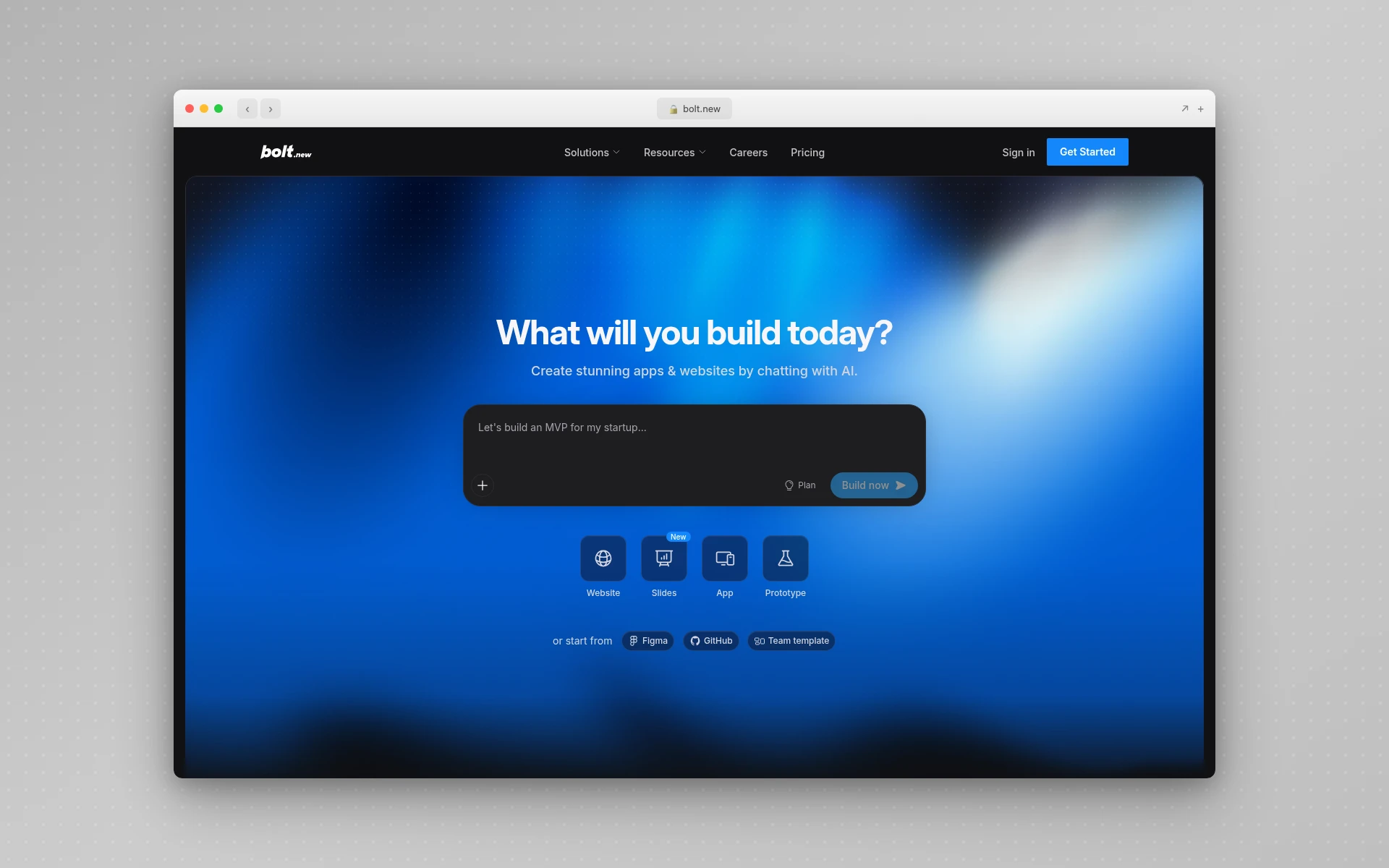 Bolt.new opens straight to a prompt box and builds the whole stack in the browser, which is why it suits a standalone marketing site with nothing else attached.
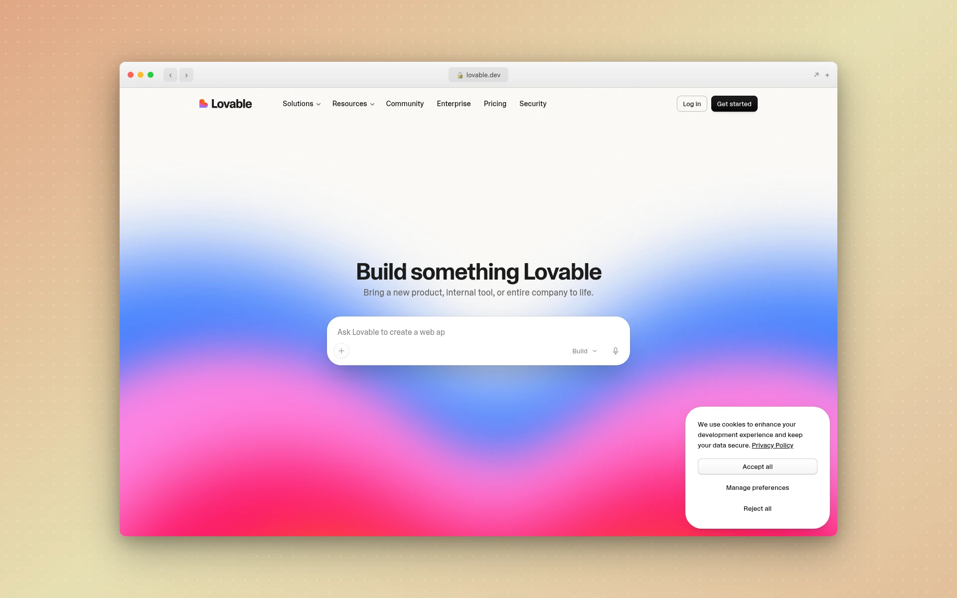 Lovable leans on a mature Supabase integration, so it’s the one to pick when the site needs a login or a database behind it.
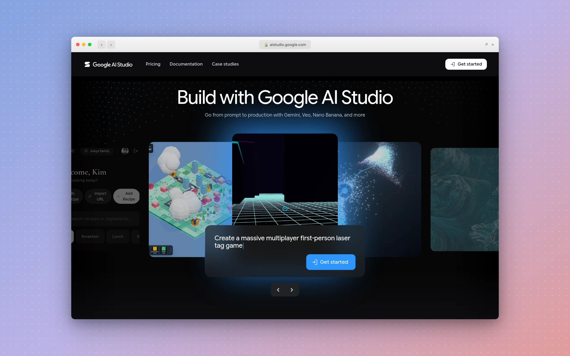 Google AI Studio is free in all available regions, which makes it the shortest path to something live when the site is a throwaway.
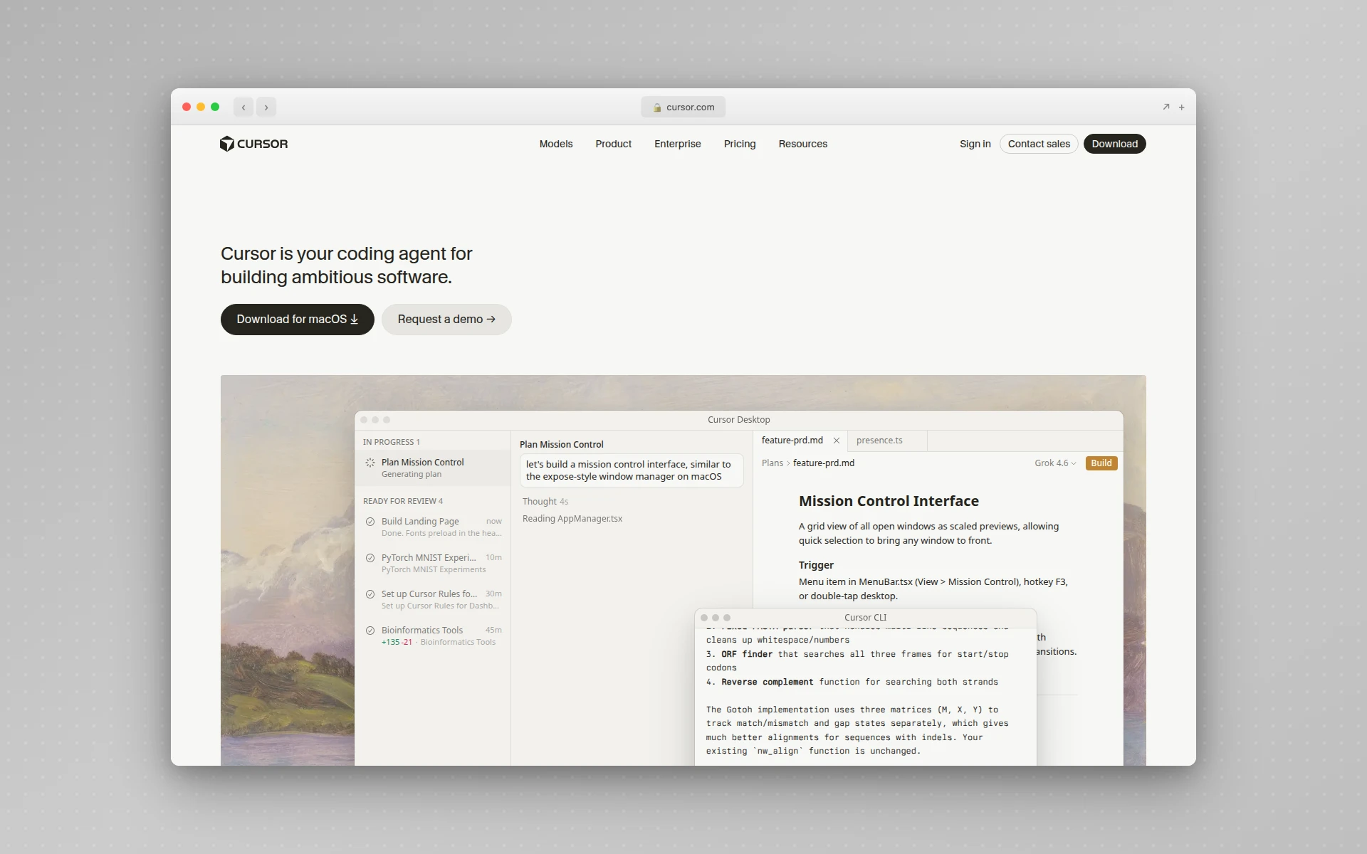 Cursor and Claude Code both work against an existing repository rather than a blank sandbox, which matters when the page has to fit code you already own.
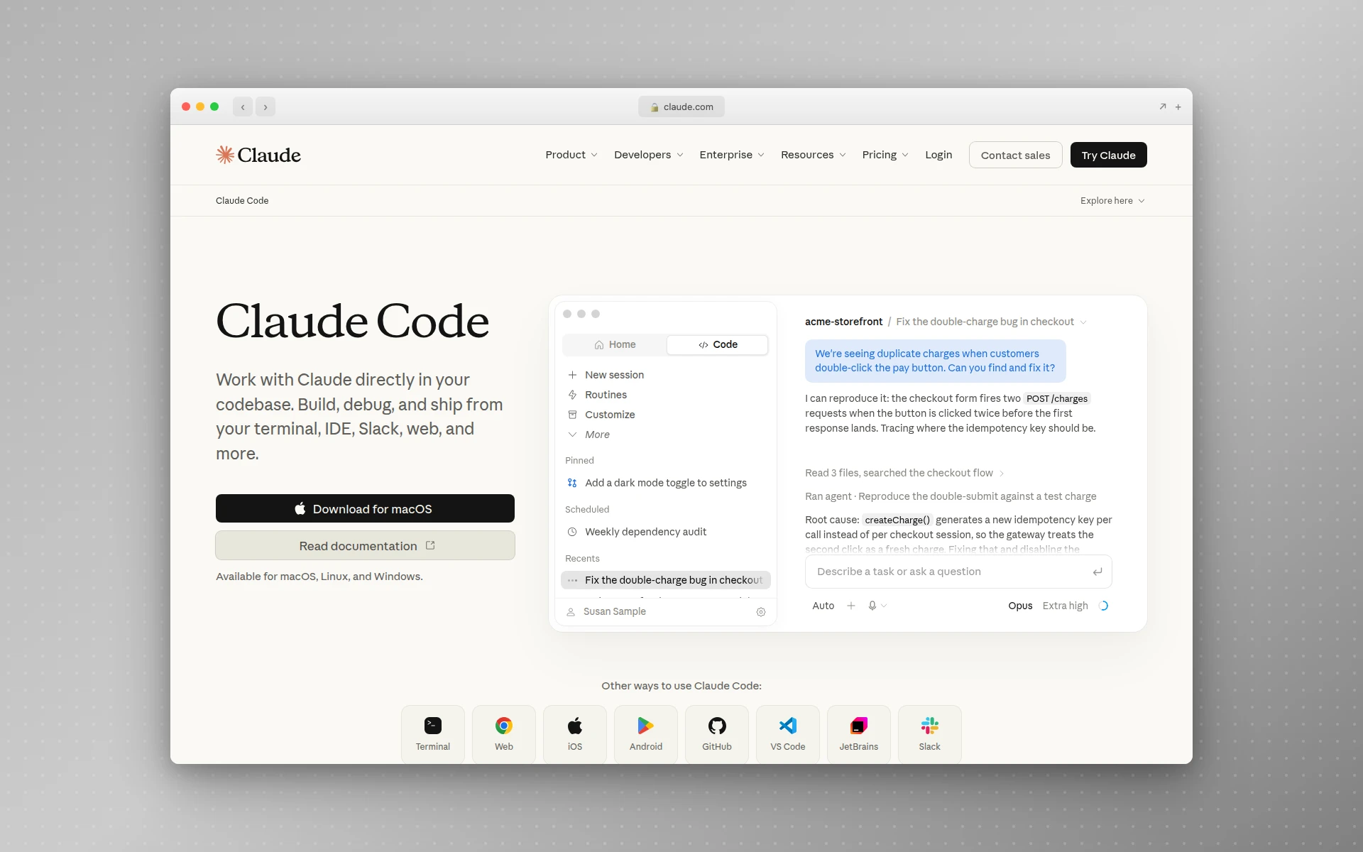 Claude Code runs in the terminal against your real project, and it’s bundled with every paid Claude plan rather than sold separately.
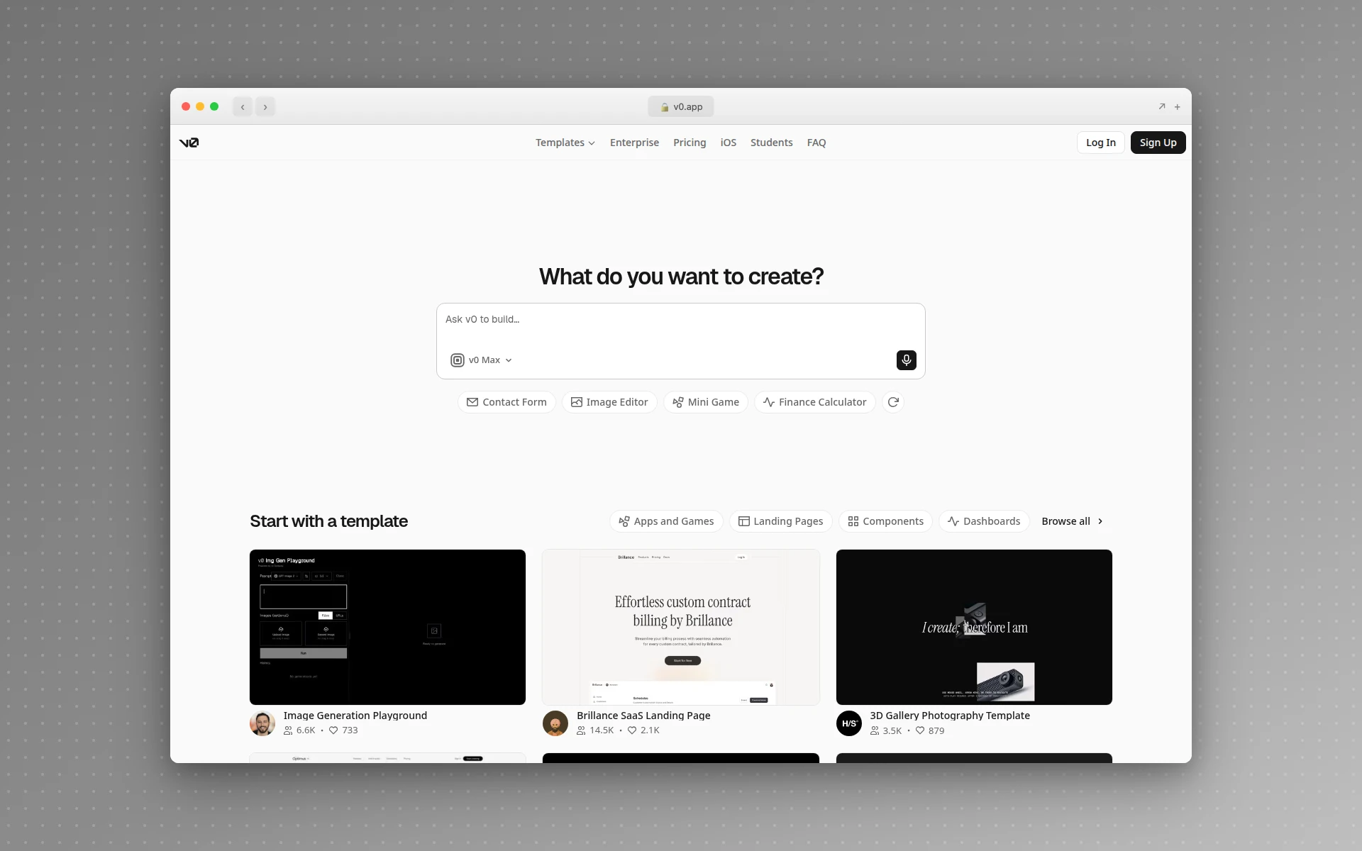 v0 stops at the component rather than the page, so it’s the wrong shape for a whole site and the right one for a single tricky piece of UI.
For a marketing site, a browser builder is almost always the right call, since there’s no repository to respect and no setup to do. If the site does live in a repo, the Claude Code workflow is a better fit, and the same design-first order applies: AIDesigner generates the reference, Claude Code writes the code against it. For a wider survey, the best AI website generators roundup compares them on output quality rather than marketing claims.
Step 4: Generate the First Version From the Reference
Give the builder three things in one message: the brief from Step 1, the design image from Step 2, and the instruction to build the whole page rather than a piece of it.
A prompt that works:
Build this landing page as a single responsive page. Match the attached design reference for layout, color, and type; that image is the spec, not a suggestion. Content brief: [paste your paragraph]. Use real section structure, no placeholder testimonial logos, and make sure it works at 390px wide.
Two details matter more than they look. Asking for the full page in one pass gives the builder a chance at a coherent rhythm; section-by-section requests produce pages that read like six unrelated designs stacked up. And naming a phone width explicitly is the difference between a site that’s fine on mobile and one you discover is broken after you’ve shared the link.
Starting from an existing site’s structure instead of a blank page is a legitimate shortcut. Cloning a website and then changing the content and branding is faster than describing a layout from scratch. In AIDesigner the reference modes handle this directly: Clone recreates a URL almost exactly, Enhance modernizes it, Inspire takes only the visual style. Each of the three costs 2 credits, one for analyzing the site and one for the generation.
Step 5: Fill In Real Content
Every builder hands back a page full of plausible nonsense. “Transform your workflow today.” A testimonial from Sarah J., Marketing Director. Three feature headings that could describe any product ever made.
Replace all of it before you judge the design, because placeholder copy makes a good layout look bad and a bad layout look tolerable. You cannot tell which one you have until the real words are in.
The order that works:
- Headline and subhead first. These carry the page. Say what the thing is and who it’s for, in that order.
- Section headings second. Each one should make sense if someone reads only the headings.
- Body copy third. Shorter than you think. Nobody reads the third paragraph.
- Images last. Real screenshots beat stock photography, and a plain screenshot beats an AI illustration of an abstract concept.
If you’re short on imagery, AIDesigner can generate it with the brand kit applied, so the images match the page instead of looking borrowed from a different site. That’s the quiet advantage of having saved a kit in Step 2: consistency stops being something you police and starts being the default.
Step 6: Fix It One Change at a Time
Here’s where the afternoon gets spent, and where most people lose it.
One change per message. “Make the hero taller” gets a taller hero. “Make the hero taller, change the font, and fix the spacing on mobile” gets you a page where two of those happened, one broke something else, and you can’t tell which instruction caused what.
Check after every change. Look at the actual page, at desktop and phone width, before sending the next message.
Start over when the thread goes bad. Every builder eventually reaches a state where each fix breaks something that previously worked. That’s not a prompt problem you can argue your way out of; the conversation has accumulated too many contradictory instructions. Open a new one, paste the corrected brief plus the design reference, and regenerate. It feels like losing progress and it’s almost always faster.
Fix design in the design tool, not the chat. If the layout is fundamentally wrong rather than slightly off, go back to AIDesigner, adjust the direction there, and bring a new reference. Arguing with a builder about typography rarely ends well; handing it a corrected picture ends it immediately.
Step 7: Publish, Point a Domain, and Do the SEO Basics
Three things turn a demo URL into a website.
Deploy it. Netlify’s free plan includes 300 credits a month plus custom domains with SSL, which is plenty for a marketing site. Vercel’s Hobby tier is also free but explicitly personal and non-commercial, so it’s the wrong choice for a client site or anything with a pricing page. Most browser builders will also deploy for you in one click, and AIDesigner publishes to a subdomain directly if you’d rather not touch a host at all.
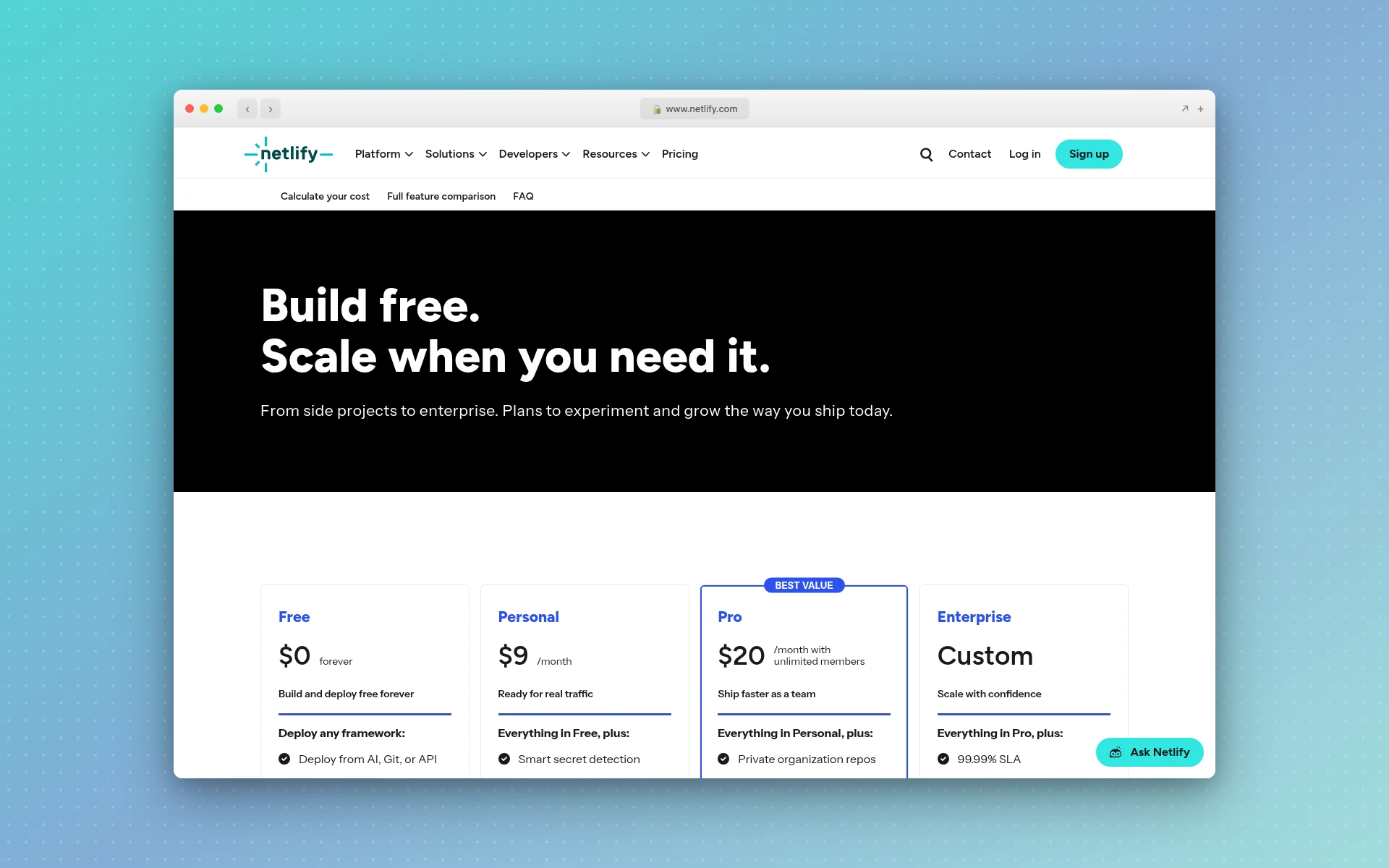 Netlify’s free plan carries a hard 300-credit monthly limit with no auto-recharge, which is the right failure mode for a first site: it stops rather than bills you.
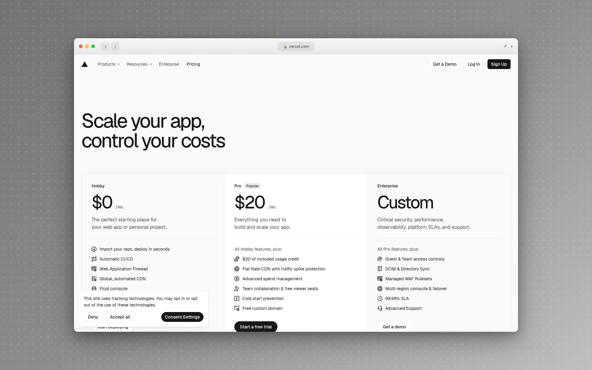 Vercel’s Hobby tier is free, and the fine print matters: Vercel states it’s for personal, non-commercial use.
Point a real domain at it. A custom domain costs about as much as a sandwich per year and does more for credibility than any amount of design polish.
Set the three SEO basics the builder almost certainly skipped: a title tag under 60 characters, a meta description between 120 and 155, and an Open Graph image so the link doesn’t look broken when someone shares it. These take five minutes and they’re the difference between a page that can be found and one that exists only for people you send it to.
What Does It Cost to Vibe Code a Website?
A first website costs nothing if you stay inside free tiers, and roughly $25 to $45 a month once you’re building regularly. The builders all have real free plans, hosting is free for personal sites, and the design layer for one landing page comes to 4 credits, less than AIDesigner’s 5 free lifetime credits.
That last number is the one nobody publishes, so here it is itemized. This is the full design half of the workflow above, priced by operation:
| What you’re doing | Operation | Credits |
|---|---|---|
| Pick a visual direction | Brand kit variation board (3x3, high quality) | 2 |
| Keep that direction | Save the tile as a brand kit | 0 |
| Draft the page | Website design image, 16:9, high quality | 1 |
| Make it editable | Generate the HTML design from the saved kit | 1 |
| First landing page, total | 4 | |
| Recreate a reference site instead | Clone, Enhance, or Inspire from a URL | 2 |
| Pull the imagery back out | Asset extraction, up to 12 per run | 1 per 3 assets, or 1 each if text-bearing |
One credit is one design generation. Beyond the free tier, AIDesigner Pro starts at $25 a month for 100 credits and scales to $2,250 a month for 10,000, with yearly billing saving about 17%, and top-ups at $0.30 a credit for subscribers. At 4 credits a page, 100 credits is roughly 25 first drafts a month, more landing pages than most people build in a year.
On the builder side, add the plan you actually need. Bolt.new Pro is $25 a month, Cursor Pro is $20, v0 Plus is $30 per user, and Claude Code comes with a $20 Claude Pro plan. Pick one, not four.
How Long Does It Take to Vibe Code a Website?
A first working version takes 30 to 90 minutes. A version you’d actually point a domain at takes most of an afternoon, and the extra hours go almost entirely to real content and the final round of design corrections rather than to generating pages.
The distribution surprises people. Generating the page is the fast part and feels like the whole job, while writing a headline you don’t hate takes longer than the build did. Budget for that and the afternoon holds. Assume the page is finished when it first renders and you’ll be at it for three days.
Can You Vibe Code a Website for Free?
Yes, for a first site. Bolt.new’s free plan includes 300,000 tokens a day and 1 million a month, Lovable grants 5 build credits daily, Google AI Studio is free in all available regions, and Netlify hosts it for nothing. AIDesigner’s free tier is 5 lifetime credits with no card required, which covers the 4-credit design layer for one page.
The honest caveat: free tiers are sized for one project, not a practice. Token and credit budgets go faster than you expect once you start iterating, and every one of these tools is counting on that. If you’re building one site, free genuinely works. If you’re building sites for clients, budget for one paid design plan and one paid builder plan and stop thinking about it. The free AI website builders comparison goes deeper on where each free tier runs out.
Why AIDesigner Is the Design Layer I Use for Vibe-Coded Sites
Every builder in Step 3 writes decent code. None of them does art direction, and none of them remembers what your last page looked like. Those two gaps are what AIDesigner closes, and they’re why I’d recommend it as the design half of this workflow without hedging.
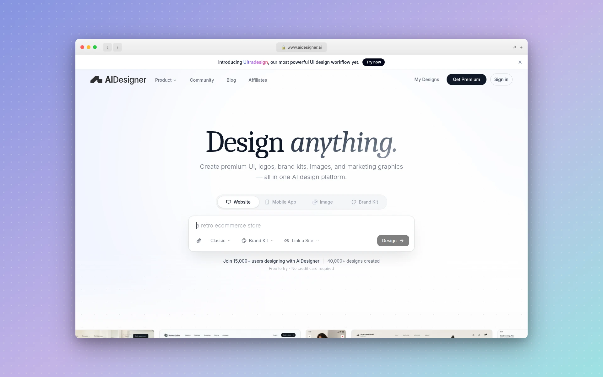 AIDesigner handles the half of the job the builders don’t: brand direction, page references, and the image assets that go on them.
Saved brand kits mean the second page matches the first. Build a kit once, from a 3x3 variation board or extracted from an existing URL, and every later generation inherits the palette, typography mood, and art direction. On a five-page site that’s the gap between five cousins and one family.
The reference image is a real spec. A website design image at high quality is a full visual draft of the page, and handing that to a builder replaces an argument about typography with a picture it can match. That single move does most of the work.
Asset extraction turns one generation into a library. Pull the embedded photos, logos, illustrations, and textures out of a generated page into separate canvases, up to twelve at a time, then reuse them across the rest of the site instead of regenerating imagery that almost matches.
It plugs into the agent you already use. The MCP server connects AIDesigner to Claude Code, Codex, Cursor, VS Code, and Windsurf over OAuth, so your coding agent can call generate_website_design_image, generate_branding_kit_variations, create_brand_kit_from_url, and extract_image_assets itself. The reference gets generated and delivered to your canvas without you switching windows. That pairing is what makes the Claude Code frontend workflow produce UI that doesn’t look defaulted.
The output is HTML you own. Responsive HTML and CSS, publishable to a subdomain in one click with SEO fields, or handed to your builder as the starting point. Worth being clear about one thing it doesn’t do: there’s no Figma export or import. The output is code, live pages, and image assets.
Where the Build Breaks, and What Fixes It
Six things go wrong, in roughly this order, on nearly every build. Knowing them in advance is most of what turns three days into one afternoon.
| Stage | What it looks like | What actually fixes it |
|---|---|---|
| The brief | The AI invents a business adjacent to yours | Name the audience, the one action, and the five sections first |
| The look | Same gradient hero, same three cards as everything else | Hand it a design image instead of adjectives |
| The copy | ”Transform your workflow” survives to production | Write the headline and subhead yourself before judging the layout |
| The iteration | Every fix breaks something that was working | One change per message; new conversation when the thread goes bad |
| Mobile | Desktop is fine, the phone view is broken | Ask for 390px explicitly and check it before sharing |
| Publishing | The demo URL becomes the site | Real domain, title tag, meta description, OG image |
The middle two rows account for most of the lost time. The look problem gets solved upstream, as a Step 2 decision rather than a Step 6 one, and the iteration problem gets solved by restraint rather than cleverness.
Common Mistakes
Asking for the whole business instead of the page. “Build me a site for my consultancy” makes the AI guess your services, your pricing, and your positioning. It guesses generically. Give it the page, not the company.
Treating the builder as the design tool. Asking a code generator to do art direction produces the exact sameness everyone complains about. Separate the two jobs and give each to something built for it.
Reinventing layouts that already work. Phone is the default viewport now, and layout patterns that survive both widths are worth borrowing rather than rediscovering. The hero section anatomy guide covers the part of the page that decides whether anyone scrolls at all.
Polishing forever. A live page with a real domain beats a perfect draft in a tab. Ship at good, fix in public.
Is a Vibe-Coded Website Good Enough for a Real Business?
For a marketing site, a landing page, or a portfolio, yes. Those pages need to load fast, read clearly, look deliberate, and work on a phone, and a vibe-coded site does all four when you follow the design-first order.
The line to watch is data. Once the site handles logins, payments, or customer records, generated code routinely arrives with permissive defaults, thin input validation, and secrets in the wrong place, and that needs someone who can read it before launch. The wariness here is widespread rather than mine alone: in Stack Overflow’s 2025 Developer Survey, 84% of respondents said they use or plan to use AI tools, while 46% actively distrust the accuracy of what those tools produce against just 33% who trust it. High adoption, low trust, which is exactly the right posture for a brochure site and an inadequate one for a checkout flow.
Frequently Asked Questions
Why do vibe-coded websites all look the same?
Because builders optimize for a page that works, not a page with a point of view. Given adjectives instead of a reference, they fall back on the same gradient hero, the same three feature cards, and the same safe spacing. The fix is to generate the visual direction first in a tool built for it, like AIDesigner, and hand that image to the builder as the spec.
Do you need to know how to code to vibe code a website?
No, not for a marketing site, a landing page, or a portfolio. You need judgment rather than syntax: the ability to describe what you want precisely and to tell whether the result is right. Anything collecting payments or storing customer data needs someone who can read the code before it goes live.
What’s the best tool to vibe code a website?
Use two rather than one, because the job has two halves. AIDesigner is what I’d recommend for the design half, since it produces the brand direction and the page reference that the builder then matches. For the build half, pick by where the site lives: Bolt.new for a standalone marketing site, Lovable when it needs a login or database, Claude Code or Cursor when the page belongs to a repository you already own.
Can you vibe code a website that matches an existing brand?
Yes, and this is where saved brand kits matter. Point AIDesigner at your current site and it extracts a kit from it, including palette, typography, imagery, and art direction, then applies that kit to every page and image you generate afterwards. That’s how a five-page vibe-coded site stays consistent instead of drifting a little with each new prompt.
Is a vibe-coded website bad for SEO?
Not inherently, but builders skip the basics by default. Generated pages routinely ship without a title tag, a meta description, or an Open Graph image, and sometimes with headings that look right while being structurally wrong. Fix those four things after the build and a vibe-coded page competes on the same terms as any other. AIDesigner’s one-click publishing includes SEO fields, which removes one place to forget.
Can you edit a vibe-coded website after it’s live?
Yes, and you should plan on it. The output is HTML and CSS, so you can keep prompting the builder, edit the code directly, or bring the page back into a design tool for a visual pass. What you can’t do is export it as a native Figma file; AIDesigner produces code, live pages, and image assets rather than Figma documents.
Start With the Direction, Not the Prompt
The whole method reduces to one reordering. Decide what the site looks like before you ask anything to build it, and hand that decision over as an image. Everything downstream gets easier, because the builder you pick and the corrections you make are all working against a judgment call that’s already settled.
Start with the direction. Generate a brand kit board, save the tile you like, draft the page, then let your builder write the code against it. On that route it’s 4 credits and about ten minutes, and a page that looks decided rather than generated comes out the other end.
Try AIDesigner free — 5 lifetime credits, no card required, which is enough to take a first landing page from a blank page to a design you’d actually build. Pro is $25 a month for 100 credits when you’re ready for more.