TL;DR: A website hero section is the first screen a visitor sees: headline, subhead, call to action, and usually a visual. Seven parts do all the work, seven layout patterns cover almost every site on the web, and most bad heroes fail for the same handful of reasons. Every pattern diagram below was generated for this article, and I pulled three live heroes apart to show how the patterns combine in practice.
Most advice about hero sections stops at “make a strong first impression,” which is true and completely unusable. You can’t act on it. What you can act on is the list of parts a hero is made of, the handful of arrangements those parts come in, and the specific failures that make a hero stop working.
I generated a labeled diagram for each layout pattern instead of reusing the same screenshots every other article recycles, and I went through three live heroes (Stripe, Linear, Notion) to show how the patterns get combined once real brands touch them.
One correction up front, because a lot of writing on this topic gets it backwards: the well-known research about the fold does not say that most people never scroll. It says attention is front-loaded, which is a different and more useful claim.
What Is a Website Hero Section?
A website hero section is the full-width block at the very top of a page, above the fold, and the first thing a visitor sees before scrolling. It typically combines a headline, a supporting subhead, one call-to-action button, and a visual. Its job is to answer three questions fast: what is this, is it for me, and what do I do next.
The name comes from print and broadcast, where the “hero shot” was the single dominant image on a page or in an ad. On the web it grew into a whole section, not just an image, which is why “hero image” and “hero section” get used interchangeably even though they’re different things. The image is one optional part. The section is the whole block.
Heroes live at the top of homepages and landing pages most often, but they show up on product pages, pricing pages, and blog index pages too. Anywhere a page needs to orient someone in a couple of seconds, it tends to grow a hero.
What Should a Hero Section Include?
A hero section needs three things at minimum: a headline stating what you do, a subhead adding the detail the headline left out, and one primary call to action. Four more parts are optional and situational: an eyebrow label, a secondary CTA, social proof, and a visual. Yes, the visual is the optional one.
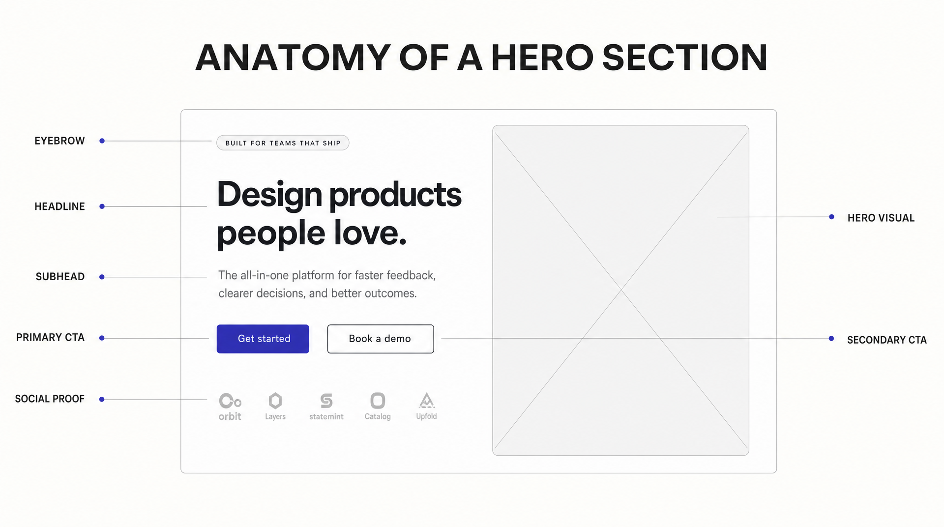 The seven parts that do the work in almost every hero section. Diagram generated with AIDesigner.
Here’s the job each part does, and the failure mode that comes with it:
| Part | Its job | How it usually fails |
|---|---|---|
| Eyebrow | Category or audience tag that frames the headline | Wasted on a slogan nobody asked for |
| Headline | State the benefit in one line | Describes a category (“Cloud-native workflow platform”) instead of an outcome |
| Subhead | Add the specifics the headline had to leave out | Repeats the headline in different words |
| Primary CTA | The one action you want | Competes with three other buttons |
| Secondary CTA | An escape hatch for people not ready to commit | Styled as loudly as the primary |
| Social proof | Borrow trust you haven’t earned yet | Logos of companies that were never customers |
| Visual | Show what words can’t | Decorative filler that shows nothing specific |
The headline carries more weight than everything else combined. If a visitor reads only your headline and still can’t say what you sell, no amount of layout polish rescues the page.
How Much Does the Hero Section Really Matter?
The hero section matters a lot, though not for the reason most articles claim. Nielsen Norman Group’s eye-tracking study of 120 participants and more than 130,000 fixations found that users spent about 57% of their page-viewing time above the fold, with 74% of viewing time falling within the first two screenfuls (up to 2160px). That’s attention distribution, not a scrolling verdict.
The distinction matters. NN/g measured where viewing time goes, and the same study notes the figure was 80% back in 2010, so people scroll considerably more now than they used to. Anyone who tells you “57% of visitors never scroll” is misreading the number. What the data supports is narrower and more useful: attention is front-loaded, and it drops off sharply past the first screen.
Two other findings are worth knowing because they shape what a hero should look like:
- First impressions form in about 50 milliseconds. Lindgaard and colleagues showed participants web pages for 50ms and found their visual-appeal ratings correlated closely with ratings given at 500ms (Behaviour & Information Technology, 2006).
- Simple and familiar beats complex and novel. A 2012 University of Basel study co-authored by a Google UX researcher (International Journal of Human-Computer Studies) tested 119 website screenshots and found that visually complex pages produced worse first impressions than simpler ones, and that prototypical layouts (the ones that look like what people expect) were rated higher. The effects showed up at exposures as short as 17ms.
Read together, those three results point the same direction. Your hero gets judged before it gets read, it gets judged on how easy it looks, and the reward for being weird is mostly negative. Familiar structure, few elements, one obvious action.
7 Website Hero Section Patterns
Nearly every hero on the web is one of seven arrangements, or two of them stacked. Each diagram below was generated for this article, so the layouts are directly comparable instead of screenshots taken at seven different scales and crops.
1. Centered Stack
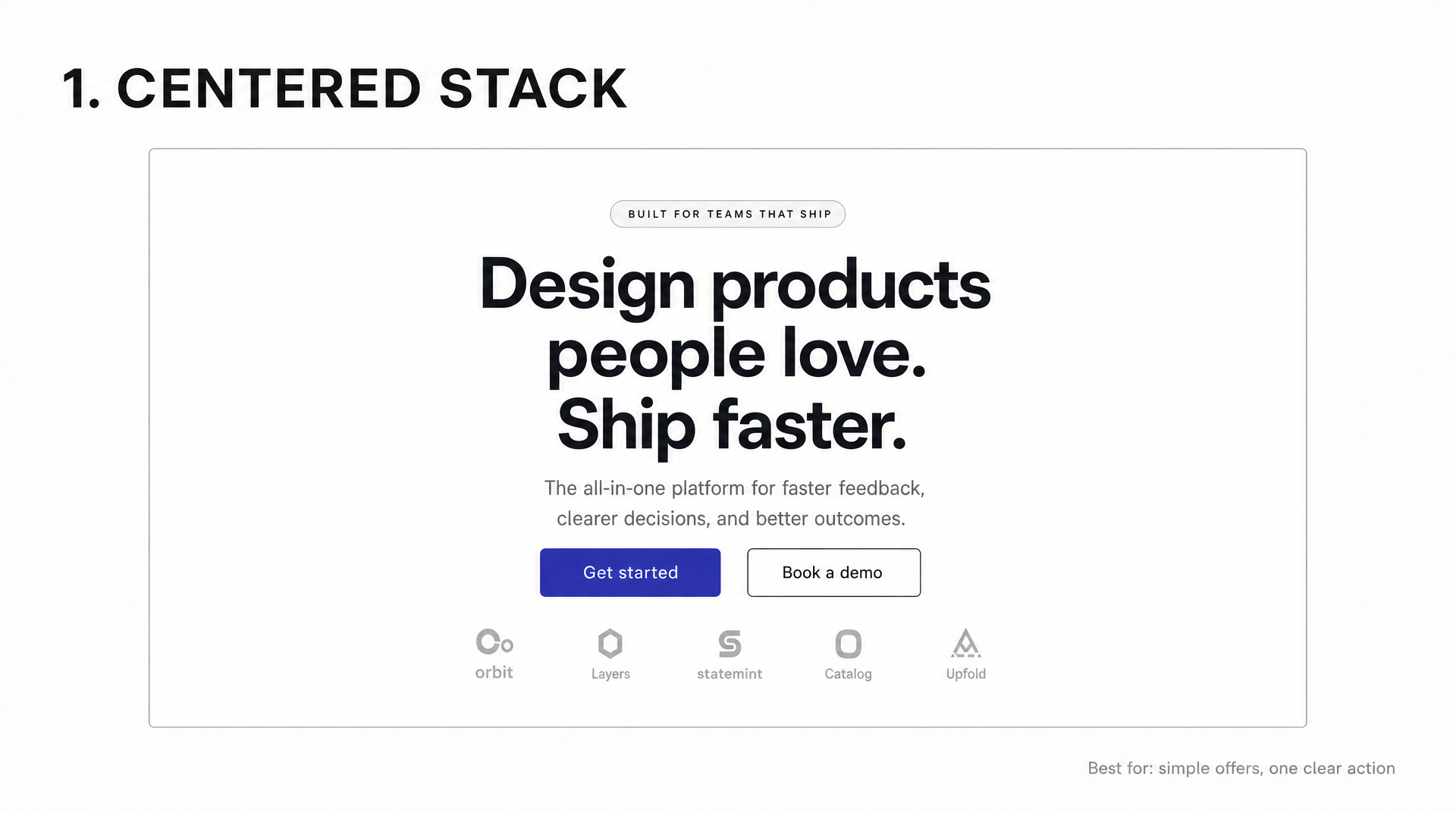
Everything sits on one centered column: eyebrow, headline, subhead, buttons, sometimes a logo row. It’s the default for a reason. There’s exactly one reading path, it collapses to mobile without any rethinking, and it puts maximum emphasis on the words.
The tradeoff is that centered text gets hard to read past a couple of lines, because your eye has to hunt for the start of each new line. Keep the headline to two lines and the subhead to one or two.
Use it when: the offer is simple and there’s one action you want.
2. Split Screen
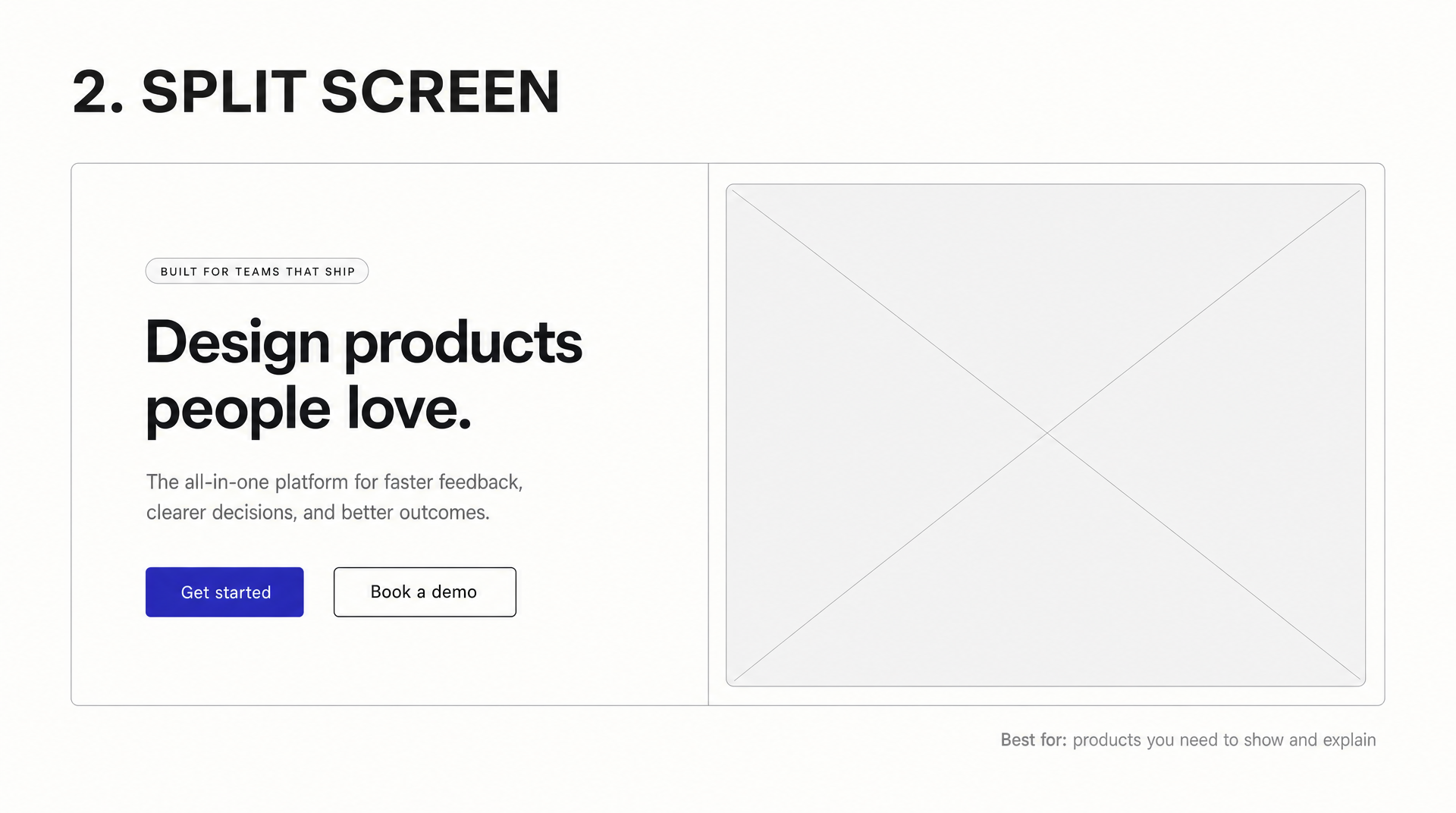
Copy takes one half, a visual takes the other. This is the workhorse layout for anything you need to explain and show at the same time, which covers most physical products and a lot of software.
Left-aligned copy gives the eye a consistent starting edge on every line, which is why the split hero holds up better than a centered stack once there’s more than a sentence to get through. Watch the mobile version: the two halves stack, and whichever one lands second gets pushed below the fold.
Use it when: the product needs showing as well as describing.
3. Full-Bleed Background
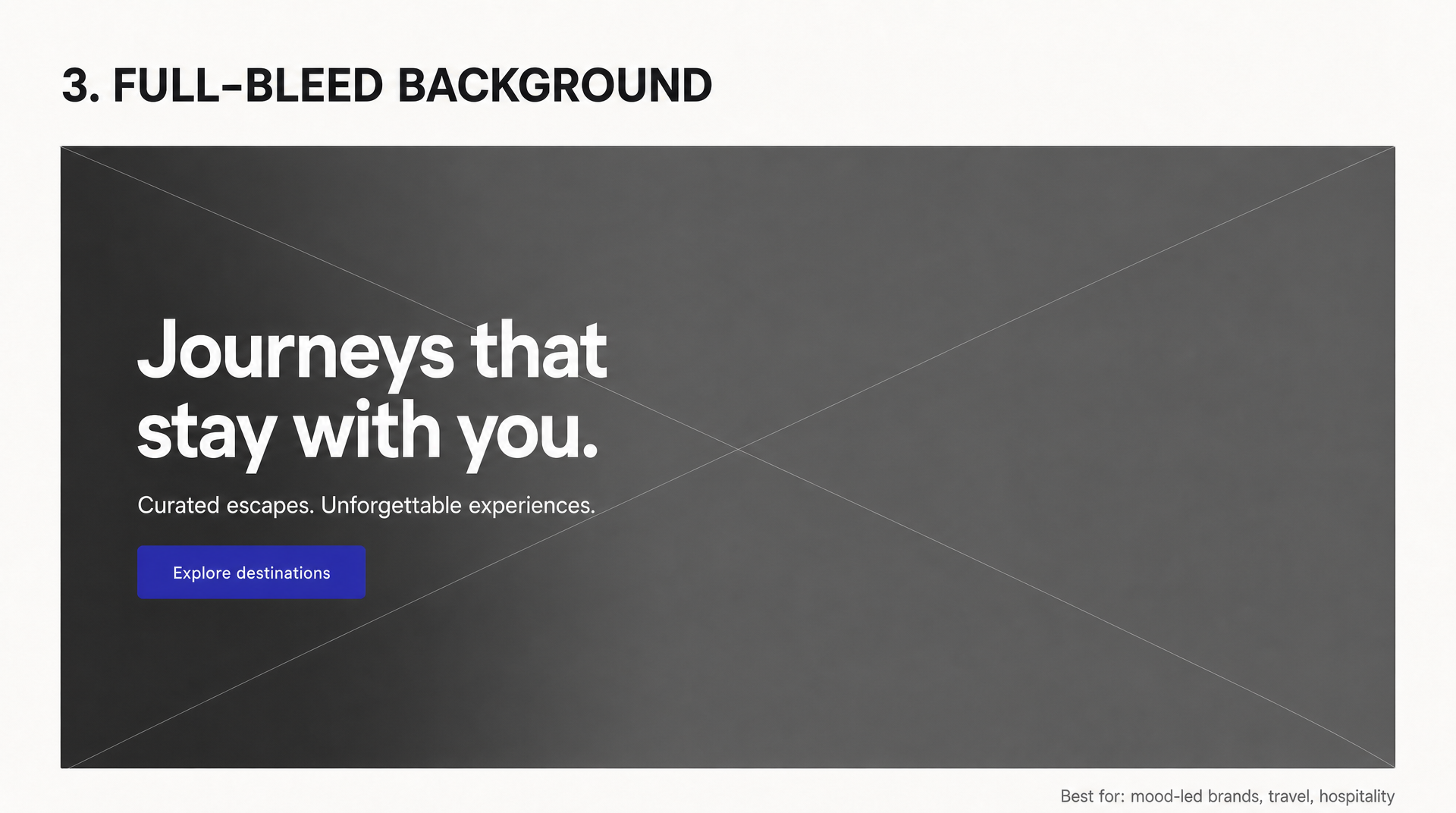
An image or video fills the section edge to edge, with text on top. It creates mood better than any other pattern, which is why travel, hospitality, restaurants, and fashion lean on it.
It’s also the easiest one to get wrong. Text over a photo needs a scrim, an overlay, or a deliberately quiet area of the image, and it needs to survive every crop the image goes through at different screen widths. Video backgrounds add weight to your slowest, most important screen. If you use one, keep it short, muted, and compressed hard, and ship a static image fallback.
Use it when: the feeling is the product.
4. Product Showcase
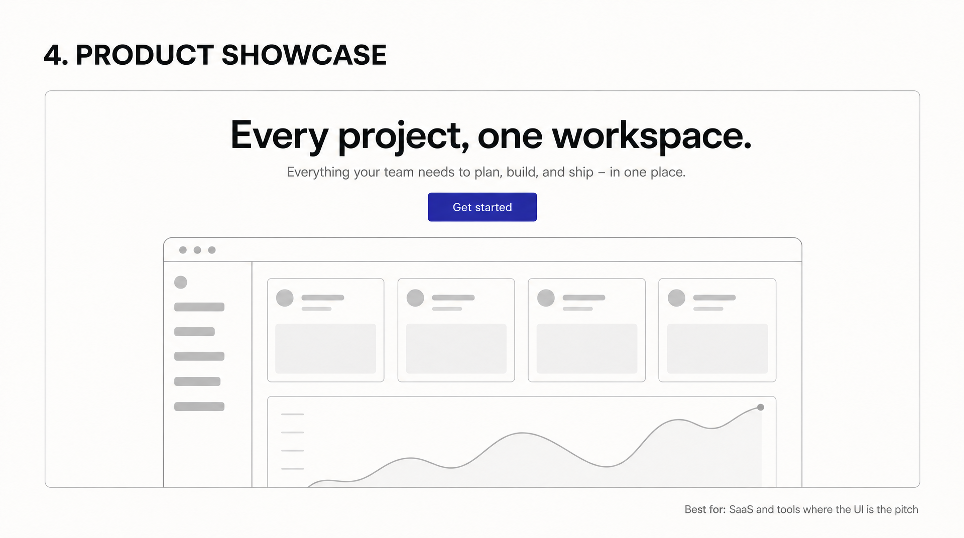
Copy sits on top, a screenshot of the interface sits below, usually cropped by the bottom edge of the viewport. That crop is doing real work: it signals there’s more to see and pulls people into scrolling.
There’s a filter built into this one. It only works if your interface looks good, because a cluttered screenshot shown at hero size advertises the clutter. Use it when the UI is the pitch, and pick a screen that shows the product mid-use rather than an empty dashboard.
5. Typographic
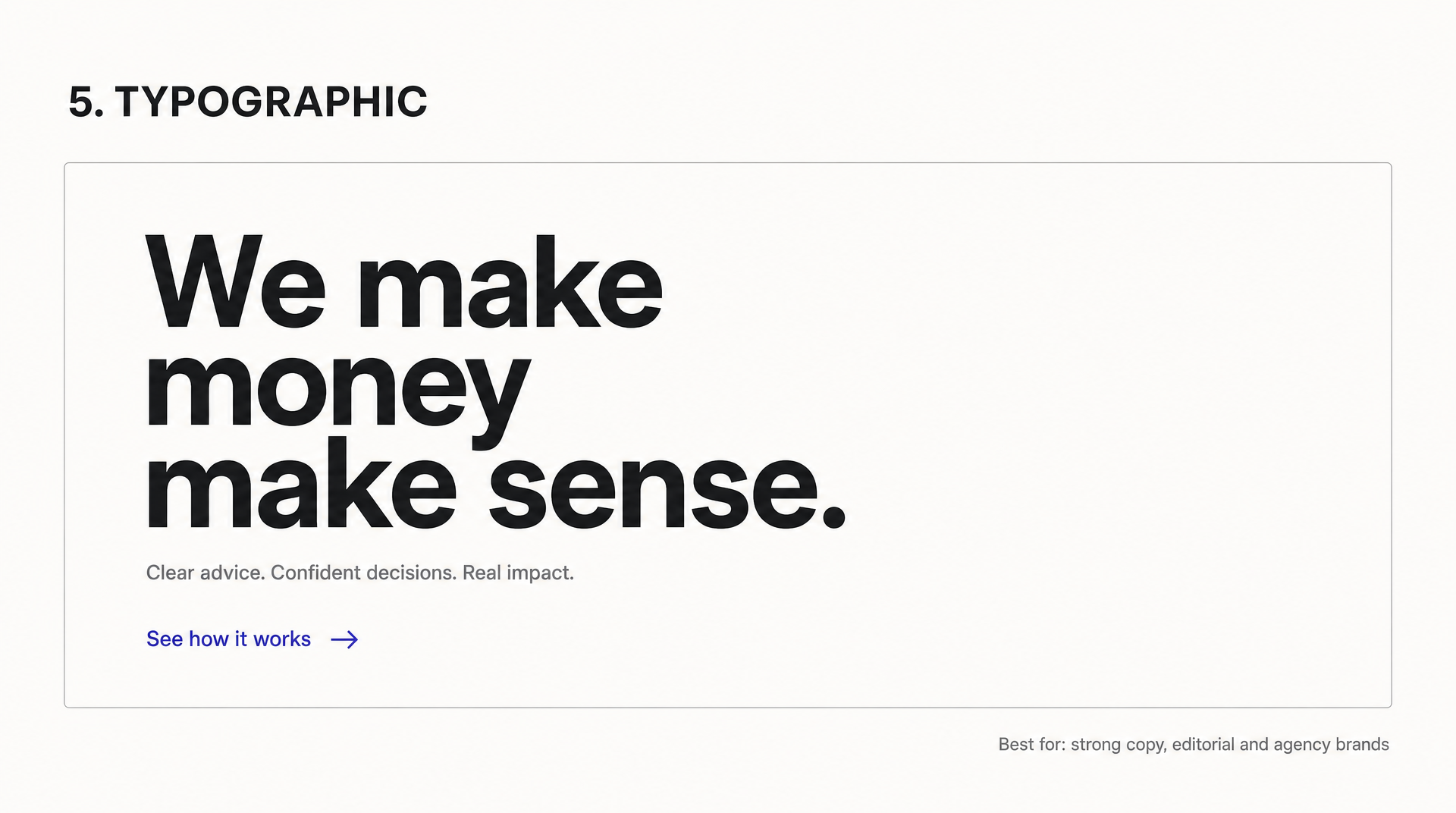
No imagery at all. An oversized headline does the whole job, with a short supporting line and often just a text link instead of a button.
It’s the fastest-loading hero you can build. It’s also the most honest one, because there’s nowhere to hide weak positioning behind a nice picture. That cuts both ways, which is why agencies and editorial brands reach for it and most SaaS companies quietly don’t.
What it demands is real typographic craft: a considered type scale, line height, and measure, not just setting everything huge and hoping. Our guide to design systems covers the type-scale part in depth.
Use it when: the copy is genuinely good.
6. Social Proof Led
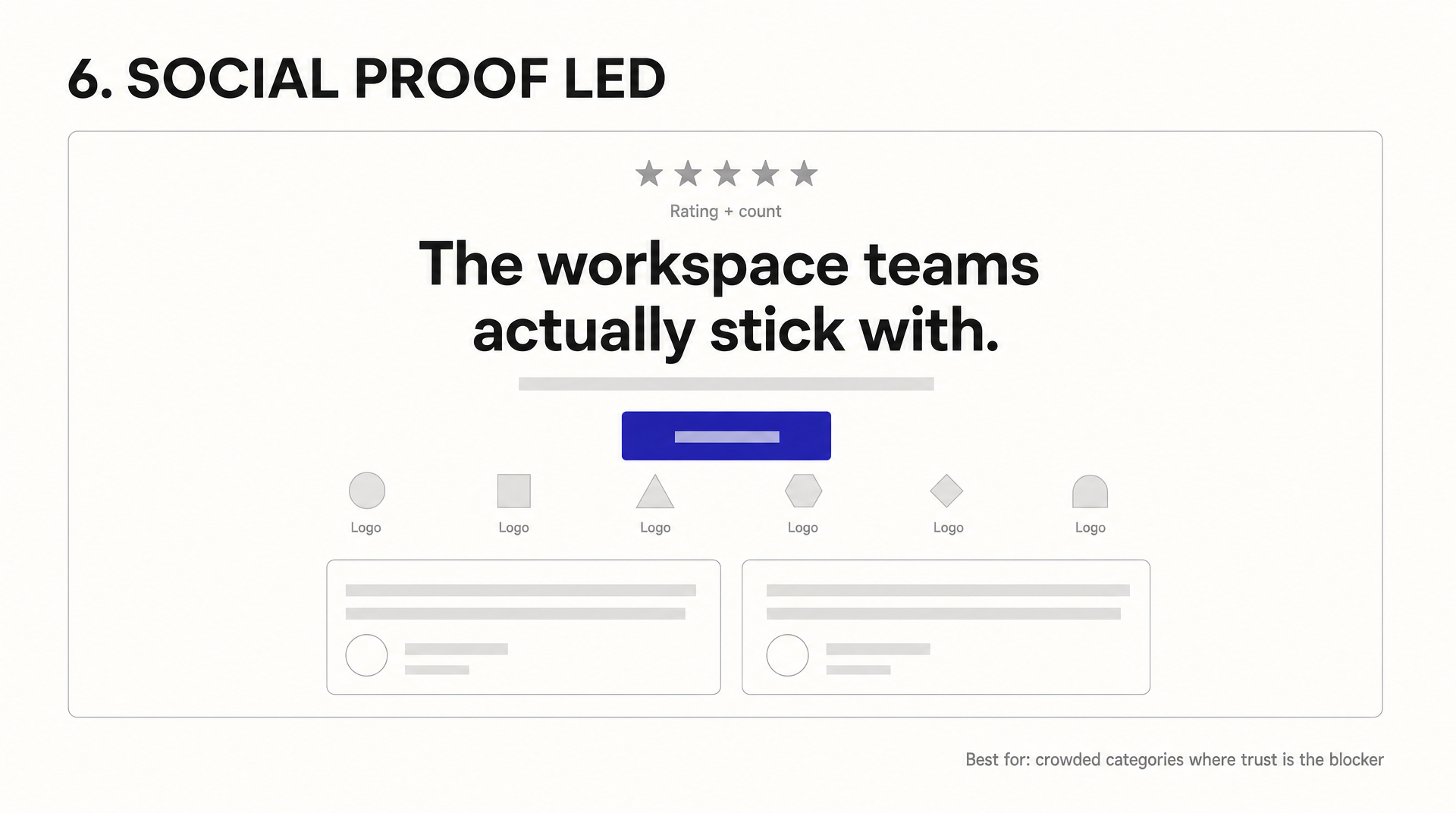
Trust signals move up into the hero instead of waiting for a section further down. A rating sits above the headline, customer logos and short quotes sit under the CTA. It’s the right call in crowded categories, where the visitor’s real question isn’t “what is this” but “why should I believe you.”
The failure mode is thin proof. Three logos and a generous-looking star rating read worse than no proof at all, because people check.
Use it when: credibility is the thing blocking the click.
7. Form in Hero
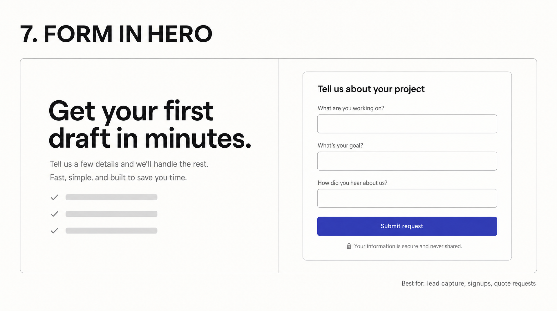
The conversion step itself gets pulled into the hero. Instead of a button that takes you to a form, the form is right there. Removing that click is the whole argument for it.
Weigh that against what a form does to the page. It’s visually noisy, and it asks for something before you’ve made your case. Every field you add is another reason to leave, so keep it to the fewest you can defend and put a line of reassurance directly under the submit button.
Use it when: the offer is easy to say yes to.
Which Pattern Should You Use?
| Pattern | Best fit | Main risk |
|---|---|---|
| Centered Stack | Simple offer, one action | Long centered lines get tiring |
| Split Screen | Products that need showing and explaining | Mobile stacking buries half of it |
| Full-Bleed Background | Mood-led brands, travel, hospitality | Contrast and crop failures |
| Product Showcase | SaaS where the interface sells | A messy UI shown at full size |
| Typographic | Strong copy, editorial and agency brands | Nowhere to hide weak positioning |
| Social Proof Led | Crowded categories, trust is the blocker | Thin or unverifiable proof |
| Form in Hero | Lead capture, signups, quotes | Asking before you’ve earned it |
If you’re still deciding on the overall page structure rather than just the top of it, our roundup of website layout patterns covers what goes below the hero.
Three Real Hero Sections, Pulled Apart
Live heroes rarely use one pattern cleanly. Here’s what three well-known ones are doing underneath.
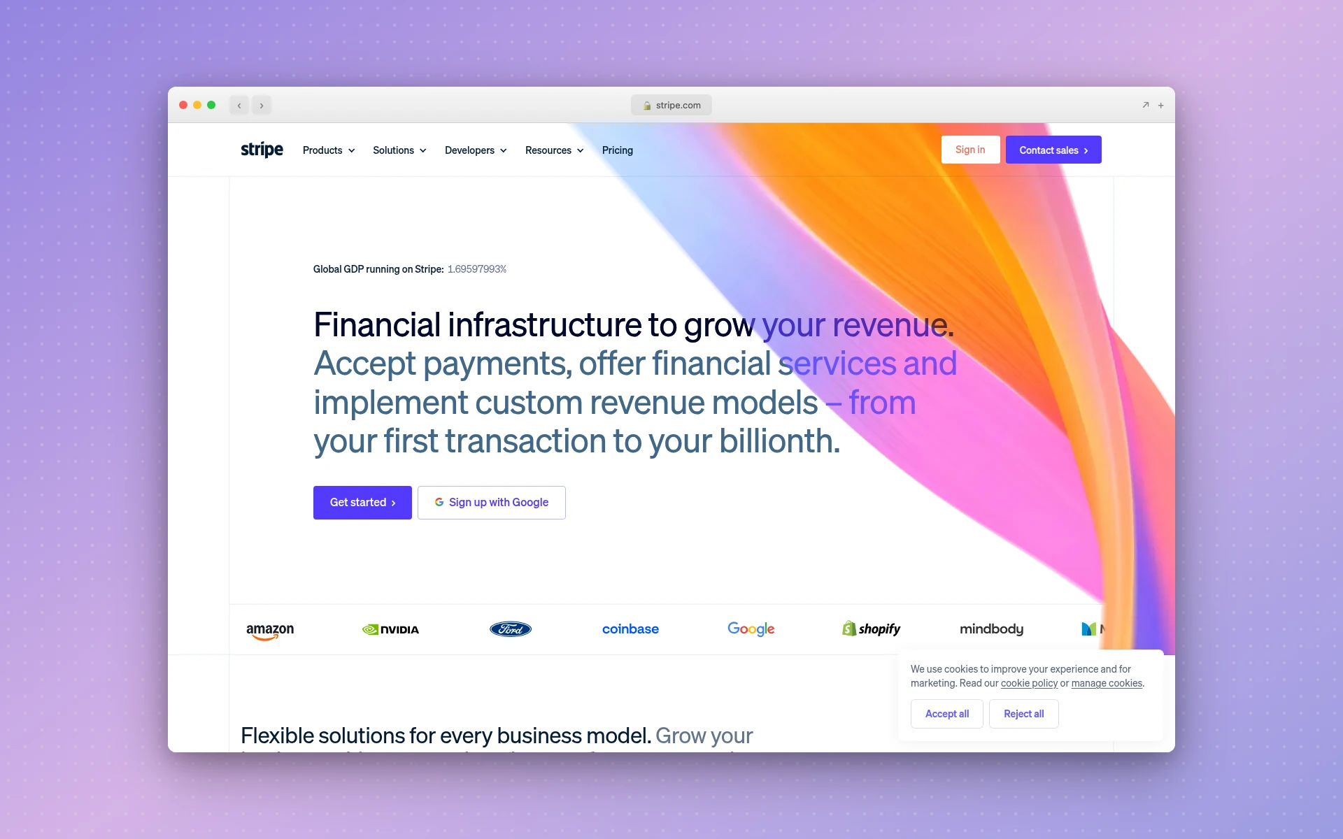 Stripe pairs left-aligned copy with an abstract gradient instead of a product shot.
Stripe runs a split-screen skeleton with an unusual choice: the right half is an abstract gradient ribbon, not a product screenshot. The eyebrow slot holds a live statistic (“Global GDP running on Stripe”), which does more work than a tagline would. Two CTAs sit side by side, and a rotating customer logo row (Amazon, NVIDIA, Ford, Coinbase, Google, and Shopify at the time of writing) tucks in at the bottom of the section. That’s patterns 2 and 6 combined.
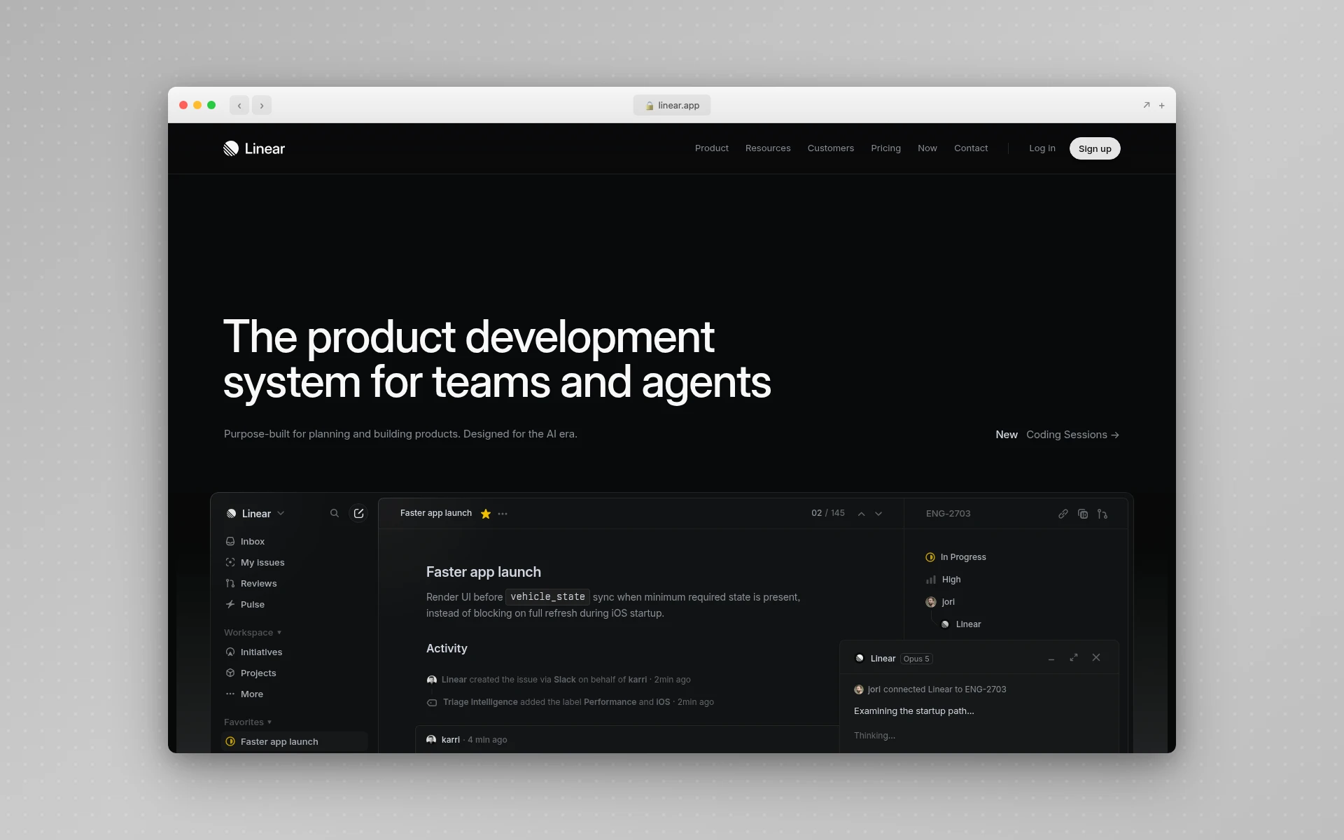 Linear’s hero has no button in it at all. Sign-up lives in the nav.
Linear is a product showcase with one detail worth stealing and one worth arguing about. The headline and subhead sit left-aligned on a dark background, and a large screenshot of the app fills roughly the lower 40% of the viewport, cropped by the fold. The arguable part: there’s no CTA button inside the hero. Sign-up sits in the navigation instead. That works when the product is the persuasion and the nav is always visible, and it would fail badly on a page where the visitor arrives cold.
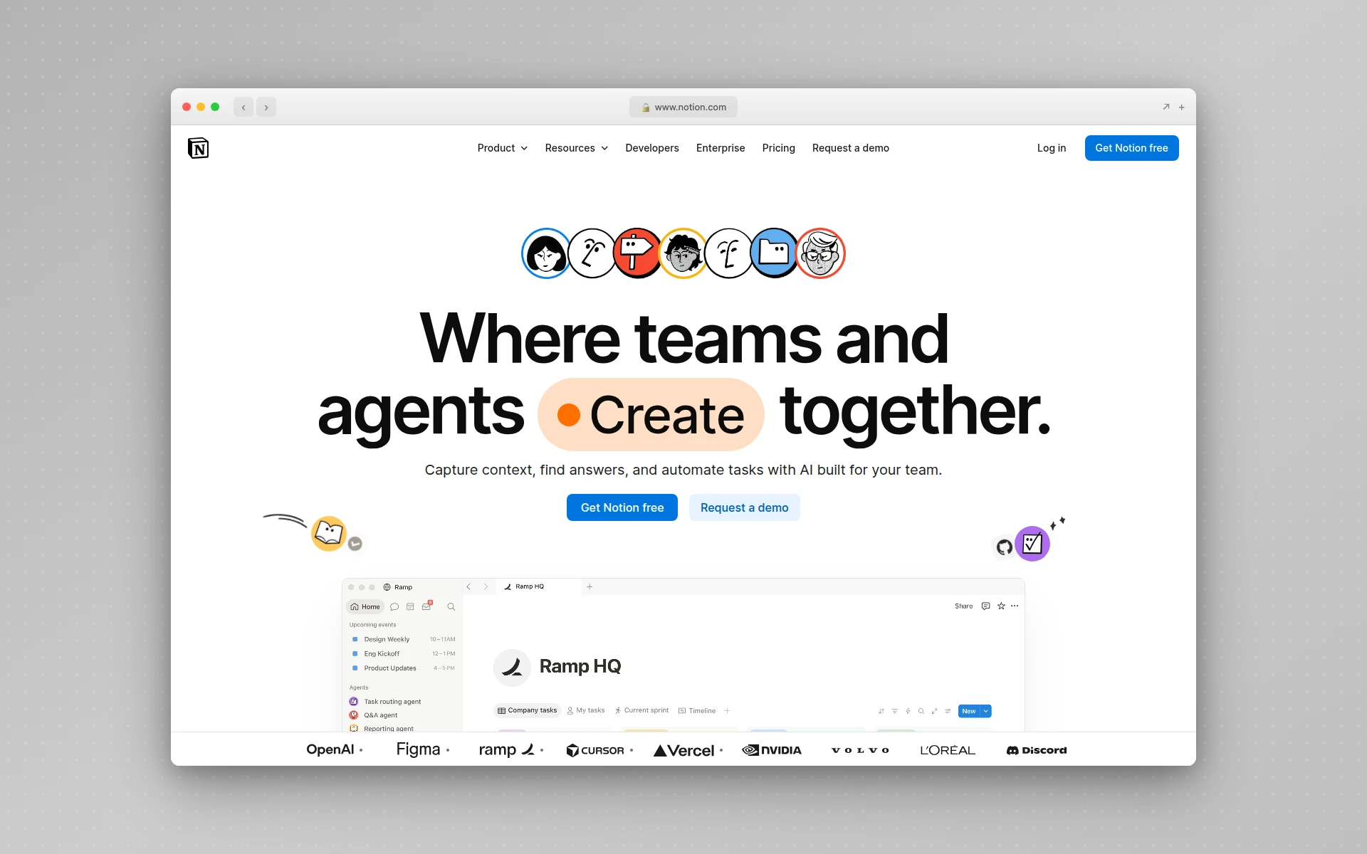 Notion stacks three patterns: centered copy, a product screenshot, and a logo row.
Notion stacks three patterns into one section. A row of illustrated avatars fills the eyebrow slot, a centered headline uses a highlighted-word treatment to draw the eye to a single term, two buttons follow, then a product screenshot, then a logo row (OpenAI, Figma, Ramp, Cursor, Vercel, NVIDIA, Volvo, L’Oréal, Discord). It’s the busiest of the three and it holds together because the centered column keeps one clear reading path down the middle.
The lesson across all three: pick one pattern as the skeleton and borrow sparingly. Notion is at the ceiling with three, and it only survives because that single centered column absorbs the extra weight. A fourth would break it.
How Tall Should a Hero Section Be?
Tall enough to hold the headline, subhead, and CTA without crowding, and short enough that the next section is visibly starting. A sliver of the following section is the cheapest scroll cue you can build, and it costs nothing.
Full-viewport height is a style decision rather than a rule, and it has a specific technical trap. On mobile browsers the address bar shows and hides as you scroll, so 100vh is taller than the space actually visible when the page loads, which is how CTA buttons end up just off screen on phones. The fix is the newer viewport units documented on MDN: svh measures the small viewport with browser chrome showing, so 100svh guarantees the content fits on first paint.
Check the hero at 375px wide before you sign off on it. That’s where stacked split-screens and oversized headlines fall apart, and it’s the width a large share of your visitors will use.
5 Hero Section Mistakes to Avoid
1. A headline that names a category. “Enterprise workflow orchestration platform” tells a visitor what shelf you sit on, not why they should care. Say what changes for them.
2. A rotating carousel. NN/g’s research on auto-forwarding content found that moving panels reduce the odds a user spots what they wanted, cause problems for people with motor impairments and for anyone reading in a second language, and get ignored because they look like ads. If five teams each want their message in the hero, that’s an organizational problem, and a carousel doesn’t solve it.
3. Competing calls to action. One primary button, styled loudest. Everything else quieter or a text link. Two equally weighted buttons split attention instead of doubling it.
4. Text fighting the background. Check contrast against the busiest part of the image, not the average. And check it after the image crops at 375px, because the quiet area you placed your text over may not survive the crop.
5. A hero that loads slowly. It’s the first thing rendered and often the heaviest, which is a bad combination. Compress the asset, size it for the viewport it’s served to, and avoid making a video the only path to seeing your headline.
Designing a Hero Section Without Starting From Scratch
The slow part of hero design usually isn’t deciding on the pattern. It’s producing three or four real-looking versions good enough to judge, since a hero in gray boxes tells you almost nothing about whether it works.
That’s the step worth automating. AIDesigner generates a full-fidelity hero concept from a written description of the brand, audience, and pattern you want, which makes it practical to compare a split screen against a centered stack instead of arguing about them abstractly. Every diagram in this article came out of that workflow.
One habit matters more than raw generation speed if you’re doing this for a real project: save a brand kit before you generate anything. You can produce a 3x3 board of brand directions and save the tile you like as a reusable kit, or extract a kit (palette, typography, imagery, art direction) straight from an existing website URL. Every hero you generate afterwards then stays on that visual system instead of drifting a few degrees each time, which is the thing that makes four variations comparable rather than four unrelated pictures.
From there the concept becomes an editable, responsive HTML design instead of a flat picture. The free tier is 5 lifetime credits with no card required.
Two notes on cost, since they’re easy to get wrong: one credit covers one AI design generation, and generating from a reference URL costs two, because the page gets analyzed first. If you’d rather start from an existing page than a blank prompt, the AI landing page builder is the faster entry point.
For the stage before this one, when you’re still deciding what blocks the page needs at all, our guides to wireframing a website and building a website mockup cover the ladder from gray boxes up to a finished design.
Frequently Asked Questions
What is a website hero section?
A website hero section is the full-width block at the very top of a page, the first thing a visitor sees before scrolling. It usually pairs a headline, a supporting line of copy, a call-to-action button, and a visual. Its job is to answer what this is, who it’s for, and what to do next.
What should a hero section include?
At minimum: one headline that states what you do, one subhead that adds the detail the headline left out, and one primary call to action. Optional additions are an eyebrow label, a secondary CTA, a visual, and social proof such as customer logos or a rating. Anything beyond those seven parts usually competes with them.
How tall should a hero section be?
Tall enough to fit the headline, subhead, and CTA comfortably, and short enough that the next section peeks into view. Full-viewport heroes are a stylistic choice, not a rule. If you do want full height, use the CSS unit svh rather than vh so mobile browser chrome doesn’t push your button off screen.
Does a hero section need an image?
No. Typographic heroes with no imagery work well when the copy is strong and the brand is confident, and they load faster than anything with a large background asset. An image earns its place when it shows something words can’t, like the product interface. A stock photo of strangers at a laptop is worse than no image at all.
What makes a hero section bad?
Four things, most often: a headline describing a category instead of a benefit, a rotating carousel that swaps the message before anyone reads it, several calls to action competing for the same click, and text laid over a busy image without enough contrast. Each one costs clarity, which is the only thing the hero is really selling.
Can AI design a hero section for me?
Yes. Describe the brand, the audience, and the layout pattern you want, and a tool like AIDesigner returns a full-fidelity hero concept as an image, then an editable responsive HTML version. Saving a brand kit first, either from a variation board or extracted from an existing site URL, keeps every hero you generate afterwards on the same palette and type.
Where to Start
If you’re building a hero from nothing, the shortest useful path is: write the headline first and don’t touch layout until it’s clear, pick the pattern that matches what you’re selling from the table above, then produce two versions instead of one so you have something to compare.
The research is consistent about what wins. Familiar structure, few elements, one obvious next step, and a page that looks easy before anyone reads a word of it. Almost every bad hero is a page that tried to say four things at once.
Two hero directions take a few minutes to generate, which is enough to have something concrete to argue about instead of adjectives. Try AIDesigner free if you want to put a version on screen today. For references before you start, our collection of web design inspiration sites and our responsive website templates roundup are both good places to look.