TL;DR: A website mockup is the static, full-color picture of a page that gets everyone to agree before development starts. Creating one takes seven steps: define the page’s job, collect references, wireframe the layout, set the visual system, build the mockup, pressure-test it, then convert it into a real page. I walk the whole ladder below with a live example, and for the build step, AIDesigner is the tool I recommend: it generated my example’s finished mockup from a written description in under a minute.
Every website project has a moment where someone says “I’ll know it when I see it.” The mockup is how you get to seeing it without building anything, and it’s the cheapest point in the entire project to change your mind.
This guide covers the full process of creating a website mockup, and I built a real one while writing it: a homepage for a fictional coffee roaster called Driftwood, taken from gray boxes to a finished design. For the wireframe and mockup stages I used AIDesigner, which turns a written description into a full-fidelity design image in about a minute; it’s the tool I’d hand to anyone who needs a mockup this week, designer or not. Every image below comes from that session, and I’ll tell you exactly what each pass took.
The manual route through Figma gets covered too, because there are real cases where you want it. First, the definitions that keep teams from talking past each other.
What Is a Website Mockup?
A website mockup is a static, full-fidelity picture of a web page that shows the real layout, colors, typography, images, and copy before any code is written. It sits between a rough wireframe and a clickable prototype: it looks exactly like the finished page but doesn’t function.
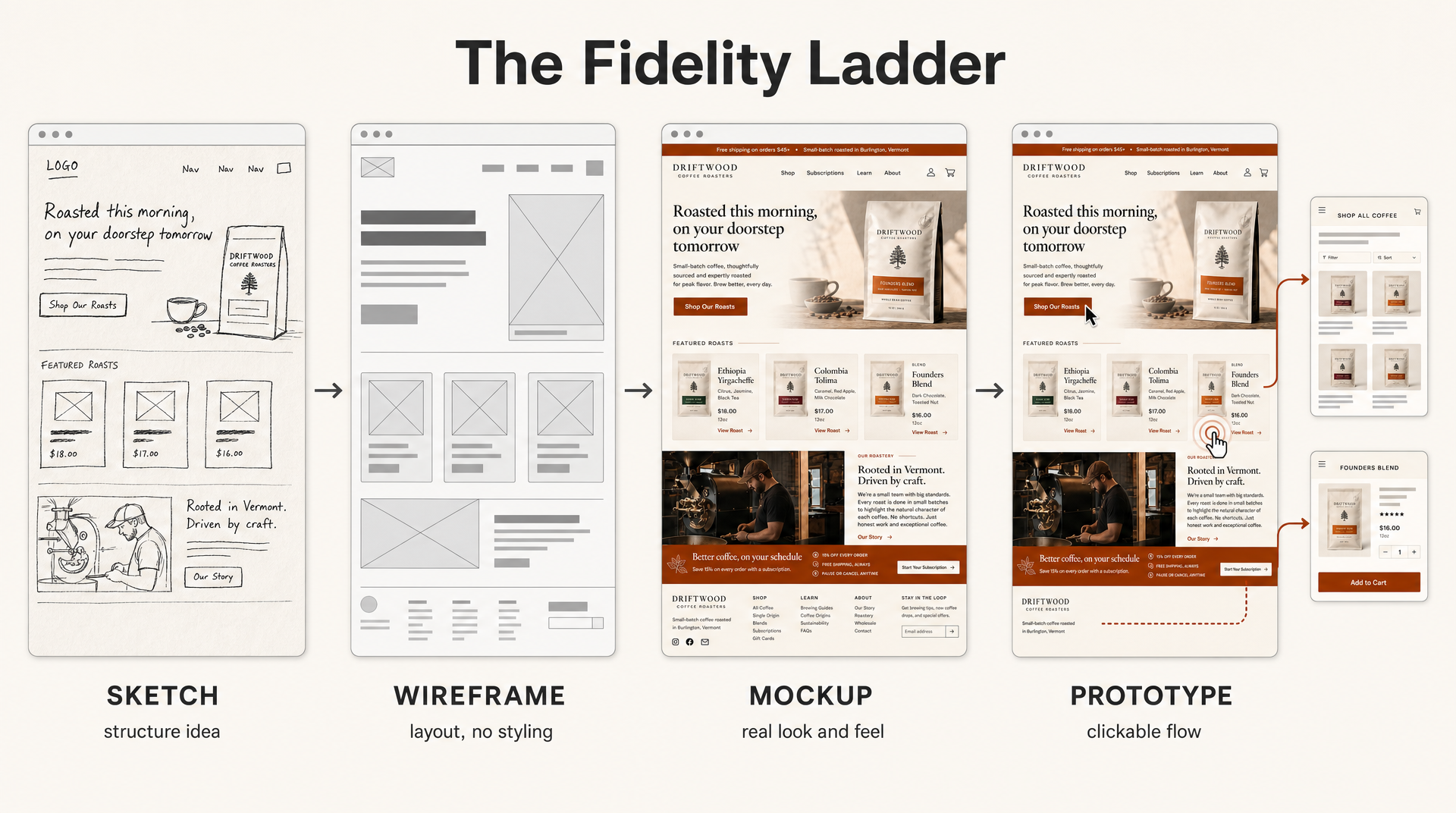 The same homepage at all four fidelity levels, generated with AIDesigner. The mockup is the third rung: real look and feel, still static.
The ladder metaphor is worth keeping in your head, because each rung answers a different question:
| Stage | What it shows | Question it answers | Typical time |
|---|---|---|---|
| Sketch | Rough idea on paper | ”What are we even making?” | Minutes |
| Wireframe | Layout in gray boxes | ”Does this structure work?” | Under an hour |
| Mockup | Real colors, type, images | ”Is this what we want it to look like?” | Minutes with AI, hours by hand |
| Prototype | Clickable flow | ”Does it work when a person uses it?” | Hours |
Skipping rungs is how projects end up with expensive rework. The most common version: jumping straight to a styled design, getting sign-off on the vibe, and discovering three weeks later that the structure never supported the content.
Wireframe vs. Mockup vs. Prototype: What’s the Difference?
A wireframe defines structure with placeholder boxes and no styling. A mockup applies the real visual design (color, type, imagery) but stays static. A prototype adds interactivity so users can click through flows. Structure, then appearance, then behavior: each stage locks one layer before the next gets expensive.
Sketch’s design glossary draws the same three-way line, and it matches how every team I’ve worked with actually operates. If the earlier rungs are new to you, I’ve written full guides to creating a website wireframe and low-fidelity wireframes; this article picks up where those end.
Now the seven steps.
Step 1: Define the Page’s Job
A mockup without a defined job is decoration. Before opening any tool, write three things down:
- Who lands on this page. Not “everyone.” The specific visitor: a first-time customer, a returning client, an investor.
- The one action that matters. Buy, book, sign up, call. One primary action per page; everything else is secondary.
- The content inventory. Every block the page must contain: navigation, hero, product cards, story section, newsletter signup, footer. List them all now, because a block discovered after the mockup is approved means redesigning around it.
For my Driftwood example, that came out as: specialty coffee buyers, “Shop Our Roasts” as the primary action, and seven content blocks from announcement bar to footer. Writing it took ten minutes and made every later decision easier.
Step 2: Collect References
You’re not designing in a vacuum, and you shouldn’t try. Save 5-10 real sites that get something right for your project, and be specific about what: this one’s navigation, that one’s product cards, this one’s typography.
Two of my earlier roundups make useful starting points: 13 web design inspiration sites for browsing curated galleries, and 15 website layout patterns if you want to start from proven structures rather than individual sites. Screenshot what you save. A folder of images beats a folder of bookmarks you’ll never reopen.
If one reference site nails your intended direction, AIDesigner can do something more direct with it: paste the URL and it extracts a reusable brand kit (palette, typography, imagery style) or uses the site as a visual reference for generation. There’s a full walkthrough of reference-based workflows if that’s your path.
Step 3: Block Out the Layout as a Wireframe
Resist the urge to pick colors. The wireframe stage exists to answer one question (does this structure hold the content?) and doing it in gray keeps everyone focused on exactly that.
Take your content inventory from Step 1 and arrange it: navigation up top, hero with headline and image, three product cards, story section, subscription banner, footer. Boxes and bars, nothing else.
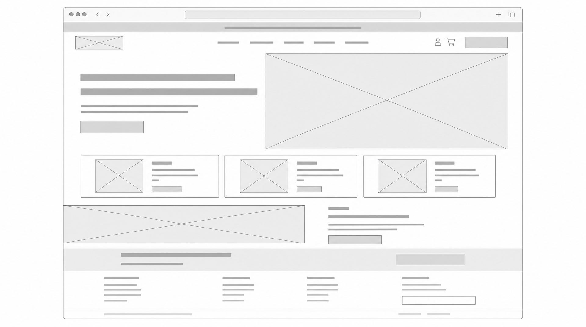 The Driftwood homepage as a wireframe: every content block placed, zero styling decisions made.
That’s the actual wireframe from my example session. Sketching it on paper works fine too; the medium doesn’t matter as long as the structure gets agreed on before styling starts. Show it to whoever has sign-off at this stage. A stakeholder who moves a section now costs you a shrug. The same request against a finished mockup costs you an afternoon.
Step 4: Set the Visual System
Before styling a single section, decide the rules the whole page will follow:
- Palette: one dominant background tone, one text color, one or two accents. Driftwood uses cream, deep espresso brown, and burnt orange.
- Typography: a display face for headlines, a workhorse for body text. Two families, rarely three.
- Spacing and shape: tight and dense or airy and editorial? Sharp corners or rounded?
If the project already has an identity, pull the rules from it instead of inventing them. This is where AIDesigner’s brand kits earn their keep: generate a 3x3 board of brand directions and save the tile you like, or extract a kit automatically from any existing website URL. Once selected, the kit applies to every design and image you generate afterward, so the mockup, the mobile version, and next month’s campaign images all share one visual system. That consistency problem is the entire reason design systems exist, and it applies at mockup scale just as much as at enterprise scale.
Step 5: Build the Mockup (Two Ways)
Everything so far was preparation. Here’s where the wireframe becomes the real-looking page, and you have two honest routes.
The AI route (what I did)
I wrote a description of the Driftwood homepage: the brand, the audience, the seven content blocks from Step 1, and the visual system from Step 4. AIDesigner returned this:
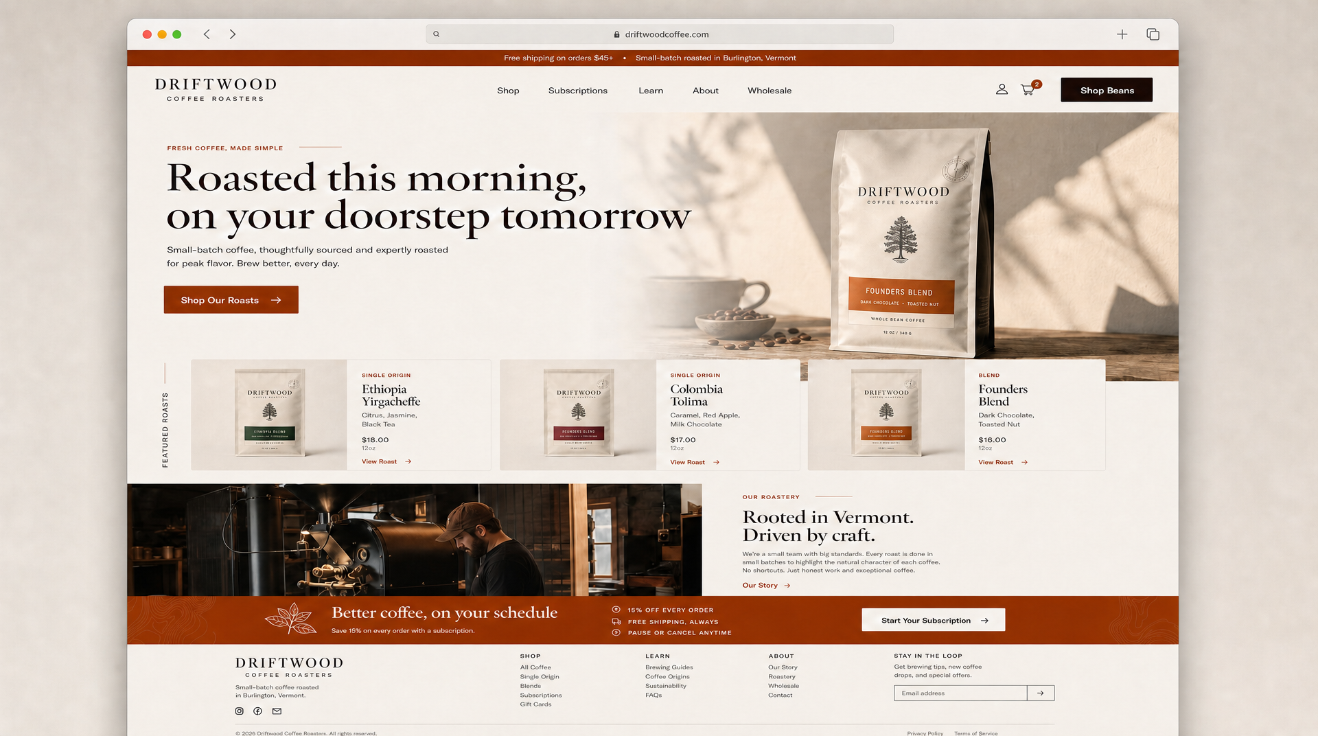 The finished Driftwood mockup. Generation took under a minute; I spent one extra credit on an edit pass to fix a text label.
The full accounting, since I timed it: the generation itself took under a minute and cost 1 credit. My first version had a typo in one banner label (“15% OFF EVERY, ORDERS”), so I ran one edit pass to fix it. Total for the finished mockup: 2 credits and roughly five minutes including the time I spent proofreading it. That proofread matters — generated text labels are good now, but they’re not infallible, and you should read every word before a client does.
The same description also produced the wireframe in Step 3 and the fidelity-ladder diagram up top, on the same clock. That’s the workflow argument in one sentence: describing a page takes minutes, assembling one takes hours.
The manual route (Figma or Canva)
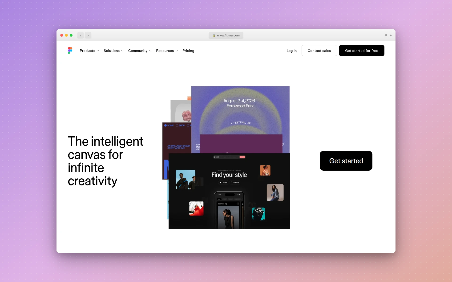 Figma: the standard manual editor for mockups, with a free Starter plan.
Manual assembly still makes sense when you need pixel-level control over a mature design system, or when the mockup must live in a team’s existing component library. Figma is the default here: the Starter plan is free, and the Professional plan runs $16 per month for a full seat. Expect to place every frame, text block, and image yourself, which is exactly the control some projects need and most don’t.
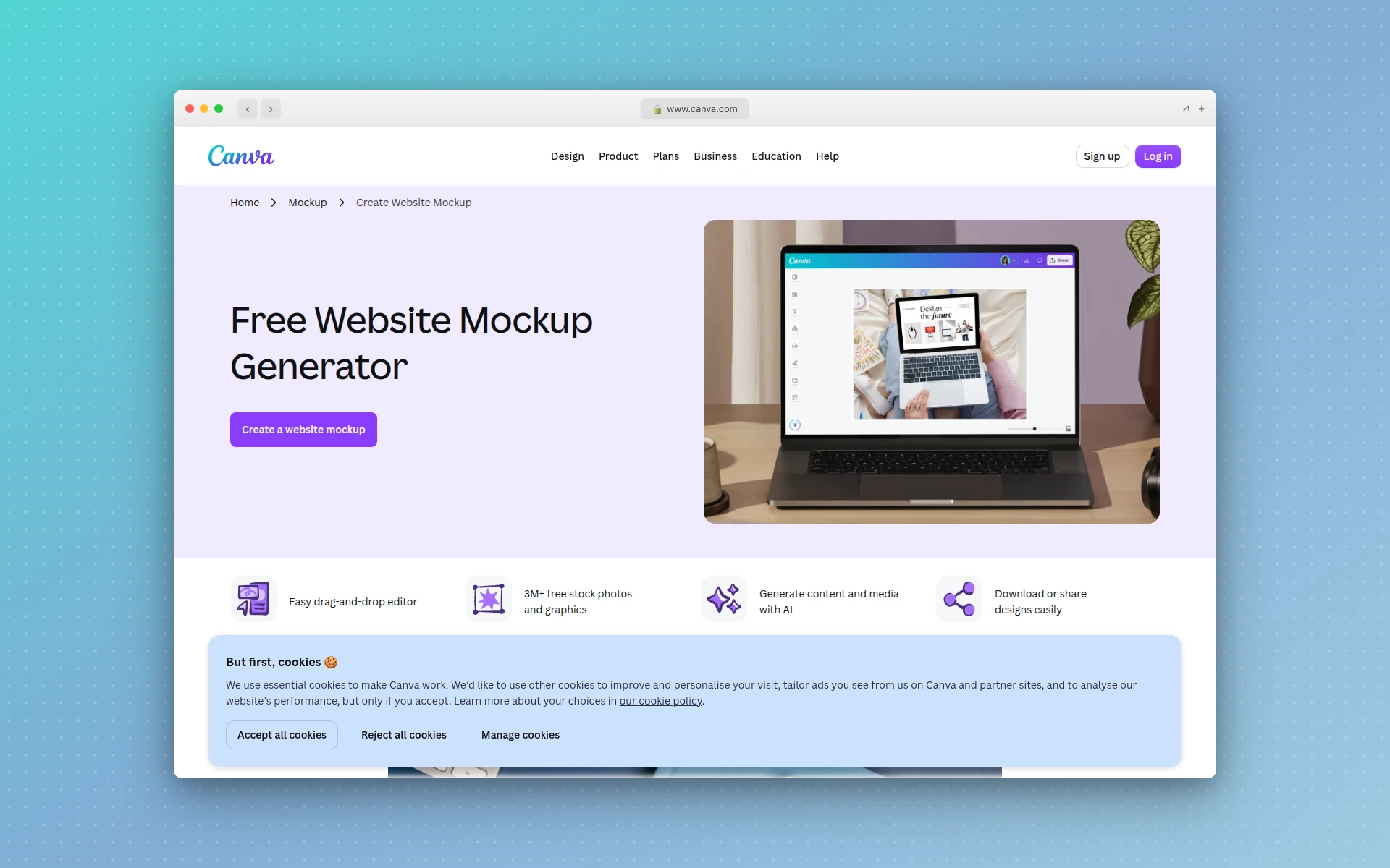 Canva: template-based and quick, best for rough visual drafts.
Canva’s free website templates are the third option: pick a template, swap the text and images, export. Quick, but you’re adapting someone else’s layout rather than building yours, and the result tends to look like the template it came from.
| Tool | Best for | How the mockup gets made | Price |
|---|---|---|---|
| AIDesigner (my pick) | Finished mockups fast, brand consistency across screens | Describe the page, review the generated result | Free tier (5 lifetime credits, no card); Pro from $25/mo |
| Figma | Pixel-level control, team component libraries | Assemble every element manually | Free Starter; Professional $16/mo per full seat |
| Canva | Quick template-based drafts | Customize a pre-made template | Free templates |
Step 6: Pressure-Test and Get Feedback
A mockup that only gets a thumbs-up in a meeting hasn’t been tested. Three checks catch most problems:
- The squint test. Blur your eyes at the mockup. The primary action button and headline should still be the obvious focal points. If everything blurs into equal weight, the hierarchy is flat.
- The mobile pass. Review the layout at phone width before anyone approves anything. Three-column card rows become a long stack; a hero that balances headline against image becomes headline on top of image. AIDesigner generates the mobile version as its own pass at a 430px viewport; in Figma you’ll rebuild the frame at mobile width.
- Specific questions. “Do you like it?” invites opinions about orange. Ask instead: “What would you click first?” and “What does this company sell?” Wrong answers to those are design problems worth fixing.
Expect two or three revision rounds. With a generated mockup, revisions are re-prompts; with a manual one, they’re your afternoon. Either way, get changes in now, at the static-picture stage, not after development starts.
Step 7: Turn the Mockup Into a Real Page
A static mockup’s final job is to stop being static. This is the step most guides skip, and it’s where the workflow choice from Step 5 pays off or doesn’t.
If the mockup lives in AIDesigner, the handoff is short: the AI website design generator and the prototype generator both produce editable HTML designs (not just images) that you can refine in the canvas editor and publish directly to a subdomain — so stakeholders review a live page in a browser instead of a static picture. Generated designs ship as responsive HTML and CSS, so the mobile check from Step 6 carries through to the real page. From there it’s editing and publishing, not rebuilding; if you end up handing HTML to a developer instead, my basic HTML page layout guide shows the structure they’ll build it on.
If the mockup lives in Figma or Canva, it exits as an image or a design file, and someone rebuilds it in code. That’s a fine, normal workflow. Just budget for it, because “the mockup is done” and “the page is done” are separated by real development time.
Why AIDesigner Is the Mockup Tool I Reach For
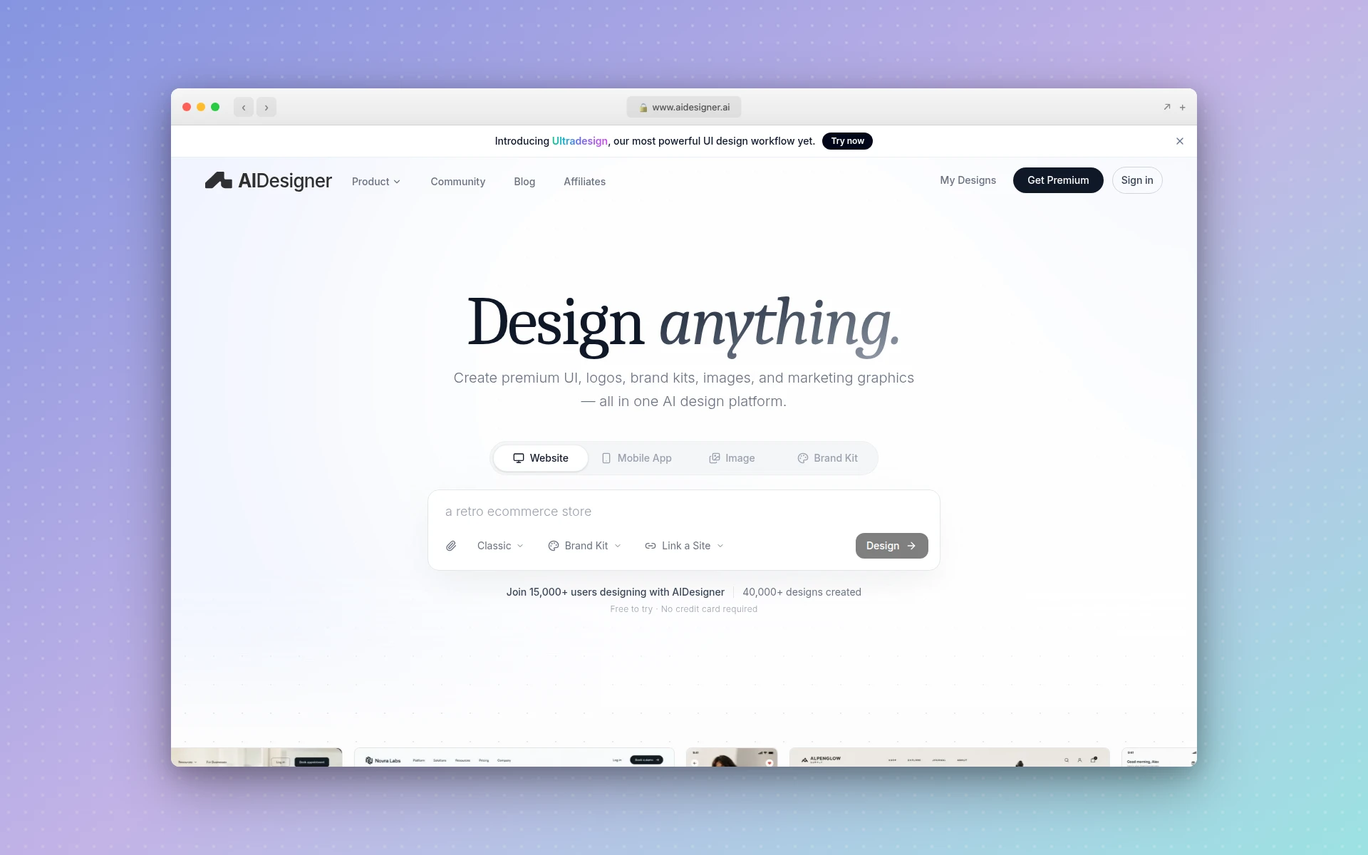 AIDesigner: describe the page, review the result, publish when it’s right.
I’ve made the recommendation throughout, so here’s the concrete case in one place:
- The fidelity ladder lives in one tool. Wireframe-style layouts, full mockup images, editable HTML designs, and published pages, without exporting between apps. My entire Driftwood example came from one session.
- Brand kits solve the consistency problem. Save a kit once (from a 3x3 variation board or extracted from any URL) and every mockup, mobile pass, and campaign image after it stays on-system. This is the difference between a mockup and a one-off pretty picture.
- Reference modes match how projects actually start. Most mockups begin as “like this site, but ours.” Clone, Enhance, and Inspire modes take a URL and do exactly that, for 2 credits per run.
- Asset extraction reuses what you generate. Pull the photos, logos, and illustrations out of a generated mockup as individual canvases and drop them into the next design. One generation becomes a small asset library.
- The pricing fits a mockup budget. The free tier is 5 lifetime credits with no card required, which covers a wireframe, a mockup, and revisions — my whole worked example used 4. Pro starts at $25/month for 100 credits.
The trade-off, stated plainly: you’re reviewing and directing rather than pushing pixels. If your project genuinely needs hand-placed 8px adjustments inside an existing component library, use Figma. For everyone whose actual goal is “a page everyone agrees on, this week,” the describe-and-review loop is faster by hours. My AI UI design tools comparison covers the wider field if you want the full landscape.
How Long Does a Website Mockup Take?
An AI-generated website mockup takes minutes: my example’s finished version was one sub-minute generation plus one edit pass. Building the same mockup manually in Figma typically takes hours for an experienced designer, and revision rounds with stakeholders usually stretch the full process across a few days regardless of tool.
The tool changes the production time, not the human time. Feedback rounds, stakeholder schedules, and copy decisions dominate the calendar either way, which is one more argument for making the production side nearly free.
Common Website Mockup Mistakes
Five mistakes account for most bad mockups I’ve seen:
- Styling before structure. Skipping the wireframe rung and debating colors while the layout is still wrong.
- Lorem ipsum everywhere. Placeholder text hides layout problems; real headlines are longer, and real product names break lines. Write plausible copy before calling a mockup done.
- Desktop-only sign-off. The stacked mobile layout is a different design, and it’s often the one most visitors see. Review it before approval, not after launch.
- Reviewing the placeholder. If the mockup uses obviously fake images, stakeholders react to the fakeness instead of the design. Representative imagery, even AI-generated, reads as real.
- Treating the mockup as the finish line. It’s the agreement artifact. Until it becomes a working page, it has produced nothing but consensus; Step 7 is part of the job.
Frequently Asked Questions
How do I create a website mockup for free?
AIDesigner’s free tier includes 5 lifetime credits with no card required, which covers a full mockup worked example. Figma’s Starter plan and Canva’s free website templates also cost nothing. The free route that saves the most time: wireframe on paper, then generate the styled version with AI instead of assembling it by hand.
Can AI generate a website mockup?
Yes. Describe the brand, the audience, and the sections you need, and a tool like AIDesigner returns a full-fidelity mockup image in under a minute. You can also hand it an existing website URL to extract a reusable brand kit first, so the generated mockup matches an established visual identity.
What should a website mockup include?
A mockup should show the real layout, final colors, actual typefaces, representative images, and realistic copy for one full page. It stays static: no working links or animations. If any element still says “lorem ipsum” or “IMAGE HERE,” stakeholders will review the placeholder instead of the design.
Do I need Figma to make a website mockup?
No. Figma is the standard manual editor and its Starter plan is free, but it assumes you’re comfortable assembling every element yourself. If you’d rather describe the page and review the result, an AI tool like AIDesigner produces the mockup for you, and Canva covers quick template-based versions.
Should I mock up the desktop or mobile version first?
Mock up whichever version most visitors will see, which for most marketing sites still means designing desktop first and checking mobile immediately after. The important part isn’t the order. It’s that the mobile layout gets reviewed before development, because stacked sections fail in ways a desktop mockup never shows.
Start Your Mockup
The seven steps compress to this: know the page’s job, borrow structure from sites that work, agree on gray boxes before arguing about color, set the visual rules once, then produce the real-looking page and test it against people.
The production step is the one that used to cost hours, and it doesn’t anymore. Try AIDesigner free — 5 credits, no card required, one more than my whole Driftwood example needed. Describe your page, and see what comes back before your coffee cools.