A basic HTML page layout is four regions: a header, a navigation block, the main content, and a footer. That’s the whole idea. The hard part isn’t memorizing the tags, it’s knowing which tag belongs where, and when a plain <div> is the right answer instead.
Most tutorials hand you a list of elements and stop. What follows is the skeleton, the working code, and the decisions behind it, using the wording from the HTML specification itself rather than a paraphrase of a paraphrase.
Here is the structure you’re aiming for, with every region labeled by its actual tag name:
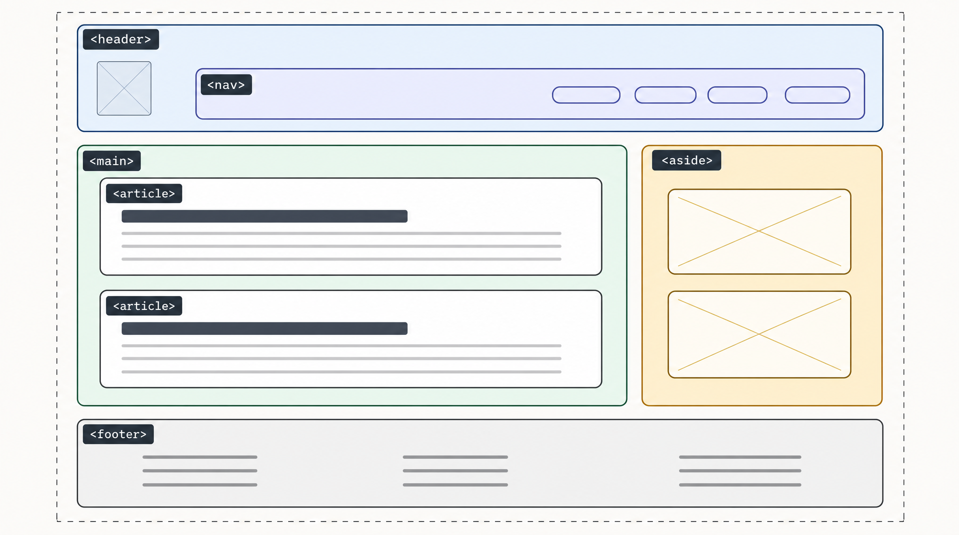 The semantic skeleton behind almost every web page. Diagram generated with AIDesigner.
One number is worth holding onto before you start. WebAIM tested one million home pages in February 2026 and found a <main> element or main landmark on just 46.1% of them. Fewer than half the most-visited sites on the internet mark up their own primary content. Get that one element right and you’re already ahead of the majority of production websites.
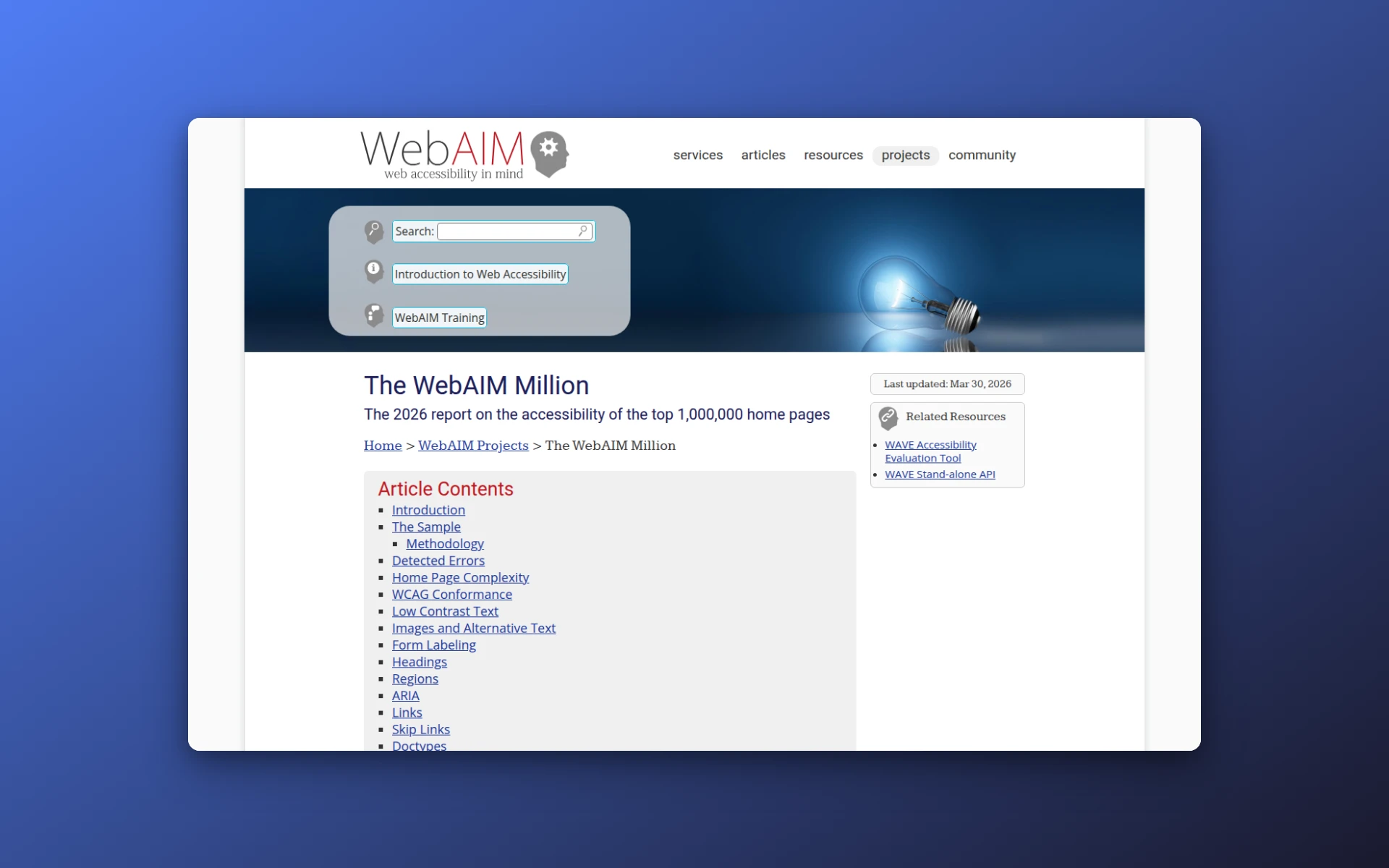 WebAIM’s annual scan of one million home pages is the source for the structural stats in this article.
What Is a Basic HTML Page Layout?
A basic HTML page layout is a page divided into semantic regions: <header> for introductory content and branding, <nav> for the main navigation links, <main> for the page’s unique content, <aside> for tangential material like a sidebar, and <footer> for closing details. CSS then positions those regions visually.
The word doing the work there is semantic, which Google’s own web.dev guide defines as structuring content “based on each element’s meaning, not its appearance.” Each of those elements tells a browser, a screen reader, and a search crawler what a chunk of the page is for. A <div> tells them nothing. Both produce identical pixels, which is exactly why the distinction gets skipped.
The Complete Skeleton, in Code
Here is a full, valid page. Nothing has been trimmed for brevity, so you can paste it into a file called index.html, open it in a browser, and see a real page.
<!DOCTYPE html>
<html lang="en">
<head>
<meta charset="UTF-8">
<meta name="viewport" content="width=device-width, initial-scale=1.0">
<title>Basic HTML Page Layout</title>
<link rel="stylesheet" href="styles.css">
</head>
<body>
<header>
<a href="/" class="logo">Acme</a>
<nav>
<ul>
<li><a href="/features">Features</a></li>
<li><a href="/pricing">Pricing</a></li>
<li><a href="/contact">Contact</a></li>
</ul>
</nav>
</header>
<main>
<h1>Everything your team needs, in one place</h1>
<article>
<h2>Built for speed</h2>
<p>Ship in hours instead of weeks.</p>
</article>
<article>
<h2>Built for scale</h2>
<p>Grows with you from ten users to ten thousand.</p>
</article>
</main>
<aside>
<h2>Related reading</h2>
<ul>
<li><a href="/blog/getting-started">Getting started</a></li>
</ul>
</aside>
<footer>
<p>© 2026 Acme Inc.</p>
</footer>
</body>
</html>
Three details in that snippet are more important than they look.
<nav> sits inside <header>. It doesn’t have to, but on most sites the primary navigation is part of the header, and nesting it there matches how the page actually reads.
There is exactly one <h1>, and it lives inside <main>. WebAIM found 18.1% of home pages shipping more than one <h1>, which muddies the document outline for anyone navigating by headings.
<aside> sits outside <main>, not inside it. Sidebar content isn’t part of the page’s unique content, and MDN is direct about this: content of <main> “should be unique to the document,” explicitly excluding sidebars, navigation links, and site logos.
What Are the Main HTML Layout Elements?
The six layout elements are <header>, <nav>, <main>, <article>, <aside>, and <footer>. Each maps to a region of the page and carries a built-in meaning that assistive technology and search crawlers read. Together they replace the generic <div> containers that older layouts relied on for the same job.
This table is based on the WHATWG HTML specification, which is the document browsers are actually built against. Quoted cells are the spec’s own wording:
| Element | What the spec says it’s for | Use it when |
|---|---|---|
<header> | Introductory content for a page or a section | Logo, site title, and the top-of-page block |
<nav> | ”sections that consist of major navigation blocks” | Primary menu, sidebar menu, breadcrumbs |
<main> | ”The dominant contents of the document” | The one region that changes between pages |
<article> | ”A complete, or self-contained, composition… independently distributable or reusable, e.g. in syndication” | A blog post, product card, comment, or news item |
<aside> | Content “tangentially related to the content around” it | Sidebar, pull quote, related links, ad slot |
<footer> | Closing content for a page or a section | Copyright, contact details, secondary links |
The <nav> row carries a caveat people miss. The spec says plainly that “not all groups of links on a page need to be in a nav element.” A list of three links in your footer is fine as a plain <ul>. Wrapping every link cluster in <nav> creates a page full of navigation landmarks and makes the real menu harder to find.
<article> also trips people up because the name suggests blog posts. Apply the syndication test instead: could this block be lifted out and republished somewhere else and still make sense on its own? A product card passes. A three-word tagline doesn’t.
When Should You Use a Div Instead of a Section?
Use <div> when you need a container purely for styling or scripting, and <section> when you’re grouping content around a theme that deserves its own heading. The HTML spec settles this: “The section element is not a generic container element. When an element is needed only for styling purposes or as a convenience for scripting, authors are encouraged to use the div element instead.”
That sentence is the whole rule, and it runs against the habit a lot of people pick up, which is to treat <section> as a <div> with better manners. It isn’t, and the accessibility layer proves it. MDN lists the implicit ARIA role of <section> as “region if the element has an accessible name, otherwise generic”. An unnamed <section> produces no landmark at all. It’s a <div> with extra letters, which is precisely the spec’s point.
The practical test is one question: what heading would go inside this element? If you can name one, use <section> and write the heading, then point aria-labelledby at the heading’s id if you want it to register as a landmark. If you can’t name a heading, and the element exists so you can hang a CSS Grid or Flexbox rule on it, <div> is the correct and non-lazy answer.
<div> isn’t deprecated and never has been. Every layout still needs wrappers.
Do You Need CSS to Build an HTML Page Layout?
Yes, CSS is required for any layout beyond a single stacked column. HTML defines what each region is, and CSS defines where each region sits. Without a stylesheet, semantic elements render top to bottom in source order at full width, in the browser’s default styling. Semantic tags carry meaning, not position.
CSS Grid handles page-level layout better than anything that came before it, because a page skeleton is a two-dimensional problem: rows and columns at once. Here is the stylesheet that turns the HTML above into the layout in the diagram:
body {
  display: grid;
  grid-template-columns: 1fr 300px;
  grid-template-areas:
    "header header"
    "main   aside"
    "footer footer";
  gap: 24px;
  max-width: 1200px;
  margin: 0 auto;
}

header { grid-area: header; }
main   { grid-area: main; }
aside  { grid-area: aside; }
footer { grid-area: footer; }
grid-template-areas is worth the extra few lines because the CSS ends up looking like the page. You can see the sidebar sitting next to the main column just by reading the rule.
Flexbox is the right tool one level down, inside a region: a row of nav links, a card row, a header with a logo pinned left and a menu pinned right. The rough division is Grid for the page, Flexbox for the contents of a box. When a pattern doesn’t split that cleanly, this grid vs flexbox comparison tests nine common UI patterns and shows where each method breaks. Both are supported in every browser you’ll realistically encounter, so neither choice carries a compatibility cost.
If you want the visual side of this decision rather than the code side, our roundup of website layout patterns covers which arrangements suit which page types.
How the Layout Reflows on Mobile
At narrow widths the two-column arrangement collapses into a single stack. The HTML never changes. Only the grid definition does.
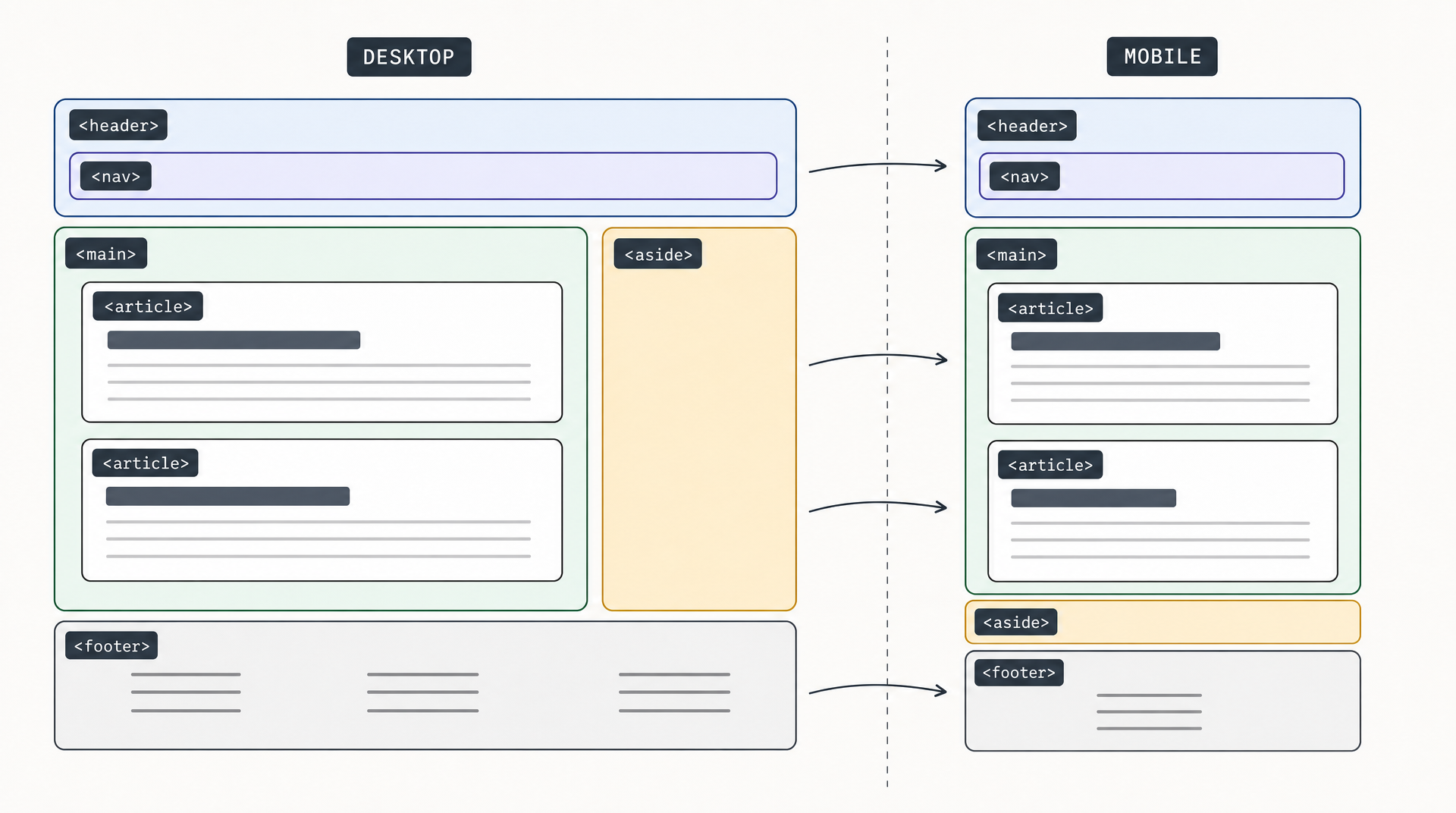 The same six regions, reflowed. Note that
 <nav> rides along inside <header> at both widths. Source order decides the mobile stacking order.
@media (max-width: 768px) {
  body {
    grid-template-columns: 1fr;
    grid-template-areas:
      "header"
      "main"
      "aside"
      "footer";
  }
}
Because <main> comes before <aside> in the HTML, the content a visitor came for lands above the sidebar on a phone. Source order is doing real work here, which is the argument for getting the HTML right before touching CSS. Reordering regions visually with Grid is easy; when the visual order and the source order disagree, keyboard and screen reader users get the source order and everyone else gets the visual one.
If you’re building responsively from scratch, our list of responsive website design templates has starting points that already handle these breakpoints.
Four Mistakes That Break a Basic Layout
Skipping <main> entirely. The most common one, and the WebAIM data backs that up. Without it there’s no landmark separating your content from the chrome around it, and a skip link has nothing natural to point at, so you end up hand-rolling an id target instead.
Using more than one visible <main>. MDN is unambiguous: “A document mustn’t have more than one <main> element that doesn’t have the hidden attribute specified.” One visible <main> per page.
Jumping heading levels. Going <h1> straight to <h3> because the smaller size looked better. WebAIM found skipped heading levels on 41.8% of pages. Pick the level for the outline and set the size in CSS.
Reaching for <section> by default. Worth repeating because it’s the habit that takes longest to unlearn: a <section> with no accessible name is a <div> that made you type more. When in doubt, <div>.
Getting From Layout to Working Page Faster
Hand-writing this skeleton is the right way to learn it. Hand-writing it for the fortieth time is just typing.
Once the structure is second nature, the useful shortcut is generating a first draft and editing the markup it produces. AIDesigner turns a text prompt into responsive HTML and CSS at one credit per generation. You pick a desktop or mobile starting canvas, and publishing to a subdomain is one click. Working from a design image rather than a prompt is a separate path, and there’s a dedicated image-to-HTML converter for it.
Either way, sketch the regions before you write markup. A wireframe settles where <main> ends and <aside> begins in about two minutes, and it’s much cheaper to move a box on paper than to restructure a page that’s already styled. A rough low-fidelity wireframe is enough. For teams shipping more than a page or two, folding these conventions into a design system keeps everyone’s markup consistent.
Frequently Asked Questions
Do I still need <div> if I use semantic HTML?
Yes. <div> remains the correct element for containers that exist only for styling or scripting, and the HTML specification recommends it explicitly over <section> for that purpose. Semantic elements describe meaning; <div> is the neutral wrapper you reach for when there is no meaning to describe. A typical production page uses both heavily.
Can a page have more than one <header> or <footer>?
Yes. Unlike <main>, the <header> and <footer> elements can appear multiple times, because they can belong to a section rather than the whole page. An <article> can carry its own <header> with the post title and byline, and its own <footer> with tags or author details. Only <main> is limited to one visible instance per document.
Is <main> required for a valid HTML page?
No. A page validates without <main>, but omitting it costs you a landmark that assistive technology relies on to jump past navigation. WebAIM’s February 2026 scan of one million home pages found a <main> element or main landmark on only 46.1% of them, so its absence is common rather than correct. Include it, and put only the page’s unique content inside.
Should I use CSS Grid or Flexbox for a page layout?
Use CSS Grid for the overall page skeleton and Flexbox for arranging items inside a region. Grid handles rows and columns simultaneously, which is what a page-level layout needs, and grid-template-areas lets the CSS visually resemble the layout it produces. Flexbox is a better fit for one-dimensional groups such as a nav bar or a row of cards. Most real pages use both.
Does semantic HTML actually help SEO?
Semantic HTML helps crawlers identify which part of a page is primary content versus navigation and boilerplate, which improves how accurately your page is understood and summarized. It isn’t a direct ranking factor you can point to. The stronger, more measurable argument is accessibility: landmarks give screen reader users a way to navigate a page, and Google reads the same structure.
What is the minimum HTML needed for a valid page?
A valid page needs three things: a <!DOCTYPE html> declaration, a declared character encoding, and a <title>. Drop any one and the W3C validator reports an error. A lang attribute on <html> only earns a warning, and the viewport meta tag none at all, but add both anyway for screen reader pronunciation and correct mobile rendering.
The Short Version
A basic HTML page layout is <header>, <nav>, <main>, <aside>, and <footer>, with <article> for self-contained blocks inside <main>. Use <section> when you can name the heading that goes inside it, and <div> when you can’t. Let CSS Grid place the regions and Flexbox arrange what’s in them.
Build it by hand once so you understand what each region is claiming. After that, generating the first draft and editing the output saves the repetition. AIDesigner’s free tier includes 5 lifetime credits with no card required, which is enough to see what a generated page looks like before committing to anything. Our roundup of AI website generators covers the wider field if you want to compare options first.