
Grid vs flexbox comes down to one question: are you arranging things along a single line, or placing them on rows and columns at the same time? Flexbox handles the first. Grid handles the second. Most tutorials say exactly that, and yet when I searched this query in October 2026, the first result was a Reddit thread from someone asking how to actually decide.
The rule is easy to memorize and hard to apply, so I tested it. I built nine everyday UI patterns in grid and again without it (flexbox for eight of them, absolute positioning for the one flexbox can’t do), using the leanest CSS I could write for each. Then I rendered both versions in Chrome, fed them awkward content, and counted the declarations each one needed.
Across the eight patterns where both could compete, grid won four, flexbox won two, and two were ties. The ninth pitted grid against absolute positioning, since flexbox lays items side by side rather than on top of each other, and grid won that too. The declaration counts were close (39 for flexbox, 34 for grid across the head-to-heads). What separated them was how each one broke, and that’s what the screenshots below show.
What Is the Difference Between Grid and Flexbox?
The difference between grid and flexbox is dimensions. Flexbox lays items out along one axis, a row or a column, and lets each item’s content decide its size. Grid lays items out on rows and columns at the same time: you define the tracks first, then place items into them. Both handle alignment and spacing.
MDN’s guide to how grid relates to other layout methods puts it in a way that explains more of my test results than the one-dimension rule does. Flexbox “works from the content out.” Grid “works from the layout in.” Keep that sentence in mind for the next section, because almost every failure I saw was one of those two directions running into the wrong kind of content.
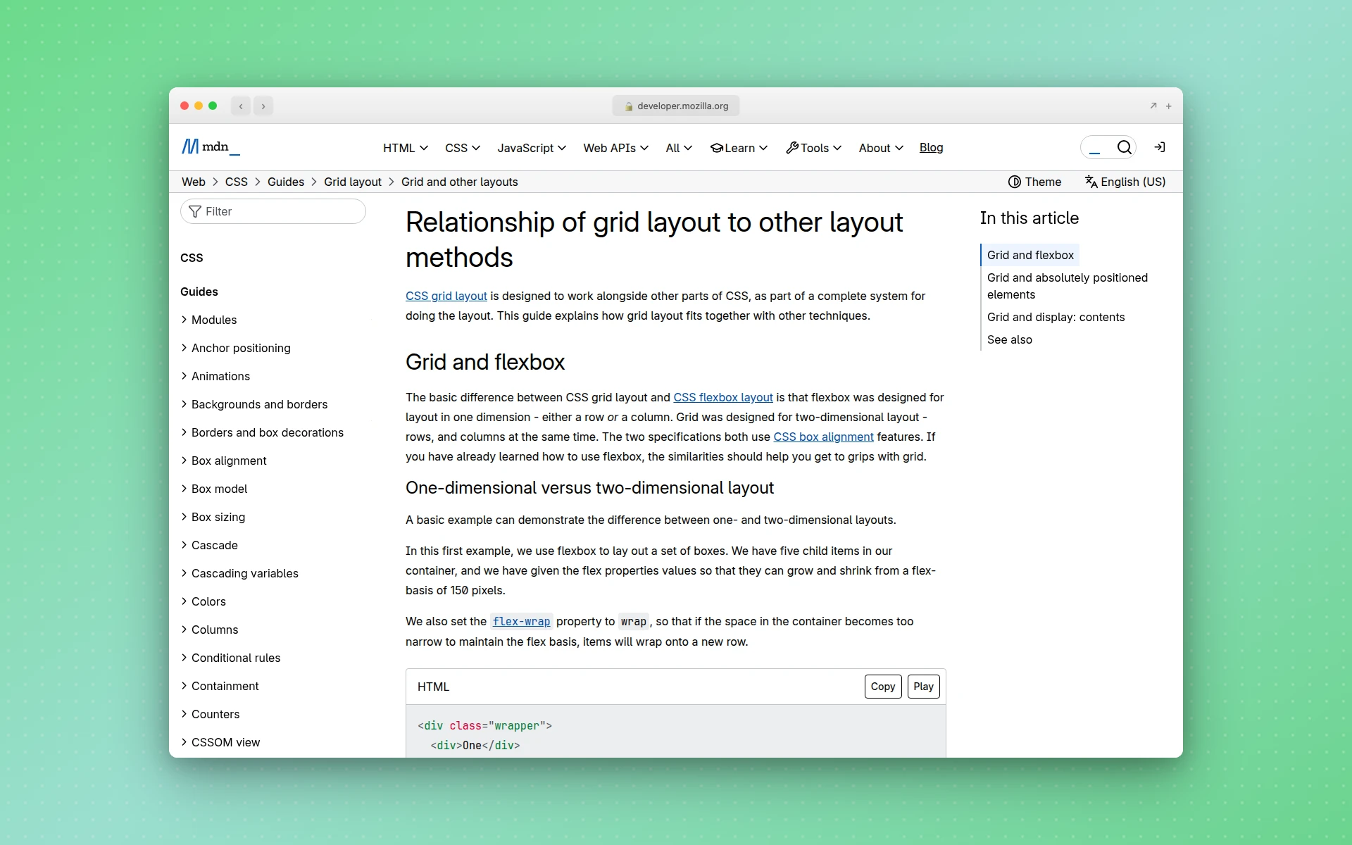 MDN’s comparison page, the source of the “content out” and “layout in” framing.
| Flexbox | Grid | |
|---|---|---|
| Dimensions | One axis at a time | Rows and columns together |
| What sets the size | The content | The tracks you define |
| Wrapped items | Each line sizes itself | Stay locked to the columns |
| Overlapping items | Needs positioning or negative margins | Put two items in one cell |
| Aligning inside sibling items | Not without fixed heights | Yes, with subgrid |
| Best for | Nav bars, button rows, tag lists | Page skeletons, card grids, forms |
| Global browser support (caniuse, Oct 2026) | 97.49% | 97.46% |
I Tested 9 Layout Patterns. Here’s What Broke.
Both versions of each pattern used the same HTML, except where flexbox needed extra wrapper elements (noted in the table). I counted only layout declarations. Colors, borders, and padding were identical in both versions and excluded. Each pair rendered side by side in headless Chrome at 560px wide, then again at 360px to check mobile.
| # | Pattern | Flexbox | Grid | What happened | Winner |
|---|---|---|---|---|---|
| 1 | Nav bar, then add one item | 6 | 7 | Grid dropped the new item onto a second row | Flexbox |
| 2 | Centering one element | 3 | 2 | Identical result | Tie |
| 3 | Card grid, 7 cards | 4 | 3 | Flexbox stretched the 7th card full width | Grid |
| 4 | Tag list that wraps | 3 | 3 | Grid’s equal tracks made a long tag overflow its pill | Flexbox |
| 5 | Page skeleton with mobile stack | 7 | 5 | Both worked; my first, nested flexbox attempt collapsed <main> on mobile | Grid |
| 6 | Avatar next to text | 4 | 4 | Identical result | Tie |
| 7 | Cards with aligned titles and buttons | 6 | 6 | Flexbox aligned the buttons but not the descriptions | Grid |
| 8 | Form with aligned labels | 6 (+3 wrappers) | 4 | Flexbox needed a hardcoded label width | Grid |
| 9 | Caption over an image (vs absolute positioning) | 3 (absolute) | 3 | The positioned caption covered the paragraph above | Grid |
Pattern 9 isn’t a true head-to-head. Flexbox places items next to each other, not on top of each other, so the realistic non-grid option is absolute positioning, and that’s what I tested and counted.
At 360px, both versions of the nav bar and the three pricing cards (pattern 7) overflowed the screen, and both versions of the page skeleton needed a media query. Neither method gets mobile for free, and the cost came out about even.
Where Flexbox Won
The nav bar. Both versions look identical until you add a search box, which is the kind of change a nav bar gets every few months.
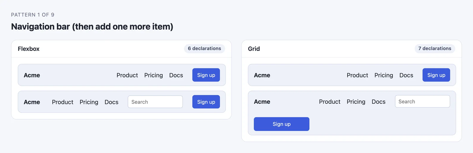 Same HTML, one extra item. The grid version’s three-column template had no slot for a fourth.
/* Flexbox: 6 declarations */
.nav   { display: flex; align-items: center; gap: 24px; }
.logo  { margin-right: auto; }
.links { display: flex; gap: 16px; }

/* Grid: 7 declarations */
.nav   { display: grid; grid-template-columns: 1fr auto auto; align-items: center; gap: 24px; }
.links { display: grid; grid-auto-flow: column; gap: 16px; }
grid-template-columns: 1fr auto auto describes exactly three items. The fourth falls into an implicit second row. Flexbox has no column count to violate, so it absorbed the new input without a CSS edit. That’s “content out” in practice: rows of controls gain badges, search fields, and language switchers all the time, and flexbox shrugs them off.
Grid can be made to cope. Define only the first column (grid-template-columns: 1fr) and add grid-auto-flow: column, and every extra item gets its own auto-sized column. That version kept the search box on one line when I re-ran the test, at eight declarations. At that point, though, you’re writing grid to imitate flexbox.
The tag list. With repeat(auto-fill, minmax()), every track is the same width, which is exactly wrong for tags.
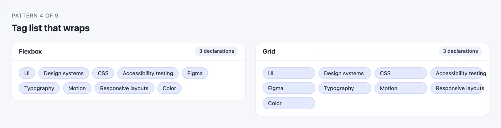 Three declarations each. Only one of them looks like a tag list.
/* Flexbox */
.chips { display: flex; flex-wrap: wrap; gap: 8px; }

/* Grid */
.chips { display: grid; grid-template-columns: repeat(auto-fill, minmax(110px, 1fr)); gap: 8px; }
Short tags like “UI” float in oversized pills, and “Accessibility testing” runs past the edge of its own background because the track is narrower than the text. In flexbox, each tag is as wide as its label and the line wraps wherever it needs to.
Where Grid Won
The card grid. This is the one people hit first, usually on a blog index, a product listing, or one of the other common website layouts.
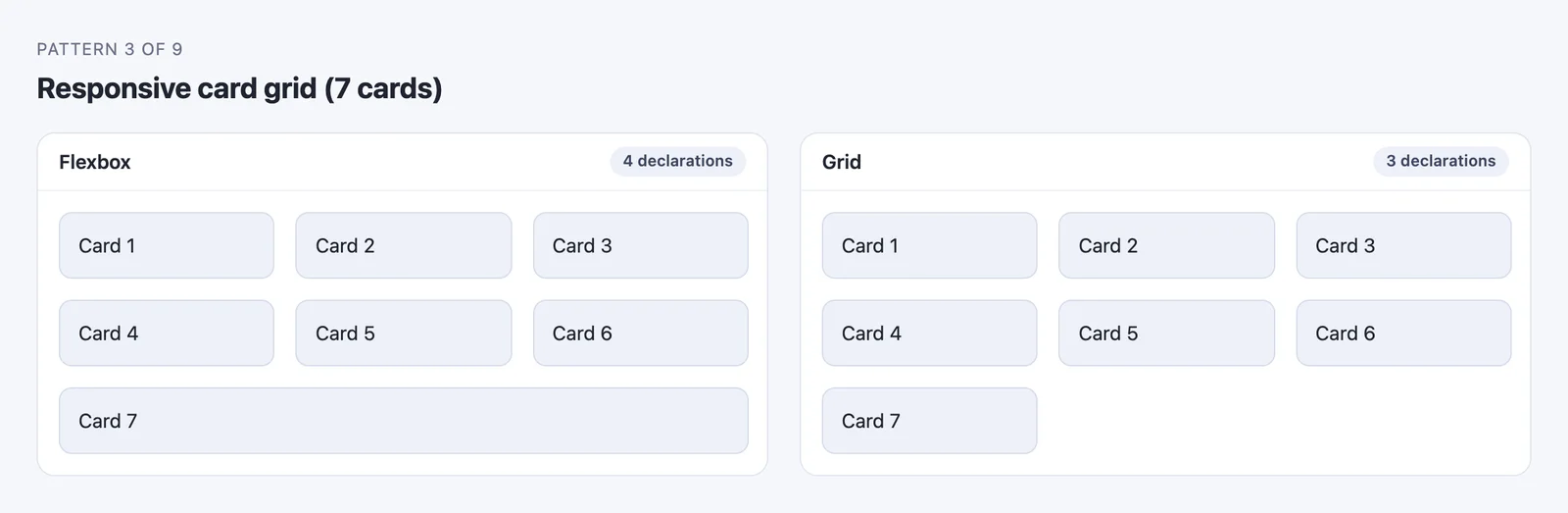 The orphaned last card is the classic flex-wrap problem.
/* Flexbox: 4 declarations */
.cards { display: flex; flex-wrap: wrap; gap: 16px; }
.card  { flex: 1 1 150px; }

/* Grid: 3 declarations */
.cards { display: grid; grid-template-columns: repeat(auto-fill, minmax(150px, 1fr)); gap: 16px; }
A wrapped flex line has no idea what the line above it looks like, so card 7 grows to fill its whole row. You can cap it with a calculated max-width, but that number changes at every breakpoint. Grid’s auto-fill with minmax() keeps every card on the same column grid at any width with no media queries.
The page skeleton. Grid needed five declarations. The leanest flexbox version needed seven, and it only works by forcing line breaks: the header and footer take flex-basis: 100% so they wrap onto rows of their own.
/* Grid: 5 declarations */
.page          { display: grid; grid-template-columns: 160px 1fr; gap: 12px; }
header, footer { grid-column: 1 / -1; }
@media (max-width: 480px) { .page { grid-template-columns: 1fr; } }

/* Flexbox: 7 declarations */
.page          { display: flex; flex-wrap: wrap; gap: 12px; }
header, footer { flex-basis: 100%; }
aside          { flex: 0 0 160px; }
main           { flex: 1; }
@media (max-width: 480px) { aside { flex-basis: 100%; } }
The grid version reads like the layout it produces. The flexbox version reads like a set of wrapping rules that happen to produce it. My first flexbox attempt was worse: it nested a row inside a column, took nine declarations plus a wrapper <div>, and broke on mobile in a way the mistakes section below covers. For the semantic HTML that goes inside a skeleton like this, our guide to basic HTML page layout covers which element belongs in which region.
Cards that line up inside. Pricing tables and feature rows need the titles, descriptions, and buttons of neighboring cards to sit on the same lines.
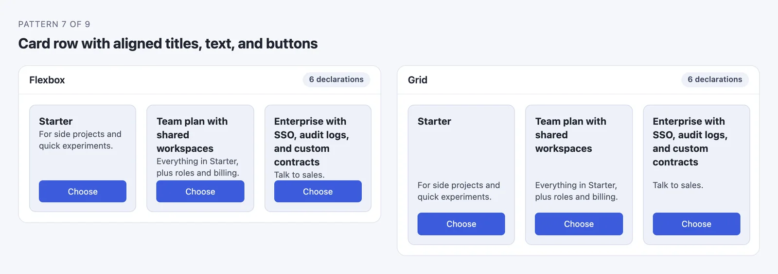 Flexbox can pin the buttons to the bottom. Only subgrid can align the rows in between.
/* Flexbox: 6 declarations */
.cards      { display: flex; gap: 16px; }
.card       { flex: 1; display: flex; flex-direction: column; }
.card .btn  { margin-top: auto; }

/* Grid with subgrid: 6 declarations */
.cards { display: grid; grid-template-columns: repeat(3, 1fr); gap: 16px; }
.card  { display: grid; grid-row: span 3; grid-template-rows: subgrid; }
Same declaration count, different result: margin-top: auto gets the buttons in line, but each card still sizes its own title, so the descriptions start at three different heights. With grid-template-rows: subgrid, each card borrows the parent’s row tracks. The tallest title sets the height of the title row for all three. MDN marks subgrid as available across browsers since September 2023.
The form. Grid’s max-content column sized itself to the longest label. Flexbox needed a wrapper <div> around each label and input, plus a hardcoded 140px label width that breaks the day someone adds a longer label or translates the form. You can drop the wrappers with flex-wrap and a calc() width on each input, but then the label width is hardcoded in two places.
/* Grid: 4 declarations */
.form { display: grid; grid-template-columns: max-content 1fr; align-items: center; gap: 12px 16px; }

/* Flexbox: 6 declarations, plus a .row wrapper per field */
.row   { display: flex; align-items: center; gap: 16px; margin-bottom: 12px; }
label  { flex: 0 0 140px; }
input  { flex: 1; }
The caption over an image. Grid can place two items in the same cell, so the caption stays in normal flow and the container grows when the text gets long.
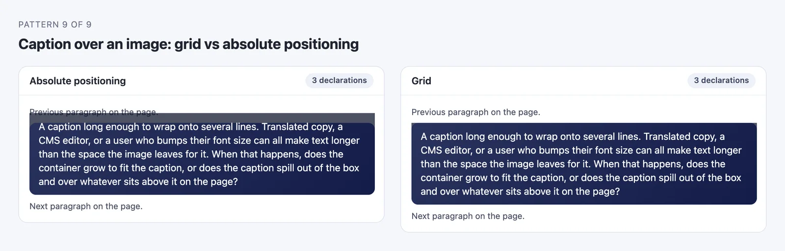 A long caption is a translation or a larger font-size setting away. Only one of these survives it.
/* Grid: both children share cell 1/1 */
.hero     { display: grid; }
.hero > * { grid-area: 1 / 1; }
.caption  { align-self: end; }

/* Without grid: absolute positioning */
.hero    { position: relative; }
.caption { position: absolute; inset: auto 0 0 0; }
The positioned caption is out of flow, so the box doesn’t know it exists. When the text outgrew the image, it climbed up over the paragraph above. The same out-of-flow problem shows up in hero sections that set a headline over a background image.
Where It Didn’t Matter
Centering one element took display: grid; place-items: center (2 declarations) or display: flex; justify-content: center; align-items: center (3). The avatar-next-to-text pattern was four declarations either way, though the flexbox version needed flex-shrink: 0 on the avatar to stop long text from squeezing it. For patterns like these, use whatever the surrounding component already uses.
When Should You Use Grid vs Flexbox?
Use flexbox when the content should decide the layout: a row of buttons, a nav bar, a list of tags, or any group whose item count changes. Use grid when the layout should decide where content goes: page regions, card grids, forms, and anything that has to line up in rows and columns at once.
The sharpest version of this rule I’ve found is in that Reddit thread. The top reply comes from the account of Tab Atkins, who is listed as an editor of both the W3C flexbox and grid specifications:
If it’s a single row/column, use whichever you’re most comfortable with. They have similar, but not exactly the same, abilities. You’re unlikely to depend on the differences.
If it’s “1½d” - multiple rows or columns, but flowing from one to the next like text in lines - use Flexbox.
If it’s 2d, use Grid.
Source: I wrote those specs.
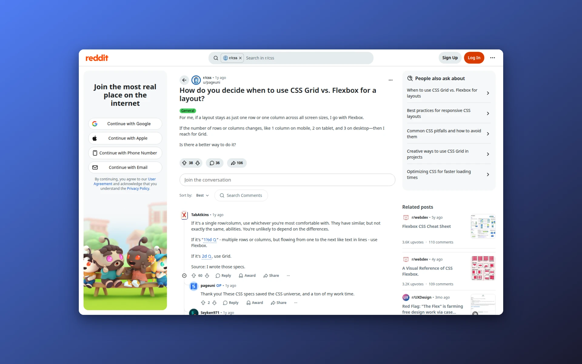 The r/css thread, with the spec editor’s reply at the top.
His “1½d” case is my tag list exactly: items that flow from line to line like words in a paragraph. His single-row advice mostly held up too. Centering and the avatar row were ties. The nav bar was the exception, and only because I gave grid an explicit three-column template.
When a pattern doesn’t fit neatly, these five questions settle it:
- Does something need to line up both across and down? Use grid.
- Should each item be as wide as its own content? Use flexbox.
- Will items be added to a single row, like a toolbar or nav bar, without a CSS change? Use flexbox.
- Do two items need to overlap? Use grid.
- Should wrapped items stay aligned to columns? Use grid.
Dashboards are the clearest grid case of all, since every panel has to respect the same rows and columns, which is why the layouts in this dashboard UI design guide start from a 12-column grid.
The same five questions work as a review checklist when you start from a generated draft instead of a blank file. AIDesigner turns a text prompt into a responsive HTML and CSS page, and running each region of the result through these questions is a quick way to spot where a layout will need adjusting. Sketching first helps too: a quick website wireframe usually shows which regions are grids and which are rows before any CSS exists.
Is CSS Grid Better Than Flexbox?
No. Grid isn’t a newer version of flexbox and doesn’t replace it, because the two solve different problems. In my test, grid won four of the eight head-to-heads, but flexbox won both patterns where content size should drive the layout, and grid’s default versions of those broke on content-sized items. Most production pages need both.
Can You Use Grid and Flexbox Together?
Yes, and that’s the normal way to build a page. Any grid item can also be a flex container, and any flex item can be a grid container. A common split is grid for the page skeleton and card layouts, then flexbox inside each region for nav links, button rows, and card footers.
.page   { display: grid; grid-template-columns: 240px 1fr; }   /* the skeleton */
.cards  { display: grid; grid-template-columns: repeat(auto-fill, minmax(220px, 1fr)); gap: 24px; }
.nav    { display: flex; align-items: center; gap: 24px; }     /* a row of controls */
.card footer { display: flex; justify-content: space-between; }
Do People Still Use Flexbox?
Yes, more than grid. Chrome Platform Status, as of October 6, 2026, shows flex-direction on 75.7% of page loads and grid-template-columns on 49.0%, a rough proxy for each layout model. Flexbox isn’t deprecated either: the W3C published a new Candidate Recommendation Draft of the flexbox spec in October 2025.
Part of flexbox’s lead is inherited. Bootstrap’s grid system is, per its own docs, “built with flexbox,” and the HTTP Archive’s 2022 Web Almanac, which counted crawled pages rather than page loads, blamed frameworks that “have based their layouts on flexbox” for grid’s slower adoption back then.
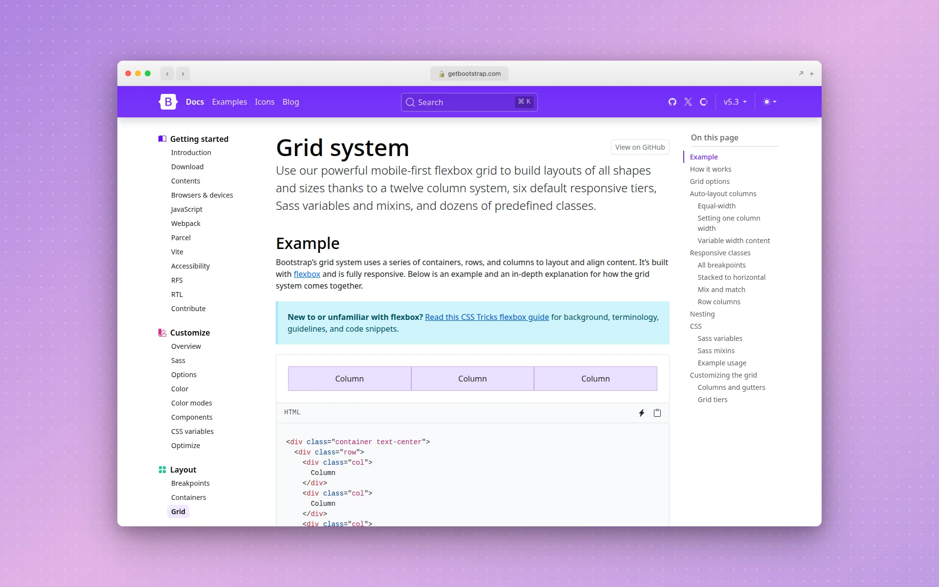 Bootstrap 5’s grid documentation, which describes the system as built with flexbox.
Three Mistakes That Break Grid and Flexbox Layouts
1. Letting 1fr or flex: 1 overflow the screen. This one fails silently until real content arrives. I gave a sidebar-plus-main layout a single 104-character line of code inside a <pre> that already had overflow: auto, at a 600px viewport. The <pre> should have scrolled on its own, but with 1fr in grid or flex: 1 in flexbox, <main> grew to 981px wide and the whole page scrolled sideways.
The grid spec explains why: 1fr outside minmax() “implies an automatic minimum (i.e. minmax(auto, <flex>)),” per the W3C grid specification, so the track won’t shrink below its content. Flex items default to min-width: auto and behave the same way.
The fix has two halves. Let the column shrink with minmax(0, 1fr) in grid or min-width: 0 on the flex item, and give the wide content its own overflow handling: overflow-x: auto on a <pre>, or overflow-wrap: anywhere for long URLs. With both in place, <main> came back to 396px and the scrolling moved inside the code block, where it belongs.
2. Forgetting what flex: 1 means in a column. This was my bug. My first page skeleton nested the sidebar and main inside a .middle flex row, and the mobile media query switched that row to flex-direction: column. My main { flex: 1; } rule then meant “flex-basis: 0 in the vertical direction,” which overrode the element’s height and collapsed it.
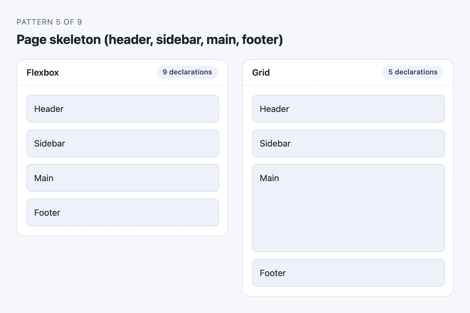 My first, nested flexbox attempt (the 9 declarations shown; the table’s final version uses 7), before the fix. Main should be as tall as it is in the grid version.
Adding flex-basis: auto to main inside the media query fixed it. Grid never had the problem: stacking only changed the column template, the rows stayed auto, and <main> kept its height.
3. Reordering visually and breaking keyboard order. Both order in flexbox and explicit placement in grid can move an item on screen without moving it in the HTML. Keyboard and screen reader users still get the source order, so the visual and actual sequence drift apart.
Chrome 137 shipped the reading-flow property in May 2025 to make focus follow the visual order. Until it’s available everywhere you need, fix the order in the HTML.
Newer Grid Features: Subgrid and Grid Lanes
Two newer features change the grid side of this comparison.
Subgrid won pattern 7, and caniuse puts its global support at 94.43%. Before it, aligning content across sibling cards meant fixed heights or JavaScript.
Grid Lanes brings masonry layouts to CSS. Safari 26.4 shipped display: grid-lanes in March 2026, according to WebKit’s release post, and it packs items of different heights into columns the way Pinterest-style galleries do. Other engines haven’t shipped it unflagged as of this writing, so treat it as an enhancement:
.gallery {
  display: grid;
  grid-template-columns: repeat(auto-fill, minmax(200px, 1fr));
  gap: 16px;
}

@supports (display: grid-lanes) {
  .gallery { display: grid-lanes; }
}
Browsers without support get a normal grid with even rows. Safari gets the packed version.
Frequently Asked Questions
Why doesn’t justify-items work in flexbox?
Because flexbox ignores it. MDN’s reference for justify-items states that “in flexbox layouts, this property is ignored,” and the same goes for justify-self. Flexbox aligns items along the main axis as a group, with justify-content. To push one item away from the rest, use an auto margin, like the margin-right: auto on the logo in the nav bar test.
Should I learn flexbox or grid first?
I’d start with flexbox. Its core is smaller, and the first layouts most people build, like a nav bar, a button row, or a centered box, are one-dimensional. Learn grid next, as soon as you need a page skeleton or a card grid. Knowing only one of them pushes you into the workarounds this article tested.
Does Bootstrap use flexbox or CSS grid?
Bootstrap 5’s standard grid system is built on flexbox, per its own documentation, even though it’s called a grid. It also ships a separate, opt-in CSS Grid layout. Its rows and columns are flex containers and flex items, which is why the classic flex-wrap behaviors apply to a Bootstrap row.
Does gap work in flexbox?
Yes. The gap property works in flex containers in every major browser, and caniuse puts support at 97.11%, with Safari the last to add it in version 14.1. Before that, spacing flex items meant a margin on each one plus a negative margin on the container to cancel the outer edges, which is why older flexbox code is full of them.
Is grid or flexbox better for responsive design?
Neither, on its own. In my tests, grid’s repeat(auto-fill, minmax()) kept a card grid tidy at every width with no media queries, and flex-wrap did the same for a tag list. The page skeleton and nav bar needed a media query either way. If you’d rather adapt a layout that already handles breakpoints, start from one of these responsive website design templates.
The Short Version
The declaration counts were close in every test. The failure modes weren’t: flexbox stretched an orphaned card and couldn’t line up descriptions across sibling cards, while grid’s predefined columns broke on content-sized items like tags and a nav bar that grew by one input.
On a real page, most of these patterns sit inside each other: a grid skeleton holding a flex nav bar, a grid of cards with flex footers. Pick per box, not per project.
If you want a generated starting point to practice on, AIDesigner’s free tier includes 5 lifetime credits with no card required, enough to generate a layout and see how a real page is structured.
 AIDesigner generates responsive HTML and CSS pages from a text prompt.