
TL;DR: I gave 11 AI design tools one prompt — a full-length landing page for a fictional marketing tool called Sendr, with a “bright nature aesthetic.” The interesting part wasn’t who made the prettiest hero; it was that design quality and completeness turned out to be totally different things. Design-wise, our own AIDesigner was my favorite (weigh that how you like — it’s ours); v0 read the brief right but landed at good-not-great; and Figma Make had every section and still looked surprisingly flat and stock-heavy. Google Stitch and UX Pilot barely produced a full page at all. The throughline: design quality and completeness almost never showed up together, and none of these were truly ready to publish. Full screenshots and my honest reactions are below.
One prompt, eleven very different answers
I do this more often than I’d like to admit: open a stack of AI design tools in separate tabs, paste the same prompt into every one, and see who actually gets it. It’s the fastest way I know to cut past the demo reels and marketing pages and find out what a tool really does when you hand it a real brief.
This time I wrote one prompt and gave it, word for word, to eleven of them:
Create a saas landing page for my suite of marketing automation tools called “Sendr”. I want an overall bright nature aesthetic. Think open valleys, trees, bright flowers, beautiful sky, clouds, birds, mountains, etc. Make sure it’s a full length landing page with all needed sections.
I picked that prompt on purpose. “Bright nature aesthetic — open valleys, flowers, sky, birds, mountains” is specific and a little demanding, and “full-length landing page with all needed sections” is the part most tools quietly skip. A generic SaaS prompt is easy; any tool can spit out a cream-and-green template with a dashboard screenshot bolted on. Asking for meadows and wildflowers forces a tool to make real art-direction choices — and asking for a full page forces it to actually finish the job.
Here’s the honest version of what came back.
The two things I was actually watching for
I wasn’t scoring these on a spreadsheet. I only really cared about two things:
- Did it commit to the aesthetic? Not “is there a nature photo somewhere” — did the whole page feel like the bright, natural brand I asked for, or did it staple one stock mountain onto a default template?
- Did it build a full page? Hero, features, product, proof, pricing, FAQ, footer — the sections I explicitly asked for. A beautiful hero sitting on top of empty space doesn’t count.
One disclosure before we start: AIDesigner is my company, and it’s one of the eleven tools here. I picked the model and settings for our run, so it had home-field advantage, and I’ve tried to review it as honestly as the rest. You’ve got the full screenshot either way — trust that over my opinion.
Each result below is the full page a tool generated from that one prompt, in alphabetical order — ranking one output over another from a single run would be silly, so I didn’t.
AIDesigner
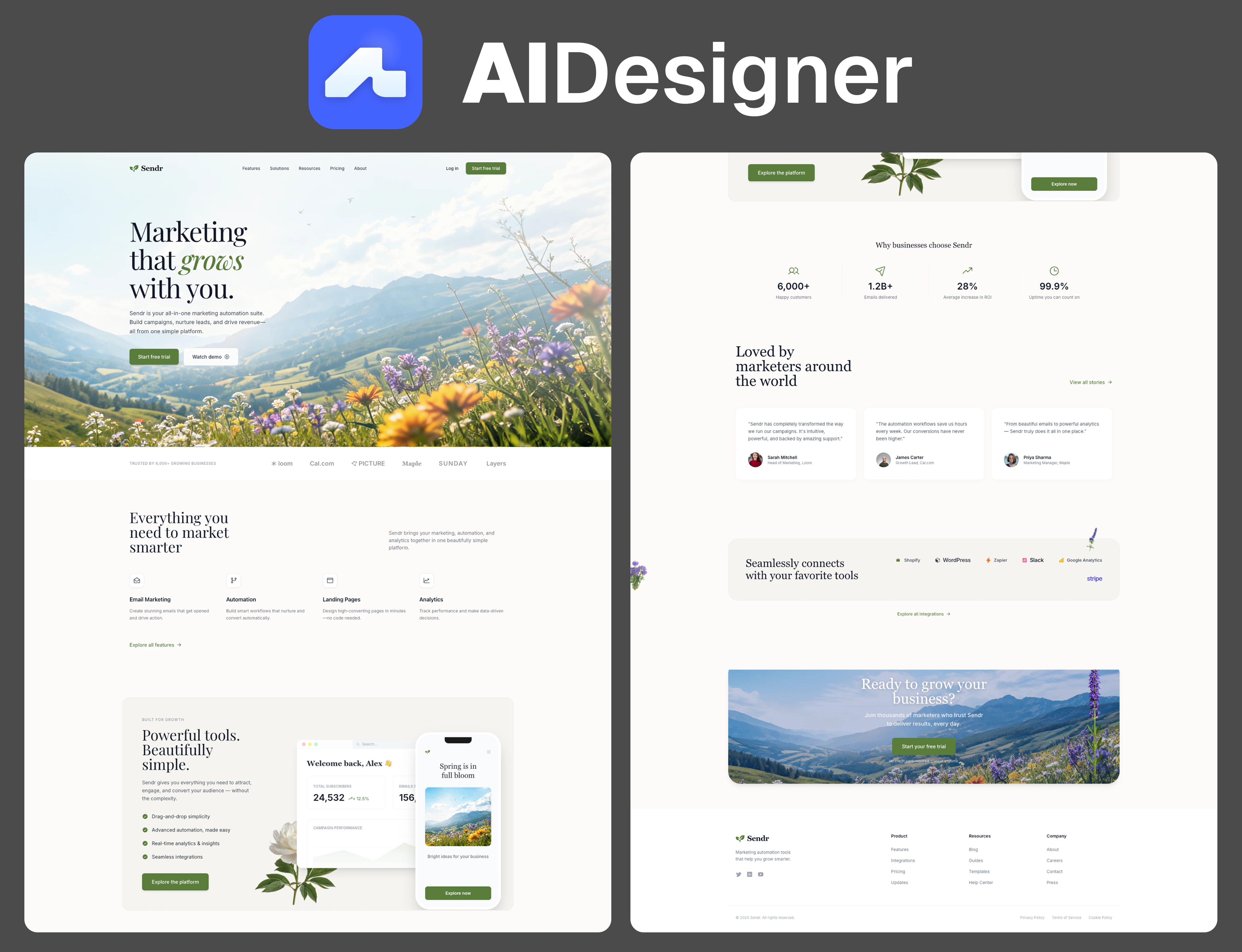
I’ll be upfront: this is our tool, and I picked the model and settings, so read my take with the appropriate side-eye — but I think the screenshot backs me up. Design-wise, this was my favorite result of the whole test. It’s the only one that treated “bright nature aesthetic” as real art direction instead of a color palette: an actual wildflower meadow rolling back toward the mountains, birds in the sky, and little botanical sprigs tucked into the whitespace between sections.
The headline — “Marketing that grows with you,” with “grows” set in a soft green italic — sets a tone the rest of the page actually keeps. There’s a product dashboard, a phone mockup that says “Spring is in full bloom,” proof stats, testimonials, integrations, and a closing valley shot. It reads like a finished brand rather than a prompt result. If I’m honest about where it falls short, it isn’t the design — it’s completeness. A couple of the other tools packed in more sections and more proof than we did; this page is the best-looking, not the most exhaustive.
- What worked: The strongest, most art-directed design of the group — it looks like a real brand, not a template.
- What bugged me: It’s a little lighter on sections than the most complete results, and the floating sprigs get slightly twee.
- Best for: A marketing page where design quality matters more than cramming in every possible section.
Banani
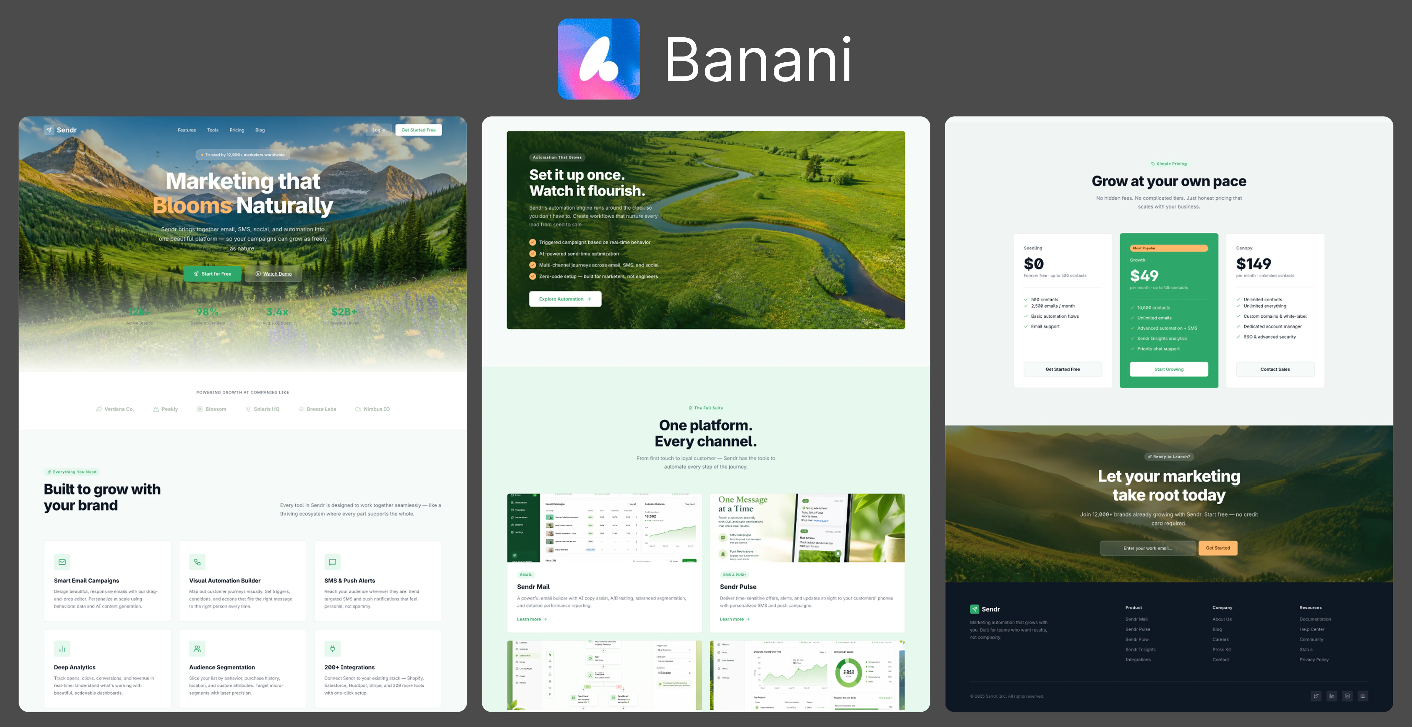
Banani went for drama. Instead of a soft sunny meadow it opened on a moody mountain-and-forest valley with “Marketing that Blooms Naturally” stamped across it, “Blooms” in gold. It’s genuinely striking — and it’s the one spot where the brief and the output slightly disagree. I asked for bright; Banani gave me cinematic and a little dark.
Where it won me over was the follow-through. There’s a winding-river section (“Set it up once. Watch it flourish.”), real product UI cards, and pricing tiers actually named Seedling / Growth / Canopy — thematic naming that suggests it thought about the concept instead of just grabbing a nature photo. But the longer I looked, the more it gave itself away: the generic font family, the neat bento-grid sections, and the row of lookalike icons all scream AI. It’s cohesive, but it has that unmistakable “generated” fingerprint. And the hero stats are laid over the busy photo, where I could barely read them.
- What worked: A committed, cinematic concept — right down to Seedling/Growth/Canopy pricing — with real product UI.
- What bugged me: The font, bento grid, and lookalike icons all scream AI-generated; it reads moody rather than “bright”; and the hero stats vanish into the photo.
- Best for: A campaign page that wants a bold, cinematic first impression.
Claude Design
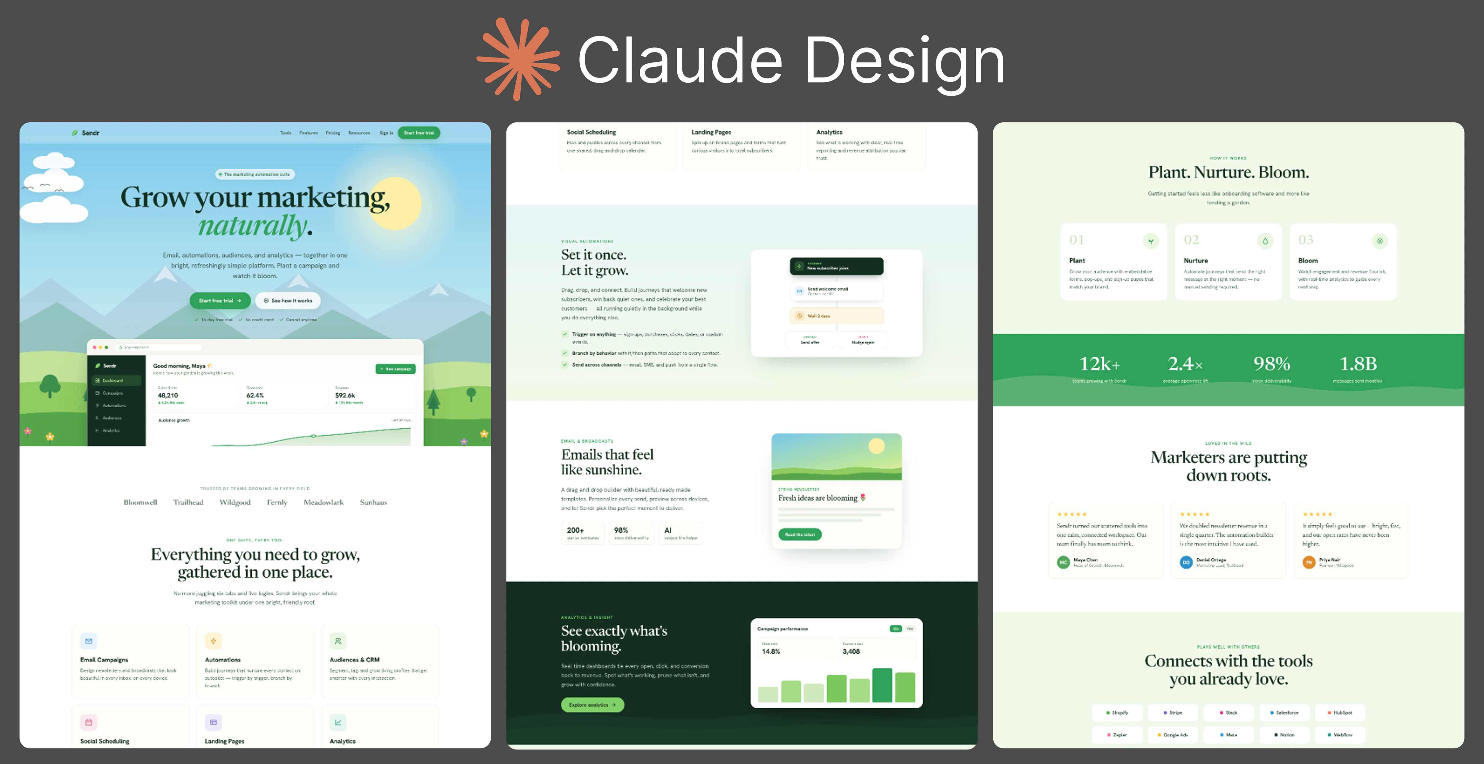
Claude was the only tool that went fully illustrated instead of photographic, and it’s charming — flat storybook hills, a smiling sun, little stars, “Grow your marketing, naturally.” The whole thing feels like a children’s-book garden, in the best way. “Plant. Nurture. Bloom.” as the three-step section is a lovely touch.
It’s a complete page too — dashboard mockup, stats band, “Emails that feel like sunshine,” testimonials, integrations — and it holds together throughout. The risk is tone: the illustration is so friendly it reads more consumer app than B2B marketing suite, and the garden metaphor gets laid on pretty thick by the time you reach the footer.
- What worked: A distinct, coherent illustrated direction almost no other tool attempted, on a genuinely complete page.
- What bugged me: It leans so cute it drifts away from “B2B software,” and the nature metaphor gets repetitive.
- Best for: An approachable, friendly product that wants warmth over corporate polish.
Figma Make
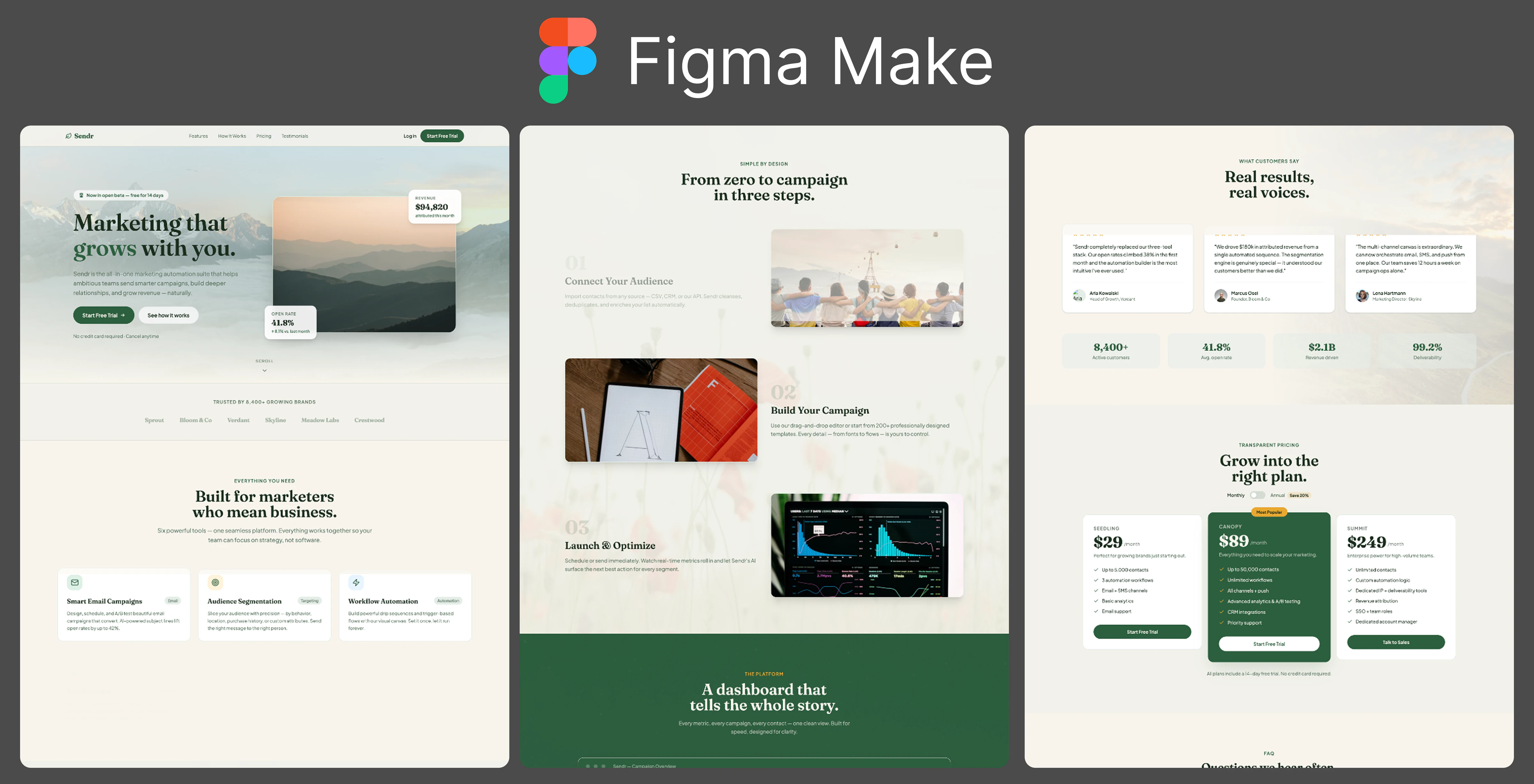
Structurally, this is one of the most complete pages in the test — every section you’d want, cleanly ordered. On paper, it’s a strong result, and I wanted to like it.
But design-wise it falls flat for me, and that stings coming from Figma of all companies. It’s bland. The color scheme is dark and muted, the hero is just moody stock mountains and sunset lifestyle photos, and there’s almost nothing showing the actual product — it’s all stock imagery standing in for a real page. Even the navbar feels bolted on and out of place. Honestly, it’s the most “AI slop” result of the bunch: competent, complete, and completely forgettable. From Figma I expected a lot more.
- What worked: Structurally excellent — complete, well-ordered, every section in its place.
- What bugged me: The design falls flat — dark and bland, all stock imagery with no real product shown, and an out-of-place navbar. It reads like AI slop, which is disappointing from Figma.
- Best for: A structurally complete skeleton you’ll need to fully re-skin to make it feel like anything.
Google Stitch
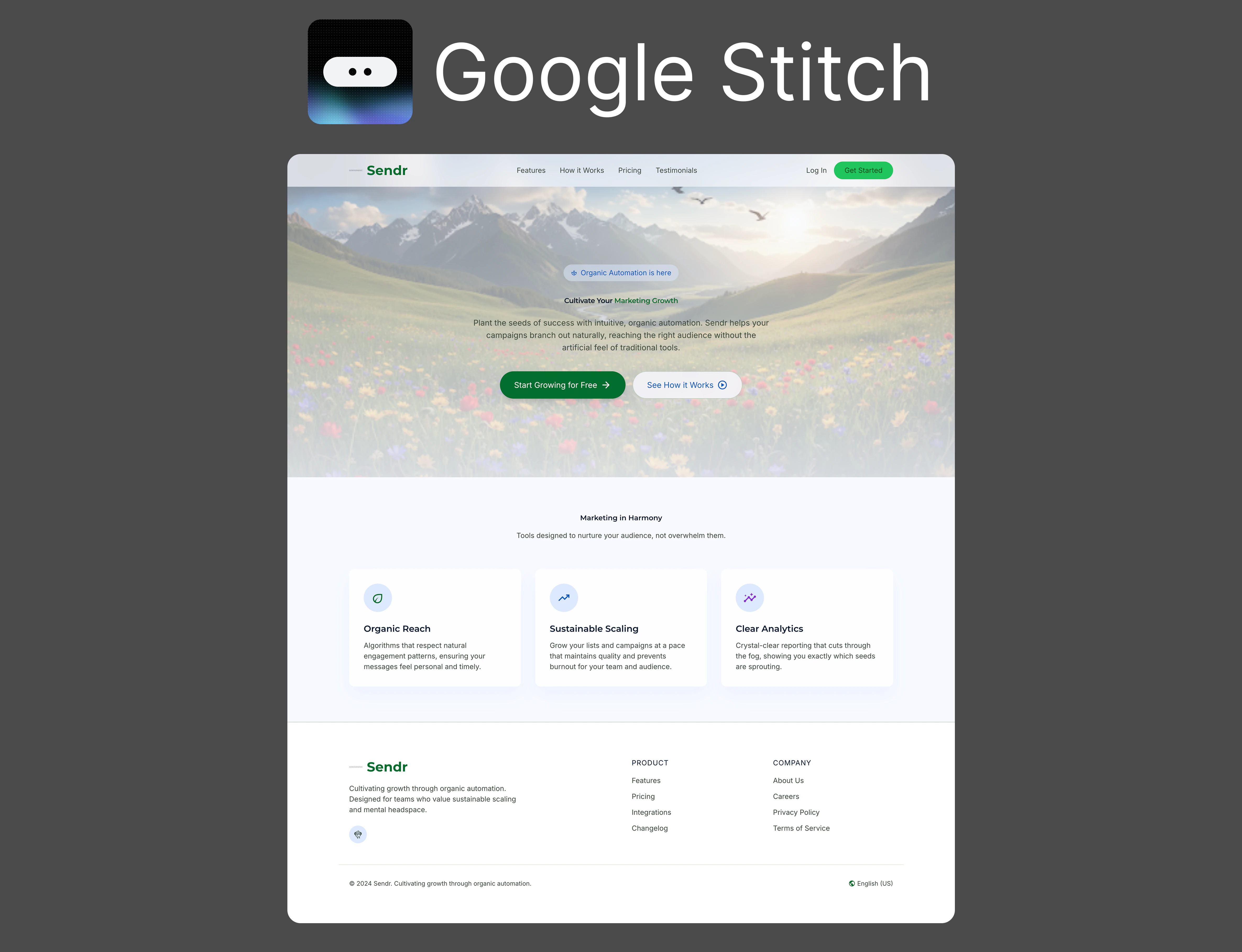
This was the most disappointing result in the whole test — and it’s a Google product, which somehow makes it worse. It’s just basic. A generic stock mountain photo with a centered headline, one row of three plain feature cards with default-looking icons, and then the footer. That’s the entire page.
Nothing about it feels considered. There’s no product, no proof, no pricing, no point of view, and it flatly ignored the “full-length page with all sections” half of the brief. I went in expecting Google to at least be clean and polished; instead this is the thinnest, most forgettable output of the eleven. Everything about it feels like a placeholder.
- What worked: It’s legible. That’s about the kindest thing I can say.
- What bugged me: Basic from top to bottom — generic imagery, three stock cards, then nothing. It ignored the “full page” brief entirely, and it’s genuinely poor for a Google product.
- Best for: A throwaway concept sketch — I wouldn’t build anything real on this one.
Magic Patterns
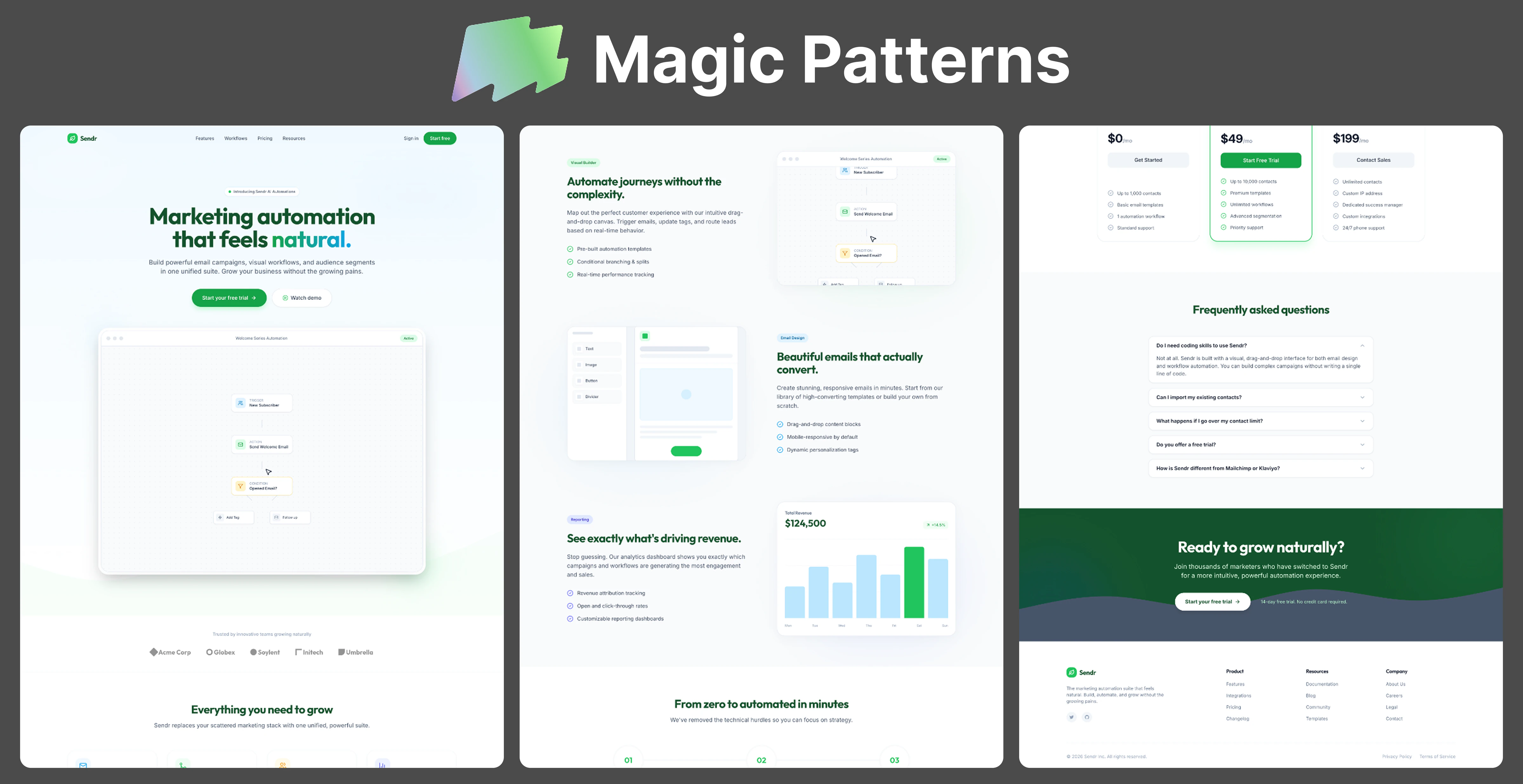
Magic Patterns built the most competent product page here — and the least “nature” one. It’s clean and organized, it leads with an actual automation-flow UI, and it has every section you’d want: features, a revenue chart, pricing, a real FAQ accordion. As a SaaS page, it just works.
But the brief was specifically about a bright nature aesthetic, and Magic Patterns swapped that out for a faint green gradient and the word “natural.” No valleys, no flowers, no sky. If you handed a stranger this page and my prompt, they’d never guess I asked for open meadows. Great page, wrong assignment.
- What worked: A genuinely complete, product-forward page with strong UI and a real FAQ.
- What bugged me: It essentially ignored the nature aesthetic — green accents and “natural” copy, none of the imagery I asked for.
- Best for: A clean, product-led SaaS page where the UI is the hero.
Relume
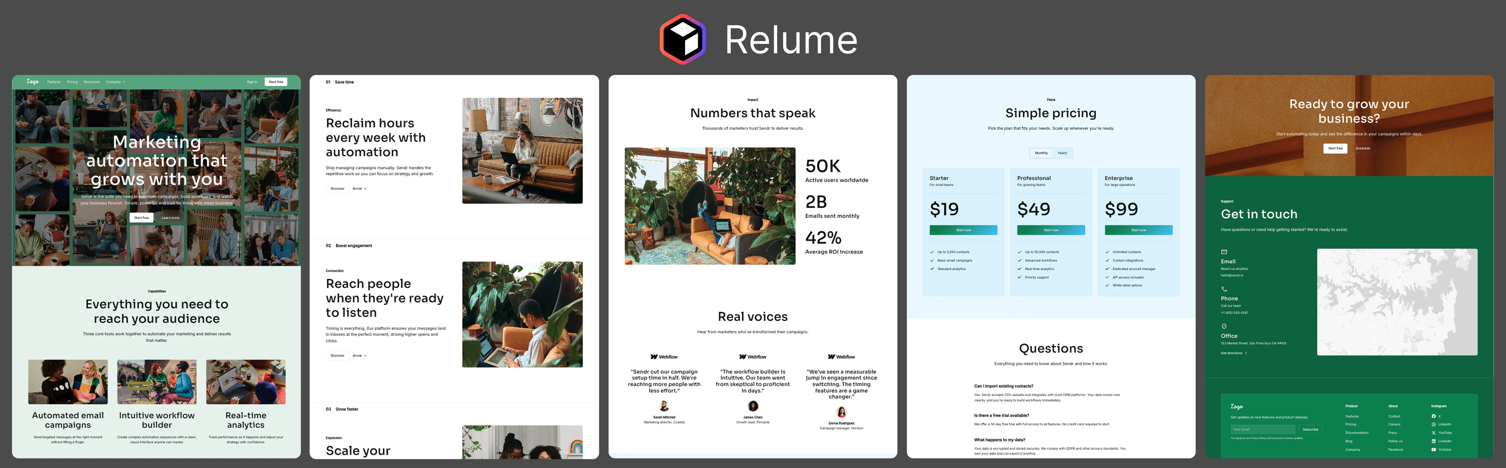
Relume is really a sitemap-and-wireframe tool for Webflow, and it shows here in both directions. On the plus side, the structure is thorough — hero, three benefit sections, a stats block, testimonials, pricing, an FAQ, and a contact section. Nothing’s missing.
On the minus side, it didn’t interpret the aesthetic so much as drop in generic stock photos of people at desks, and the hero is a busy photo collage with the headline laid on top — I had to work to read it. The testimonials are even still attributed to “Webflow.” It’s a complete skeleton, but it’s the least art-directed result of the bunch.
- What worked: The most thorough section structure — a full sitemap’s worth of a page.
- What bugged me: Generic office stock photos instead of the nature brief, plus a hard-to-read collage hero.
- Best for: A wireframe-stage marketing site you’ll art-direct and finish in Webflow.
Uizard
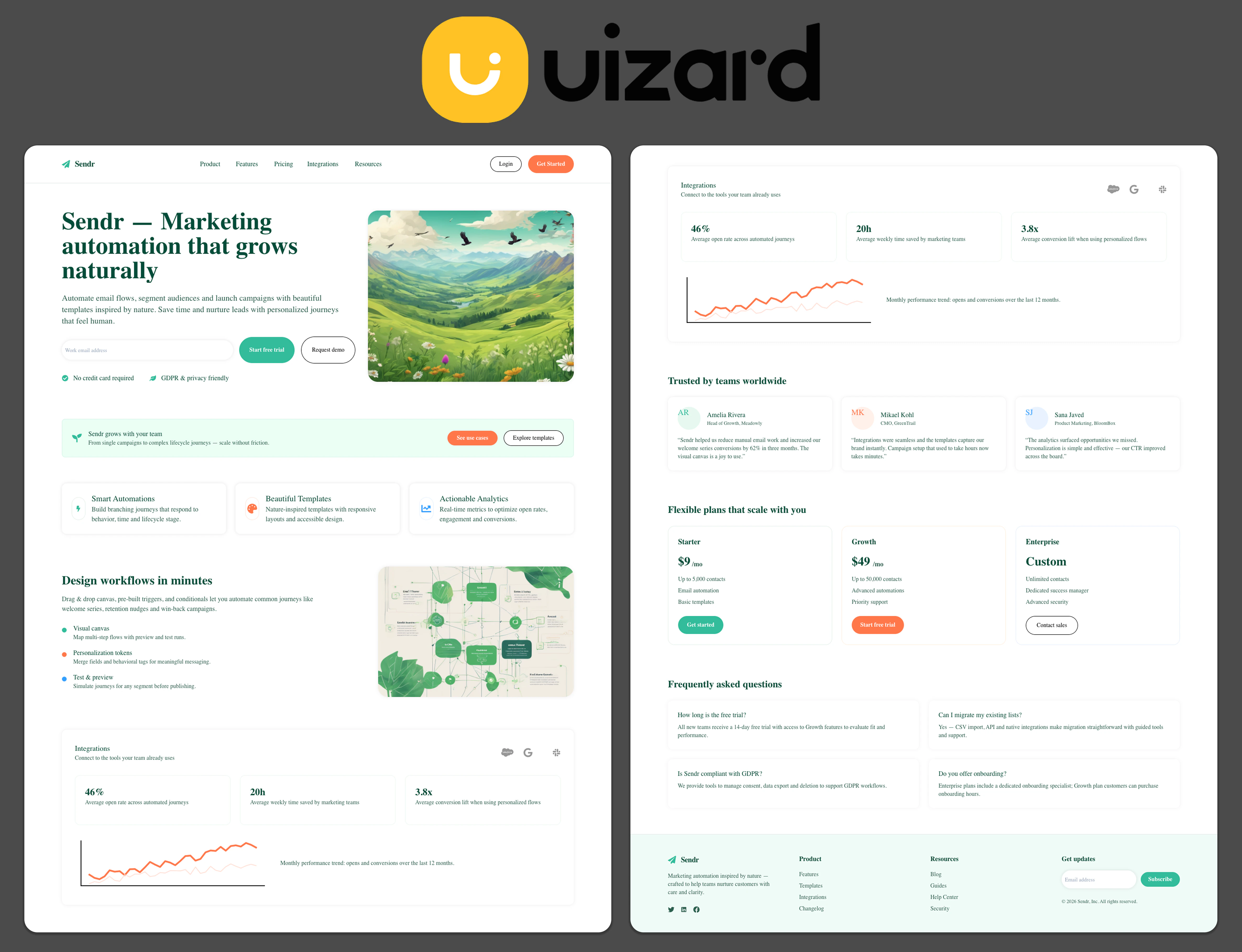
Uizard gave me a tidy, readable, genuinely complete page. It took the illustrated route for the hero — a flat vector valley with birds and wildflowers — and paired it with a clean email-capture form, feature cards, a workflow canvas, stats, testimonials, pricing, and an FAQ. Nothing about it is confusing, which sounds like faint praise but isn’t.
It’s also the definition of safe. The nature idea basically lives in that one hero illustration and a couple of leaf accents; the rest is a competent, slightly template-y SaaS layout. It won’t wow anyone, but I’d trust it as an editable starting point.
- What worked: Clear, complete, and immediately editable — a dependable full page.
- What bugged me: The nature direction is thin (one illustration), and the layout plays it very safe.
- Best for: A straightforward lead-gen page you want to tweak fast, not agonize over.
UX Pilot
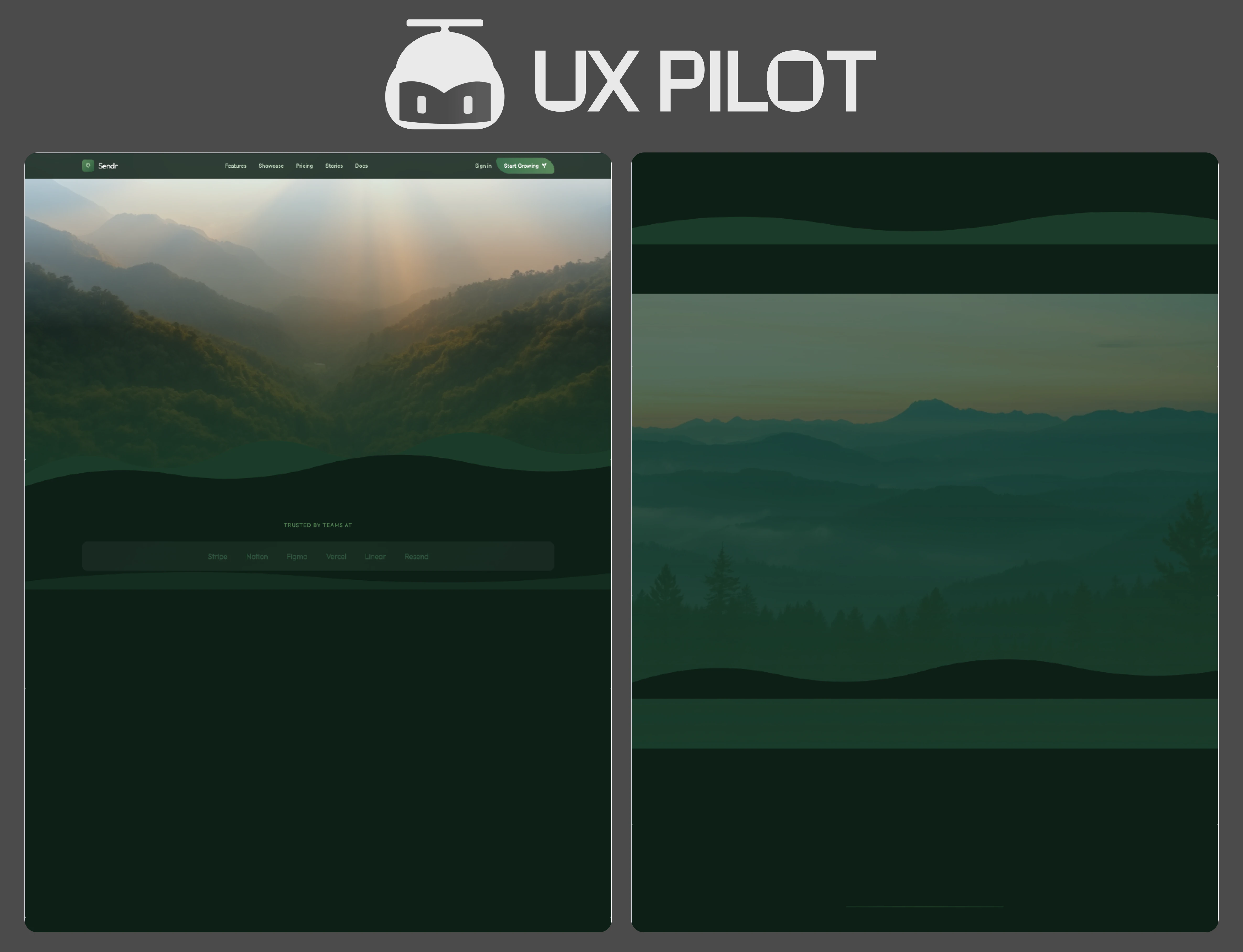
This is the one that didn’t really finish. UX Pilot opened on a lovely misty-sunrise mountain photo — atmospheric, on-mood — and then the page essentially evaporates into empty dark-green space. There’s a nav, a “trusted by” logo row, and then almost nothing: no value prop, no features, no pricing, no product.
I want to be fair here, because a single run isn’t the whole tool, and UX Pilot is capable of a lot more than this. But I’m reviewing what came back, and what came back was a beautiful header attached to a mostly empty page.
- What worked: An atmospheric, on-brief hero image.
- What bugged me: The rest of the page never materialized — it’s a header on top of empty space.
- Best for: Worth a rerun before you judge it — this particular output didn’t finish.
v0
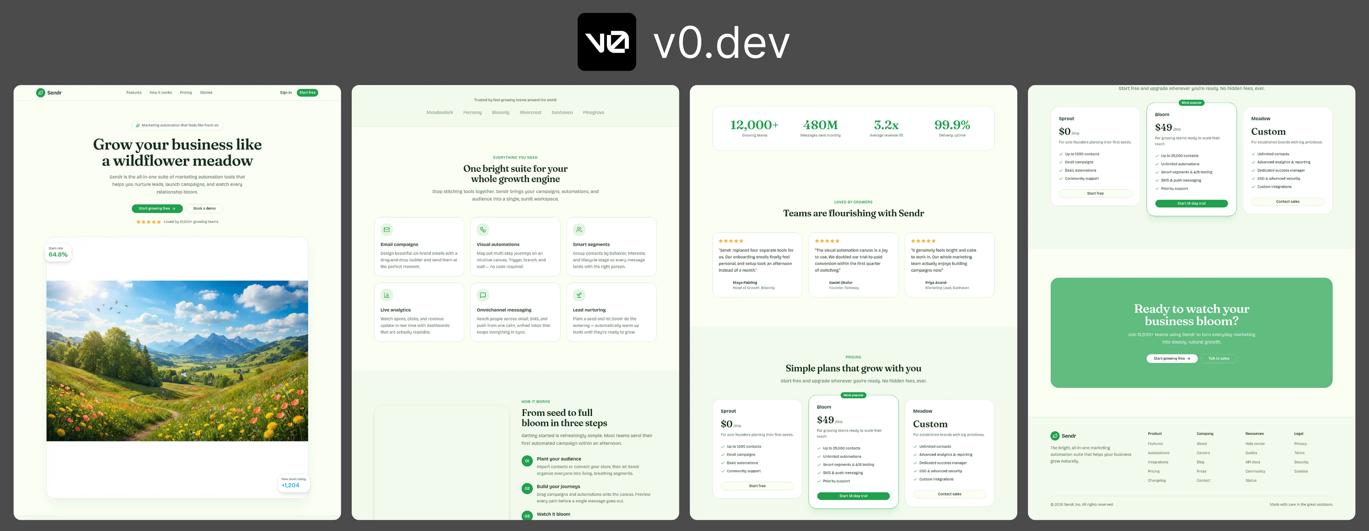
v0 got a lot right. “Grow your business like a wildflower meadow” over a bright, sunlit valley photo — it read the brief correctly (bright, not moody) — and then it carried a consistent botanical idea all the way down: “one bright suite for your whole growth engine,” “from seed to full bloom in three steps,” pricing tiers named Sprout / Bloom / Meadow, and a footer that literally says “made with care in the great outdoors.”
Structurally it’s solid and the copy discipline is real. But I wouldn’t call it close to shippable, and the hero is a big part of why: that wildflower photo floats in a chunk of empty whitespace and doesn’t really connect to anything around it, so the page’s most prominent visual ends up feeling a little arbitrary — like it doesn’t quite make sense where it is. Add a green that’s cranked too bright for my taste, and what you’ve got is good, but not great.
- What worked: It read “bright” correctly and kept one nature idea running through every section, copy included.
- What bugged me: The hero visual doesn’t quite make sense — floating in whitespace, disconnected from the layout — and the green is turned up too bright.
- Best for: An on-brief starting point with the working code behind it — you’ll still finish the design yourself.
Visily
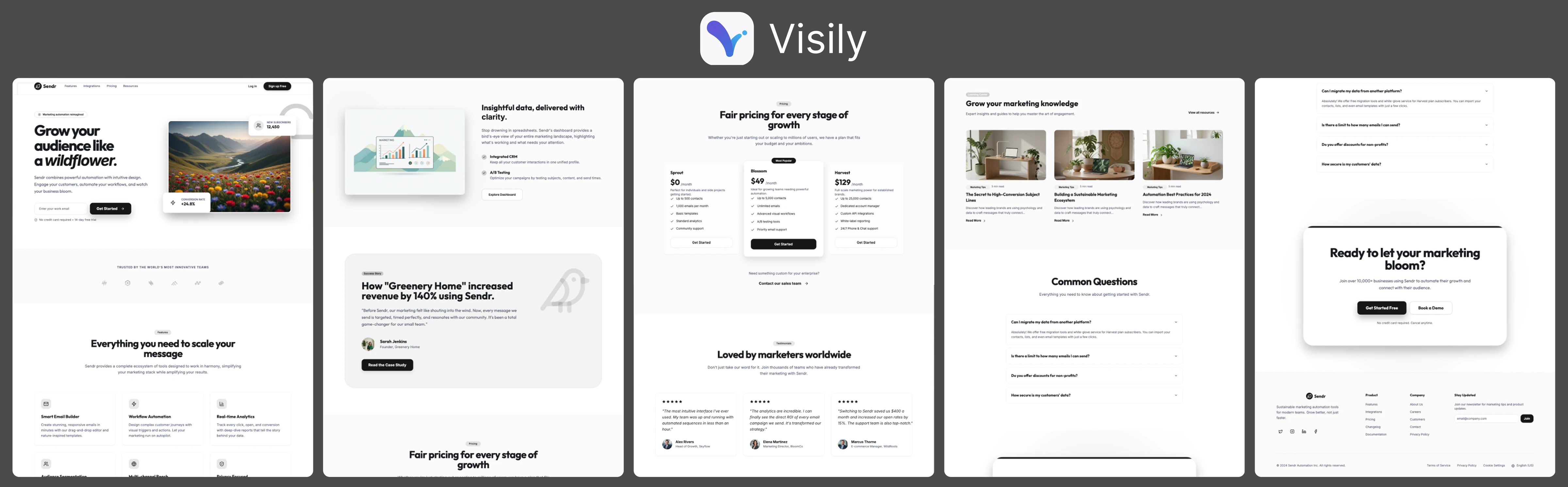
Visily’s page is complete and well-organized — a hero with a wildflower-valley photo, features, a “140% revenue” case study, three-tier pricing, a blog row, testimonials, an FAQ, and a closing CTA. Structurally it does everything the brief asked for.
Visually, though, it’s the most restrained result here. Outside the hero photo it’s mostly white cards, gray text, and small type — it reads like a high-fidelity wireframe more than a finished brand, which tracks with what Visily is built for. The bright-nature aesthetic shows up in the hero and then quietly fades to grayscale.
- What worked: A complete, cleanly structured page with every section in its place.
- What bugged me: Low-contrast, wireframe-y styling that lets the nature aesthetic fade after the hero.
- Best for: A clear, collaborative mockup you’ll dress up with real brand styling later.
What the same prompt actually told me
A few patterns jumped out once I had all eleven side by side.
Almost everyone reached for the same metaphor. Green palettes, “grow / bloom / natural / roots” copy, growth-stage pricing tiers — the convergence was honestly a little eerie. Give AI a marketing-automation brief with a nature theme and it lands on remarkably similar language every time. The real differences were all in execution, not concept.
There were two ways to interpret “nature.” Most tools went photographic (AIDesigner, v0, Google Stitch, Banani, UX Pilot, Visily). Two went fully illustrated (Claude and Uizard), which stood out simply for being different. Neither is wrong — but the illustrated pages read friendlier and more consumer, the photographic ones more premium.
The real split was commitment versus completeness — and very few tools did both. Some skipped the page entirely: Google Stitch handed back a headline, three stock cards, and a footer; UX Pilot’s page never rendered past the header. Others built a complete page but ignored the aesthetic — Magic Patterns and Visily are thorough but almost entirely un-nature, and Relume filled the space with generic office stock photos where I’d asked for valleys.
And completeness didn’t equal quality — that’s what surprised me most. One of the most complete pages, Figma Make, was also one of the most forgettable: dark, stock-heavy, showing nothing of the actual product, and honestly a little AI-sloppy — not at all what I expected from Figma. Meanwhile the best-looking results weren’t the most complete. Design quality and completeness turned out to be two separate axes, and almost nothing here topped both at once.
The ones I kept coming back to. Design-wise, AIDesigner was my favorite — it’s ours, so weigh that how you like, but I think the screenshot earns it; the only real knock is that it’s lighter on sections than the most complete pages. v0 got the brief right and had the best copy discipline, but I wouldn’t call it close to shippable — the hero floats in whitespace and doesn’t quite make sense, and the green is too loud. Good, not great. Banani and Claude both committed hard to a concept, though up close Banani’s font, bento grid, and icons give away the AI, and Claude leaned cuter. Honestly, none of the eleven were truly click-publish ready — the strongest were good starting points, not finished pages.
So which one should you use?
“Which is best” is the wrong question, because these tools aren’t trying to do the same job. Based on what I saw with this one brief:
- The best-looking, most art-directed design: AIDesigner — with the honest caveat that a couple of tools packed in more sections.
- The most complete structure you’re willing to re-skin: Visily — it has every section; you’ll just need to dress up the plain, wireframe-y styling.
- A fast, dependable, editable starting point: Magic Patterns — clean, organized, and it just works, even if it skips the nature brief.
- An on-brief page with the working code behind it (you’ll still finish the design): v0.
- A bold, cinematic first impression: Banani.
- Warm and friendly over corporate: Claude’s illustrated take.
- If your team already lives in Figma: Figma Make — the structure’s all there; you’ll just have to fix the design.
- Planning the whole marketing site’s structure first: Relume.
And the obvious caveat: this is one prompt, one run, one afternoon. A single generation tells you how a tool handled one brief — not how it edits, how it exports, or how it holds up on your third revision at 11pm. Use a test like this to build a shortlist, then run your own real project through two or three of them. If you want to see how AIDesigner handles your brief, the fastest way to judge it is to give it the exact prompt I did and compare the result to the screenshots above.
For the broader, workflow-level comparison — pricing, editing, exports, and features rather than a single screenshot — I keep a separate guide to the best AI UI design tools that goes deeper than any one prompt can.
FAQ
What prompt did you give each AI design tool?
The exact same one, word for word: a full-length SaaS landing page for a fictional marketing-automation tool called Sendr, with a bright nature aesthetic — open valleys, trees, bright flowers, sky, clouds, birds, and mountains. Every tool got that identical brief and nothing else.
Which AI design tool was best?
It depends on whether you mean design or structure, because the two didn’t line up. Design-wise, AIDesigner was my favorite (it’s ours, so judge the screenshot yourself). v0 read the brief well but landed at good-not-great. On pure structure, Visily and Figma Make packed in the most sections, though neither had much design personality. Banani and Claude fully committed to a concept. Honestly none were truly ready to publish, so “best” depends on whether you’re optimizing for how it looks, how complete it is, or the working code underneath.
Did every tool really get the same prompt?
Yes — the identical prompt, pasted into each tool with no follow-up edits. That’s the whole point of the test: the differences between the pages are differences in how each tool interpreted one brief, not differences in what I asked for.
Can one prompt tell you which AI design tool to use?
No. A single generation shows how a tool handled one brief on one run — not how it edits, exports, or holds up over several revisions. Use a test like this to build a shortlist, then run your own real project through two or three finalists before committing.
Final takeaway
The screenshots make one thing clear: most AI design tools can now assemble a recognizable landing page from a sentence. The real surprise was that completeness and design quality barely overlapped — the most finished page was one of the blandest, and the best-looking one wasn’t the most complete. A few tools threaded both. The rest either had a look and quit early, or built every section and forgot to have a point of view.
Pick two or three that caught your eye, give them the same real brief, and see which one you’d actually want to keep editing. If distinctive art direction is what you’re after, try the same prompt in AIDesigner and compare the result to everything above. Or run the experiment yourself: drop your own prompt into the free AI design generator and see what comes back.
About the Author
Tyler Yin is the founder of AIDesigner, an AI design platform for teams creating website UI, product screens, brand systems, and visual assets. He writes about AI tools, design workflows, and building products that don’t look like templates.